vue-accessible-date-field
vue-accessible-date-field
Vue date field with possibility to use a visual date picker to choose the date. Accessibility is under development. Not recommended to use this component until version 1.0.0 is released. Component is made with Vue 3.
Installation
npm install vue-accessible-date-fieldGeneral information
- default language is English
- string prop defaultDate in format "yyyy-mm-dd"
- user can feed date in the input field in formats "dd.mm.yyyy", "dd/mm/yyyy" or "dd-mm-yyyy"
- when user changes the selected date, component emits "update:selectedISODate" in format "yyyy-mm-dd"
- in case of multiple datefields on same page, you can use uniqueName string prop to make component id:s unique also between components. This contributes to accessibility.
Date field: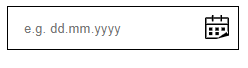
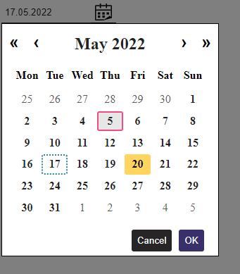
Date picker showing selected date with dotted border, focused but not selected date with yellow background color and hovered date with light gray background and pink border.
The W3C documents and the Date Picker Dialog Example earlier found on their website have been used to help develop this component. In addition, Duet Date Picker has influenced in the implementation of localization. The component is not ready yet, but many functionalities are already working.
Styling
The component has some CSS custom variables that are possible to override by adding the following class to project's global stylesheet and editing it the way that suit's your needs.
.vue-accessible-date-field {
  --main-color: #222222;

  /* date field section (text fields) */
  --date-field-section-outline-color: #d71ef7;
  --calendar-icon-focus-color: #d71ef7;
  --open-calendar-button-background-color: #ffffff;
  --error-text-color: #BB1331;

  /* date picker (modal) section */
  --day-hover-background-color: #e8e7e7;
  --day-not-disabled-hover-border-color: #f44a87;
  --day-focus-border: #3182a0;
  --day-tabindex-0-background-color: #ffd55f;
  --day-selected-border-color: #3182a0;
  --chooce-selected-button-background-color: #39306b;
  --chooce-selected-button-background-color-hover: #5c73bc;
  --close-modal-button-background-color: #272525;
  --close-modal-button-hover-background-color: #677983;

  --modal-backdrop-z-index: 1000;
  --date-picker-z-index: 1001;
}
You can also override other CSS styles as you like. Please keep accessibility in mind if changing the values.