vue-accessible-datepicker v0.2.0
Vue Accessible Datepicker
⚠️WARNING: vue-accessible-datepicker is at pre-alpha stage of development so there may be bugs and various changes made. ⚠️
Submit issues and feature requests here.
Table of Contents
About
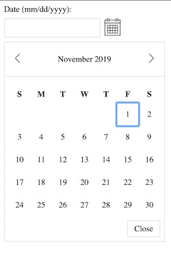
VueAccessibleDatepicker is a fully customisable, AA accessible datepicker built in Vue, for Vue projects.

WCAG 2.1 AA Accessible - work in progress - currently in pre-alpha stages.
If you're curious, here's some information on how to meet WCAG 2.1 AA Accessibility:
To find all of the functionality that a date-picker should have, VueAccessibleDatepicker is based off of this date picker from W3's website.
Installation
npm install vue-accessible-datepickeror if you prefer yarn
yarn add vue-accessible-datepickerUsage
Global
You may install the date-picker globally:
import Vue from 'vue';
import VueAccessibleDatepicker from 'vue-accessible-datepicker';

Vue.use(VueAccessibleDatepicker);
This will make <vue-accessible-datepicker> available to all components within your Vue app.
Local
Include the datepicker directly into your component using import:
import VueAccessibleDatepicker from 'vue-accessible-datepicker';

export default {
  ...
  components: {
    VueAccessibleDatepicker,
  }
  ...
};
Props
| Prop | Type | Default | Description |
|---|---|---|---|
| calendarIcon | String | Default Icon | Icon for the button to open the date-picker. A default icon appears if none is provided. |
| customClasses | Object | {} | Provide classes to override the default styles. See customClasses for more info. |
| dateFormat | String | "MM/DD/YYYY" | The format of the date to use for the input and calendar. See dateFormat for more info. |
| initialValue | String | null | Provide an initial value to the input if needed. |
| inputPlaceholder | String | null | Placeholder for the input. |
| label | String | "Date (mm/dd/yyyy):" | "(mm/dd/yyyy)" changes depending on the dateFormat prop. |
| minDate | Date | null | Every date before the minDate is disabled. |
| maxDate | Date | null | Every date after the maxDate is disabled. |
| navigateMonthIcons | Object | {} | Provide custom icons for the previous and next navigation arrows. See navigateMonthIcons for more info |
| required | Boolean | false | Boolean for if the input is required for the form it is used in. |
| name | String | null | Name for the input field |
customClasses
Provide custom classes in an object via the prop customClasses.
The aim of this prop is to make the calendar as customisable as possible.
Available classes:
- Classes for the wrapper container with input and button:
wrapperinputContainerinputWrapperinputLabelinputErrorinputtoggleButtontoggleButtonIcon
- Classes for the datepicker:
datepickerWrapperdatepickerHeaderWrapperdatepickerChangeMonthButton- for both next and previous buttons.datepickerChangeMonthButtonDisabled- Disabled state ofdatepickerChangeMonthButtonelement.datepickerBackArrow- for the icon itself.datepickerHeaderdatepickerNextArrow- for the icon itself.datepickerContent- the wrapper for the table element itself. Houses the calendar.datepickerWeekdaysWrapper- On the<thead>element. Wraps the header part with the list of weekdays.datepickerWeekdaysRowWrapper- On the<tr>element. Wraps the list of weekdays.datepickerWeekday- On each<th>element (each weekday).datepickerWeeks- On the<tbody>element.datepickerWeek- On the<tr>element, wraps each week.datepickerDay- On the<td>element, wraps each day button.datepickerDayButtonSelected- Selected state ofdatepickerDaytdelement.datepickerDayButtonDisabled- Disabled state ofdatepickerDaytdelement.datepickerDayButton- On the<button>in eachtd.datepickerFillerDate- On each blank<td>to make each month start on the correct day of the week.datepickerFooter- Footer wrapper with the close button.datepickerFooterButton
Code example:
<vue-accessible-datepicker
  :custom-classes="{
    wrapper: 'custom-datepicker-wrapper-class',
    datepickerChangeMonthButton: 'custom-datepicker-change-month-class',
    toggleButtonIcon: 'toggle-me-class',
  }"
/>
dateFormat
The formatting is taken from MomentJS.
See the docs here https://momentjs.com/docs/#/displaying/format/.
The formats accepted are:
MM/DD/YYYYMM-DD-YYYYDD/MM/YYYYDD-MM-YYYYYYYY/MM/DDYYYY-MM-DD
If dateFormat is not provided, it defaults to MM/DD/YYYY.
If you type a different format of date than the dateFormat specified, there will be an error in the console.
Code example:
<vue-accessible-datepicker date-format="DD-MM-YYYY" />navigateMonthIcons
Provide src of img or svgs through the navigateMonthIcons prop as an object with next and previous as the keys.
Code example:
<vue-accessible-datepicker
  :navigate-month-icons="{
    next: '/img/next-arrow.svg',
    previous: '/img/previous-arrow.svg',
  }"
/>
Events
- Input - On blur - the component emits "input-blur" with the value of the input.
- Input - On focus - the component emits "input-focus" with the value of the input.
- Input - On change - the component emits "input-change" with the value of the input.
- Date selected via date-picker - component emits "date-selected" with the selected date.
Slot
There is a single slot with the classname of v-datepicker__input-error for any form error messages you want to inject and style.
Example
<vue-accessible-datepicker
  name="start-date"
  required
  date-format="DD-MM-YYYY"
  :custom-classes="{
    wrapper: 'v-wrapper',
    input: 'v-input'
  }"
/>
Roadmap
- Tests
Development
yarn install
yarn dev
License
This project is licensed under MIT - see LICENSE.md for details.
© 2019 Hex Digital.