vue-audio-visual
vue-audio-visual


Vue HTML5 audio visualization components
UPDATE NOTES
The current plugin version is compatible only with Vue v3. For Vue 2, use plugin version 2.5.1. See the install section for details.
Overview
An audio spectrum visualizer plugin for VueJS framework.
It is built with HTML5
Web Audio API
and compatible with all browsers that support the HTML5 audio API. It provides
several Vue components that let you draw lightweight, attractive visualizations
for audio HTML elements.
Visit DEMO page for working examples.
Usage examples:
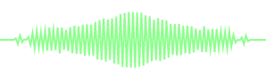
Component AvLine. Vue template name <av-line>
<av-line :line-width="2" line-color="lime" src="/static/music.mp3"></av-line>This will create the following element:
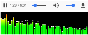
Component AvBars. Vue template name <av-bars>
<av-bars
  caps-color="#FFF"
  :bar-color="['#f00', '#ff0', '#0f0']"
  canv-fill-color="#000"
  :caps-height="2"
  src="/static/bach.mp3"
></av-bars>
This will create the following element:
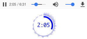
Component AvCircle. Vue template name <av-circle>
<av-circle
  :outline-width="0"
  :progress-width="5"
  :outline-meter-space="5"
  :playtime="true"
  playtime-font="18px Monaco"
  src="/static/bach.mp3"
></av-circle>
This will create the following element:
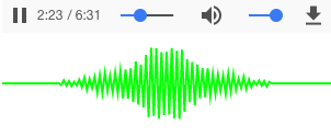
Component AvWaveform. Vue template name <av-waveform>
<av-waveform src="/static/bar.mp3"></av-waveform>This will create the following waveform element:
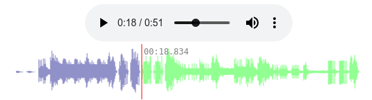
The component will pre-load audio content and generate a clickable waveform.
Component AvMedia. Vue component <AvMedia>
<AvMedia :media="mediaObject" type="vbar"></AvMedia>This will create the following media element:

There are more media types. See details below.
Get started
Install
Install using npm
npm install --save vue-audio-visualFor Vue 2, install version 2.5.1
npm i -S vue-audio-visual@2.5.1Use plugin
Install the plugin in main.js:
import { createApp } from "vue";
import App from "./App.vue";
import { AVPlugin } from "vue-audio-visual";

const app = createApp(App);
app.use(AVPlugin);

app.mount("#app");
Then anywhere in your app you can use it like this:
<av-bars src="/static/bach.mp3" bar-color="#CCC"> </av-bars>Use component
A single component can be imported and used:
<script setup lang="ts">
import { AVWaveform } from 'vue-audio-visual'
</script>

<template>
  <AVWaveform src="http://foo.com/music.ogg" />
</template>
Composable functions
The plugin provides composable "use" functions for each component. Each component uses a composable function internally. See, for example, line component.
Composable functions use audio and canvas element refs. They are handy when you need full access to audio or canvas elements. At the same time they are easy to use:
<script setup lang="ts">
import { ref } from 'vue'
import { useAVBars } from 'vue-audio-visual'

const player = ref(null)
const canvas = ref(null)
const mySource = "./symphony.mp3"

// composable function useAVBars
useAVBars(player, canvas, { src: mySource, canvHeight: 40, canvWidth: 200, barColor: 'lime' })
</script>

<template>
  <div>
    <audio ref="player" :src="mySource" controls />
    <canvas ref="canvas" />
  </div>
</template>
API
There are several components that come with the plugin. Here is the list of available components:
| Name | Component name | Composable function |
|---|---|---|
| av-bars | AVBars | useAVBars |
| av-circle | AvCircle | useAVCircle |
| av-line | AVLine | useAVLine |
| av-media | AVMedia | useAVMedia |
| av-waveform | AVWaveform | useAVWaveform |
There are props that are common to all components and special props for each component. Component prop names follow Vue conventions when used with composable functions: when a prop's name is "foo-bar", the corresponding composable function parameter is expected to be "fooBar".
Common props
| Name | Type | Default | Description |
|---|---|---|---|
| src | String |
null |
URL for the audio element's src attribute. When provided, creates an audio element wrapped in a "div". |
| audio-controls | Boolean |
true |
Audio element controls attribute. When provided, displays the audio element with controls. |
| canv-fill-color | String |
null |
Canvas fill background RGB color.
Default is null, which makes the background transparent.
Examples:canv-fill-color="#00AAFF" |
AVLine props
| Name | Type | Default | Description |
|---|---|---|---|
| canv-width | Number |
300 |
Canvas element width. Default 300.
Example: :canv-width="600"
|
| canv-height | Number |
80 |
Canvas element height. Default 80.
Example: :canv-height="120"
|
| line-width | Number |
2 |
Graph line width in px. Integer or float number.
Example: :line-width="0.5"
|
| line-color | String, Array |
#9F9 |
Graph line color. Can be string RGB color or Array of RGB color.
When an Array is given, the plugin creates a linear gradient and sets it as the background.
The Array value should be bound.
Examples:line-color="#00AAFF":line-color="['#FFF', 'rgb(0,255,127)', '#00f']"
|
| fft-size | Number |
128 |
Represents the window size in samples that is used when performing
a Fast Fourier Transform (FFT) to get frequency domain data. Must be power of 2 between 25 and 215. Example: :fft-size="512"
|
Composable function:
function useAVLine<T extends object>(
  player: Ref<HTMLAudioElement | null>,
  canvas: Ref<HTMLCanvasElement | null>,
  props: T,
);
AVBars props
| Name | Type | Default | Description |
|---|---|---|---|
| canv-width | Number |
300 |
Canvas element width. Default 300.
Example: :canv-width="600"
|
| canv-height | Number |
80 |
Canvas element height. Default 80.
Example: :canv-height="120"
|
| bar-width | Number |
5 |
Width of bars in pixels. Example: :bar-width="12"
|
| bar-space | Number |
1 |
Space between bars. Example: :bar-space="1.6" |
| bar-color | String, Array |
#0A0AFF |
Bar fill color. Can be string RGB color or canvas gradients array. Examples: bar-color="#00AAFF":bar-color="['#FFF', 'rgb(0,255,127)', 'green']"
|
| caps-height | Number |
0 |
Create caps on bars with given height in pixels.
When zero no caps created. Example: :caps-height="2"
|
| caps-drop-speed | Number |
0.9 |
Caps drop down animation speed. The higher the number, the faster the caps go down.
Example: :caps-drop-speed="0.5"
|
| caps-color | String |
#A0A0FF |
Caps rectangles RGB color.
Example: caps-color="lime"
|
| brick-height | Number |
0 |
Draw bar as bricks when height is set and not zero. Example: :brick-height="6"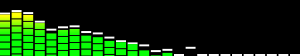
|
| brick-space | Number |
1 |
Space between bricks. Example: :brick-space="2"
|
| symmetric | Boolean |
false |
Draw bars symmetric to canvas vertical center.
Example: :symmetric="true"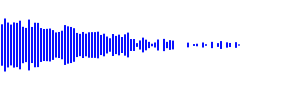
|
| fft-size | Number |
1024 |
Represents the window size in samples that is used when performing
a Fast Fourier Transform (FFT) to get frequency domain data. Must be power of 2 between 25 and 215. Example: :fft-size="2048"
|
Composable function
function useAVBars<T extends object>(
  player: Ref<HTMLAudioElement | null>,
  canvas: Ref<HTMLCanvasElement | null>,
  props: T,
);
AVCircle props
| Name | Type | Default | Description |
|---|---|---|---|
| canv-width | Number |
100 |
Canvas element width.
Example: :canv-width="600"
|
| canv-height | Number |
100 |
Canvas element height.
Example: :canv-height="120"
|
| radius | Number |
0 |
Base circle radius. If zero, then will be calculated from canvas
width: (canv-width / 2) * 0.7
Example: :radius="20"
|
| line-width | Number |
1 |
Frequency bit line width to draw.
Example: :line-width="0.4"
|
| line-space | Number |
1 |
Space between lines to draw.
Example: :line-space="2"
|
| outline-color | String |
#0000FF |
Outline (contour) style RGB color.
Example: outline-color="rgb(0,255,0)"
|
| outline-width | Number |
0.3 |
Outline (contour) line width. Float value.
Example: :outline-width="1"
|
| bar-width | Number |
1 |
Frequency graph bar width.
Example: :bar-width="1"
|
| bar-length | Number |
0 |
Frequency graph bar length/height.
Default is a difference between radius and canvas width.
Example: :bar-length="27"
|
| bar-color | String, Array |
[#FFF,#00F] |
Bar style RGB color or radial gradient when an array.
Example: :bar-color="#12AA55"
|
| progress | Boolean |
true |
Draw playtime progress meter.
Example: :progress="false"
|
| progress-width | Number |
1 |
Playtime progress meter width.
Example: :progress-width="2.4"
|
| progress-color | String |
#0000FF |
Playtime progress meter color.
Example: :progress-color="green"
|
| progress-clockwise | Boolean |
false |
Playtime progress meter arc draw direction.
Example: :progress-clockwise="true"
|
| outline-meter-space | Number |
3 |
Space between outline and progress meter. The bigger the value, the closer to the circle centre.
Example: :outline-meter-space="1"
|
| playtime | Boolean |
false |
Draw played time as text in the center of the circle.
Example: :playtime="true"
|
| playtime-font | String |
14px Monaco |
Played time print font.
Example: playtime-font="18px monospace"
|
| playtime-color | String |
#00f |
Played time font color.
Example: playtime-color="green"
|
| rotate-graph | Boolean |
false |
Enable clockwise graph rotation.
Example: :rotate-graph="true"
|
| rotate-speed | Number |
0.001 |
Rotate graph speed.
Example: :rotate-speed="0.2"
|
| fft-size | Number |
1024 |
Represents the window size in samples that is used when performing
a Fast Fourier Transform (FFT) to get frequency domain data. Must be power of 2 between 25 and 215. Example: :fft-size="2048"
|
Composable function
function useAVCircle<T extends object>(
  player: Ref<HTMLAudioElement | null>,
  canvas: Ref<HTMLCanvasElement | null>,
  props: T,
);
AVWaveform props
| Name | Type | Default | Description |
|---|---|---|---|
| canv-width | Number |
500 |
Canvas element width.
Example: :canv-width="600"
|
| canv-height | Number |
80 |
Canvas element height.
Example: :canv-height="120"
|
| played-line-width | Number |
0.5 |
Waveform line width for played segment of audio.
Example: :played-line-width="0.8"
|
| played-line-color | String |
navy |
Waveform line color for played segment of audio.
Example: :played-line-color="#ABC123"
|
| noplayed-line-width | Number |
0.5 |
Waveform line width for the not-yet-played segment of audio.
Example: :noplayed-line-width="1"
|
| noplayed-line-color | String |
lime |
Waveform line color for the not-yet-played segment of audio.
Example: :noplayed-line-color="grey"
|
| playtime | Boolean |
true |
Display played time next to progress slider.
Example: :playtime="false"
|
| playtime-with-ms | Boolean |
true |
Display milliseconds in the played time when true. For example: 02:55.054.
Example: :playtime-with-ms="false"
|
| playtime-font-size | Number |
12 |
Played time print font size in pixels.
Example: :playtime-font-size="14"
|
| playtime-font-family | String |
monospace |
Played time print font family.
Example: :playtime-font-family="monaco"
|
| playtime-font-color | String |
grey |
Played time print font RGB color string.
Example: :playtime-font-color="#00f"
|
| playtime-text-bottom | Boolean |
false |
Position the playtime text at the bottom. Default is on top.
Example: playtime-text-bottom
|
| playtime-slider | Boolean |
true |
Draw played time slider on the waveform.
Example: :playtime-slider="false"
|
| playtime-slider-color | String |
red |
Played slider color.
Example: :playtime-slider-color="#fafafa"
|
| playtime-slider-width | Number |
1 |
Played slider width.
Example: :playtime-slider-width="2.5"
|
| playtime-clickable | Boolean |
true |
Allow click on waveform to change playtime.
Example: :playtime-clickable="false"
|
The composable function uses useFetch from
@vueuse/core package. The last argument of useAVWaveform is
options for the "createFetch" function from the "useFetch" module.
export function useAVWaveform<T extends object>(
  player: Ref<HTMLAudioElement | null>,
  canvas: Ref<HTMLCanvasElement | null>,
  props: T,
  fetchOpts: CreateFetchOptions = {},
);
AVMedia props
The component expects a MediaStream object. You can get it directly from
navigator.mediaDevices or from the @vueuse/core library function
useUserMedia. A live example can be found
in
App.vue.
<script setup lang="ts">
import { AVMedia } from 'vue-audio-visual'
import { useUserMedia } from '@vueuse/core'
...
const { stream } = useUserMedia()
...
</script>

<template>
...
<AVMedia :media="stream" type="circle" />
...
</template>| Name | Type | Default | Description |
|---|---|---|---|
| media | MediaStream |
none |
Required property. See example above. |
| type | String |
wform |
Type of media visualization. Available types: 'wform', 'circle', 'frequ' and 'vbar'.
If not set or not recognized then 'wform' is set. See examples in the demo. Example: type="frequ"
|
| canv-width | Number |
null |
Canvas element width. Default value depends on plugin type:
:canv-width="600"
|
| canv-height | Number |
null |
Canvas element height. Default value depends on plugin type:
:canv-height="120"
|
| canv-class | String |
null |
Canvas element css class name. |
| fft-size | Number |
1024/8192 |
Represents the window size in samples that is used when performing
a Fast Fourier Transform (FFT) to get frequency domain data.
Default 8192 for the type 'wform' or 1024 for 'frequ'
Example: :fft-size="512"
|
| frequ-lnum | Number |
60 |
Number of vertical lines for 'frequ' type.
Example: :frequ-lnum="30"
|
| frequ-line-cap | Boolean |
false |
Draw lines of 'frequ' type with rounded caps.
Example: :frequ-line-cap="true"
|
| frequ-direction | String |
lr |
Direction to draw the frequency. Available values: 'lr' or 'mo' (left to right or middle out).
If not set or not recognized then 'lr' is set. Example: frequ-direction="mo"
|
| line-color | String |
#9F9 |
Graph line RGB color.
Examples:line-color="#00AAFF"
|
| line-width | Number |
0.5 / 3 |
Graph line width in px. Integer or float number.
If not set then 0.5 for 'wform' type and 3 for 'frequ'
Example: :line-width="0.8"
|
| radius | Number |
0 |
Base 'circle' radius.
Example: :radius="4"
|
| connect-destination | Boolean |
false |
Analyser to connect to audio context's destination.
Avoid echo during playback.
Example: :connect-destination="true"
|
| vbar-bg-color | String |
#e1e1e1 |
Background canvas color for 'vbar' type |
| vbar-caps | Boolean |
true |
Rounded bars for 'vbar' types |
| vbar-space | Number |
1 |
Space between bars in 'vbar' type |
| vbar-width | Number |
4 |
Width of bars in 'vbar' type |
| vbar-fill-color | String |
lime |
Color of bars in 'vbar' type |
| vbar-right-color | String |
#c0c0c0 |
Color of bars on right side in 'vbar' type |
Composable function:
function useAVMedia<T extends object>(
  canvas: Ref<HTMLCanvasElement | null>,
  props: T,
);
License
MIT Copyright (c) 2018-present, Stas Kobzar