vue-float-menu v1.9.1
- 👌 Drag and place the menu anywhere on screen.
- 👓 The smart menu system detects the edges of the screen and flips the menu automatically.
- 👍 Support for nested menus.
- ⌨ Keyboard Accessible.
- 🌈 Support for custom themes.
- 💪 Built with Typescript.
- 🧰 Intuitive API with data driven behavior.
- 🌠 Built with the all new Vue 3.
- ⚡ Installation
- 🚀 Getting Started
- Props
- 📦 Build Setup
- 🔨 Contributing
- 🧱 Built with
- Notes
- 🔨 Contributing
- Built with
- Notes
- Meta
⚡ Installation
yarn install vue-float-menu🚀 Getting Started
vue-float-menu has some great defaults. Please check the props section for all available options.
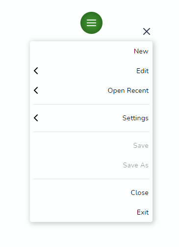
vue-float-menu finds the optimal menu orientation depending on the position of the menu. for e.g if the menu is placed at the bottom edge and the orientation set to bottom, the component will automatically flip the orientation to top.
Here is a basic example that sets the default position of the menu as top left.
<template>
  <float-menu
    :position="'top left'"
    :dimension="50"
    :menu-data="items"
    :on-selected="handleSelection"
  >
    Drag
  </float-menu>
</template>

<script>
import { FloatMenu } from "vue-float-menu";
import "vue-float-menu/dist/vue-float-menu.css";

export default {
  components: {
    FloatMenu,
  },
  setup() {
    const handleSelection = (selectedItem) => {
      console.log(selectedItem);
    };
    return {
      handleSelection,
    };
  },
  data() {
    return {
      items: [
        { name: "New" },
        {
          name: "Edit",
          subMenu: {
            name: "edit-items",
            items: [{ name: "Copy" }, { name: "Paste" }],
          },
        },
        {
          name: "Open Recent"
        },
        {
          name: "Save",
        }
      ],
    };
  },
};
</script>
Props
| Prop | Type | Description |
|---|---|---|
| dimension | number | dimension of the Menu Head width x height in pixels. |
| position | String | initial position of the Menu Head. can be any one of the values top left, top right, bottom left, bottom right |
| fixed | Boolean | disables dragging and the menu will be fixed. use the position prop to fix the menu position |
| menu-dimension | Object | sets the width and minimum height of the Menu. |
| menu-data | Object | data to generate the menu. refer to populating the menu for usage details. |
| on-selected | Function | hook that is called on selection. |
| menu-style | String | can be slide-out or accordion.slide-out is the default menu style. |
| flip-on-edges | Boolean | flips the menu content on the right edges of the screen. |
| theme | Object | prop to customize the color schemes. refer theme for usage. |
Position
The position prop can be used to set the initial position of the Menu Head. The prop can accept any one of the following values.
top left(default)top rightbottom leftbottom right
  <float-menu :dimension=50 position="bottom right">
    <template #icon>
      <BoxIcon />
    </template>
  </float-menu>
Menu head dimension
dimension prop can be used to set the width and height of the menu head. The prop takes a single number value to set the height and width of the Menu Head.
  <float-menu :dimension=50>
    <template #icon>
      <BoxIcon />
    </template>
  </float-menu>
Menu dimension
prop to set the height and width of the menu.
  <float-menu
    :dimension=50
    :menu-dimension="{height: 400, width: 300}"
    position="bottom right"
  >
    <template #icon>
      <BoxIcon />
    </template>
  </float-menu>
Menu Style
The component supports two modes slide-out(default) and accordion. The accordion style is more suitable for mobile devices.
  <float-menu
    position="bottom right"
    flip-on-edges
    menu-style="accordion"
  >
    <template #icon>
      <BoxIcon />
    </template>
  </float-menu>
Populating the Menu
Use the menu-data prop to create simple or nested menus of your liking. menu-data takes an array of MenuItem type
MenuItem properties
| property | description |
|---|---|
| name | display name of the menu item. |
| subMenu | data for the sub-menu |
| disabled | disables the menu item |
| divider | makes the item as a divider |
Here we create a simple Menu structure with 3 Menu items with no sub menus.
const menuData = [
  { name: "New" },
  {
    name: "Edit",
    subMenu: {
      name: "edit-items",
      items: [{ name: "Copy" }, { name: "Paste", disabled: true }],
    },
  },
  {divider: true},
  {
    name: "Open Recent",
    subMenu: {
      name: "recent-items",
      items: [{ name: "Document 1" }, {divider: true}, { name: "Document 2" }],
    },
  },
]
<float-menu
:dimension=50
:menu-dimension="{height: 400, width: 300}"
:menu-data="menuData"
position="bottom right"
>
<BoxIcon />
</float-menu>on-select
hook for the menu item selection event.
  <float-menu
    :dimension=50
    position="bottom right"
    :menu-dimension="{height: 400, width: 300}"
    :menu-data="{items: [{name: 'File'}, {name: 'Open'}]}"
    on-select="handleSelection"
  >
    <BoxIcon />
  </float-menu>
Flip on edges
setting this prop flips the menu content on the right edges of the screen.
  <float-menu
    :dimension=50
    position="bottom right"
    flip-on-edges
    on-select="handleSelection"
  >
    <BoxIcon />
  </float-menu>
Fixed Menu
To disable dragging and to fix the position statically, set fixed to true. This prop is disabled by default. Use this prop along with the position prop to set the desired position.
  <float-menu :dimension=50 position="bottom right" fixed>
    <template #icon>
      <BoxIcon />
    </template>
  </float-menu>
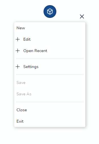
🎨 Custom icon
To customize the Menu Icon, simply pass any content in between the float-menu tags. Here we render a custom icon.
  <float-menu
    :dimension=50
    :menu-data="menuData"
  >
    <template #icon>
      <BoxIcon />
    </template>
  </float-menu>
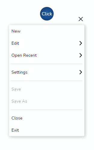
and here we render a text Click inside the Menu handle
  <float-menu
    :dimension=50
    :menu-data="menuData"
  >
    Click
  </float-menu>
🎭 Icon support
Each menu item can be iconified and the component uses slots to inject the icons.
Pass individual icons (or images) as templates marked with a unique slot id. please make sure the ids match the iconSlot property in the items array.
<float-menu
  :menu-data="items"
>
  <template #new>
    <img
      src="../assets/new.svg"
      alt="new"
    >
  </template>
  <template #edit>
    <img
      src="../assets/edit.svg"
      alt="edit"
    >
  </template>
</float-menu>

export default defineComponent({
  name: "MenuExample",
  data()  {
    return {
      items: [
        { name: "New File", iconSlot: "new" },
        { name: "New Window", iconSlot: "edit" },
      ]
    }
  }
})![]()
This works seamlessly even for nested menu structure. Make sure the slot ids match and the component will render the icons appropriately.
<float-menu
  :menu-data="items"
>
  <template #cut>
    <img
      src="../assets/window-maximize.svg"
      alt="cut"
    >
  </template>
</float-menu>

export default defineComponent({
  name: "MenuExample",
  data()  {
    return {
      items: [
        { name: "edit",
        subMenu: [{ name: "cut", iconSlot: "cut" }]},
      ]
    }
  }
});
🌈 Theme
Customize the color schemes with the theme prop.
  <float-menu
    :dimension=50
    :theme="{
      primary: '#00539C',
      textColor: '#000',
      menuBgColor: '#fff',
      textSelectedColor: '#fff',
    }"
  >
    Click
  </float-menu>
📦 Build Setup
# install dependencies
yarn install

# start dev
yarn run dev

# run css linting
yarn run lint:css

# lint everything
yarn run lint:all

# package lib
npm run rollup
🔨 Contributing
- Fork it ( https://github.com/prabhuignoto/vue-float-menu/fork )
- Create your feature branch (
git checkout -b new-feature) - Commit your changes (
git commit -am 'Add feature') - Push to the branch (
git push origin new-feature) - Create a new Pull Request
🧱 Built with
- Vue.JS - The Component is written in Vue + Typescript.
Notes
- The project uses vite instead of @vue/cli. I choose vite for speed and i also believe vite will be the future.
Meta
Prabhu Murthy – @prabhumurthy2 – prabhu.m.murthy@gmail.com
Distributed under the MIT license. See LICENSE for more information.
4 years ago
5 years ago
5 years ago
5 years ago
5 years ago
5 years ago
5 years ago
5 years ago
5 years ago
5 years ago
5 years ago
5 years ago
6 years ago
6 years ago
6 years ago
6 years ago
6 years ago
6 years ago
6 years ago
6 years ago
6 years ago
6 years ago
6 years ago
6 years ago
6 years ago
6 years ago
6 years ago
6 years ago
6 years ago
6 years ago
6 years ago
6 years ago
6 years ago
6 years ago
6 years ago
6 years ago
6 years ago
6 years ago
6 years ago
6 years ago
6 years ago
6 years ago
6 years ago
6 years ago
6 years ago
6 years ago
6 years ago
6 years ago
6 years ago
6 years ago
6 years ago
6 years ago
6 years ago
6 years ago
6 years ago
6 years ago
6 years ago
6 years ago
6 years ago
6 years ago
6 years ago
6 years ago
6 years ago
