vue-keys-display v1.1.1
About The Project
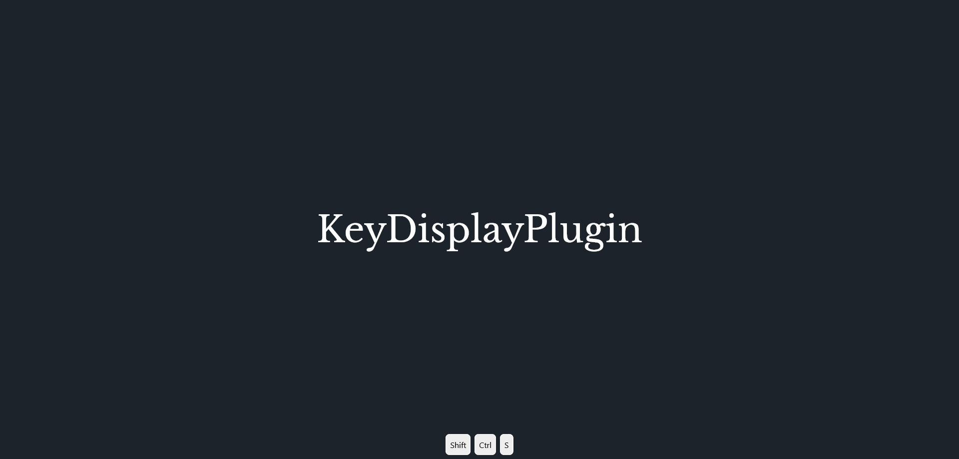
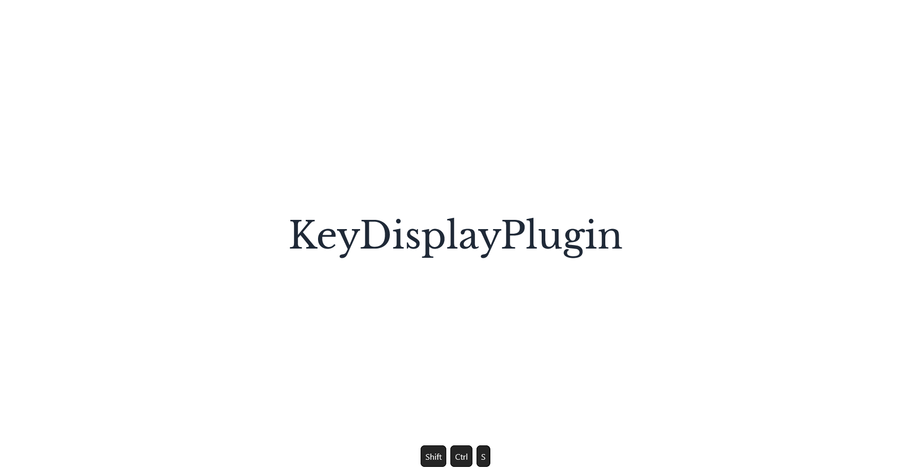
KeyDisplayPlugin ,as the name implies, is a plugin for Vue 3 that displays key pressed on your screen. KeyDisplayPlugin is a standalone component and require almost no dependencies.
Built With
Getting Started
Installation
To start using KeyDisplayPLugin:
- Install KeyDisplayPlugin using your package manager.
- npm
npm i vue-keys-display - yarn
yarn install vue-keys-display - pnpm
pnpm install vue-keys-display
Import the plugin and use it
import KeyDisplayPlugin from "vue-plugin-key-display";
import App from "./App.vue";

const app = createApp(App);
app.use(KeyDisplayPlugin);
(Optional) Import default CSS styling
import "vue-plugin-key-display/style.css";Use the KeyAnchor component
<main
  class="flex items-center justify-center h-full overflow-scroll background-wrapper"
>
  <!-- Put anywhere in your app. For default css Styling, put it under body or your root -->
  <KeyAnchor
    :fadeDelay="1500"
    :displayOnEventCallOnly="false"
    :events="[events]"
    :blackList="[blacklisted]"
    :KeyCtrlStyleObject="{ color: 'red' }"
    :numberOfKeyGroupDisplayed="8"
  />
  <!-- Rest of you code Here -->
</main>
Usage
Using the plugin is pretty straight forward, use the props on KeyAnchor component to customize the behaviour. Below is a list of props accepted by option object.
KeyAnchor props
interface KeyPluginOptions {
  KeyAnchorStyleObject?: StyleValue | undefined;
  KeyContainerStyleObject?: StyleValue | undefined;
  KeyGroupStyleObject?: StyleValue | undefined;
  KeyBlocStyleObject?: StyleValue | undefined;
  KeyAltStyleObject?: StyleValue | undefined;
  KeyShiftStyleObject?: StyleValue | undefined;
  KeyCtrlStyleObject?: StyleValue | undefined;
  fadeDelay?: number;
  numberOfKeyGroupDisplayed?: number;
  blackList?: KeyEntity[];
  events?: KeyEntity[];
  displayOnEventCallOnly?: boolean;
}| Props | Description | Type | Default | Example |
|---|---|---|---|---|
| KeyAnchorStyleObject | Represents inline styling applied to the outer keys wrapper This is the direct parent to the keys container | StyleValue/undefined | undefined | { position: 'absolute', top: '50%', left: '50%' } |
| KeyContainerStyleObject | Represents inline styling applied to the inner keys wrapper. This is the direct parent to the keys Group | StyleValue/undefined | undefined | { padding: '3rem' } |
| KeyGroupStyleObject | Reperents inline styling applied to a key group. this is the direct parent to keys blocs. | StyleValue/undefined | undefined | { background-color: 'red', fontSize: '30px' } |
| KeyBlocStyleObject | Reperents inline styling applied to a key bloc. | StyleValue/undefined | undefined | { color: 'blue' } |
| KeyAltStyleObject | Reperents inline styling applied to the Alt bloc. | StyleValue/undefined | undefined | { color: 'green' } |
| KeyShiftStyleObject | Reperents inline styling applied to the Alt bloc. | StyleValue/undefined | undefined | { color: 'yellow' } |
| KeyCtrlStyleObject | Reperents inline styling applied to the Alt bloc. | StyleValue/undefined | undefined | { color: 'purple' } |
| fadeDelay | Time in ms before key group fade out | Number | 2000 | 5000 |
| numberOfKeyGroupDisplayed | Number of key groups displayed at the same time | Number | 3 | 8 |
| blackList | Array of KeyEntities to blacklist | KeyEntity[] | undefined | See below |
| events | Array of keyEntities that will call their function on press | KeyEntity[] | undefined | See below |
| displayOnEventCallOnly | Boolean to show keys displayed only if they are linked to an events in the Events props | Boolean | false |
// Constructor parameter of KeyEntity.ts
    private _content: string,
    private _modifiersKeyState: ModifiersKeysState = {
      altPressed: false,
      ctrlPressed: false,
      shiftPressed: false,
    },
    readonly _callback?: (...params: any) => void,
    private readonly _message?: string
Examples:
<template>
  <main
    class="flex items-center justify-center h-full overflow-scroll background-wrapper"
  >
    <KeyAnchor
      :fadeDelay="1500"
      :displayOnEventCallOnly="false"
      :events="[events]"
      :blackList="[blacklisted]"
      :KeyCtrlStyleObject="{ color: 'red' }"
      :numberOfKeyGroupDisplayed="8"
    />
    <h1 class="font-serif text-center dark:text-white text-7xl">
      KeyDisplayPlugin
    </h1>
  </main>
</template>

<script lang="ts">
  import { KeyAnchor, KeyEntity } from "vue-keys-display";

  export default {
    setup() {
      const events = new KeyEntity(
        "A",
        { altPressed: false, ctrlPressed: true, shiftPressed: false },
        () => {
          console.log("hello world from console");
        },
        "hello world 😂 on screen"
      );
      const blacklisted = new KeyEntity("X", {
        ctrlPressed: true,
        altPressed: false,
        shiftPressed: false,
      });
      return { events, blacklisted };
    },
    components: { KeyAnchor },
  };
</script>
Contributing
Contributions are what make the open source community such an amazing place to learn, inspire, and create. Any contributions you make are greatly appreciated.
If you have a suggestion that would make this better, please fork the repo and create a pull request. You can also simply open an issue with the tag "enhancement". Don't forget to give the project a star! Thanks again!
- Fork the Project
- Create your Feature Branch (
git checkout -b feature/AmazingFeature) - Commit your Changes (
git commit -m 'Add some AmazingFeature') - Push to the Branch (
git push origin feature/AmazingFeature) - Open a Pull Request
License
Distributed under the MIT License. See LICENSE.txt for more information.
Contact
Mehdi Mani - mani.mehdi@outlook.com
Project Link: https://github.com/Mehdi-Mani/KeyDisplayVuePlugin
Acknowledgments
Use this space to list resources you find helpful and would like to give credit to. I've included a few of my favorites to kick things off!