0.1.8 • Published 5 years ago
vue-responsive-vh v0.1.8
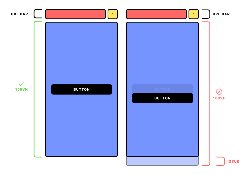
This Plugin solves the URL Bar Resizing issue with viewport units on mobile devices. Read here.

Navigation
Installation
npm install vue-responsive-vhRegistration
Vue.js
Go to your main.js and use the Plugin as follows:
// ./src/main.js

import Vue from 'vue'
import VueResponsiveVh from 'vue-responsive-vh'
import 'vue-responsive-vh/dist/vue-responsive-vh.css'

Vue.use(VueResponsiveVh)
Registration complete ✨.
Nuxt.js
For Nuxt.js we will create a simple Plugin.
First create a file named vue-responsive-vh.js in your ~/plugins folder.
Then register the Plugin as follows:
// ~/plugins/vue-responsive-vh.js

import Vue from 'vue'
import VueResponsiveVh from 'vue-responsive-vh'
import 'vue-responsive-vh/dist/vue-responsive-vh.css'

Vue.use(VueResponsiveVh)
Then add the Plugin into the plugins: [] Array in your Nuxt.js configuration file nuxt.config.js
// ~/nuxt.config.js

export default {

  plugins: [
    '~/plugins/vue-responsive-vh.js'
  ],

}
Registration complete ✨.
Usage
You can choose between two Directives:
| Directive | Description | Changed CSS Property |
|---|---|---|
v-min-h-screen | Min height of the element is screen height. | min-height |
v-h-screen | Fixed height of the element is screen height. | height |
Add the Directive you need to any element you choose to give it a responsive vh, which depends on the appearance of the URL Bar.
// YourComponent.vue

<template>
  <div v-min-h-screen>
    ...
  </div>
</template>
// YourComponent.vue
<template>
<div v-h-screen>
...
</div>
</template>Fallback
If there is an issue with the calculation or missing Browser Support, the default Fallback is 100vh.