vue-tag-maker v1.1.0
GloomyTags
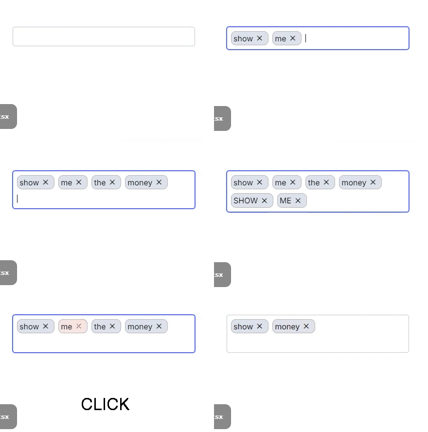
GloomyTags is a Vue.js component for adding and removing tags. It allows users to add or remove tags in an input field, with support for customizable styling and input control.
Installation
To add the GloomyTags component to your Vue project, install it using either npm or yarn:
npm install vue-tag-makeror
yarn add vue-tag-makerUsage

Component Registration
Register the component in the Vue file where you want to use it:
<script setup lang="ts">
import GloomyTags from 'vue-tag-maker'
</script>

<template>
  <GloomyTags
    :state="tags"
    :setState="updateTags"
    name="tags"
    placeHolder="Type and press enter"
  />
</template>
Component Properties
The
GloomyTagscomponent supports the following properties:name: The name of the input field.placeHolder: The placeholder text for the input field.state: The current array of tags.setState: A function to update the array of tags.onChange: A callback function that is called when tags are changed.onBlur: A callback function that is called when the input field loses focus.separators: An array of keys that separate tags. Defaults to[].disableBackspaceRemove: If true, prevents tags from being removed with the backspace key. Defaults tofalse.onExisting: A callback function that is called when an existing tag is entered.onRemoved: A callback function that is called when a tag is removed.disabled: Disables the input field if true. Defaults tofalse.isEditOnRemove: If true, switches to edit mode when a tag is removed. Defaults tofalse.beforeAddValidate: A validation function that is called before adding a tag.onKeyUp: A callback function that is called when a key is released in the input field.classNames: An object with customized CSS class names.throttleTime: The throttle time (ms) for tag addition requests. Defaults to300.
Component Methods
The
GloomyTagscomponent includes the following methods:cursorToInput: Focuses the input field when thegloomy-tag--containeris clicked.handleKeyDown: Handles key input events to add or remove tags.handleTagRemove: Removes a specific tag.
Styling
The
GloomyTagscomponent uses scoped CSS for styling. The CSS includes the following elements:.gloomy-tag--container: The default style for the tag input container..gloomy-tag--input: The default style for the input field..gloomy-tag--tag: The default style for each tag..gloomy-tag--focus: The style for a focused tag..gloomy-tag--tag.disappearing: The style for a tag that is being removed.
Example
<template>
  <div id="app">
    <GloomyTags
      :state="tags"
      :setState="updateTags"
      name="tags"
      placeHolder="Type and press enter"
      :separators="['Enter', ',']"
      :classNames="{ tag: 'custom-tag-class', input: 'custom-input-class' }"
    />
  </div>
</template>

<script setup lang="ts">
import { ref } from 'vue'
import GloomyTags from 'vue-tag-maker'

const tags = ref<string[]>([])

function updateTags(newTags: string[]) {
  tags.value = newTags
}
</script>
Contributing
For those who wish to contribute, please refer to the CONTRIBUTING.md file.
License
This project is licensed under the MIT License. For more details, please refer to the LICENSE file.