vue3-insta-stories
A VueJs Plugin for Instagram like stories
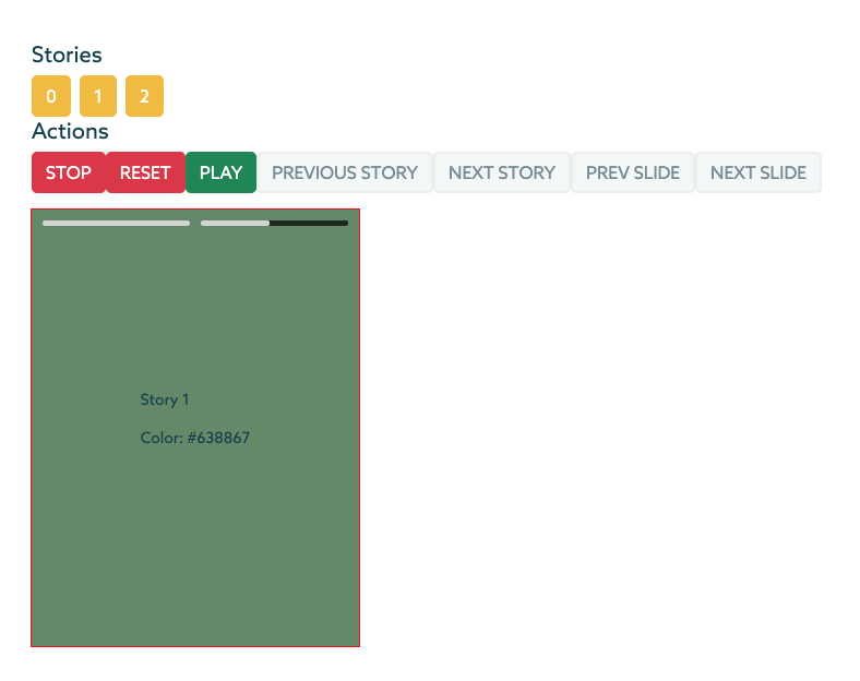
Demo
This is a demo presentation, feel free to design your stories & slides as you wish.
Features
- Responsive component
- Custom design ready
  - Feel free to design your slides and stories as you wish
- Swipe events
- Scroll top/bottom on big screens (Pc) to go to another story
- Custom duration per each slide
- Built-in actions [Stop,Rest,Play,Previous Story etc.]
- Built-in Event [ended,next_story,next_slide etc.]
You can clone this directory and run the command below to generate a demo Vue 3 project using this plugin!
npm run serve:demoDependencies
This plugin uses AnimeJS && HammerJS. Install them using the below commands:
npm i animejs
npm i hammerjs
Installation
npm i vue3-insta-storiesRead before implementation
Stories component is a responsive component, so it should be places inside a container with a specific width and height, and the component will stretch it's self into the parent container.
Implementation
<div class="stories_wrapper">
  <stories
    :autoplay="false"    // Autoplay stories
    :duration="duration" // Default duration per each slide
    :breakpoint='768'    // Mobile breakepoint
    :stories="stories"
    ref="stories_component"
  >
    <template v-slot:slide="{ story, slide }">
      <!-- Inside this template you can desing the slides -->
      <!-- {{ story }} and {{ slide }} objecta are available to you inside this template -->
      <div class="slide" :style="'background-color:' + slide.color">
        <div>
          <p>{{ story.custom_attribute }}</p>
          <p>Color: {{ slide.color }}</p>
        </div>
      </div>
    </template>
  </stories>
</div>
Import Stories component into your preferred component.
In case you want to use the Actions provided by this Component than you also need to import ref from vue;
import Stories from "vue3-insta-stories";
import { ref } from "vue";
export default {
  components: { Stories },
  name: "YourCustomComponent",
  setup() {
    const stories_component = ref(null);

    return {
      stories_component,
    };
  },
  data() {
    return {
      duration: 5000,
      stories: [
        {
          //Add as many custom attributes per story as you like
          custom_attribute: "Story 1",
          slides: [
            {
              // The attributes below [id,color] are custom attributes
              // Add the duration attribute in case you want to add a custom duration for this slide
              id: 1,
              color: "#D53738",
              duration: 3000
              },
            {
              id: 2,
              color: "#638867",
              duration: 10000
            },
          ],
        },
        {
          custom_attribute: "Story 2",
          slides: [
            {
              id: 3,
              color: "#DAF7A6"
            },
          ],
        },
        ...
      ],
    };
  },
Events and How To Use them
1. ended
2. next_story
3. prev_story
4. prev_slide
5. next_slide<stories
:autoplay="false"
:duration="duration"
:stories="stories"
ref="stories_component"
@ended="endedEvent"
@next_story="nextStoryEvent"
@prev_story="prevStoryEvent"
@prev_slide="prevSlideEvent"
@next_slide="nextSlideEvent"
@slide_changed="slideChangedEvent"
@swipe_up="swipe_up"
@swipe_down="swipe_down"
@swipe_left="swipe_left"
@swipe_right="swipe_right"
>export default {
methods: {
//Events
endedEvent() {
console.log("endedEvent");
},
prevStoryEvent() {
console.log("prevStoryEvent");
},
nextStoryEvent() {
console.log("nextStoryEvent");
},
prevSlideEvent() {
console.log("prevSlideEvent");
},
nextSlideEvent() {
console.log("nextSlideEvent");
},
slideChangedEvent(index){
console.log("slideChangedEvent: " + index);
},
swipe_left() {
console.log("swipe_left Event");
this.stories_component.nextStory();
},
swipe_right() {
console.log("swipe_right Event");
this.stories_component.prevStory();
},
swipe_up() {
console.log("swipe_up Event");
},
swipe_down() {
console.log("swipe_down Event");
this.stopStory();
// -- Close slider
},
},
...Methods
1. stopStory
2. resetStory
3. playStory
4. prevStory
5. nextStory
6. prevSlide
7. nextSlide<button class="btn btn-danger" @click="stopStory">Stop</button>
<button class="btn btn-danger" @click="resetStory">Reset</button>
<button class="btn btn-success" @click="playStory">Play</button>
<button class="btn btn-secondary" @click="prevStory">Previous Story</button>
<button class="btn btn-secondary" @click="nextStory">Next Story</button>
<button class="btn btn-secondary" @click="prevSlide">Prev Slide</button>
<button class="btn btn-secondary" @click="nextSlide">Next Slide</button>
<button class="btn btn-secondary" @click="recalculateDimensions">Recalculate Dimensions</button>export default {
methods: {
//Actions
storyClicked(index) {
this.stories_component.playStory(index);
},
stopStory() {
this.stories_component.stopStory();
},
resetStory() {
this.stories_component.resetStory();
},
playStory() {
this.stories_component.playStory();
},
prevStory() {
this.stories_component.prevStory();
},
nextStory() {
this.stories_component.nextStory();
},
prevSlide() {
this.stories_component.prevSlide();
},
nextSlide() {
this.stories_component.nextSlide();
},
recalculateDimensions(){
this.stories_component.recalculateDimensions();
}
},
...