1.0.2 • Published 3 years ago
vuetify3-time-range-picker v1.0.2
vuetify3-time-range-picker
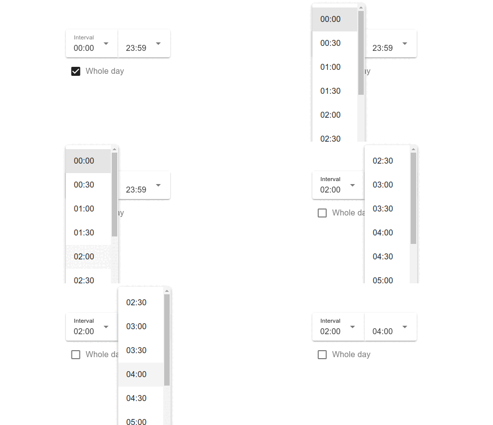
A time range picker based on Vuetify 3, made so users can easily pick a time interval.

Compatible with Vue 3 and Vuetify 3
If you are looking for the version 2 compatible package: check the previous version.
Installation
NPM
npm i vuetify3-time-range-pickerYARN
yarn add vuetify3-time-range-pickerUsage
Dependencies: Vue 3 and Vuetify 3
JavaScript
// main.js
import App from './App.vue'
import { createApp } from 'vue'
import { createVuetify } from 'vuetify'
import 'vuetify/styles'

createApp(App).use(createVuetify({})).mount('#app')

// Component.vue
import TimeRangePicker from 'vuetify3-time-range-picker';
import 'vuetify3-time-range-picker/dist/style.css'

export default {
  ...,
  components: {
    TimeRangePicker,
  },
};
HTML
<template>
  <v-app id="app">
    <time-range-picker
      v-model="time"
      variant="solo"
      step="30"
    />
  </v-app>
</template>
Props
| Name | Type | Description | Default Value |
|---|---|---|---|
| modelValue | Object | An object used as v-model containing 'start', 'end' and 'duration' | { start: '00:00', end: '23:59', duration: 1439 } (duration is in minutes) |
| inputLabel | String | Input label text | 'Interval' |
| wholeDayLabel | String | Whole day checkbox label text | 'Whole day' |
| step | String, Number | Interval of minutes between available times | 15 |
| disabledTimes | String, String[] | Times to be removed from options (e.g. '00:00', '12:00') | [] |
| innerDivCustomClass | String | Custom CSS classes to be added at input's wrapper | '' |
| inline | Boolean | Applies the inline style | false |
| hideWholeDayCheckbox | Boolean | Hides whole day option (this becomes true if maxDuration is set) | false |
| maxDuration | Number | Max range duration (in minutes, 0 means no max) | 0 |
| allowNextDay | Boolean | Enables next day end time selection | false |
| nextDayLabel | String | Next day checkbox label | 'Next day' |
Besides you can also pass most of the v-select props.
Events
| Name | Description |
|---|---|
| update:modelValue | Updates the v-model value |
| mouseover | Emitted at input mouseover |
| mouseleave | Emitted at input mouseleave |
| focus | Emitted at input focus |
| blur | Emitted at input blur |
More Examples
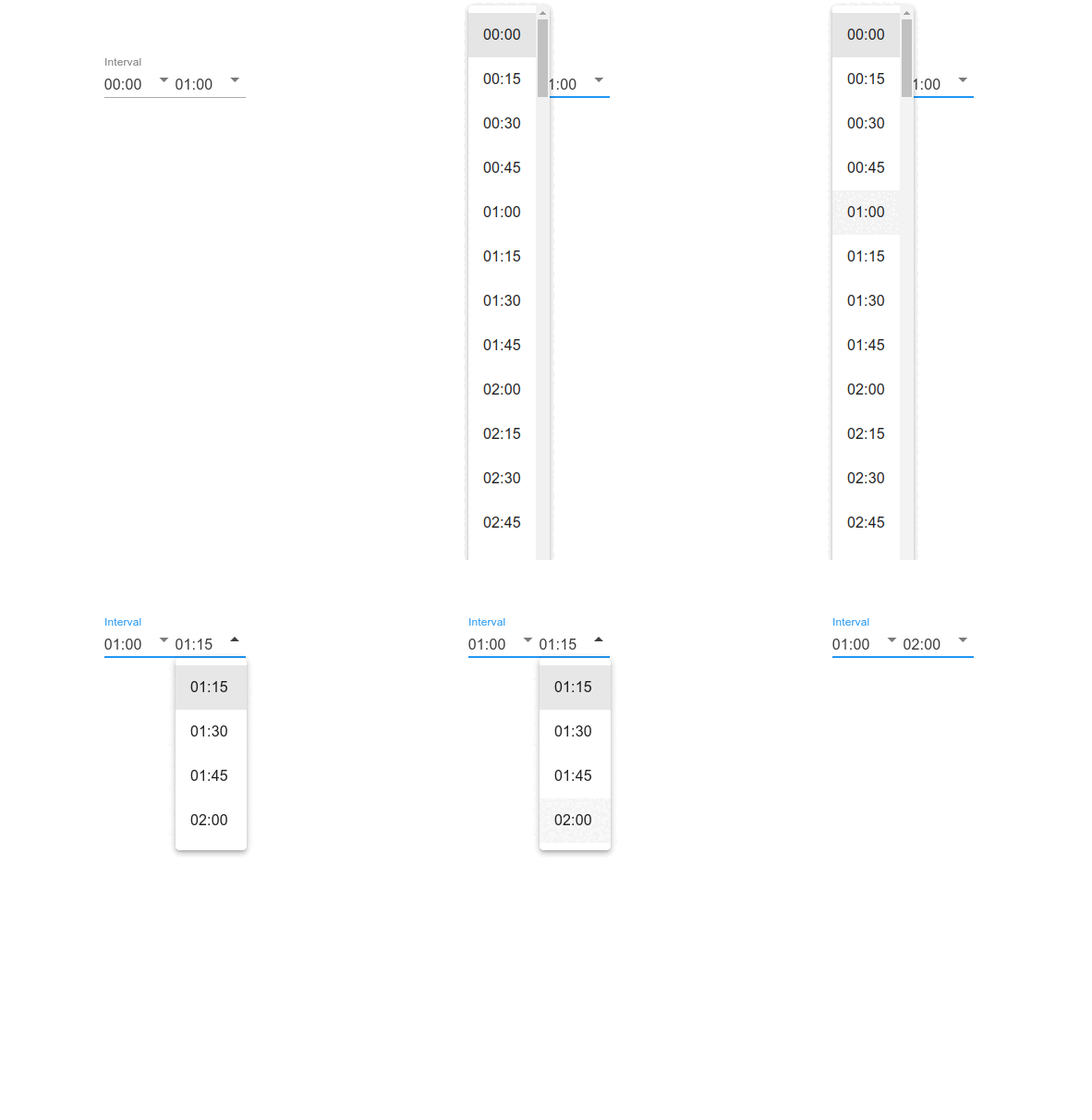
Max duration
<time-range-picker
  v-model="range"
  variant="underlined"
  step="60"
  :max-duration="120"
  color="blue"
/>
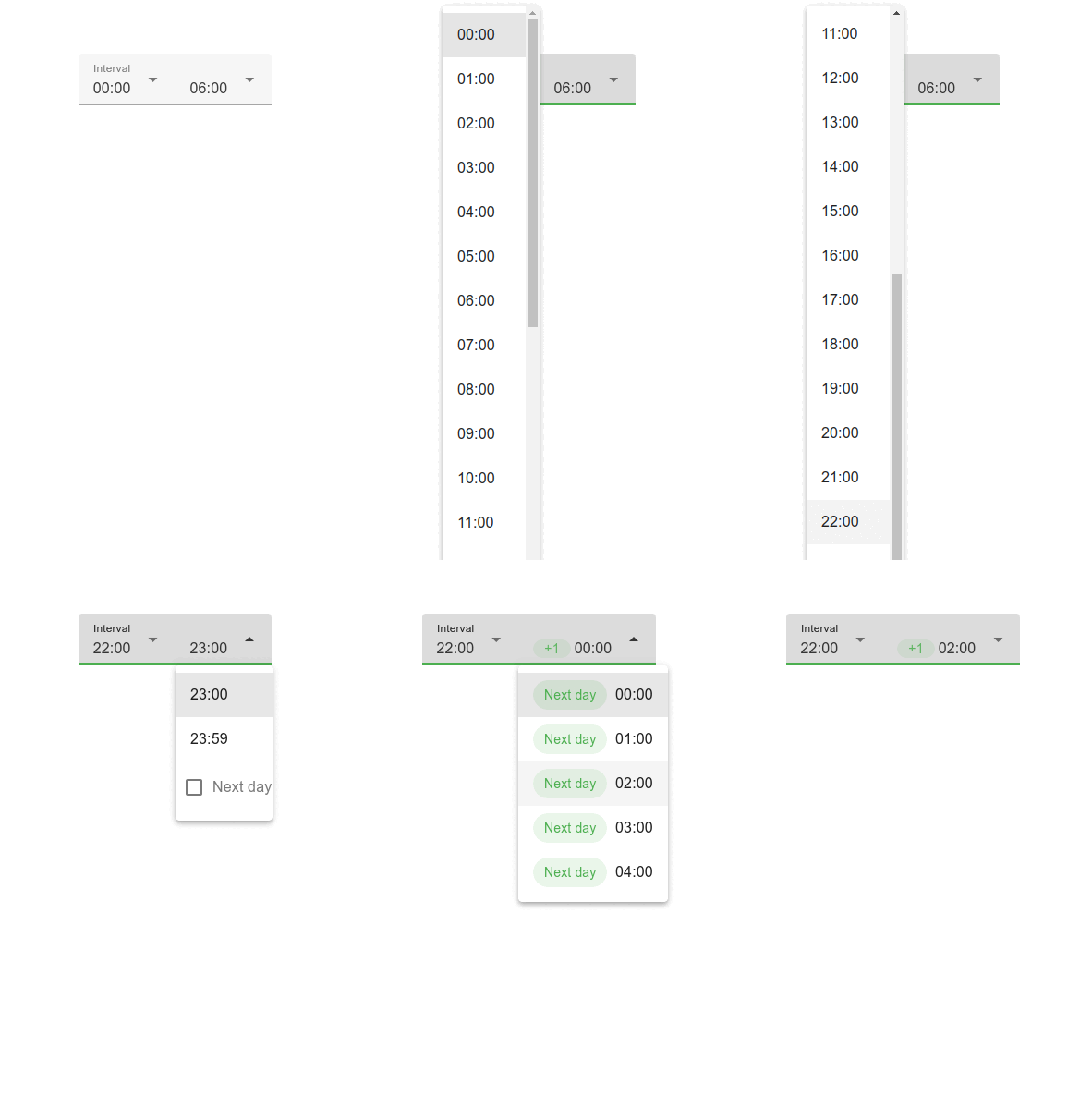
Allow next day
<time-range-picker
  v-model="range"
  variant="filled"
  step="60"
  :max-duration="360"
  color="green"
  allow-next-day
/>