wch-site-developer-tools v0.2.2
wch-site-developer-tools
A developer application to display and preview all components in a WCH site.
Table of contents
- Table of contents
- Introduction
- Screenshots
- Prerequisites
- Install and deploy the sample
- Using the application
- License
Introduction
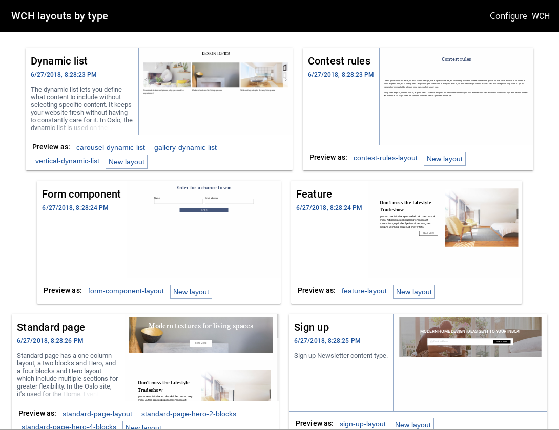
A standalone developer application to list, preview and create layouts is included in this SPA source code. It displays a gallery of all the components (ie: type and layout combination) in your WCH site. Each type can be previewed using all of its layouts. To get started, just start the app by following the steps below.
Screenshots
Component gallery
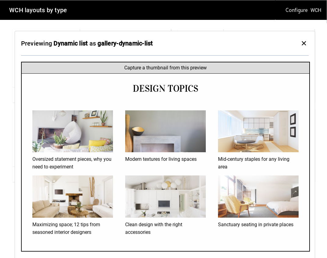
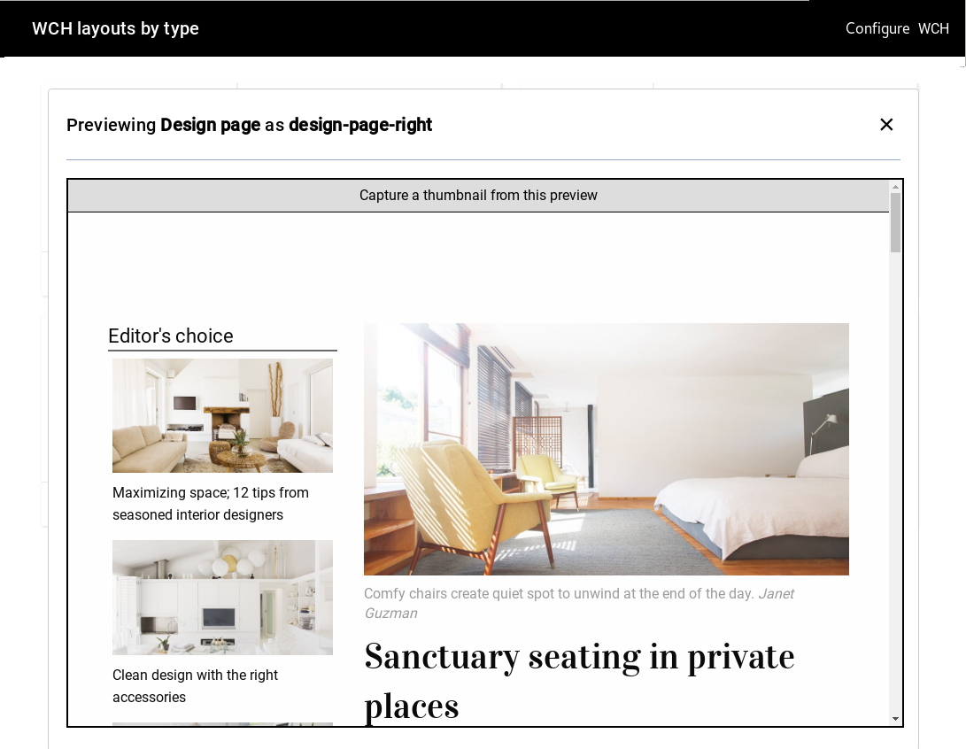
Layout preview
Prerequisites
- A WCH tenant in Trial or Standard Tier
- wchtools-cli v2.0.3 or above
- Node.js v6.11.1 or above
Install and deploy the sample
Update the SDK CLI
- Install the
@ibm-wch-sdk/clipackage globally vianpm install -g @ibm-wch-sdk/cli. - If it is already installed, update with
npm update -g @ibm-wch-sdk/cli.
Update your site application
To get component preview capabilities:
1. (Optional) Update your SPA from wch-site-application, sample-site-react or sample-site-vue.
2. Make sure it is building correctly with the npm run build command.
Configure and start the application
- Make sure CORS is enabled in WCH at Hub Setup > General Setting > Security.
- Use the
npm run start-dev-toolscommand start the application from your SPA directory. It can be accessed at http://localhost:3000/ in your browser.
Using the application
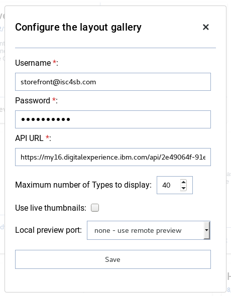
The first time the application is opened, you will be prompted to fill in your WCH API URL, username and password. These options can be updated at any time by clicking on the Configure button in the application header.
A gallery of your components and associated layouts will display in your browser. Click on a layout name to preview the sample content. The preview is created by pointing to a special URL in your live WCH site. Only components that have at least 1 layout and 1 piece of content can be previewed. The piece of content tagged with "IBM tools" will be used for preview, otherwise a piece of content is randomly selected.
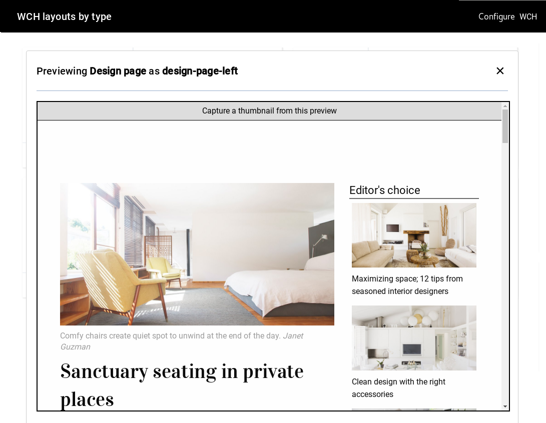
Here you see the Design page component being previewed using both its left and right versions:
Gallery thumbnail options
By default, the thumbnail for each type card is a static image from WCH. To use a rendered live version in a scaled iframe instead, open the Configure dialog, check the box marked Use live thumbnails, and save. It is not recommended to do this if you have many components in the gallery, for browser performance.
You can also configure the Maximum number of Types to display option, to control how many type cards are shown on the page at one time.
If you are running your SPA locally (eg: http://localhost:4200/, http://localhost:4201/, http://localhost:4202/), you can point the layout preview to that URL with the Local preview port option.
Creating thumbnails for types
The component previews each contain a button for capturing a thumbnail. A small version (max 300x600 pixels) of what is currently seen on the screen will be generated, and you can save it to your computer. This image can then be uploaded in WCH as a thumbnail for the associated type.
Creating new layouts
Use the "New layout" button to create a layout for a Type. Just input a name, and the new layout will be created, built and deployed from your site application directory. Only one layout can be created at a time.
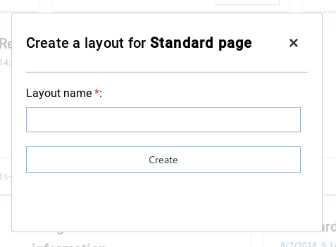
After developing your new layout in your SPA code base, use npm run build-deploy to push it to your content hub.
WCH helper package
This sample uses the js helper for querying WCH.
License
See the included license file License.