zebra_dialog v3.1.0
Zebra Dialog 
A small, compact, mobile-friendly and highly configurable jQuery plugin for creating responsive modal dialog boxes
A modal dialog box is a focused interface element that prompts users to take action before returning to the main application. These dialogs are commonly used to capture user attention, deliver important information, confirm actions, or highlight warnings and errors. By temporarily blocking interaction with the rest of the page, modal windows ensure that users address critical tasks or notifications before proceeding, making them a fundamental part of modern web applications.
Zebra Dialog is a small (~12KB minified, 3KB gzipped), compact (one JavaScript file, no dependencies other than jQuery 1.7.0+), mobile-friendly and highly configurable jQuery plugin for creating responsive modal dialog boxes, meant to replace native JavaScript alert, confirm and prompt dialog boxes.
Can also be used as a notification widget (when configured to show no buttons and to close automatically) for updates or errors, without distracting users from their browser experience by displaying obtrusive alerts.
Features
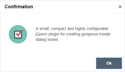
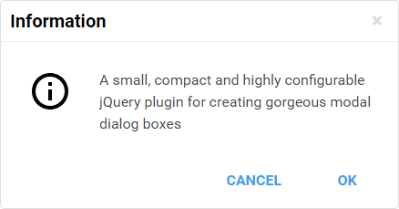
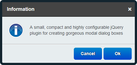
- great looking dialog boxes, out of the box, with 3 beautiful themes included
- 6 types of dialog boxes available: confirmation, error, information, prompt, question and warning
- content can also be added through AJAX calls, iFrames or from inline elements (together with attached events)
- easily customisable appearance by editing the CSS file
- create modal or non-modal dialog boxes
- easily add custom buttons
- position the dialog box wherever you want - not just in the middle of the screen
- dialog boxes are draggable
- callback functions can be used for further customisations
- use callback functions to handle users' choice
- works on mobile devices
works in pretty much any browser (Chrome, Firefox, Safari, Edge, Opera, Internet Explorer 6+)
For the classic theme, the icons used for confirmation, information, error and question dialog boxes are made by DryIcon while the warning icon is made by Function Design & Development Studio (website is not online anymore).
For the flat theme, the icons used are made by Elegant Themes
For the materialize theme theme, the icons used are taken from Google's Material Design "design language".
🎂 Support the development of this project
Your support means a lot and it keeps me motivated to keep working on open source projects. If you like this project please ⭐ it by clicking on the star button at the top of the page. If you are feeling generous, you can buy me a coffee by donating through PayPal, or you can become a sponsor. Either way - Thank you! 🎉
Demo
See the demos
Requirements
Zebra Dialog has no dependencies other than jQuery 1.7.0+
Installation
Zebra Dialog is available as a npm package. To install it use:
# the "--save" argument adds the plugin as a dependency in packages.json
npm install zebra_dialog --save
How to use
First, load jQuery from a CDN and provide a fallback to a local source like:
<script src="https://code.jquery.com/jquery-3.7.1.min.js"></script>
<script>window.jQuery || document.write('<script src="path/to/jquery-3.7.1.js"><\/script>')</script>
Load the Zebra Dialog jQuery plugin:
<script src="path/to/zebra_dialog.min.js"></script>Alternatively, you can load Zebra Dialog from JSDelivr CDN like this:
<!-- for the most recent version, not recommended in production -->
<script src="https://cdn.jsdelivr.net/npm/zebra_dialog@latest/dist/zebra_dialog.min.js"></script>

<!-- for a specific version -->
<script src="https://cdn.jsdelivr.net/npm/zebra_dialog@3.0.6/dist/zebra_dialog.min.js"></script>

<!-- replacing "min" with "src" will serve you the non-compressed version -->
Load the style sheet file from a local source
<link rel="stylesheet" href="path/to/theme/zebra_dialog.min.css">...or from JSDelivr CDN
<!-- for the most recent version of the "flat" theme -->
<link
  rel="stylesheet"
  href="https://cdn.jsdelivr.net/npm/zebra_dialog@latest/dist/css/flat/zebra_dialog.min.css">

<!-- for the most recent version of the "default" theme -->
<link
  rel="stylesheet"
  href="https://cdn.jsdelivr.net/npm/zebra_dialog@latest/dist/css/default/zebra_dialog.min.css">

<!-- replacing "min" with "src" will serve you the non-compressed version -->
Now, within the DOM-ready event do
$(document).ready(function() {

    // show a dialog box when clicking on an element
    $('#element').on('click', function(e) {
        e.preventDefault();
        new $.Zebra_Dialog('The link was clicked!');
    });

});
Configuration options
Properties
Events
Methods
close()
Call this method to manually close a dialog box.
var dialog = new $.Zebra_Dialog('This is some information');

dialog.close();
update()
Use this method to adjust the dialog box's position after content is changed dynamically, at run-time.
var dialog = new $.Zebra_Dialog('This is some information');

// change the content in the dialog box
$('.ZebraDialog_Body').html('New content');

dialog.update();
Sponsors
Cross browser/device testing is done with


