@adobe/gatsby-theme-aio v4.15.1
Adobe I/O Gatsby Theme
A Gatsby Theme for building markdown powered Adobe I/O sites.
Why Gatsby ?
For many reasons :
- Static site
- Single Page Application
- React Server Side Rendered at build time
- Blazing fast
- Large and active community
- Huge ecosystem of plugins
- Open source
and more ... see https://www.gatsbyjs.com/why-gatsby/.
Why Gatsby theme ?
Gatsby themes allow Gatsby site functionality to be packaged as a standalone product for others to easily reuse. Using a theme, all of your default configuration lives in an npm package.
View the Gatsby site templates using the Adobe I/O Gatsby Theme:
Contents
- Getting started
- Content structure
- Configuration
- Building the Gatsby site
- Publishing the Gatsby site
- Writing Enhanced Markdown
- Customizations
- Upgrading
- Issue tracker
- Contributing
- Releases
Getting started
This section will help you get started building a Gatsby site with the Adobe I/O Gatsby Theme.
Pre-requisites
- Install Node.js LTS
- Install a package manager like npm or yarn
Using GitHub repository templates
To initialize a site repository, you can use one of the available Gatsby site templates mentioned above. Simply click on the “Use this template” button to create a new GitHub repository of the template.
The templates are pre-configured with example pages.
Using the Adobe I/O CLI
First install the Adobe I/O CLI via the Terminal
npm install -g @adobe/aio-cliThen install the Doc Plugin by running.
aio discover -iSelect the @adobe/aio-cli-plugin-doc plugin by pressing the Spacebar and finally press Enter to install it.
For more information about the Doc plugin, see https://github.com/adobe/aio-cli-plugin-doc.
Now you can create your site by running
aio doc init path/to/site/folderwhich will use by default the Documentation site template.
You can specify another template with
aio doc init path/to/doc/folder --template URL_TO_TEMPLATE_GIT_REPOContent structure
The content of the site is written in Markdown which is both easy to read and easy to learn.
As in most cases, the markdown content is stored in GitHub, we support GitHub Flavored Markdown (GFM), which provides additional functionality for common formatting needs. Additionally, Adobe extended Markdown in a few ways to support certain features see Writing Enhanced Markdown.
Make sure the markdown content is located under src/pages and please follow below guidelines for writing content.
Use a folder structure to define your site pages e.g. :
root
├- src/pages [/]
│  ├- index.md
│  ├- hero.png
│  ├- api [/api/]
│  │  └- index.md
│  └- guides [/guides/]
│      ├─ index.md
│      └- get_started [/guides/get_started/]
│        ├- index.md
│        └- debugging [/guides/get_started/debugging/]
│           └- index.md
├- .env
├─ gatsby-config.js
└─ package.json
Folder names should be unique.
Using a folder structure with only index.md files gets you close to the final site build files. During the build process, Gatsby will transform the md files into index.html files.
The build files can be found in the public folder. Please read the Overview of the Gatsby Build Process for more information.
Here's a simple example of a content structure with md files and the resulting html files:
root
├- src/pages [/]
│  ├- index.md
│  ├- i_follow_recommendation [/i_follow_recommendation/]
│  │  └- index.md
│  └- i_dont_follow_recommendation [/i_dont_follow_recommendation/]
├- .env
├─ gatsby-config.js
└─ package.json
will output:
root
└- public
   ├- index.html
   ├- i_follow_recommendation
   │  └- index.html
   ├- i_dont_follow_recommendation
   │  └- index.html
   └- Minified JS, CSS files
Internal links
You can use absolute links or relative links to link between markdown pages e.g. with the example folder structure from Content Structure you can add a link from /guides/index.md to /api/index.md with:
Relative link
[Link to API](../api/) Absolute link
[Link to API](/api/) Please note that currently only absolute links will work with transcluded content.
Configuration
To make sure you don't run into troubles during the site build process, please follow the below configuration steps.
.env file
Follow these steps to configure your .env file.
- Copy
.env.exampleto.env - Add the appropriate values in the
.envfile
The .env should not be committed.
GitHub's API is being called during the site build phase to retrieve the authors of every markdown page under src/pages.
If the GitHub Token information is missing, the build will just print a warning, and no contributor information will be retrieved (just the contributor information in a page's front matter, if any, will be used).
To retrieve your GitHub personal access token, you can follow these steps.
Only READ permissions on repositories are required for the token.
.env settings for GitHub Contributors
For example, if your doc site repo was at https://github.com/adobe/gatsby-theme-aio using the main branch, this would be what your .env would look like:
REPO_GITHUB_TOKEN=YOUR_PERSONAL_ACCESS_TOKEN_HERE
REPO_OWNER=adobe
REPO_NAME=gatsby-theme-aio
REPO_BRANCH=main
REPO_ROOT=example
By default, you can omit the ROOT env var, and it should use the root folder as the source of the documentation pages. If your site is in a sub-folder, add the relative path as the ROOT.
.env settings for the Feedback Component and Analytics
- You need to set up Adobe Launch, with an Adobe Analytics Reporting Suite
- In Adobe Analytics, add a custom eVar (Text String type) to capture the feedback. This eVar will contain either "yes" or "no".
- In Adobe Launch, create two Data Elements:
- Feedback-Yes: edit the code and paste in
return document.querySelectorAll('button.feedback-yes')[0].innerText - Feedback-No: edit the code and paste in
return document.querySelectorAll('button.feedback-no')[0].innerText
- Feedback-Yes: edit the code and paste in
- In Adobe Launch, for the two Data Elements, make sure these checkboxes are checked:
- Enable Default Value
- Force lowercase value
- Clean text
- In Adobe Launch, create three Rules:
- Feedback-Yes: On click, it will set variables in Adobe Analytics (set the custom eVar to value of the Feedback-Yes Data Element), and then Send the Beacon
- Feedback-No: On click, it will set variables in Adobe Analytics (set the custom eVar to the value of the Feedback-No Data Element), and then Send the Beacon
- Analytics: On library loaded (page top), Send the Beacon
- In Adobe Launch:
- Go through the
Publishing Flow, don't forget toAdd All Resources - In
Environments, select the appropriate environment, and under theInstallcolumn, select the icon - Copy the url displayed in the
scripttag
- Go through the
This last value will be the value you put in GATSBY_LAUNCH_SRC.
GATSBY_LAUNCH_SRC_INCLUDE_IN_DEVELOPMENT is a boolean value, set to true if you want to enable the script to run in development.
Example:
GATSBY_LAUNCH_SRC=https://your.adobe.launch.url.here
GATSBY_LAUNCH_SRC_INCLUDE_IN_DEVELOPMENT=true
Global Navigation
The Global navigation links are configurable in gatsby-config.js under pages.
If you follow the recommended content structure, you can define the path value using the folder names.
For example, the following folder structure maps to the URL defined in brackets:
src/pages [/]
├- index.md
├- api [/api/]
│  └- index.md
└- guides [/guides/]
   └─ index.md
then define your Global Navigation using pages in gatsby-config.js:
pages: [
  {
    title: 'Adobe Analytics',
    path: '/'
  },
  {
    title: 'Guides',
    path: '/guides/'
  },
  {
    title: 'API Reference',
    path: '/api/'
  }
]
If the current location corresponds to a path defined under pages, the correspond tab in the Global Navigation is set as active.
Otherwise, the first defined tab is set as active by default.
At least one defined page is required. It's recommended to define the first page path as the root path /.
Please ensure to end every path value with a trailing slash /.
The order in which the pages are defined is respected in the Global Navigation.
A common shared configuration at @adobe/gatsby-theme-aio/globalNav.json defines the Global Navigation logo, title, menus etc.
It's pre-configured and used in the templates inside the gatsby-config.js file by default.
Side Navigation
The Side navigation links are configurable in gatsby-config.js under subPages.
You have to create a directory hierarchy which will be represented literally in the URL so that any sub page path starts with a path from pages.
For example, the following folder structure maps to the URL defined in brackets:
src/pages [/]
├- index.md
├- api [/api/]
│  └- index.md
└- guides [/guides/]
   ├─ index.md
   └- get_started [/guides/get_started/]
      ├- index.md
      └- debugging [/guides/get_started/debugging/]
         └- index.md
then define your Side Navigation for /guides/ using subPages in gatsby-config.js:
pages: [
  {
    title: 'Adobe Analytics',
    path: '/'
  },
  {
    title: 'Guides',
    path: '/guides/'
  },
  {
    title: 'API Reference',
    path: '/api/'
  }
],
subPages: [
  {
    title: 'Get Started',
    path: '/guides/get_started',
    pages: [
      {
        title: 'Debugging',
        path: '/guides/get_started/debugging/'
      }
    ]
  }
]
Please ensure to end every path value with a trailing slash /.
Notice that all sub pages paths have to be children of the top-level navigation path.
Similarly to the Global Navigation, the order in which the sub pages are defined is respected in the Side Navigation.
Variations
There are 3 variations of the Side Navigation:
- Single-level side navigation
- Categorical single-level side navigation
- Multi-level side navigation
Please refer to the section use the right variation to understand which side navigation variation to use.
Single-level side navigation
To create a single-level side navigation, you shouldn't specify pages for subPages for example:
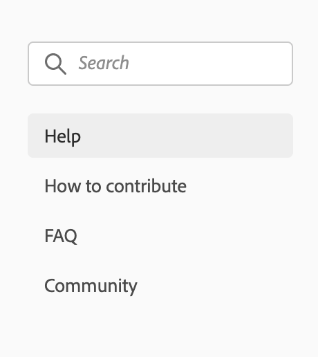
is matching to the following config:
pages: [
  {
    title: 'Support',
    path: '/support/'
  }
],
subPages: [
  {
    title: 'Help',
    path: '/support/'
  },
  {
    title: 'How to contribute',
    path: '/support/contribute/'
  },
  {
    title: 'FAQ',
    path: '/support/FAQ/'
  },
  {
    title: 'Community',
    path: '/support/community/'
  }
]
Single-level side navigation with headers
To create a single-level side navigation with headers, you should set header: true on top-level subPages and follow the auto-collapsing rules for example:
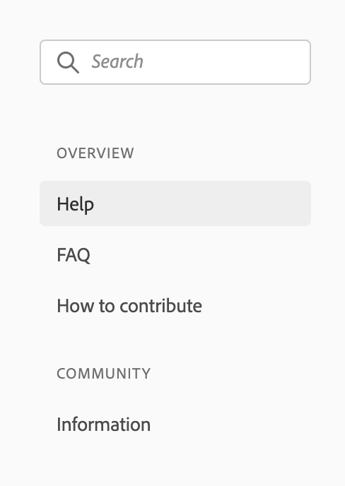
is matching the following config:
pages: [
  {
    title: 'Support',
    path: '/support/'
  }
],
subPages: [
  {
    title: 'Overview',
    path: '/support/',
    header: true,
    pages: [
      {
        title: 'Help',
        path: '/support/'
      },
      {
        title: 'FAQ',
        path: '/support/FAQ/'
      },
      {
        title: 'How to contribute',
        path: '/support/contribute/'
      }
    ]
  },
  {
    title: 'Community',
    path: '/support/community/',
    header: true,
    pages: [
      {
        title: 'Information',
        path: '/support/community/'
      }
    ]
  }
]
Multi-level side navigation
To create a multi-level side navigation, you have to define pages for subPages for example:
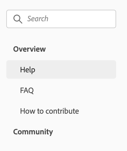
is matching the following config:
pages: [
  {
    title: 'Support',
    path: '/support/'
  }
],
subPages: [
  {
    title: 'Overview',
    path: '/support/',
    pages: [
      {
        title: 'Help',
        path: '/support/'
      },
      {
        title: 'FAQ',
        path: '/support/FAQ/'
      },
      {
        title: 'How to contribute',
        path: '/support/contribute/'
      }
    ]
  },
  {
    title: 'Community',
    path: '/support/community/',
    pages: [
      {
        title: 'Information',
        path: '/support/community/'
      }
    ]
  }
]
Auto-collapsing of multi-level side navigation
In the previous multi-level side navigation example, if the current location is /support/, Overview auto-collapses and selects Help by default because Overview and Help paths both matches the current location /support/.
It also means that if you don't want the auto-collapsing behavior, you have to define different paths for subPages than you defined for pages e.g. for the previous example, to avoid auto-collapsing of Overview,
you would have to define a different path for Overview and Help:
pages: [
  {
    title: 'Support',
    path: '/support/'
  }
],
subPages: [
  {
    title: 'Overview',
    path: '/support/overview/',
    pages: [
      {
        title: 'Help',
        path: '/support/overview/help/'
      },
      {
        title: 'FAQ',
        path: '/support/overview/FAQ/'
      },
      {
        title: 'How to contribute',
        path: '/support/overview/contribute/'
      }
    ]
  },
  {
    title: 'Community',
    path: '/support/community/',
    pages: [
      {
        title: 'Information',
        path: '/support/community/'
      }
    ]
  }
]
which will render:
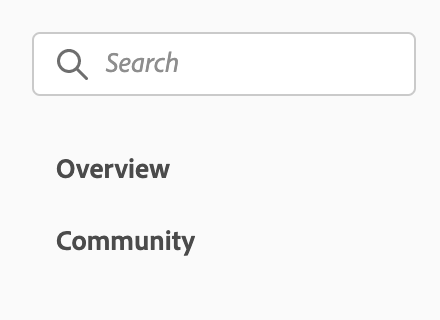
Use descriptive titles
Navigation should be helpful. Choose titles for navigation items that clearly represent the surfaces where they'll go. Avoid using titles that are arbitrary or un-useful, since this can pose usability issues for your product.
Be concise
Along with being descriptive, navigation items should be succinct. Reduce any unnecessary words in order to ensure simplicity. Navigation items should never be so long that they require truncation, except in instances where navigation is user-generated.
Use sentence case
Navigation items should be written in sentence case.
Use the right variation
Make sure that you are using the right variation for your products’ context and users’ needs. Don’t mix behavior, styles, or variations together in a single navigation menu:
- When navigation is simple, use the single-level side navigation.
- When navigation is simple but categorical, use the single-level side navigation with headers.
- When navigation is expansive, hierarchical, and/or you need progressive disclosure in your menu behavior, use the multi-level side navigation.
Avoid deep nested menus
The multi-level side navigation should only go 3 levels deep. More than 3 levels will make the indentation indiscernible, which can become a major usability issue in your product.
Use consistent multi-level behavior
If top-level navigation items have a location associated with them, send the user to that location and open the sub-level navigation items. If a top-level navigation item does not have any associated location, only open the sub-level navigation items.
Side navigation can use either of these behaviors, but should never mix behaviors in the same experience.
Versions
You can specify multiple versions for your site in gatsby-config.js under versions.
The first entry is the selected version by default.
versions: [
  {
    title: 'v2.0'
  },
  {
    title: 'v1.4',
    path: 'https://github.com/AdobeDocs/analytics-1.4-apis'
  }
],
Building the Gatsby site
You can generate a production version of the site using following commands:
With the CLI:
aio doc generateOr run following commands:
- To build and preview a production version of the site:
yarn start. - To build and preview a production version of the site with path prefix:
yarn start:prefix. - To build and preview a development version of the site with hot reloading:
yarn dev.
Adding a Path Prefix
Many applications are hosted at something other than the root (/) of their domain.
For example, a Gatsby blog could live at example.com/blog/, or a site could be hosted on GitHub Pages at example.github.io/my-gatsby-site/.
To add a Path Prefix, go to your gatsby-config.js file and specify the prefix with:
pathPrefix: process.env.PATH_PREFIX || '/MY_PREFIX' Publishing the Gatsby site
Publishing to GitHub Pages (Dev)
On every commit to the main branch, the site will be built to GitHub Pages automatically, for you to preview as a development version. This is the default branch for new repos in GitHub.
GitHub Contributors component: this will use the GitHub token automatically provided by the GitHub Action to retrieve data
Feedback component: no environmental variable should be set since GitHub Pages should only be for development purposes
Publishing to Azure Storage Static Websites (Production)
A site is published via a Pull Request:
1. The Pull Request should be tagged with the deploy label (Production deploy) AND/OR
2. The Pull Request should be tagged with the deploy:dev label (Dev deploy)
3. Lastly, the Pull Request must be approved to start deploying
Pre-requisites:
1. Create a GitHub label called deploy if it does not exist
2. Create a GitHub label called deploy:dev if it does not exist
3. Add a Azure Blob Storage connection string GitHub Secret for production called AZURE_PROD_CONNECTION_STRING
4. Add a Azure Blob Storage connection string GitHub Secret for development called AZURE_DEV_CONNECTION_STRING
5. Add a Github Secret for production called PATH_PREFIX. This is the sub-folder to deploy this micro-site to.
- For example, if you want to deploy to https://example.com/foo/bar you must set
PATH_PREFIXtofoo/bar - For sites deployed to the
root, use/as thePATH_PREFIX
- Add a Adobe Launch URL GitHub Secret called
GATSBY_LAUNCH_URL(see section above for the Feedback component) - The Pull Request must be on a
branch in the same repo(this is a GitHub Actions security restriction for secrets access) The person initiating the Pull Request must have a
Contributorrole to the repo (because of the previous requirement)
Writing Enhanced Markdown
Front matter
Front matter allows an author to specify metadata for a page. For example, you can define the page meta title and description by adding front matter to the beginning of your markdown file:
title: Guides - Adobe Analytics
description: This is the guides overview page of Adobe Analytics
In addition to the GitHub contributors of a markdown file, you can specify external contributors with front matter. They'll show up first before the GitHub contributors.
contributors:
OpenAPI
We use Redoc to render OpenAPI specs. Simply use front matter to define the spec URL.
openAPISpec: https://raw.githubusercontent.com/AdobeDocs/analytics-2.0-apis/master/docs/swagger.json
JSDoc
We currently recommend to use the JSDoc to markdown converter.
Use front matter to specify a JSDoc markdown document.
jsDoc: true
Then annotate your JS parameters with <JsDocParameters/> to render them nicely see the example markdown file.
MDX
MDX is supported out of the box. MDX enables writing JSX React components in markdown giving authors new powers.
Despite the markdown files having all an md extension, they are actually treated as MDX files. You can use md and mdx extensions interchangeably.
As we try to limit the use of MDX in favor of pure markdown, we have come up with a way to couple the use of basic markdown syntax with JSX.
Always make sure to close JSX blocks and use line breaks between JSX blocks and markdown content to avoid MDX parser issues.
Modular Content System
The modular content system is a set of content blocks with variants and compositions that can be used to create pages.
Content Blocks are goal-focused. A group of content that has a specific goal or intention, to structure and support the overall narrative. Examples are groupings of text, groupings of buttons, and hero content.
Variants are messaging-focused. The messaging points/content (this includes both written and visual content/images) that makes the goal of the content block happen. Examples are text content blocks with icons vs no icons.
Compositions are layout-focused. The overall narrative for the page.
A variant can go into a content block. Multiple content blocks make up a composition.
JSX Blocks
The Content Blocks are defined as JSX Blocks. They use a slots property to identify which markdown elements to ingest using only string properties.
This helps maintain better readability when rendered on https://github.com.
Common slots are: heading, image and text. See below examples for full details.
Hero Block
A Hero Block should be used on every home page. Only 1 Hero Block per page is allowed. They are used to set up the tone of the page and optionally add call to actions and intentions for users.
There are 3 different variants:
- The default variant for Documentation pages.
- The half width variant for Product/Platform authored pages.
- The full width variant for Index home pages.
Default variant:

<Hero slots="image, heading, text" background="rgb(64, 34, 138)"/>

# Adobe Analytics
Adobe Product API offers limitless ways to integrate your most important customer data into key business processes. Adobe Product API offer limitless ways. Use slots to identify the markdown content:
heading(required)text(required)image(optional)
Use background to set a custom background color matching your color scheme. Defaults to rgb( 29, 125, 238);
Use theme to match the text color to your color scheme. Defaults to dark.
Half width variant
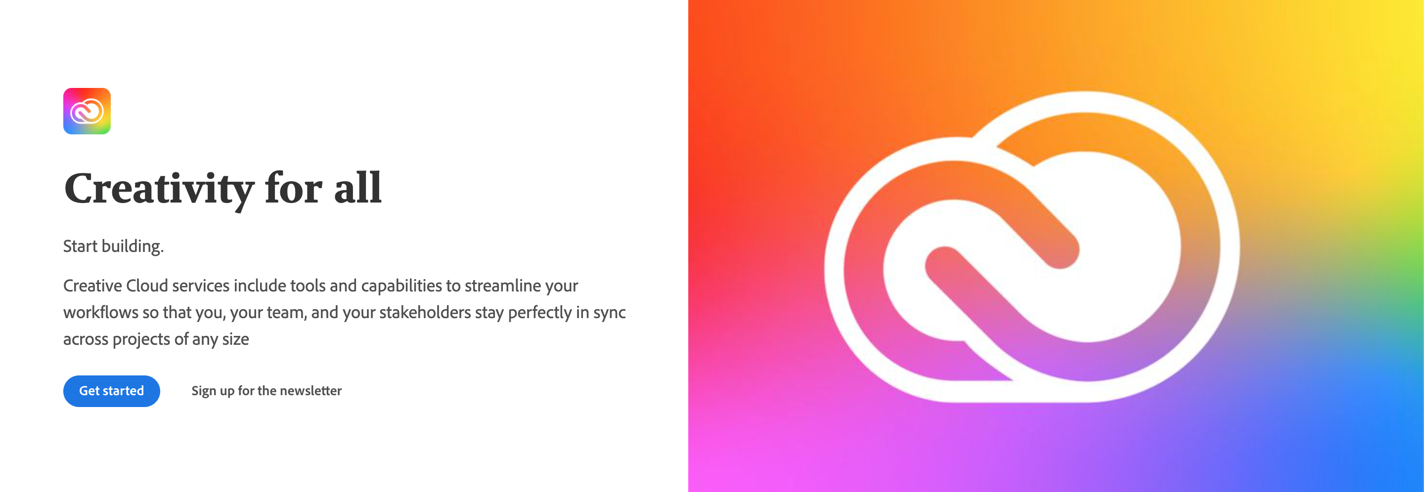
<Hero slots="image, icon, heading, text1, text2, buttons" variant="halfwidth" />


# Creativity for all
Start building.
Creative Cloud services include tools and capabilities to streamline your workflows so that you, your team, and your stakeholders stay perfectly in sync across projects of any size
* [Get started](https://adobe.io)
* [Sign up for the newsletter](https://adobe.io) Use variant="halfwidth"" to set the half width variant.
Use slots to identify the markdown content:
heading(required)text(required)image(required)background(optional)icon(optional)buttons(optional)
Full width variant

<Hero slots="image, heading, text, buttons" variant="fullwidth" background="rgb(51, 51, 51)" />

# The most memorable digital experiences are unleashed by developer creativity
Adobe products and technologies power them
* [Explore our APIs](https://adobe.io)
* [Subscribe](https://adobe.io)Use variant="fullwidth"" to set the full width variant.
Use slots to identify the markdown content:
heading(required)text(required)image(required)background(optional)buttons(optional)
Use theme to match the text color to your color scheme. Defaults to dark.
Resources Block
Each Documentation overview page has a Resources Block with to display a list of links. They can point to internal or external documents or pages.
Only 1 Resource Block per page is allowed.
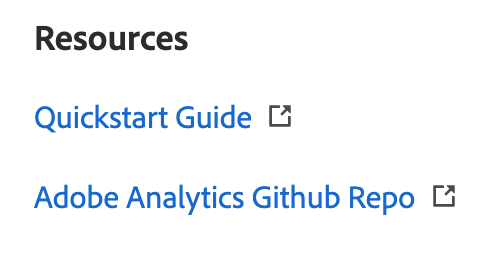
<Resources slots="heading, links"/>

#### Resources

* [Quickstart Guide](https://www.adobe.io/apis/experiencecloud/analytics/docs.html)
* [Adobe Analytics GitHub Repo](https://github.com/AdobeDocs/analytics-2.0-apis)
Use slots to identify the markdown content:
heading(required)links(required)
Discover Block
A Discover Block is a section of content that can be used to highlight certain areas of a Documentation overview page. There can be multiple Discover Blocks in a row. Discover Blocks can be illustrated but only one illustration per row is allowed.
Single Discover Block
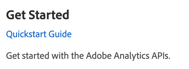
<DiscoverBlock width="100%" slots="heading, link, text"/>

### Get Started

[Quickstart Guide](guides/)

Get started with the Adobe Analytics APIs.
Multiple Discover Blocks in a row

<DiscoverBlock slots="heading, link, text"/>

### Guides

[Calculated Metrics API](guides/calculated_metrics_api/)

Returns information on the user's company that is necessary for making other Adobe Analytics API calls.


<DiscoverBlock slots="link, text"/>

[Segments API](guides/segments_api/)

Provides configuration guidance and best practices for the /segments endpoint.


<DiscoverBlock slots="link, text"/>

[Reporting Guide API](guides/reporting_api/)

Provides configuration guidance and best practices for the /reports endpoint.

<DiscoverBlock slots="link, text"/>
Discover Block with illustrations

<DiscoverBlock slots="image, heading, link, text"/>

### Developer forum
[Get started](https://adobe.io)
Open discussion and support with community experts and Adobe staff.
<DiscoverBlock slots="link, text"/>
[Experience league](https://adobe.io)
Tutorials and videos for the community.Use slots to identify the markdown content:
heading(1 required per row)text(required)link(required)image(optional)
Use width to define the size of the block.
Code Block
A Code Block is an enhanced code section which supports additional features like request/response format, multiple languages etc.
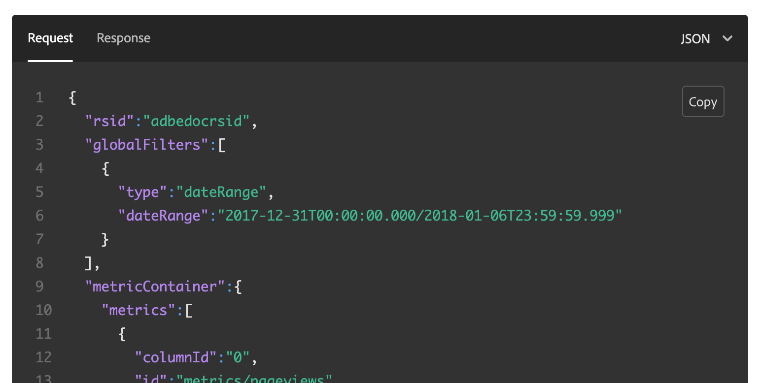
<CodeBlock slots="heading, code" repeat="3" languages="JSON, CURL, JSON" /> Use slots to identify the markdown content:
heading(required)code(required)
Use repeat to define how many code sections are part of the Code Block.
Use languages to define a language name for each code section. Code sections with the same heading are automatically grouped together.
Inline Alert Block
The Inline Alert Block is used to highlight information.

<InlineAlert variant="help" slots="text"/>

The refresh token grant type is automatically added to OAuth clients created after September 18, 2019
Use slots to identify the markdown content:
text(required)
Use variant to define the indicator type: info (default), help, error, success, warning.
Announcement Block
The Announcement Block goes directly underneath the Hero Block for Product/Platform pages. It's used to call out new features, blog posts, news etc. anything that needs that needs to be surfaced above the fold.

<AnnouncementBlock slots="heading, text, button" />

### Try out the magic of Photoshop

Pull together Photoshop, Lightroom and Adobe Sensei into one place. Reduce time spent in each app, freeing you up for more creative time.

[Demo](https://www.adobe.io/apis/creativecloud/photo-imaging-api/api-demo.html)
Use slots to identify the markdown content:
heading(required)button(required)text(optional)
Use theme to match the text color to your color scheme. Defaults to light.
Summary Block
The Summary Block acts as an anchor at the end of the page. It's a change for Products to give users another call to action, and encourage them to interact after they have gotten to the bottom of the page.

<SummaryBlock slots="image, heading, text, buttons" background="rgb(246, 16, 27)" />

## Subscribe to the Creative Cloud developers newsletter
A monthly newsletter featuring news for anyone who creates, develops, or build plugins, extensions, or integrations for the
Creative Cloud family of products.
* [Subscribe to the newsletter](https://adobe.io)
* [Learn more](https://adobe.io) Use slots to identify the markdown content:
heading(required)buttons(1 button required at least)text(optional)image(optional)
Use background to set a custom background color matching your color scheme.
Use theme to match the text color to your color scheme. Defaults to dark.
Title Block
A Title Block is used at the beginning of sections, or to frame compositions on Product/Platform pages.

<TitleBlock slots="heading, text" theme="light" />

### Collaborate better with Content Cloud APIs

With the Cloud Content APIs, you can bring design work created in XD directly to your product or service.
Use slots to identify the markdown content:
heading(required)text(optional)
Use theme to match the text color to your color scheme. Defaults to lightest.
Text Block
Text Blocks are used for layout compositions. They are areas for long blocks of text and explaining features etc. for Product/Platform pages. They are coupled with images or videos.

With an image, texts and links
<TextBlock slots="image, heading, text1, text2, links" />

### Extend Adobe CC Flagship Apps
Extend Creative Cloud desktop apps like [Photoshop](https://www.adobe.com/products/photoshop.html), [Premiere Pro](https://www.adobe.com/products/premiere.html), and [InDesign](https://www.adobe.com/products/indesign.html) through our APIs and SDKs.
Be sure to check out [Common Extensibility Platform (CEP)](https://www.adobe.io/apis/creativecloud/cep.html), which lets you build custom UI panels for multiple CC apps at once.
When you're ready to ship, distribute your work on [Adobe Exchange](https://exchange.adobe.com/), the preferred marketplace for Adobe Creative Cloud users.
And be sure to join the [Exchange Program for Creative Cloud](https://partners.adobe.com/exchangeprogram/creativecloud) to unlock more benefits, including streamlined publishing and promotional opportunities.
*  [Adobe Premiere Pro](https://www.adobe.com/products/premiere.html)
*  [Adobe InDesign](https://www.adobe.com/products/indesign.html)
*  [Adobe After Effect](https://www.adobe.com/products/aftereffects.html) Multiple centered Text Blocks in a row

<TextBlock slots="image, heading, text, links" width="33%" isCentered />

### Microsoft teams
Easily share Creative Cloud assets and files, and get comment notifications on your prototypes.
* [Learn more](https://www.microsoft.com/microsoft-365/microsoft-teams/group-chat-software)
<TextBlock slots="image, heading, text, links" width="33%" isCentered />

### JIRA Cloud
Make designer to developer handoffs easy. Find the latest designs and specs and get thumbnail previews and asset info.
* [Learn more](https://www.atlassian.com/enterprise/cloud)
<TextBlock slots="image, heading, text, links" width="33%" isCentered />

### Slack
Instantly share Creative Cloud files, designs, specs, and notifications all in real time.
* [Learn more](https://slack.com/enterprise) With a video, icons, buttons dark themed

<TextBlock slots="video, icons, heading, text, buttons" theme="dark" />
[Creative Cloud for a new era](https://www.youtube.com/watch?v=JemJbNJ4ZtU&ab_channel=AdobeCreativeCloud)
* 
* 
### Partner Success Story
Connect your users to Creative Cloud right from within your mobile or web apps with our service APIs. Give users access to
world-class creative assets with the Adobe Stock API, or sign up for early information on our upcoming CC Storage API.
* [Learn more](https://adobe.io)
* [Sign up for partner program](https://adobe.io) Use slots to identify the markdown content:
heading(required)text(required). Support multiple texts e.gtext1, text2etc.links(optional). Supports 1 optional image per link.buttons(optional)icons(optional)image(optional).imageshould only be defined as first or last slot to define the layout.imageexcludesvideo.video(optional).videoshould only be defined as first or last slot to define the layout.videoexcludesimage. Supports youtube videos only.
Use theme to match the text color to your color scheme. Defaults to lightest.
Use width to define the size of the block. Supported values are 100%, 50%, 33% and 25%;
Use isCentered to center the text.
Use theme to match the text color to your color scheme. Defaults to lightest.
Product Card
Product Cards group information that allow to browse a collection of related content.

<ProductCard slots="icon, heading, text, buttons" theme="light" width="33%" />

#### CC Storage API
CC Storage API lets you access and modify assets stored in the Creative Cloud, the world's most popular creative platform.
* [Learn more](https://adobe.io)
* [View docs](https://adobe.io)
<ProductCard slots="icon, heading, text, buttons" theme="light" width="33%" />

#### Adobe Stock
Gives your users access to the perfect Adobe Stock asset to enhance their creative projects.
* [Learn more](https://adobe.io)
* [View docs](https://adobe.io)
<ProductCard slots="icon, heading, text, buttons" theme="light" width="33%" />

#### Common Extensibility Platform
Build extensions with HTML, CSS, Javascript and Node. Deploy across multiple Adobe apps.
* [Learn more](https://adobe.io)
* [View docs](https://adobe.io) Use slots to identify the markdown content:
heading(required)text(required)buttons(1 button required at least)icon(optional)
Use theme to match the text color to your color scheme. Defaults to lightest.
Use width to define the size of the block. Supported values are 100%, 50%, 33% and 25%;
Product Card Grid
Use Product Card Grid to display Product Cards with filter and sort options based on meta data.
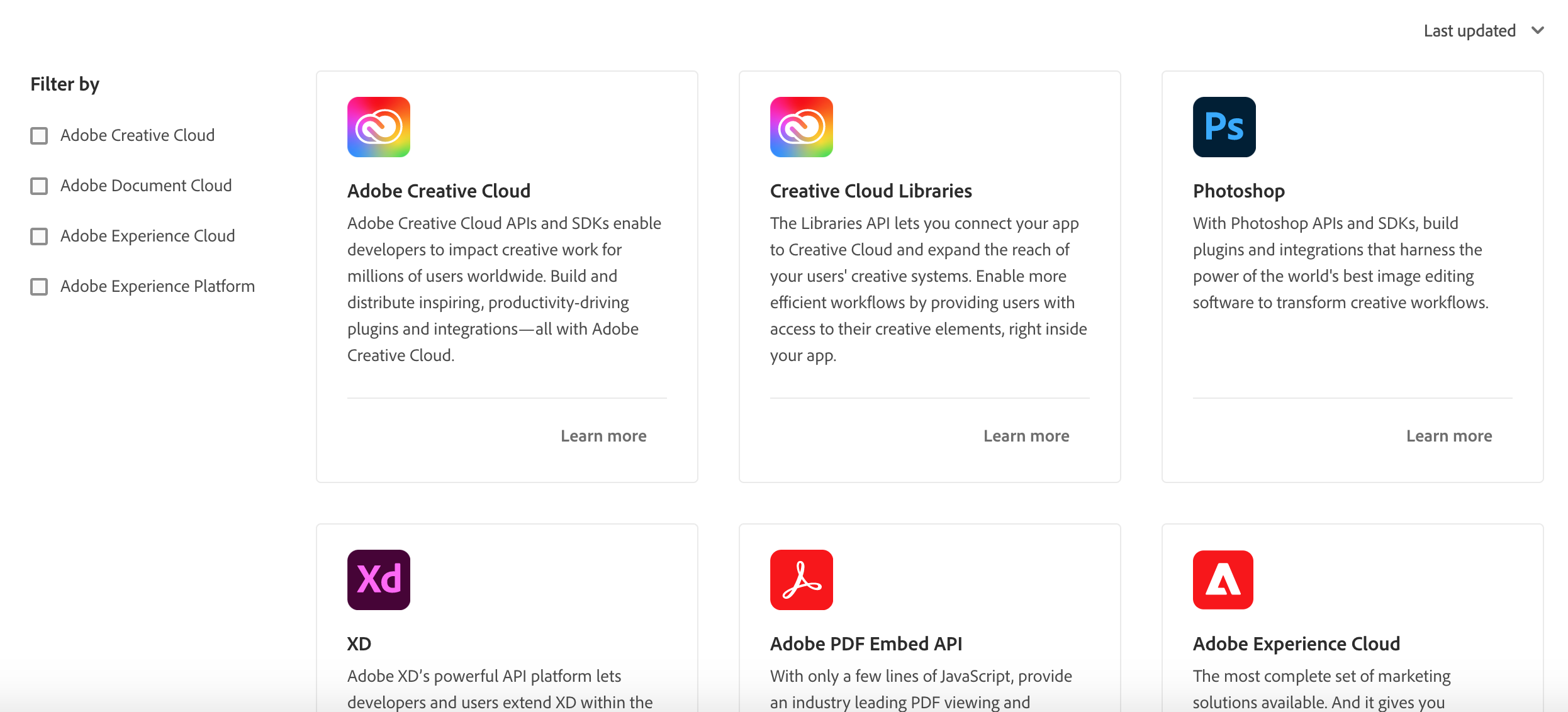
Set interaction to true to display the filter and sort options.
See the data example to provide for clouds and products.
<ProductCardGrid clouds={clouds} products={products} interaction={true} /> Use orderBy to define the default ordering. Choose between last_updated and name.
Use filterByCloud to define the default cloud filter. You can define multiple clouds by default filterByCloud={[cloud1, cloud2]}.
Use filterByIds to define a custom filter e.g. filterByIds=[1, 3, 4] to display products with ids 1, 3 and 4 in that order.
Resource Card
Resource Cards are used on Product/Platform pages for external cross-promotion of materials. Examples includes articles, videos etc.
There are 2 variants: horizontal and vertical Resource Cards. Use multiple Resource Cards with different variants to create a Resource composition.

<ResourceCard slots="link, image, heading, text" width="50%" variant="vertical" />
[Adobe I/O](https://adobe.io)

### Creating a Great Adobe XD Plugin Listing
Rob Kleiman, July 8th 2020
<ResourceCard slots="link, image, heading, text" width="50%" />
[Adobe I/O](https://adobe.io)

### Pattern Builder: A Behind the Scenes Look at Adobe Capture
Nihil Gupta, July 24th 2020
<ResourceCard slots="link, image, heading, text" width="50%" />
[Adobe I/O](https://adobe.io)

### Photoshop Extensibility Enters a New Era Soon: How to get Involved Early
Ash Ryan Arnwine, March 12th 2020 Use slots to identify the markdown content:
link(required)heading(required)image(required)text(optional)
Use theme to match the text color to your color scheme. Defaults to lightest.
Use width to define the size of the block. Supported values are 100%, 50%, 33% and 25%;
Embedding markdown documents and filtering content
You can use MDX transclusion to embed markdown documents into other markdown documents see the MDX documentation.
Embedding local markdown files
For example, if you want to include the content of overview.md into index.md:
index.md content:
import Overview from './overview.md'

# Welcome

Lorem ipsum

<Overview/>

## Questions

Lorem ipsum
overview.md content:
## Overview

Lorem ipsum
index.md will be rendered as:
# Welcome

Lorem ipsum

## Overview

Lorem ipsum

## Questions

Lorem ipsum
Embedding external markdown files
Gatsby sites are using npm to define dependencies so we can also include external markdown documents.
You have to define a name in the package.json like here to be able to include it
as a dependency in another site.
You don't have to release the site on npm since npm supports installing dependencies using github repository urls. For example, to install https://github.com/AdobeDocs/dev-site-documentation-template/
as a dependency in another site, you can run the command yarn add adobedocs/dev-site-documentation-template;
Your site package will show up under node_modules/[PACKAGE_NAME] e.g. node_modules/dev-site-documentation-template.
See full example below using a Variant block.
Filtering content with Variant Blocks
Together with Variant Blocks, the author can query what should be rendered from external sources.
This allows to write content once, and reuse it everywhere.
For example, let's say there are 2 repositories named http://github.com/adobedocs/repo1 and http://github.com/adobedocs/repo2.
Both are Gatsby sites using the theme @adobe/gatsby-theme-aio and have markdown content defined under src/pages.
1) repo1 has reusable markdown content written with Variant Blocks under /src/pages/debugging/index.md:
## How to Debug Your Plugin
Bugs happen! In this tutorial, you will learn how to debug your plugin.
<Variant product="XD" repeat="2" />
First launch the XD console, by clicking Developer > Console
[XD link](https://adobe.io)
<Variant product="Photoshop" repeat="2" />
First launch the Photoshop console, by clicking Developer > Console
[Photoshop link](https://adobe.io)
<Variant test="image" repeat="2" />
#### Image
 Use repeat to define how many elements are part of the Variant Block. Use any key=value property to mark your Variant Block.
2) repo2 added repo1 as dependency with yarn add adobedocs/repo1 to be able to reference its markdown content.
3) repo2 embeds repo1 content by using the import statement and inserts the content in its own markdown together with a query filter to only display what is needed.
import Debugging from 'repo1/src/pages/debugging/index.md'

# Debugging

<Debugging query="product=Photoshop" />

More content
will be rendered as:
# Debugging

## How to Debug Your Plugin

Bugs happen! In this tutorial, you will learn how to debug your plugin.

First launch the Photoshop console, by clicking Developer > Console

[Photoshop link](https://adobe.io)

More content
You can query multiple elements, for example you can add the section with the image by adding it to the query.
<Debugging query="product=Photoshop&image=test" />Customizations
When using Gatsby themes, you can take advantage of something called Gatsby shadowing. This allows you to override the default component included in the theme with a custom one you’ve created.
The Adobe I/O Gatsby Theme package has a component to render code using the Prism syntax highlighter. With shadowing, you can override the component to provide your own.
If you look at the file tree of your site, you’ll see it looks something like this:
root
├─ src/pages
│   ├- index.md
│   └- etc.
├- .env
├─ gatsby-config.js
└─ package.json
To enable shadowing, you need to add a folder called @adobe/gatsby-theme-aio.
Any file placed in that directory with a path that matches the path of a file from the theme will completely shadow the file.
So the new folder structure with shadowing enabled will look like following:
root
├─ src
│  ├- pages
│  │  ├- index.md
│  │  └- etc.
│  └- @adobe
│     └- gatsby-theme-aio
│        └- components
│           └- Code
│              └- index.js
├- .env
├─ gatsby-config.js
└─ package.json
You can define your own Code components under src/@adobe/gatsby-theme-aio/components/Code/index.js.
Notice omitting the src directory in the shadow folder.
Theming
Currently, you can only define a light or dark theme for Code blocks. By default, Code blocks are displayed in dark theme.
To change Code blocks from dark to light theme, you have to shadow the theme/index.js file:
export default {
  code: 'light'
};
Upgrading
Locally
To upgrade to the latest version of @adobe/gatsby-theme-aio, simply run yarn upgrade or npm update if you have defined the dependency with a version range selector.
If not, update the version of the dependency by setting the version manually in the package.json and run yarn install or npm install.
This will also update the lock file yarn.lock or package-lock.json.
Automated
We recommend to setup GitHub dependabot in your Gatsby site repository.
Simply copy the dependabot file in your .github folder.
The bot will automatically submit pull requests to keep your version of @adobe/gatsby-theme-aio up to date. Please make sure to use a version range selector for your dependencies in your package.jsone.g "@adobe/gatsby-theme-aio": "^2.1.5".
Issue tracker
Use the GitHub issue tracker to report issues, ask questions or log feature requests. Any feedback is welcome !
Please check existing issues before filing anything new.
Contributing
Contributions are welcomed! Read the Contributing Guide for more information.
See Conventional Commits for commit guidelines.
Releases
You can check the latest released version of @adobe/gatsby-theme-aio at https://github.com/adobe/gatsby-theme-aio/releases.
This repository is setup as a monorepo using lerna for automated publishing to NPM.
Use GH_TOKEN=[YOUR_GH_TOKEN] lerna publish --create-release github --conventional-commits --no-private for publishing @adobe/gatsby-theme-aio on npm.
1 year ago
1 year ago
1 year ago
1 year ago
1 year ago
1 year ago
1 year ago
1 year ago
1 year ago
1 year ago
1 year ago
1 year ago
12 months ago
10 months ago
10 months ago
10 months ago
10 months ago
1 year ago
1 year ago
1 year ago
12 months ago
1 year ago
1 year ago
1 year ago
1 year ago
1 year ago
1 year ago
1 year ago
1 year ago
1 year ago
1 year ago
1 year ago
1 year ago
1 year ago
1 year ago
2 years ago
2 years ago
2 years ago
2 years ago
2 years ago
2 years ago
2 years ago
2 years ago
2 years ago
2 years ago
2 years ago
2 years ago
2 years ago
2 years ago
2 years ago
2 years ago
2 years ago
2 years ago
2 years ago
2 years ago
2 years ago
2 years ago
2 years ago
2 years ago
2 years ago
2 years ago
2 years ago
2 years ago
2 years ago
2 years ago
2 years ago
2 years ago
2 years ago
2 years ago
2 years ago
2 years ago
2 years ago
2 years ago
2 years ago
2 years ago
2 years ago
2 years ago
2 years ago
2 years ago
2 years ago
2 years ago
2 years ago
2 years ago
2 years ago
2 years ago
2 years ago
2 years ago
2 years ago
2 years ago
2 years ago
2 years ago
2 years ago
2 years ago
2 years ago
2 years ago
2 years ago
2 years ago
2 years ago
2 years ago
2 years ago
2 years ago
2 years ago
2 years ago
2 years ago
2 years ago
2 years ago
2 years ago
2 years ago
2 years ago
2 years ago
2 years ago
2 years ago
2 years ago
2 years ago
2 years ago
2 years ago
2 years ago
2 years ago
2 years ago
2 years ago
2 years ago
2 years ago
2 years ago
2 years ago
2 years ago
2 years ago
2 years ago
2 years ago
2 years ago
2 years ago
2 years ago
2 years ago
2 years ago
2 years ago
2 years ago
2 years ago
2 years ago
2 years ago
2 years ago
2 years ago
2 years ago
2 years ago
2 years ago
2 years ago
2 years ago
2 years ago
2 years ago
2 years ago
2 years ago
2 years ago
2 years ago
2 years ago
2 years ago
2 years ago
2 years ago
2 years ago
2 years ago
2 years ago
2 years ago
2 years ago
2 years ago
2 years ago
2 years ago
2 years ago
2 years ago
2 years ago
2 years ago
2 years ago
2 years ago
2 years ago
2 years ago
2 years ago
2 years ago
2 years ago
2 years ago
2 years ago
2 years ago
2 years ago
2 years ago
2 years ago
2 years ago
2 years ago
2 years ago
3 years ago
3 years ago
3 years ago
3 years ago
2 years ago
2 years ago
3 years ago
3 years ago
2 years ago
3 years ago
3 years ago
3 years ago
3 years ago
3 years ago
3 years ago
3 years ago
3 years ago
3 years ago
3 years ago
3 years ago
3 years ago
3 years ago
3 years ago
3 years ago
3 years ago
3 years ago
3 years ago
3 years ago
3 years ago
3 years ago
3 years ago
3 years ago
3 years ago
3 years ago
3 years ago
3 years ago
3 years ago
3 years ago
3 years ago
3 years ago
3 years ago
3 years ago
3 years ago
3 years ago
3 years ago
3 years ago
3 years ago
3 years ago
3 years ago
3 years ago
3 years ago
3 years ago
3 years ago
3 years ago
3 years ago
3 years ago
3 years ago
3 years ago
3 years ago
3 years ago
3 years ago
3 years ago
3 years ago
3 years ago
3 years ago
3 years ago
3 years ago
3 years ago
3 years ago
3 years ago
3 years ago
3 years ago
3 years ago
3 years ago
3 years ago
3 years ago
3 years ago
3 years ago
3 years ago
3 years ago
3 years ago
3 years ago
3 years ago
3 years ago
3 years ago
3 years ago
3 years ago
3 years ago
3 years ago
3 years ago
3 years ago
3 years ago
3 years ago
3 years ago
3 years ago
4 years ago
4 years ago
4 years ago
4 years ago
4 years ago
4 years ago
3 years ago
4 years ago
4 years ago
4 years ago
4 years ago
4 years ago
4 years ago
4 years ago
4 years ago
4 years ago
4 years ago
4 years ago
3 years ago
4 years ago
4 years ago
4 years ago
4 years ago
4 years ago
4 years ago
4 years ago
4 years ago
4 years ago
4 years ago
4 years ago
4 years ago
4 years ago
4 years ago
4 years ago
4 years ago
4 years ago
4 years ago
4 years ago
4 years ago
4 years ago
4 years ago
4 years ago
4 years ago
4 years ago
4 years ago
4 years ago
4 years ago
4 years ago
4 years ago
4 years ago
4 years ago
4 years ago
4 years ago
4 years ago
4 years ago
4 years ago
4 years ago
4 years ago
4 years ago
4 years ago
4 years ago
4 years ago
4 years ago
5 years ago
5 years ago
5 years ago
5 years ago
5 years ago
5 years ago
5 years ago
5 years ago
5 years ago
5 years ago
5 years ago
5 years ago
5 years ago
5 years ago
5 years ago
5 years ago
5 years ago
5 years ago
5 years ago
5 years ago
5 years ago
5 years ago
5 years ago
5 years ago
5 years ago
5 years ago
5 years ago
5 years ago
5 years ago
5 years ago
5 years ago
5 years ago
5 years ago
5 years ago
5 years ago
5 years ago
5 years ago
5 years ago
5 years ago
5 years ago
5 years ago
5 years ago
5 years ago
5 years ago
5 years ago
5 years ago
5 years ago
5 years ago
5 years ago
5 years ago
5 years ago
5 years ago
5 years ago
5 years ago
5 years ago
5 years ago
5 years ago
5 years ago
5 years ago
5 years ago
5 years ago
5 years ago
5 years ago
5 years ago
5 years ago
5 years ago
5 years ago
5 years ago
5 years ago
5 years ago
5 years ago
5 years ago
5 years ago
5 years ago
5 years ago
5 years ago
5 years ago
5 years ago
5 years ago
5 years ago
5 years ago
5 years ago
5 years ago
5 years ago