@choc-ui/chakra-autocomplete v6.1.3
Chakra V3 and V2 Support
AutoComplete Version 6+ supports Chakra UI V3. If you are using Chakra UI V2, please continue to use the current choc-autocomplete v5.X. We will continue to try and support Chakra V2 but will eventually be removed once V3 becomes more widely adopted.
For help migrating from Chakra UI V2 to V3, please see their migration guide
The public API of the AutoComplete components have not changed with this migration.
Known issues with Chakra V3
There is only 1 known display issue with Chakra V3. When using the multiple prop, it is no longer possible to replicate the same styling to the Box wrapper as what the underlying Input is using. We are still looking into ways to resolve this, but neither the Chakra nor next-themes teams have published guidance on this yet.
Install
npm i --save @choc-ui/chakra-autocomplete
#or
yarn add @choc-ui/chakra-autocomplete
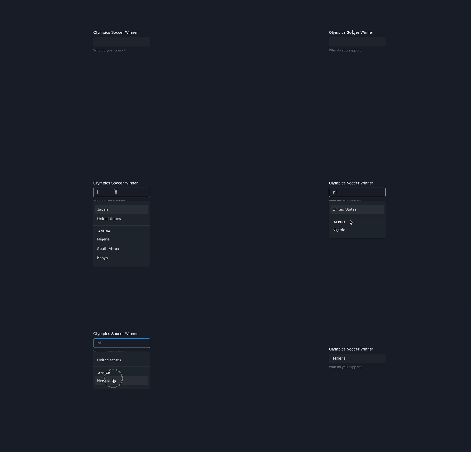
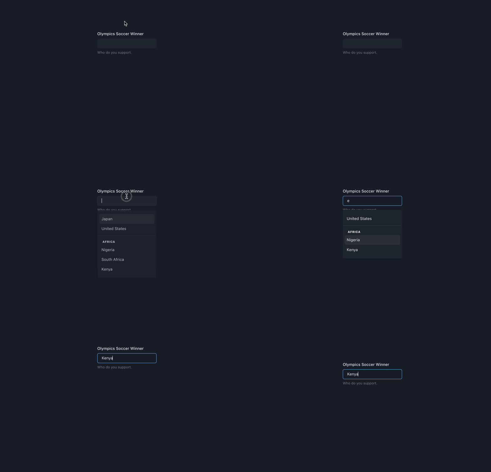
Preview
With Mouse

With Keyboard

Usage
Basic Usage
import { Flex, Field } from "@chakra-ui/react";
import {
  AutoComplete,
  AutoCompleteInput,
  AutoCompleteItem,
  AutoCompleteList,
} from "@choc-ui/chakra-autocomplete";

function App() {
  const countries = [
    "nigeria",
    "japan",
    "india",
    "united states",
    "south korea",
  ];

  return (
    <Flex pt="48" justify="center" align="center" w="full">
      <Field.Root w="60">
        <Field.Label>Olympics Soccer Winner</Field.Label>
        <AutoComplete openOnFocus>
          <AutoCompleteInput variant="subtle" />
          <AutoCompleteList>
            {countries.map((country, cid) => (
              <AutoCompleteItem
                key={`option-${cid}`}
                value={country}
                textTransform="capitalize"
              >
                {country}
              </AutoCompleteItem>
            ))}
          </AutoCompleteList>
        </AutoComplete>
        <Field.HelperText>Who do you support.</Field.HelperText>
      </Field.Root>
    </Flex>
  );
}

export default App;
Creating Groups
You can create groups with the AutoCompleteGroup Component, and add a title with the AutoCompleteGroupTitle component.
import React from "react";
import {
  AutoComplete,
  AutoCompleteGroup,
  AutoCompleteGroupTitle,
  AutoCompleteInput,
  AutoCompleteItem,
  AutoCompleteList,
} from "@choc-ui/chakra-autocomplete";
import { Stack, Text } from "@chakra-ui/react";

export default function App() {
  const continents = {
    africa: ["nigeria", "south africa"],
    asia: ["japan", "south korea"],
    europe: ["united kingdom", "russia"],
  };
  return (
    <Stack direction="column">
      <Text>Group </Text>
      <AutoComplete openOnFocus>
        <AutoCompleteInput placeholder="Search..." variant="subtle" />
        <AutoCompleteList>
          {Object.entries(continents).map(([continent, countries], co_id) => (
            <AutoCompleteGroup key={co_id} showDivider>
              <AutoCompleteGroupTitle textTransform="capitalize">
                {continent}
              </AutoCompleteGroupTitle>
              {countries.map((country, c_id) => (
                <AutoCompleteItem
                  key={c_id}
                  value={country}
                  textTransform="capitalize"
                >
                  {country}
                </AutoCompleteItem>
              ))}
            </AutoCompleteGroup>
          ))}
        </AutoCompleteList>
      </AutoComplete>
    </Stack>
  );
}
Accessing the internal state
To access the internal state of the AutoComplete, use a function as children (commonly known as a render prop). You'll get access to the internal state isOpen, with the onOpen and onClose methods.
import {
  Flex,
  Field,
  Icon
} from "@chakra-ui/react";
import * as React from "react";
import {
  AutoComplete,
  AutoCompleteInput,
  AutoCompleteItem,
  AutoCompleteList,
} from "@choc-ui/chakra-autocomplete";
import { FiChevronRight, FiChevronDown } from "react-icons/fi";
import { InputGroup } from "./components/ui/input-group";

function App() {
  const countries = [
    "nigeria",
    "japan",
    "india",
    "united states",
    "south korea",
  ];

  return (
    <Flex pt="48" justify="center" align="center" w="full">
      <Field.Root w="60">
        <Field.Label>Olympics Soccer Winner</Field.Label>
        <AutoComplete openOnFocus>
          {({ isOpen }) => (
            <>
              <InputGroup
                endElement={<Icon>{isOpen ? <FiChevronRight /> : <FiChevronDown />}</Icon>}
              >
                <AutoCompleteInput variant="subtle" placeholder="Search..." />
              </InputGroup>
              <AutoCompleteList>
                {countries.map((country, cid) => (
                  <AutoCompleteItem
                    key={`option-${cid}`}
                    value={country}
                    textTransform="capitalize"
                  >
                    {country}
                  </AutoCompleteItem>
                ))}
              </AutoCompleteList>
            </>
          )}
        </AutoComplete>
        <Field.HelperText>Who do you support.</Field.HelperText>
      </Field.Root>
    </Flex>
  );
}

export default App;
Custom Rendering
You can Render whatever you want. The AutoComplete Items are regular Chakra Boxes.
import React from "react";
import {
  AutoComplete,
  AutoCompleteGroup,
  AutoCompleteInput,
  AutoCompleteItem,
  AutoCompleteList,
} from "@choc-ui/chakra-autocomplete";
import { Stack, Text } from "@chakra-ui/react";
import { Avatar } from "./components/ui/avatar";

export default function App() {
  const europeans = [
    { name: "Dan Abramov", image: "https://bit.ly/dan-abramov" },
    { name: "Kent Dodds", image: "https://bit.ly/kent-c-dodds" },
    { name: "Ryan Florence", image: "https://bit.ly/ryan-florence" },
  ];
  const nigerians = [
    { name: "Segun Adebayo", image: "https://bit.ly/sage-adebayo" },
    { name: "Prosper Otemuyiwa", image: "https://bit.ly/prosper-baba" },
  ];
  return (
    <Stack direction="column">
      <Text>Custom Render </Text>
      <AutoComplete rollNavigation>
        <AutoCompleteInput variant="subtle" placeholder="Search..." />
        <AutoCompleteList>
          <AutoCompleteGroup title="Nigerians" showDivider>
            {nigerians.map((person, oid) => (
              <AutoCompleteItem
                key={`nigeria-${oid}`}
                value={person.name}
                textTransform="capitalize"
                align="center"
              >
                <Avatar size="sm" name={person.name} src={person.image} />
                <Text ml="4">{person.name}</Text>
              </AutoCompleteItem>
            ))}
          </AutoCompleteGroup>
          <AutoCompleteGroup title="Europeans" showDivider>
            {europeans.map((person, oid) => (
              <AutoCompleteItem
                key={`europe-${oid}`}
                value={person.name}
                textTransform="capitalize"
                align="center"
              >
                <Avatar size="sm" name={person.name} src={person.image} />
                <Text ml="4">{person.name}</Text>
              </AutoCompleteItem>
            ))}
          </AutoCompleteGroup>
        </AutoCompleteList>
      </AutoComplete>
    </Stack>
  );
}
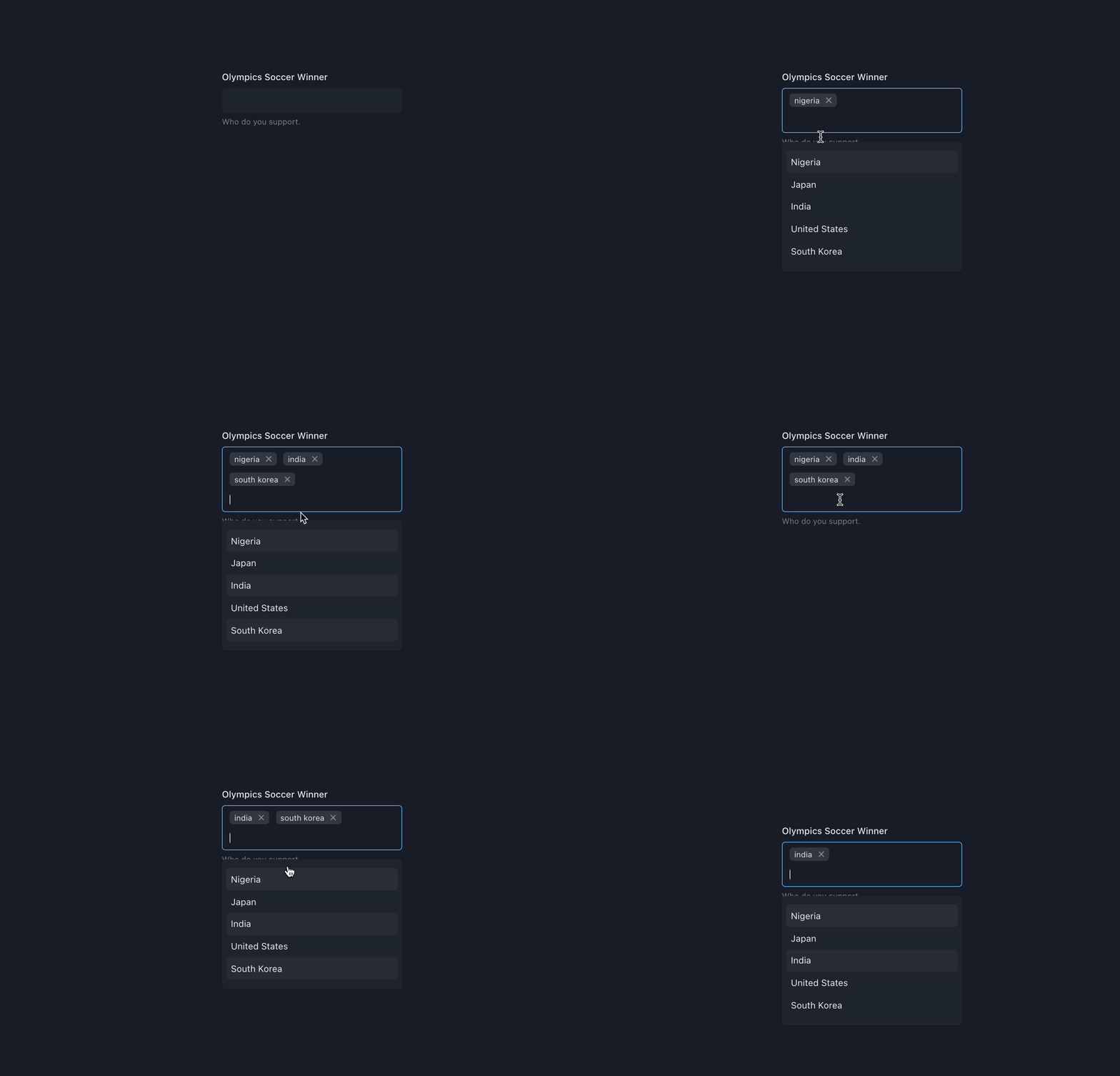
Multi Select with Tags
Add the multiple prop to AutoComplete component, the AutoCompleteInput will now expose the tags in it's children function.
The onChange prop now returns an array of the chosen values
Now you can map the tags with the AutoCompleteTag component or any other component of your choice. The label and the onRemove method are now exposed.
Important - With Chakra UI V3, it is no longer possible to replicate the same styling to the Box wrapper as what the underlying Input is using. We are still looking into ways to resolve this, but neither the Chakra nor next-themes teams have published guidance on this yet.
import React from "react";
import {
  AutoComplete,
  AutoCompleteInput,
  AutoCompleteItem,
  AutoCompleteList,
  AutoCompleteTag,
} from "@choc-ui/chakra-autocomplete";
import { Stack, Text } from "@chakra-ui/react";

export default function App() {
  const countries = [
    "nigeria",
    "japan",
    "india",
    "united states",
    "south korea",
  ];
  return (
    <Stack direction="column">
      <Text>Multi select with tags</Text>
      <AutoComplete openOnFocus multiple onChange={(vals) => console.log(vals)}>
        <AutoCompleteInput placeholder="Search..." variant="subtle">
          {({ tags }) =>
            tags.map((tag, tid) => (
              <AutoCompleteTag
                key={tid}
                label={tag.label}
                onRemove={tag.onRemove}
              />
            ))
          }
        </AutoCompleteInput>
        <AutoCompleteList>
          {countries.map((country, cid) => (
            <AutoCompleteItem
              key={`option-${cid}`}
              value={country}
              textTransform="capitalize"
              _selected={{ bg: "whiteAlpha.50" }}
              _focus={{ bg: "whiteAlpha.100" }}
            >
              {country}
            </AutoCompleteItem>
          ))}
        </AutoCompleteList>
      </AutoComplete>
    </Stack>
  );
}
Creatable Items
I know that title hardly expresses the point, but yeah, naming is tough. You might want your users to be able to add extra items when their options are not available in the provided options. e.g. adding a new tag to your Polywork profile.
First add the creatable prop to the AutoComplete component.
Then add the AutoCompleteCreatable component to the bottom of the list. Refer to the references for more info on this component.
import React from "react";
import {
  AutoComplete,
  AutoCompleteCreatable,
  AutoCompleteInput,
  AutoCompleteItem,
  AutoCompleteList,
  AutoCompleteTag,
} from "@choc-ui/chakra-autocomplete";
import { Stack, Text } from "@chakra-ui/react";

export default function App() {
  const options = ["apple", "appoint", "zap", "cap", "japan"];
  return (
    <Stack direction="column">
      <Text>Creatable </Text>
      <AutoComplete multiple rollNavigation creatable>
        <AutoCompleteInput
          variant="subtle"
          placeholder="Search basic..."
          autoFocus
        >
          {({ tags }) =>
            tags.map((tag, tid) => (
              <AutoCompleteTag
                key={tid}
                label={tag.value}
                onRemove={tag.onRemove}
                disabled={tag.label === "japan"}
              />
            ))
          }
        </AutoCompleteInput>
        <AutoCompleteList>
          {options.map((option, oid) => (
            <AutoCompleteItem
              key={`option-${oid}`}
              value={option}
              textTransform="capitalize"
            >
              {option}
            </AutoCompleteItem>
          ))}
          <AutoCompleteCreatable />
        </AutoCompleteList>
      </AutoComplete>
    </Stack>
  );
}
Loading State
Need to pull data from API, but don't want your users to see a blank screen? You can enable the loading state by passing the isLoading prop to AutoComplete. By doing this, 2 other props will be enabled
loadingIcononAutoCompleteInputwill display some sort of loading icon on the right side of the input. By default, aSpinnerwill be displayed, but you can pass in any custom element to be renderedloadingStateonAutoCompleteListcan display custom loading content whenisLoadingistrue. All content will be rendered in the center of the list. By default, aSpinnerwill be displayed, but you can pass in any custom element to be rendered.
Best practice is to combine setTimeout and useEffect to create a debounce effect. This will prevent un-necessary API calls if your user types relatively quickly.
A working code demo can be found here
Integration with Form Libraries
It is relatively easy to integrate with form libaries such as React Hook Form, Formik, and others. Working examples can be found in the demos folder of this repo. See the Contributing section of this doc on how to clone and set it up for testing.
Does your favorite form library not have a working example? Submit a PR to get it added and help others using this library quickly get up and running.
Autocomplete methods
Assign a ref to the AutoComplete component and call the available methods with:
ref.current?.resetItems();
ref.current?.removeItem(itemValue);
Codesandbox Link Here
API Reference
NB: Feel free to request any additional Prop in Issues.
AutoComplete
Wrapper and Provider for AutoCompleteInput and AutoCompleteList
AutoComplete composes Box so you can pass all Box props to change its style.
NB: None of the props passed to it are required.
boolean | MaybeRenderProp<{ value: Item["value"] }>(query: string, optionValue: Item["value"], optionLabel: Item["label"]) =>
boolean;(value: string | Item["value"][], item: Item| Item[]) => void(params: {
item: Item;
selectMethod: "mouse" | "keyboard" | null;
isNewInput: boolean;
}) => boolean | void(params: {
item: Item;
focusMethod: "mouse" | "keyboard" | null;
isNewInput: boolean;
}) => boolean | void(props:{tags:ItemTag[]}) => void(removedTag: Item["value"],item: Item, tags: Item["value"][]) => void(value: string) => booleanstring[]AutoCompleteTag
Tags for multiple mode
AutoCompleteTag composes Tag so you can pass all Tag props to change its style.
stringstring() => voidAutoCompleteInput
Input for AutoComplete value.
AutoCompleteInput composes Input so you can pass all Input props to change its style.
type children = MaybeRenderProp<{
  tags: Item & { onRemove: () => void }[];
}>;
callback that returns ReactNode and is provided with tags in multiple mode
e.g.
<AutoCompleteInput variant="subtle">
  {({ tags }) =>
    tags.map((tag, tid) => (
      <AutoCompleteTag key={tid} label={tag.label} onRemove={tag.onRemove} />
    ))
  }
</AutoCompleteInput>RefObject<HTMLInputElement><AutoComplete multiple creatable />React.ReactNode | JSXAutoCompleteList
Wrapper for AutoCompleteGroup and AutoCompleteItem
AutoCompleteList composes Box so you can pass all Box props to change its style.
AutoCompleteGroup
Wrapper for collections of AutoCompleteItems
AutoCompleteGroup composes Box so you can pass all Box props to change its style.
AutoCompleteItem
This Composes your suggestions
AutoCompleteItem composes Flex so you can pass all Flex props to change its style.
val => val;boolean{
fontWeight: 'extrabold',
}boolean{
fontWeight: 'extrabold',
}{
fontWeight: 'extrabold',
}{
fontWeight: 'extrabold',
}AutoCompleteCreatable
Used with the AutoComplete component's creatable prop, to allow users enter arbitrary values, not available in the provided options.
AutoCompleteCreatable composes Flex so you can pass all Flex props to change its style.
It also accepts a function as its children prop which is provided with the current inputValue.
type children = MaybeRenderProp<{ value: any }>;ReactNode or callback that returns ReactNode
e.g.
<AutoCompleteCreatable>
  {({ value }) => <span>Add {value} to List</span>}
</AutoCompleteCreatable>boolean;When true, AutoCompleteCreatable is shown even when the AutoCompleteInput is empty
Contribute
- Clone this repository
git clone https://github.com/anubra266/choc-autocomplete.git- Install all dependencies (with yarn)
yarn- Install package example dependencies (with yarn)
cd example
yarn
Start the package server, and the example server
# root directory
yarn start

# example directory with (cd example)
yarn dev
Sponsors ✨
Thanks goes to these wonderful people (emoji key):
Contributors ✨
Thanks goes to these wonderful people (emoji key):
This project follows the all-contributors specification. Contributions of any kind welcome!
1 year ago
10 months ago
10 months ago
10 months ago
1 year ago
10 months ago
10 months ago
1 year ago
1 year ago
1 year ago
1 year ago
1 year ago
1 year ago
1 year ago
1 year ago
1 year ago
2 years ago
2 years ago
2 years ago
2 years ago
2 years ago
2 years ago
2 years ago
2 years ago
2 years ago
2 years ago
2 years ago
2 years ago
2 years ago
3 years ago
3 years ago
3 years ago
3 years ago
2 years ago
2 years ago
3 years ago
3 years ago
3 years ago
3 years ago
3 years ago
3 years ago
3 years ago
3 years ago
3 years ago
3 years ago
4 years ago
4 years ago
4 years ago
4 years ago
4 years ago
4 years ago
4 years ago
4 years ago
4 years ago
4 years ago
4 years ago
4 years ago
4 years ago
4 years ago
4 years ago
4 years ago
4 years ago
4 years ago
4 years ago
4 years ago
4 years ago
4 years ago
4 years ago
4 years ago
4 years ago
4 years ago
4 years ago
4 years ago
4 years ago
4 years ago
4 years ago
4 years ago
4 years ago
4 years ago
4 years ago
4 years ago
4 years ago
4 years ago
4 years ago
4 years ago
4 years ago
4 years ago
4 years ago
4 years ago
4 years ago
4 years ago
4 years ago
5 years ago
5 years ago
5 years ago
5 years ago
5 years ago
5 years ago
5 years ago
5 years ago
5 years ago
5 years ago
5 years ago
5 years ago
5 years ago
5 years ago
5 years ago
5 years ago
5 years ago
5 years ago
5 years ago
5 years ago
5 years ago
5 years ago
5 years ago
5 years ago
5 years ago
5 years ago
5 years ago
5 years ago
5 years ago
5 years ago
5 years ago
5 years ago
5 years ago
5 years ago
5 years ago
5 years ago
5 years ago
5 years ago
5 years ago
5 years ago
5 years ago
5 years ago
5 years ago
5 years ago
