0.6.2 • Published 8 years ago
@krzysztofkarol/material-ui-fullscreen-dialog v0.6.2
material-ui-fullscreen-dialog
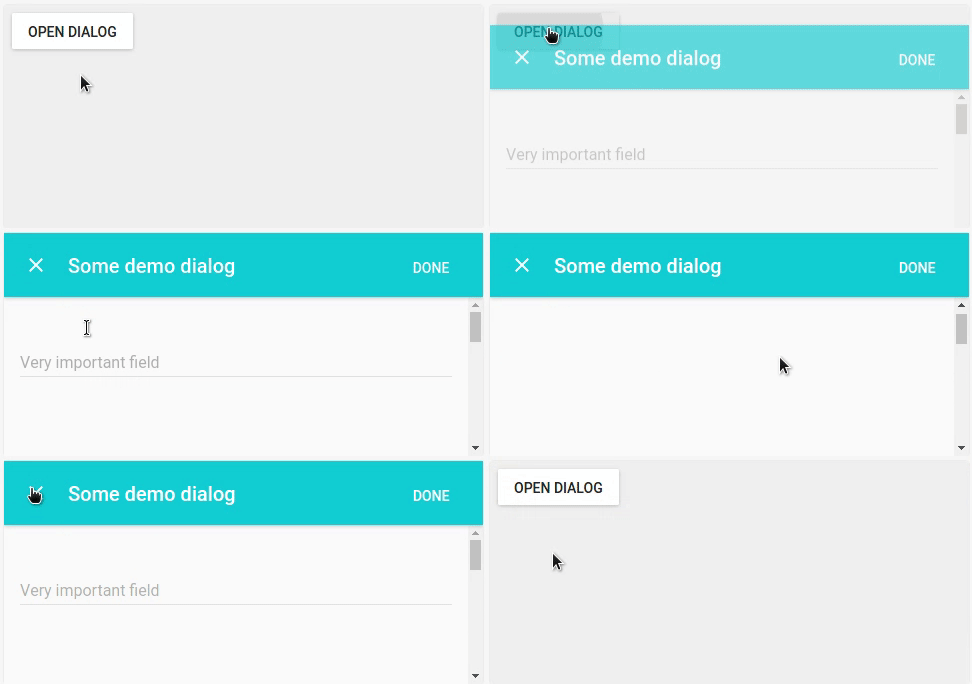
This project provides a fullscreen dialog for Material-UI.

If you want to try the component yourself instead of watching a gif, head over to the storybook for a live demo!
Installation
npm i --save material-ui-fullscreen-dialogUsage
import FullscreenDialog from 'material-ui-fullscreen-dialog'

<FullscreenDialog
  open={this.state.open}
  onRequestClose={() => this.setState({ open: false })}
  title={'Demo dialog'}
  actionButton={<FlatButton
    label='Done'
    onClick={() => this.setState({ open: false })}
  />}
>
  // dialog content here
</FullscreenDialog>
Properties
| Name | Type | Default | Description |
|---|---|---|---|
| actionButton | node | A FlatButton or IconButton that is used as affirmative action button. | |
| appBarStyle | object | Overrides the inline-styles of the app bar. | |
| appBarZDepth | number | 1 | Overrides the z-depth of the app bar, will affect its shadow. This is ignored if immersive is set to true. |
| children | node | Children elements. | |
| closeIcon | node | Close icon | Icon element used for the dismissive action. This is hidden if onRequestClose is not set. |
| containerStyle | object | Overrides the inline-styles of the dialog's children container. | |
| immersive | bool | false | Toggles the immersive mode. If set to true, the app bar has a semi-transparent gradient and overlays the content. |
| onRequestClose | function | Callback that is invoked when the dismissive action button is touched. | |
| open * | bool | Controls whether the dialog is opened or not. | |
| style | object | Overrides the inline-styles of the dialog's root element. | |
| title | string | The title of the dialog. | |
| titleStyle | object | Overrides the inline-styles of the app bar's title element. |
* required property
Credits
The code for the animation was adapted from Material UI's Dialog, although the animation itself is different.
License
The files included in this repository are licensed under the MIT license.