
Portal
Portal is a publishable React game-input and virtual-controller component library. It provides reusable button, input, slider, panel, HUD, and controller components, a decoupled input core, and an optional React Three Fiber presentation surface.
Demo
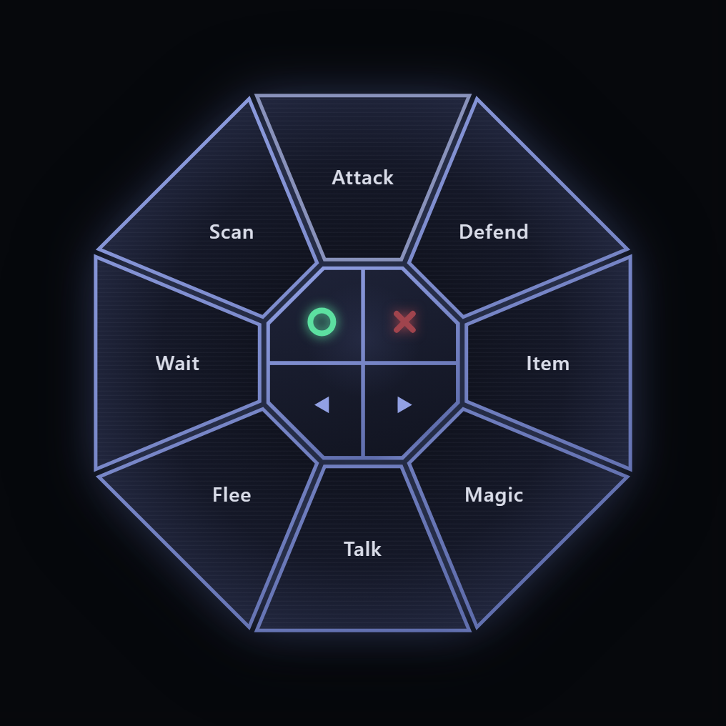
The RadialMenu above is the flagship control: true wedge-shaped sections
computed as clip-path geometry around a center hub that holds 0, 1, 2, or 4
drawn action symbols, with staggered open/close animation, paging through the
center previous/next actions, and an inline collapsible form whose hub
persists as the toggle. Its Tier-1 sibling RadialPad shares the same
geometry and emits per-section input signals.
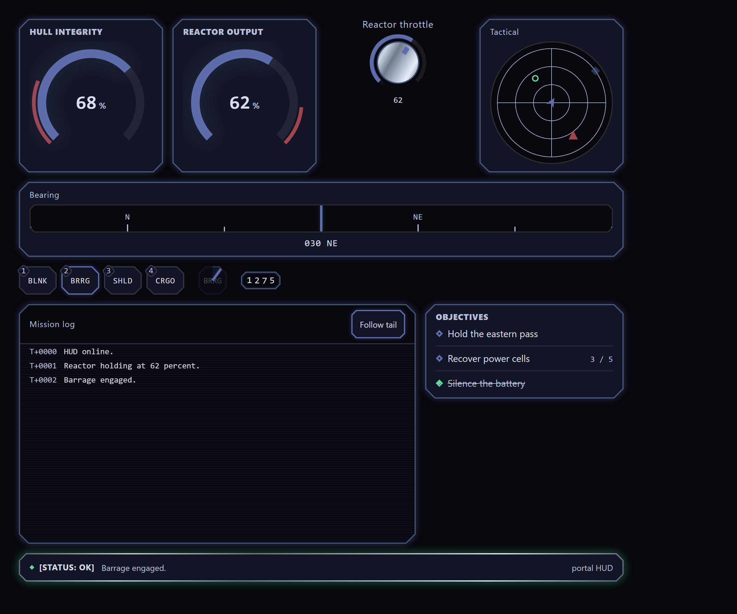
The Patterns/Game HUD story wires the HUD set together through real state:
hotbar presses arm the cooldown chip and append mission-log entries, the
rotary dial drives the reactor gauge into its redline, and the cargo key
opens an inventory-grid dialog whose moves are logged too.
Live, interactive Storybook (every control, the controller showcase with the R3F orb backdrop, and the Unity-binding example): https://lairdwt.github.io/portal/
Stack
- React and TypeScript.
- Vite in library mode.
- CSS Modules with CSS custom-property theming.
- Anime.js for UI motion.
- React Three Fiber and Drei for the optional 3D surface.
- Storybook, Playwright, and Vitest for review and testing.
Install
pnpm add @laird-wt/portalReact, React DOM, and Anime.js are required peer dependencies (React 18 or newer, Anime.js 4 or newer). Anime.js powers the motion presets exported from the package root, so it is required even if you do not use the 3D surface:
pnpm add react react-dom animejsThe shader core depends on three (it imports Color and the IUniform
type), so three is a required peer whenever you import either portal/shaders
or portal/r3f. The @react-three/fiber and @react-three/drei peers are
needed only for the portal/r3f surface:
pnpm add three
pnpm add @react-three/fiber @react-three/drei
Portal is ESM-only. Use a bundler (Vite, webpack, Rollup, esbuild) or Node with
ESM enabled, and a TypeScript moduleResolution of bundler, node16, or
nodenext so the exports subpaths (./theme, ./r3f, ./shaders) resolve.
Usage
Import components from the package root and load the stylesheet once at your
application entry point. The flagship RadialMenu in a few lines - an
octagonal action wheel that collapses to its own themed hub toggle (the
default inline form) with a cancel key in the middle:
import { type ReactElement, useState } from 'react';

import { ERadialAction, RadialMenu } from '@laird-wt/portal';
import '@laird-wt/portal/styles.css';

export function Example(): ReactElement {
    const [open, setOpen] = useState(false);
    return (
        <RadialMenu
            open={open}
            onOpen={() => setOpen(true)}
            onClose={() => setOpen(false)}
            label="Battle actions"
            sides={8}
            items={[
                { id: 'attack', label: 'Attack' },
                { id: 'defend', label: 'Defend' },
                { id: 'item', label: 'Item' },
                { id: 'magic', label: 'Magic' },
                { id: 'talk', label: 'Talk' },
                { id: 'flee', label: 'Flee' },
                { id: 'wait', label: 'Wait' },
                { id: 'scan', label: 'Scan' },
            ]}
            centerActions={[ERadialAction.Cancel]}
            onSelect={(id) => console.log('selected', id)}
        />
    );
}
The collapsed hub is the open/close toggle: it wears a drawn plus mark by
default, or pass toggleIcon / toggleText for a custom icon or short text
label. Set collapsible={false} for the portaled modal-overlay form driven
by your own trigger. The radial also pages: pass more items than sides plus
the ERadialAction.Previous / ERadialAction.Next center actions and the
wheel pages through them. Sections take an optional icon (with iconOnly
for pure glyph keys), and every mode honors the user's reduced-motion
preference.
The optional 3D surface lives behind a separate entry point. Mount it inside a
React Three Fiber <Canvas> (the 3D peers above must be installed):
import { Canvas } from '@react-three/fiber';

import { OrbBackdrop } from '@laird-wt/portal/r3f';

export function Backdrop(): ReactElement {
    return (
        <Canvas>
            <OrbBackdrop />
        </Canvas>
    );
}
Theming
Portal exposes design tokens as CSS custom properties namespaced with the
--portal- prefix. Override any token on a containing element or on
:root to retheme the components:
:root {
    --portal-color-accent: #3da9fc;
    --portal-radius-md: 0.75rem;
    --portal-touch-target-min: 3rem;
}
The theme entry point exports the token names (as var() references) for
programmatic use - for example to feed a React Three Fiber material the same
color the DOM uses:
import { PORTAL_TOKENS, type PortalTokens } from '@laird-wt/portal/theme';Sizing uses clamp, min, max, and intrinsic units rather than fixed
pixels or viewport-stretch units. Layout is safe-area aware through the
env(safe-area-inset-*) values, touch targets meet the 3rem minimum, and
motion respects the user prefers-reduced-motion setting.
Entry points
Portal ships several ESM subpath exports:
@laird-wt/portal- the component library and React hooks.@laird-wt/portal/styles.css- the stylesheet; import once at your entry.@laird-wt/portal/theme-PORTAL_TOKENSand thePortalTokenstype.@laird-wt/portal/r3f- the optional React Three Fiber surface (OrbBackdrop,ShaderSurface,isWebGlAvailable); requires the 3D peers.@laird-wt/portal/shaders- the shader core behind the R3F surface (rippleGridShader,createRippleField, and theShaderDescriptorcontract) for consumers wiring their own renderer. It needs only thethreepeer, not the full@react-three/fiber/@react-three/dreistack.
Input and Unity binding
Portal's input core is decoupled from React and from any game. A control
describes itself with an InputDescriptor (an opaque id, a value kind, and a
label) and emits an InputSignal carrying the value, the interaction, and a
timestamp. Controls share emit hooks so the wiring is uniform:
useDigitalPressanduseEmitBindingfor button-like inputs.useAxis2DControlfor absolute (joystick) and relative (thumbpad) pads.useScalarControlfor sliders.
Timestamps come from an injectable TimeProvider (default performance.now).
Override it through TimeProviderContext to make emission deterministic in
tests or to align the clock with a host application:
import { TimeProviderContext } from '@laird-wt/portal';

<TimeProviderContext.Provider value={() => engineClock.nowMs()}>
    <Controller />
</TimeProviderContext.Provider>;
Inputs are mapped to actions by a data-driven registry rather than hard-coded
in the controls. The registry is immutable; each mutator returns a new
registry, and a binding can be scoped to a named context (a profile such as
menu or gameplay) with a global fallback:
import { createRegistry } from '@laird-wt/portal';

const registry = createRegistry([
    { inputId: 'fire', actionId: 'weapon.primary' },
    { inputId: 'fire', actionId: 'ui.confirm', context: 'menu' },
]);

registry.resolve('fire').actionId; // 'weapon.primary'
registry.resolve('fire', 'menu').actionId; // 'ui.confirm'
const rebound = registry.rebind('fire', 'weapon.special');
At the Unity boundary, toWireInput narrows a signal to a serializable
FInputWirePayload (the descriptor collapsed to its id, plus the interaction,
value, and timestamp) and throws if a value does not match the descriptor's
declared kind. The Patterns/Unity Binding Storybook story wires a binding
profile, a custom TimeProvider, and the wire codec together.
Generic UI components
A domain-agnostic UI layer, separate from the game-input controllers above. It emits plain value and selection callbacks and never the input-signal contract, so it suits any React UI, not only game input. It spans, among others:
- Inputs and forms:
CTA,TextField,TextArea,SecretField,SearchBox,Select,Combobox,TagInput,Checkbox,RadioGroup,SegmentedControl,NumberStepper,RangeSlider,Rating,ColorPicker,Toggle,OtpField,Field(form scaffolding),Calendar,DatePicker,TimePicker,FileUpload. - Data and navigation:
List/SearchableList,DataTable,TreeView,Accordion,Tabs,Breadcrumb,Pagination,NavRail,Toolbar,Link,Menu/MenuBar/ContextMenu,CommandPalette,Wizard,RadialMenu(the flagship radial action wheel;RadialPadis its game-input sibling). - Surfaces and overlays:
Panel,ReadoutPanel,Section,Dialog,Drawer(with resize snap points),Popover,Tooltip,Toast,Window,SplitPane,Carousel,Lightbox,DockLayout(the docking manager: a serializable split/tab/floating layout over SplitPane, Tabs, and Window). - Display and feedback:
Text,Badge,Chip,StatPill,StatTile,KeyValue, theChartfamily (bars,Sparkline,LineChart),Progress,Spinner,Banner,Avatar,Skeleton,EmptyState,Marquee,Scanlines,StepTrack,Timeline,TitleBar,StatusFooter,SelectableTile. - Game HUD:
Gauge(radial arc meter with hub content, amount labelling, and shoulder bounds),Cooldown(unwinding ability scrim),LogConsole(virtualized scrollback with opt-in wrap, resizable time column, and a dockable fill mode),InventoryGrid(slot grid with keyboard grab/move, drag-reorder, and rectangular multi-cell item spans),Minimap(radar/map instrument with an optional sweep),Compass(heading strip),Reticle(decorative aiming glyph),FloatingText(combat-text layer),Odometer(rolling digit counter),DialogueBox(typewriter narrative line),ObjectiveTracker(quest list), plus the signal-emittingDial,Hotbar, andVirtualKeyboardon the game-input side. - Layout:
Stack,Grid,Divider.
See the live Storybook (linked above) for the full, current catalogue with interactive examples.
Colour comes from one opaque tone prop rather than a fixed palette. A
component sets --portal-tone from it and derives its accent, border, glow, and
fill, so a consumer maps any domain palette without per-component CSS:
import { SelectableTile, StatPill } from '@laird-wt/portal';

<SelectableTile id="ship-1" tone="var(--faction-crimson)" onSelect={select}>
    Frigate
</SelectableTile>;
<StatPill label="Energy" value={7} tone="oklch(0.7 0.16 150)" />;
With no tone, components use the neutral portal accent. An optional
SelectionProvider supplies an ambient selection sink so tiles are wired once
rather than per control.
Scripts
pnpm verifyruns typecheck, lint, CSS lint, format check, tests, and build.pnpm storybookstarts Storybook for component review.pnpm buildproduces the library bundle indist.pnpm probe:hudandpnpm probe:rtldrive the built Storybook in headless Chromium (the visual-verification probes; runpnpm build-storybookfirst - seescripts/probes/README.md).
Example app
A runnable Vite demo lives in example/. Run pnpm -C example dev to start it
locally (it renders ControlSurface with behavior fixtures selectable via a
?fixture= query), and pnpm example:typecheck to typecheck the demo against
the workspace package.