1.1.0 • Published 2 years ago
@mustapha-ghlissi/react-native-accordion v1.1.0
React Native Accordion
@mustapha-ghlissi/react-native-accordion: a Collapsible Sections for React Native.
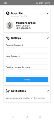
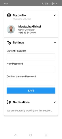
Screenshots


Demo

Example
You can check out this Example.
Installation
Installing the package
Use npm or yarn to install the package.
npm i @mustapha-ghlissi/react-native-accordionyarn add @mustapha-ghlissi/react-native-accordionInstalling dependencies
npm i react-native-reanimated react-native-vector-iconsyarn add react-native-reanimated react-native-vector-iconsNote: to finish the installation, you have to finish configuring the installed dependencies react-native-reanimated and react-native-vector-icons.
Usage
import {Accordion, AccordionItem} from '@mustapha-ghlissi/react-native-accordion';

<Accordion>
    <AccordionItem
        title="Section 1"
        subTitle="SubSection 1">
        {/* Put section body content here */}
    </AccordionItem>
    <AccordionItem title="Section 2">
        {/* Put section body content here */}
    </AccordionItem>
    <AccordionItem title="Section 3">
        {/* Put section body content here */}
    </AccordionItem>
</Accordion>
Common Props
Common Props has specific effects depends on the Component.
| Parameter | Type | Description |
|---|---|---|
| androidRipple | RippleConfig: optional | Define the ripple of the pressable when pressing in the Accordion Item. |
| leftIcon | string , ReactNode: optional | Accordion Item left icon. |
| titleStyle | TextStyle: optional | Accordion item title style. |
| subTitleStyle | TextStyle: optional | Accordion item sub-title style. |
| titleContainerStyle | ViewStyle: optional | Accordion item title container style. |
| headerStyle | ViewStyle: optional | Accordion item header style. |
| itemContainerStyle | ViewStyle: optional | Accordion item container style. |
| contentContainerStyle | ViewStyle: optional | Accordion item body style. |
| contentWrapperStyle | ViewStyle: optional | Accordion item body wrapper style. |
Accordion Props
All common Props can be used here in addition to the following Props:
| Parameter | Type | Description |
|---|---|---|
| containerStyle | ViewStyle: optional | Accordion container style. |
| animationDuration | number: optional | The duration of the collapse action |
| compact | boolean: optional | Define if the Accordion Items are compact or not. |
Accordion Item Props
All common Props can be used here in addition to the following Props:
| Parameter | Type | Description |
|---|---|---|
| title | string: required | Accordion item title. |
| subTitle | string: optional | Accordion item sub-title |
| header | ReactNode: optional | Custom accordion item header component. |
| rightIcon | string , ReactNode: optional | Accordion Item right icon (default = chevron-right). |
Advanced Usage
import {Accordion, AccordionItem} from '@mustapha-ghlissi/react-native-accordion';

const styles = StyleSheet.create({
    titleStyle: {
        fontSize: 16,
        fontWeight: 700,
    },
    contentContainerStyle: {
        paddingTop: 15,
        paddingBottom: 20
    }
});

<Accordion
    compact
    animationDuration={250}
    titleStyle={styles.titleStyle}
    contentContainerStyle={styles.contentContainerStyle}>
    <AccordionItem
        rightIcon='account'
        title="Section 1"
        subTitle="SubSection 1">
        {/* Put section body content here */}
    </AccordionItem>
    <AccordionItem
        rightIcon={<Icon name='cogs' size={26} color='#000' />}
        title="Section 2"
    >
        {/* Put section body content here */}
    </AccordionItem>
    <AccordionItem title="Section 3">
        {/* Put section body content here */}
    </AccordionItem>
</Accordion>
Donate
Donate with Wise by clicking this link or by scanning the following QRCode

Authors
Other libraries
- React Native OTP: One time password input for React Native.
- React Native Select Picker: Reanimated Dropdown Select for React Native.


