@nkbt/react-collapse v5.0.0-alpha.3
react-collapse 
Component-wrapper for collapse animation for elements with variable (and dynamic) height

Installation
NPM
npm install --save react-collapse1998 Script Tag:
<script src="https://unpkg.com/react/umd/react.production.min.js"></script>
<script src="https://unpkg.com/react-collapse/build/react-collapse.min.js"></script>
(Module exposed as `ReactCollapse`)
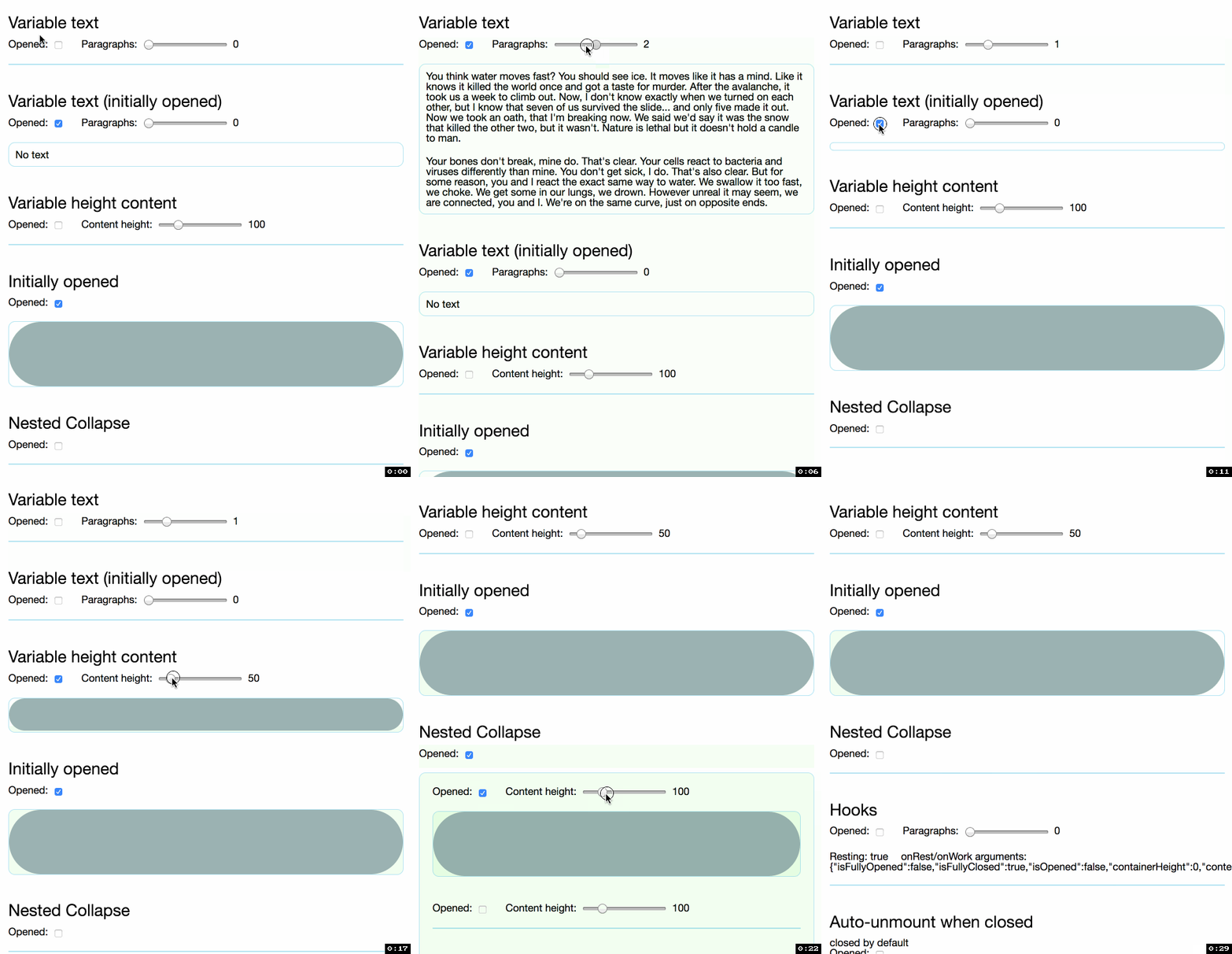
Demo
http://nkbt.github.io/react-collapse
Codepen demo
http://codepen.io/nkbt/pen/MarzEg
Usage
Default behaviour, never unmounts content
import {Collapse} from 'react-collapse';

// ...
<Collapse isOpened={true || false}>
  <div>Random content</div>
</Collapse>
If you want to unmount collapsed content, use Unmount component provided as:
import {UnmountClosed} from 'react-collapse';

// ...
<UnmountClosed isOpened={true || false}>
  <div>Random content</div>
</UnmountClosed>
Options
isOpened: PropTypes.boolean.isRequired
Expands or collapses content.
children: PropTypes.node.isRequired
One or multiple children with static, variable or dynamic height.
<Collapse isOpened={true}>
  <p>Paragraph of text</p>
  <p>Another paragraph is also OK</p>
  <p>Images and any other content are ok too</p>
  <img src="nyancat.gif" />
</Collapse>hasNestedCollapse: PropTypes.bool (default: false)
If Collapse component has more Collapse components inside, it needs hasNestedCollapse to be set
to avoid delayed animations. See https://github.com/nkbt/react-collapse/issues/76 for tech details.
<Collapse isOpened={true} hasNestedCollapse={true}>
  <Collapse isOpened={true}>
    <div>Nested collapse</div>
  </Collapse>
  <Collapse isOpened={true}>
    <div>Nested collapse</div>
  </Collapse>
</Collapse>fixedHeight: PropTypes.number
If content's height is known ahead it is possible pass optional fixedHeight prop with number of pixels.
<Collapse isOpened={true} fixedHeight={100}>
  <div>Animated container will always expand to 100px height</div>
</Collapse>springConfig: PropTypes.objectOf(PropTypes.number)
Custom config {stiffness, damping, precision} passed to the spring function (see https://github.com/chenglou/react-motion#--spring-val-number-config-springhelperconfig--opaqueconfig)
import {presets} from 'react-motion';

<Collapse isOpened={true} springConfig={presets.wobbly}>
  <div>Wobbly animated container</div>
</Collapse>
<Collapse isOpened={true} springConfig={{stiffness: 100, damping: 20}}>
<div>Customly animated container</div>
</Collapse>forceInitialAnimation: PropTypes.boolean
When initially opened, by default collapse content will be opened without animation, instantly. With this option set to true you can enforce initial rendering to be smoothly expanded from 0.
It is used internally in Unmount component implementation.
theme: PropTypes.objectOf(PropTypes.string)
It is possible to set className for extra div elements that ReactCollapse creates.
Example:
<Collapse theme={{collapse: 'foo', content: 'bar'}}>
  <div>Customly animated container</div>
</Collapse>
Default values:
const theme = {
  collapse: 'ReactCollapse--collapse',
  content: 'ReactCollapse--content'
}
Which ends up in the following markup:
<div class="ReactCollapse--collapse">
  <div class="ReactCollapse--content">
    {children}
  </div>
</div>
NOTE: these are not style objects, but class names!
onRest: PropTypes.func
Callback function for animation finished from react-motion. It can be used to trigger any function after animation is done.
<Collapse onRest={() => console.log(123)}>
  <div>Container text</div>
</Collapse>onMeasure: PropTypes.func
Callback function for changes in height. Also passes measured width. As an example it can be used to implement auto-scroll if content expand below the fold.
<Collapse onMeasure={({height, width}) => this.setState({height, width})}>
  <div>Container text</div>
</Collapse>onRender: PropTypes.func
Callback function for every re-render while animating.
Passes current height, as well as from/to heights.
DANGEROUS use with caution, may have huge performance impact if used improperly. Never do setState with it, since it is running while rendering and React will shoot Warning.
Possible usage: synchronous scrolling of some other component
<Collapse onRender={({current, from, to}) => (this.anotherComponent.scrollTop = current)}>
  <div>Container text</div>
</Collapse>
Pass-through props
All other props are applied to a container that is being resized. So it is possible to pass style or className, for example.
<Collapse isOpened={true}
  style={{width: 200, border: '1px solid red'}}
  className="collapse">

  <div>
    Animated container has red border, 200px width
    and has `class="collapse"`
  </div>
</Collapse>
Behaviour notes
- initially opened Collapse elements will be statically rendered with no animation (see #19)
- it is possible to override
overflowandheightstyles for Collapse (see #16), and ReactCollapse may behave unexpectedly. Do it only when you definitely know you need it, otherwise, never overrideoverflowandheightstyles. - Due to the complexity of margins and their potentially collapsible nature, ReactCollapse does not support (vertical) margins on their children. It might lead to the animation "jumping" to its correct height at the end of expanding. To avoid this, use padding instead of margin. (see #101)
Migrating from v2 to v3
Use named exports, it is a preferred way
V2:
import Collapse from 'react-collapse';V3
import {Collapse} from 'react-collapse';Default behavior changed to never unmount collapsed element. To actually unmount use extra provided component
UnmountCollapsedV2:
import Collapse from 'react-collapse';

<Collapse isOpened={true || false}>
  <div>Random content</div>
</Collapse>
V3:
import {UnmountClosed as Collapse} from 'react-collapse'; <Collapse isOpened={true || false}> <div>Random content</div> </Collapse>onHeightReadyrenamed toonMeasurewhich now takes object of shape{width, height}V2:
<Collapse onHeightReady={height => console.log(height)}>
  <div>Random content</div>
</Collapse>
V3:
<Collapse onMeasure={({height, width}) => console.log(height, width)}>
  <div>Random content</div>
</Collapse>
Some new props/features:
hasNestedCollapse,forceInitialAnimation,onRender, etc
Development and testing
Currently is being developed and tested with the latest stable Node on OSX.
To run example covering all ReactCollapse features, use yarn start, which will compile example/Example.js
git clone git@github.com:nkbt/react-collapse.git
cd react-collapse
yarn install
yarn start

# then
open http://localhost:8080
Tests
# to run ESLint check
yarn lint

# to run tests
yarn test
License
MIT


