@procore/storybook-addon v4.4.2
STORYBOOK-ADDON
An addon to customize procore theme and adds common used configuration.
Installation
yarn add -D @procore/storybook-addonAnd add the addon to you addon sets:
module.exports = {
  addons: ['@procore/storybook-addon'],
};
This simple addon adds 3 main addon used across different apps at Procore.
Usage
- $\textit{Prcore Logo:}$

- a hower text ${\text{\color{green}{Core}}}$
- the link to core design system https://design.procore.com on the logo.
In order to set the theme by default values ${\text{\color{green}{createProcoreTheme}}}$ needs to be added in manager.js. If no parameter has been passed to the createProcoreTheme the aforementioned default values will be set.
// .storybook/manager.js
import { createProcoreTheme } from '@procore/storybook-addon';
import { addons } from '@storybook/manager-api';

addons.setConfig({
  theme: createProcoreTheme(),
});
For more configuration please visit: https://storybook.js.org/docs/react/configure/theming
// .storybook/manager.js
// example below will override Procore default theming configuration
import { createProcoreTheme } from '@procore/storybook-addon';
import { addons } from '@storybook/manager-api';

addons.setConfig({
  theme: createProcoreTheme({
    base: 'light',
    brandTitle: 'My custom storybook',
    brandUrl: 'https://example.com',
    brandImage: 'https://place-hold.it/350x150',
    brandTarget: '_self',
  }),
});
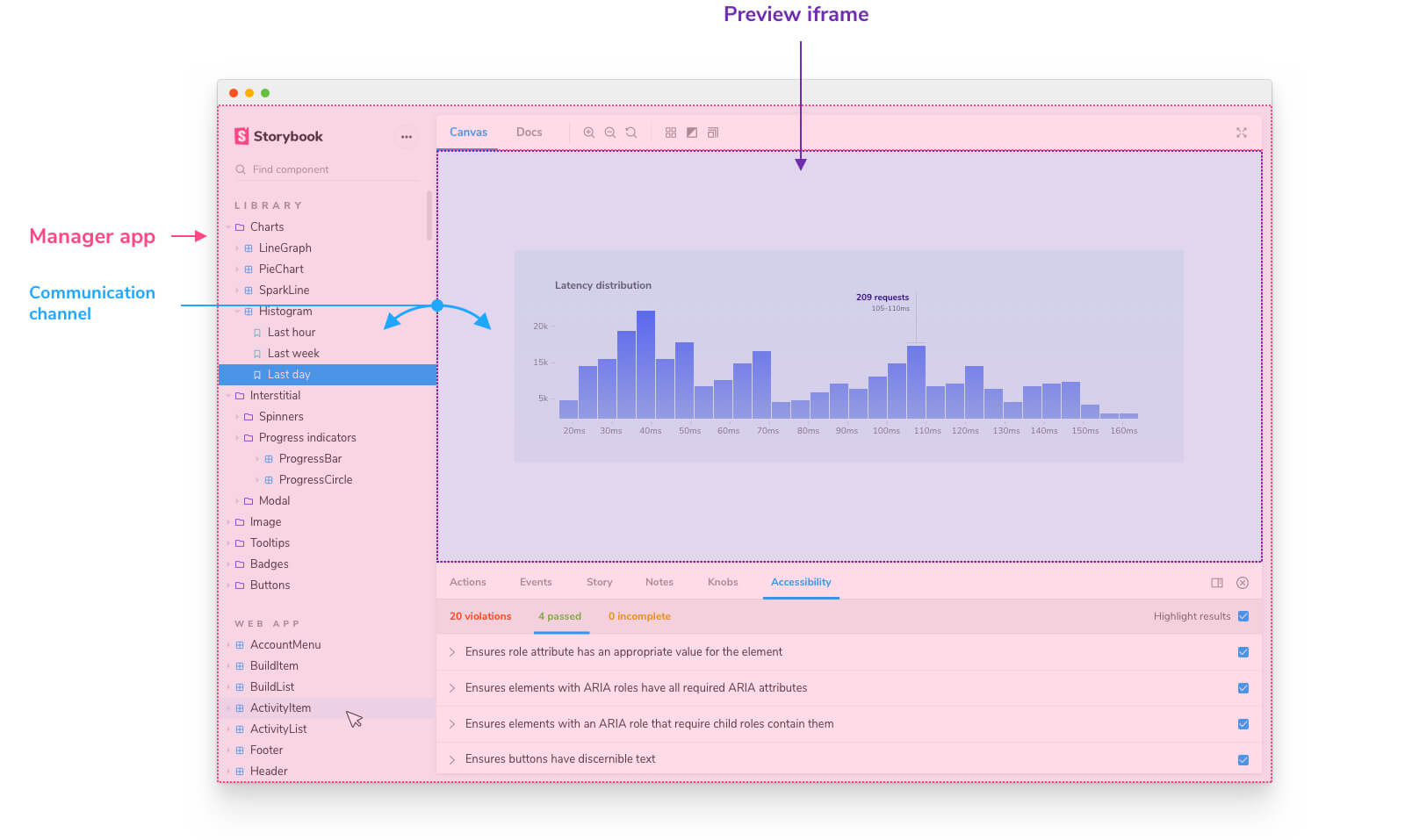
There are some default configurations added to the previewHead such as adding ${\text{\color{green}{Inter}}}$ font and some default styling (box-sizing) in the Preview area in storybook iframe where the stories are rendered.

if there is more needs to be added into preview iFrame Head section, then please refer to: https://storybook.js.org/docs/react/addons/writing-presets#previewmanager-templates.
import { request } from '@procore/core-http';

function ExampleRequest() {
  request('/some-url-here', { baseUrl: 'https://www.example.com' })
    .then((response) => console.log(response))
    .catch((err) => console.error(err));
}
this library by default supports: '.ts', '.tsx', '.js', '.jsx', '.css' extensions and adds css-loader as a rule to config module.
To enable .scss support - install sass module. Addon checks if sass is present in node_modules.
This library also adds basic ${\text{\color{green}{Typescript}}}$ configs.
Please refer to Storybook Docs to override or add more configurations.
Testing
This addon should be tested by running storybook in example-apps/react-ts and example-apps/react-core-scripts apps.