@storybook/addon-styling v1.3.7
@storybook/addon-styling
Get started in Storybook faster with popular styling tools.

✨ Features
- 🧩 Configuration templates for popular tools
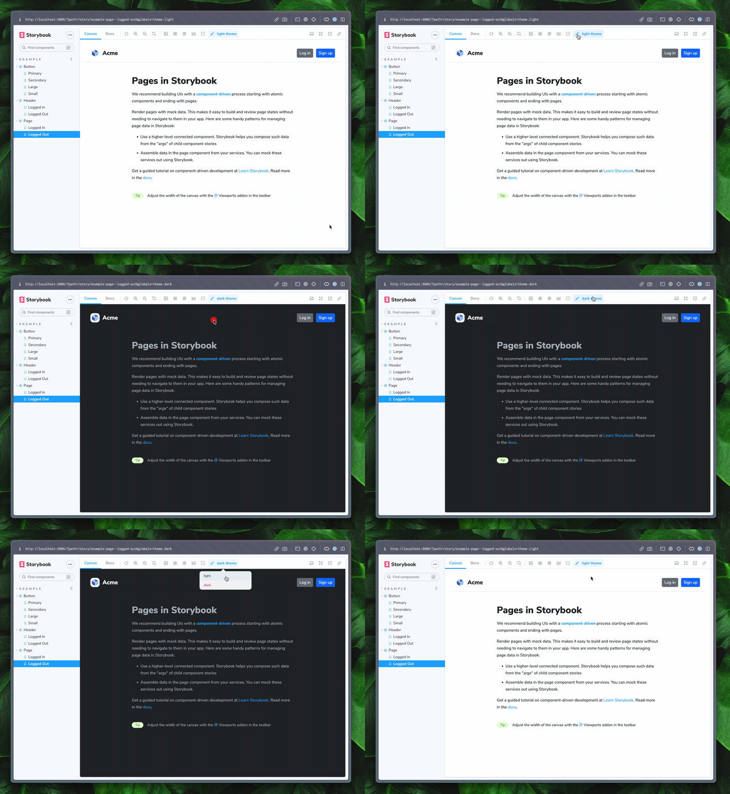
- 🎨 Provide themes
- 🔄 Toggle between multiple themes when more than one is provided
- ❗️ Override theme at the component and story level through parameters
🏁 Getting Started
To get started, install the package as a dev dependency
yarn:
yarn add -D @storybook/addon-stylingnpm:
npm install -D @storybook/addon-stylingpnpm:
pnpm add -D @storybook/addon-stylingThen, include the addon in your .storybook/main.js file
module.exports = {
  stories: [
    "../stories/**/*.stories.mdx",
    "../stories/**/*.stories.@(js|jsx|ts|tsx)",
  ],
  addons: [
    "@storybook/addon-essentials",
+   "@storybook/addon-style-config"
  ],
};
👇 Tool specific configuration
For tool-specific setup, check out the recipes below
Don't see your favorite tool listed? Don't worry! That doesn't mean this addon isn't for you. Check out the "Writing a custom decorator" section of the api reference.
❗️ Overriding theme
If you want to override your theme for a particular component or story, you can use the theming.themeOverride parameter.
import React from "react";
import { Button } from "./Button";

export default {
  title: "Example/Button",
  component: Button,
  parameters: {
    theming: {
      themeOverride: "light", // component level override
    },
  },
};

const Template = (args) => <Button {...args} />;

export const Primary = Template.bind({});
Primary.args = {
  primary: true,
  label: "Button",
};

export const PrimaryDark = Template.bind({});
PrimaryDark.args = {
  primary: true,
  label: "Button",
};
PrimaryDark.parameters = {
  theming: {
    themeOverride: "dark", // Story level override
  },
};
🤝 Contributing
If you'd like to contribute to this addon, THANK YOU, I'd love your help 🙏
📝 Development scripts
yarn startruns babel in watch mode and starts Storybookyarn buildbuild and package your addon code
3 years ago
3 years ago
3 years ago
3 years ago
3 years ago
3 years ago
3 years ago
3 years ago
3 years ago
3 years ago
3 years ago
3 years ago
3 years ago
3 years ago
3 years ago
3 years ago
3 years ago
3 years ago
3 years ago
3 years ago
3 years ago
3 years ago
3 years ago
3 years ago
3 years ago
3 years ago
3 years ago
3 years ago
3 years ago
3 years ago
3 years ago
3 years ago
3 years ago
3 years ago
3 years ago
3 years ago
3 years ago
3 years ago
3 years ago
3 years ago
3 years ago
3 years ago
3 years ago
3 years ago
3 years ago
3 years ago
3 years ago
3 years ago
3 years ago
3 years ago
3 years ago
3 years ago
3 years ago
3 years ago
3 years ago
3 years ago
3 years ago
3 years ago
3 years ago
3 years ago
3 years ago
3 years ago
3 years ago
3 years ago
3 years ago
3 years ago
3 years ago
3 years ago
3 years ago
3 years ago
3 years ago
3 years ago
3 years ago
3 years ago
3 years ago
3 years ago
3 years ago
3 years ago
3 years ago
3 years ago
3 years ago
3 years ago
3 years ago
3 years ago
3 years ago
3 years ago
3 years ago
3 years ago
3 years ago
3 years ago
3 years ago
3 years ago
3 years ago
3 years ago
3 years ago
3 years ago
3 years ago
3 years ago
3 years ago
3 years ago
3 years ago
3 years ago
3 years ago
3 years ago
3 years ago
3 years ago
3 years ago
3 years ago
3 years ago
3 years ago
3 years ago
3 years ago
3 years ago
3 years ago
3 years ago
3 years ago
3 years ago
3 years ago
3 years ago
3 years ago
3 years ago
3 years ago
3 years ago
3 years ago
3 years ago
3 years ago
3 years ago
3 years ago
3 years ago
3 years ago