


SVAR Svelte Core library offers 30+ lightweight, fast-performing Svelte UI components with TypeScript support. Beautifully designed light and dark themes are included and fully customizable via CSS variables. A straightforward API and comprehensive documentation make it easy to start building feature-rich Svelte interfaces faster.
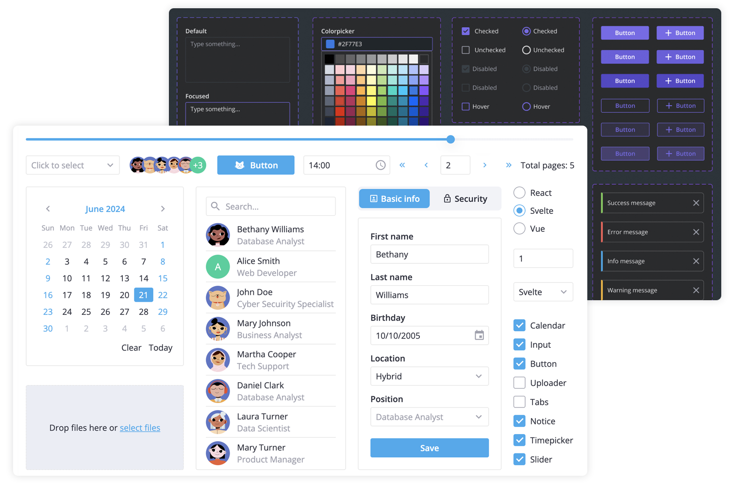
SVAR Svelte Core library includes the following components:
- buttons & form controls,
- calendar (datepicker),
- popups, tooltips,
- notifications,
- sliding sidebar,
- tabs, and more.
Additionally, you can use these SVAR Svelte components to build unified app interfaces:
Svelte 4 and Svelte 5 versions
There are two versions of the library: the 1.x version - designed to work with Svelte 4, and the 2.x version - created for Svelte 5.
To use the SVAR Core for Svelte 5, install it as follows:
npm install @svar-ui/svelte-coreTo use the SVAR Core for Svelte 4:
npm install wx-svelte-core@1.3.0How to Use
To use any of the Core components, simply import the package and include the desired component in your Svelte file:
<script>
	import { Button } from "@svar-ui/svelte-core";
</script>

<Button>Click me</Button>
See the getting started guide to quickly set up and begin using SVAR Core components in your Svelte projects.
How to Modify
Typically, you don't need to modify the code. However, if you wish to do so, follow these steps:
- Run
yarnto install dependencies. Note that this project is a monorepo usingyarnworkspaces, so npm will not work - Start the project in development mode with
yarn start
Run Tests
To run the test:
- Start the test examples with:
yarn start:tests - In a separate console, run the end-to-end tests with:
yarn test:cypress
Need Help?
Join our community forum to get help or submit feature requests.