
React Kanban Component
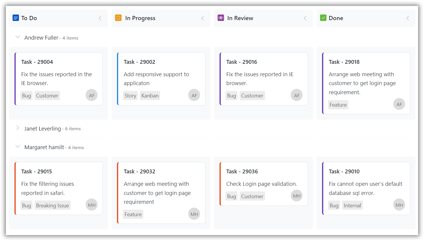
The React Kanban component is a popular tool for visualizing and managing work in a variety of contexts, including software development, project management, and personal productivity. The control supports necessary features to design task scheduling applications. The key features are swimlanes, customizable cards, binding from local and remote data sources, columns mapping, stacked headers, WIP validation, templating, responsiveness, filtering, and editing.
Getting started . Online demos . Learn more
Trusted by the world's leading companies

Using this package with an AI coding agent
Before generating Syncfusion code, ask your AI coding agent to run the Syncfusion setup using the following prompt:
Set up this project for Syncfusion before generating code. Fetch and follow the official instructions at https://ai.syncfusion.com/agent-setup/prompt.md, then report the detected platform, installed skill pack, MCP status, and any required licensing action.The setup detects your project’s platform and loads the appropriate Syncfusion skill pack. No Syncfusion account or MCP key is required to install or read Syncfusion agent skills.
Platform reference: https://ai.syncfusion.com/react/llms.txt
Setup
Create a React Application
You can use Vite to set up a modern React application. To create a React TypeScript app, use the following command.
npm create vite@latest my-app -- --template react-ts
cd my-app
npm install
npm run dev
Adding Syncfusion Kanban and Theme Packages
All Syncfusion react packages are published in the npmjs.com registry. To install the React Kanban package and the Tailwind 3 theme package, use the following commands.
npm install @syncfusion/ej2-react-kanban
npm install @syncfusion/ej2-tailwind3-theme
Adding CSS references for Kanban
Add CSS references needed for Kanban in src/App.css from ../node_modules/@syncfusion package folder.
@import "../node_modules/@syncfusion/ej2-tailwind3-theme/styles/kanban/index.css";Add Kanban Component
In src/App.tsx file, use the following code snippet to render the Syncfusion React Kanban control and import App.css to apply styles to the kanban:
import { KanbanComponent, ColumnsDirective, ColumnDirective } from "@syncfusion/ej2-react-kanban";
import * as React from 'react';
import './App.css';

function App() {
    let data = [
        { Id: 1, Status: 'Open', Summary: 'Analyze the new requirements gathered from the customer.', Type: 'Story', Priority: 'Low', Tags: 'Analyze,Customer', Estimate: 3.5, Assignee: 'Nancy Davloio', RankId: 1 },
        { Id: 2, Status: 'InProgress', Summary: 'Fix the issues reported in the IE browser.', Type: 'Bug', Priority: 'Release Breaker', Tags: 'IE', Estimate: 2.5, Assignee: 'Janet Leverling', RankId: 2  },
        { Id: 3, Status: 'Testing', Summary: 'Fix the issues reported by the customer.', Type: 'Bug', Priority: 'Low', Tags: 'Customer', Estimate: '3.5', Assignee: 'Steven walker', RankId: 1 },
        { Id: 4, Status: 'Close', Summary: 'Arrange a web meeting with the customer to get the login page requirements.', Type: 'Others', Priority: 'Low', Tags: 'Meeting', Estimate: 2, Assignee: 'Michael Suyama', RankId: 1 },
        { Id: 5, Status: 'Validate', Summary: 'Validate new requirements', Type: 'Improvement', Priority: 'Low', Tags: 'Validation', Estimate: 1.5, Assignee: 'Robert King', RankId: 1 }
    ];
    return (
            <div className="App">
                <KanbanComponent id="kanban" keyField="Status" dataSource={data} cardSettings={{ contentField: "Summary", headerField: "Id" }}>
                    <ColumnsDirective>
                    <ColumnDirective headerText="To Do" keyField="Open"/>
                    <ColumnDirective headerText="In Progress" keyField="InProgress"/>
                    <ColumnDirective headerText="Testing" keyField="Testing"/>
                    <ColumnDirective headerText="Done" keyField="Close"/>
                    </ColumnsDirective>
                </KanbanComponent>
            </div>
          );
};
export default App;
Supported frameworks
The Kanban control is also available in the following list of frameworks.
 JavaScript |
 Angular |
 Vue |
 ASP.NET Core |
 ASP.NET MVC |
|---|
Showcase samples
Key features
- Data binding - Seamless data binding refers to the process of linking the data displayed on a Kanban board with a variety of data sources, such as array of JSON objects or DataManager.
- Swimlane - Swimlanes are typically represented as rows within the board, with each row containing its own set of columns and cards. The rows can be expanded and collapsed as needed to show or hide the contained cards, which can be useful for reducing clutter and focusing on specific areas of work.
- Toggle columns - To expand and collapse the columns as needed in order to focus on specific areas of work or reduce clutter on the board.
- WIP validation - Work-in-progress (WIP) validation is a common practice in Kanban boards, and it involves setting limits on the number of tasks or cards that can be in progress at any given time. This helps to prevent overloading team members and ensures that work is being completed in a timely and efficient manner.
- Dialog editing - Dialog editing support refers to the ability to perform create, read, update, and delete (CRUD) actions on the cards using dialog box. This can be useful for allowing users to quickly and easily add new tasks or make changes to existing ones without having to navigate away from the Kanban board.
- Drag and drop - Cards can be easily dragged and dropped from one column to another, as well as from one swimlane to another, in order to indicate progress and changes in status. This can be a convenient and intuitive way for users to manage their work and collaborate with team members.
- Stacked headers - To add additional column headers in a stacked manner, which can be useful for displaying additional information or for organizing the columns in a more visually appealing way.
- Card tooltip - To display the information for a card using a tooltip template, which can be a convenient way for users to view and interact with the data without having to open a separate dialog or window.
- Templates - Templates to customize the appearance and behavior of the key elements, such as cards, column headers, swimlanes, and tooltips. This can be useful for embedding any kind of HTML element or CSS style, and for creating a more personalized and interactive user experience.
- Responsive rendering - A Kanban board can be designed to adapt to different form-factors, such as mobile and desktop, in order to provide an optimal user experience across different devices and screen sizes.
- Localization support - To localize the static text content to any desired language in order to make the control more accessible and user-friendly for international users.
- RTL support - To display the control contents from right to left (RTL) in order to support languages that are written in this direction, such as Arabic or Hebrew.
Resources
Support
Product support is available through the following mediums.
- Support ticket - Guaranteed Response in 24 hours | Unlimited tickets | Holiday support
- Community forum
- GitHub issues
- Request feature or report bug
- Live chat
Changelog
Check the changelog here. Get minor improvements and bug fixes every week to stay up to date with frequent updates.
License and copyright
This is a commercial product and requires a paid license for possession or use. Syncfusion licensed software, including this component, is subject to the terms and conditions of Syncfusion EULA. To acquire a license for 150+ React UI components, you can purchase or start a free 30-day trial.
A free community license is also available for companies and individuals whose organizations have less than $1 million USD in annual gross revenue and five or fewer developers.
See LICENSE FILE for more info.
Copyright 2026 Syncfusion Inc. All Rights Reserved. The Syncfusion Essential Studio license and copyright applies to this distribution.