1.1.3 • Published 9 years ago
animated-material-button v1.1.3
Animated-material-floatbutton
A floating round material button that has animations between states.
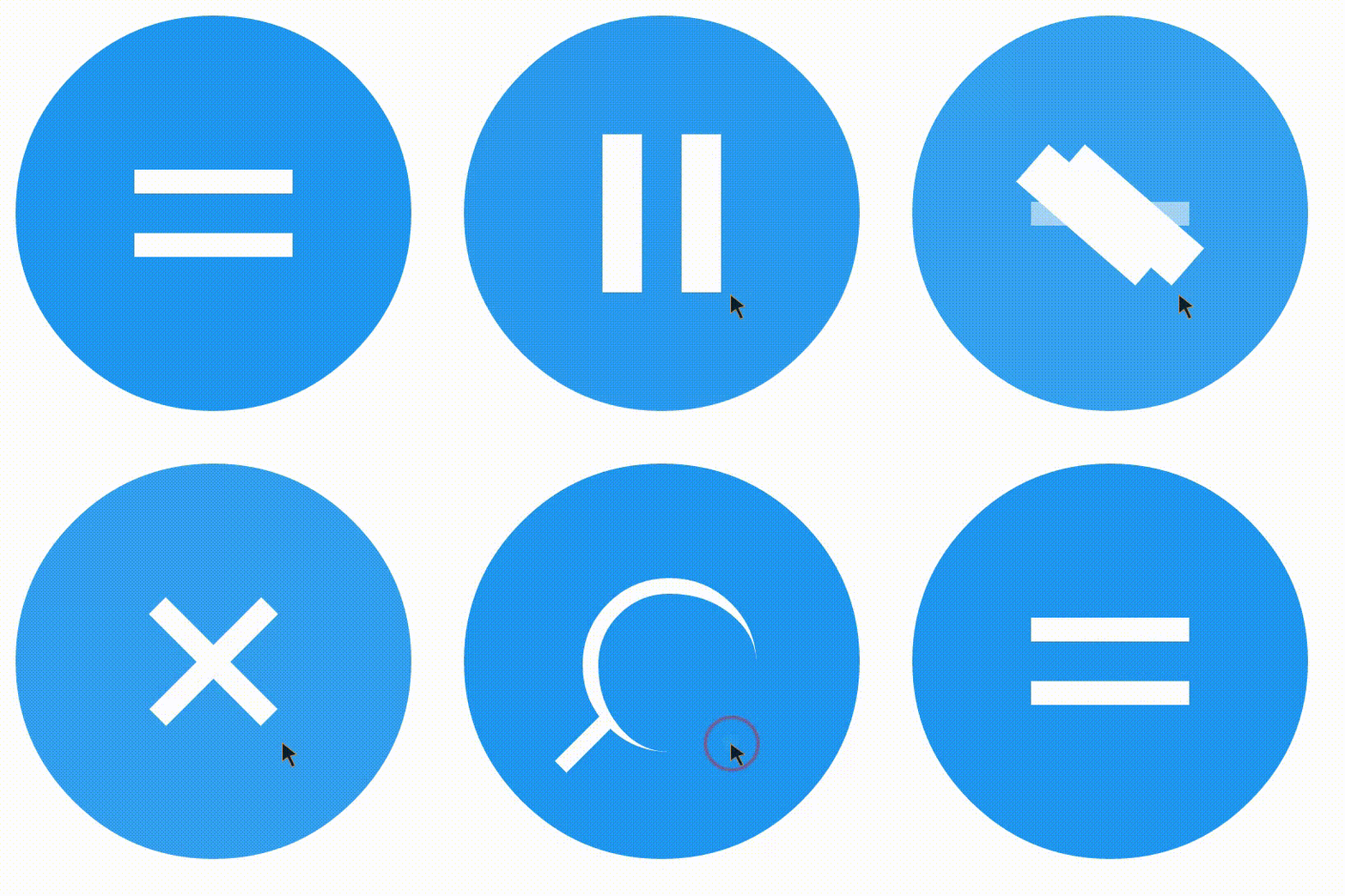
Screenshot animation

Demo
States
Currently the following icons/states are supported:
- equals
- check
- min
- cross
- close
- hamburger
- search
- stop
- play
- pause
- arrow-down
- arrow-right
- arrow-left
- arrow-up
Usage
Either download/clone this repo or install it with yarn/npm or bower:
yarn add animated-material-floatbutton
npm i animated-material-floatbutton -S
bower install animated-material-floatbutton
Simply use the following snippet:
<div class="animated-material-fab">
    <div class="icon-holder equals">
        <div class="icon-bar bar1"></div>
        <div class="icon-bar bar2"></div>
        <div class="icon-bar bar3"></div>
    </div>
</div>
For a example check the example dir.
Change the class equals to any class you want to use (see States)
Ripple
This lib plays pretty nice with a ripple effect library I made. Which is available here See the example dir for a example on how to combine these.
Issues
- Play and pause button are a bit funky. Need to find a way to display them without border attributes.
- Changing the scale in Chrome first changes the icon-container (blue circle) and the icon after that.