auth-em-form v1.0.2
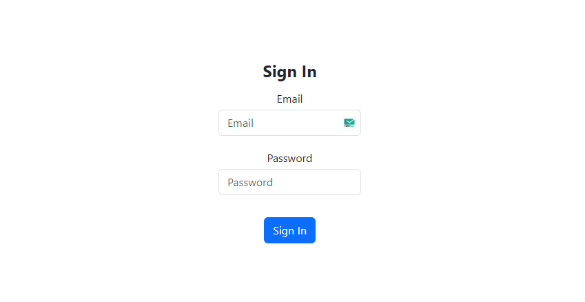
Auth Form

Auth-Em-Form

Overview
The AuthForm component is a versatile and reusable React component with support for other frameworks designed to streamline the implementation of authentication forms within web applications. It provides a robust foundation for both sign-in and sign-up actions, offering customization options for form fields, validation, and integration with social login providers.
Features
- Customizable Form Fields: Define form fields with various configurations such as label, type, and required status.
- Validation Support: Built-in support for form validation using Yup schema validation.
- Password Encryption: Option to encrypt passwords using bcrypt for enhanced security.
- Social Login Integration: Seamlessly integrate social login functionality with configurable options.
- Integrated Components: Flexibility to integrate additional components within the authentication form.
- Error Handling: Comprehensive error handling for form submissions and validation errors.
Installation
To install the AuthForm component in your React project, use npm:
npm install auth-em-form
OR
yarn add auth-em-form
OR
pnpm add auth-em-form
Usage
import AuthForm from 'auth-em-form';

const handleFormSubmit = (formData, action) => {
  // Handle form submission
};

const MyComponent = () => {
  return (
    <AuthForm
      headingText="Authentication"
      action="signIn"
      onSubmit={handleFormSubmit}
      // Add additional props as needed
    />
  );
};

export default MyComponent;
Props
- headingText: (string) The heading text displayed on the authentication form.
- action: (string) The action type of the form, either
"signIn"or"signUp". - fields: (array of objects) An array of field configurations defining the form fields.
- onSubmit: (function) Callback function invoked when the form is submitted.
- customStyles: (object) Custom styles to apply to form elements.
- validation: (boolean) Enable or disable form validation.
- validationErrors: (object) Object containing validation errors for form fields.
- submitIcon: (element) Icon component to display next to the submit button.
- submitIconPosition: (string) Position of the submit icon, either
"left"or"right". - encryptPassword: (boolean) Boolean indicating whether to encrypt passwords using bcrypt.
- saltRounds: (number) Number of salt rounds used for password encryption.
- customValidationSchema: (function) Custom Yup validation schema for form fields.
- socialLoginEnabled: (boolean) Enable or disable social login integration.
- socialLoginPosition: (string) Position of social login buttons, either
"top"or"bottom". - socialLoginStyles: (object) Custom styles to apply to social login buttons.
- socialLoginProviders: (array of objects or strings) Array of social login provider configurations or provider names.
- socialButtonOptions: (object) Options for social login buttons.
- onSocialLogin: (function) Callback function invoked when a social login provider button is clicked.
- integratedComponents: (array of objects) Integrated components to include in the form.
Benefits
- Saves Development Time: Eliminates the need to build authentication forms from scratch, saving development time and effort.
- Flexible Customization: Offers extensive customization options for form fields, validation, and integration, catering to diverse project requirements.
- Enhanced Security: Supports password encryption using bcrypt, ensuring robust security measures for user data.
- Seamless Integration: Easily integrates with existing React projects, allowing for seamless implementation of authentication functionality.
Future Features
- Multi-step Authentication: Implement support for multi-step authentication processes.
- Additional Social Login Providers: Expand social login integration to include more third-party providers.
- Enhanced Error Handling: Improve error handling capabilities for better user experience.
- Localization Support: Introduce support for multi-language localization in authentication forms.
Social Login Buttons Component
Overview
The SocialLoginButtons component is a React component designed to render social login buttons for various providers. It allows users to authenticate using different social media platforms.
Props
- socialLoginProviders: (array of objects or strings) An array of social login provider configurations or provider names.
- onSocialLogin: (function) Callback function invoked when a social login provider button is clicked.
- socialLoginStyles: (object) Custom styles to apply to the container of social login buttons.
- socialButtonOptions: (object) Options for the social login buttons, such as button styles.
Usage
import SocialLoginButtons from 'auth-em-form/social';

const MyComponent = () => {
  const handleSocialLogin = (provider) => {
    // Handle social login with the selected provider
  };

  return (
    <SocialLoginButtons
      socialLoginProviders={['Google', 'Facebook']}
      onSocialLogin={handleSocialLogin}
      socialLoginStyles={{ backgroundColor: 'lightgray' }}
      socialButtonOptions={{ size: 'lg' }}
    />
  );
};

export default MyComponent;
Supported Social Login Providers
- The
socialLoginProvidersprop accepts an array of strings representing the names of supported social login providers (e.g.,"Google","Facebook").
Customization
- You can customize the appearance of social login buttons using the
socialLoginStylesprop to apply custom styles to the container of social login buttons. - Additionally, the
socialButtonOptionsprop allows for further customization of individual social login buttons using React Bootstrap'sButtonProps.
Possible Supported Frameworks
Next.js: Next.js is a React framework for building server-side rendered (SSR) or statically generated (SSG) web applications. The
AuthFormcomponent can be directly used within Next.js applications without significant modifications, making it suitable for handling authentication forms in Next.js projects.Gatsby: Gatsby is a React-based framework for building static websites and web applications. Similar to Next.js, the
AuthFormcomponent can be seamlessly integrated into Gatsby projects as a standard React component for authentication forms.Create React App (CRA): Create React App is a tool developed by Facebook to quickly set up new React projects. The
AuthFormcomponent can be easily included in projects created with CRA without any additional configurations, providing a straightforward solution for managing authentication forms in CRA-generated projects.React Native: React Native is a framework for building native mobile applications using React. While primarily designed for mobile app development, React Native also supports web development via libraries like React Native Web. If you're using React Native for web development (React Native Web), you can adapt the
AuthFormcomponent for use in React Native web projects by incorporating it into your React Native Web application codebase.Remix: Remix is a full-stack React framework that emphasizes server-rendered React applications. Remix integrates seamlessly with React, allowing React components like the
AuthFormcomponent to be used within Remix applications without significant modifications. TheAuthFormcomponent can be seamlessly integrated into Remix applications for handling authentication forms.RedwoodJS: RedwoodJS is a full-stack JavaScript framework built on React, GraphQL, and Prisma. The
AuthFormcomponent can be integrated into RedwoodJS projects for managing authentication forms, leveraging React's component-based architecture within the RedwoodJS framework.Blitz.js: Blitz.js is a full-stack React framework that aims to make building full-stack React apps easy and scalable. With Blitz.js, the
AuthFormcomponent can be utilized for authentication-related functionalities within Blitz.js applications, taking advantage of React's capabilities for building user interfaces.After.js: After.js is a Next.js-like framework built with React Router. It enables server-rendered React applications with client-side hydration. The
AuthFormcomponent can be integrated into After.js applications for managing authentication forms, leveraging React's component-based approach within After.js projects.Razzle: Razzle is a tool for building server-rendered universal JavaScript applications with React. The
AuthFormcomponent can be seamlessly incorporated into Razzle projects for handling authentication forms, utilizing React's capabilities for building dynamic user interfaces.Neutrino: Neutrino is a toolkit for building JavaScript applications with minimal configuration. The
AuthFormcomponent can be integrated into Neutrino projects for managing authentication forms, leveraging React's component-based architecture within Neutrino applications.
These React-based frameworks and platforms provide different approaches to building web applications, and the AuthForm component can be seamlessly integrated into them to handle authentication forms with minimal effort.
Creator
AuthForm component is created and maintained by Ethern Myth. Feel free to reach out with any questions or feedback!
License
This project is licensed under the MIT License - see the LICENSE file for details.