

Cogo Toast
Beautiful, Zero Configuration, Toast Messages for React ~4kb gzip (with styles and icons)
https://cogoport.github.io/cogo-toast/







Install via NPM:
npm install --save cogo-toastInstall via Yarn:
yarn add cogo-toastNote:
The latest version ^3.0.0 makes the use of React Hooks internally.
To use this package in projects that don't support hooks, use v2.0.1 instead.
yarn add cogo-toast@2.0.1Usage
Its Plug and Play. No configuration required. Just import and you are good to go.
import cogoToast from 'cogo-toast';

cogoToast.success('This is a success message!');
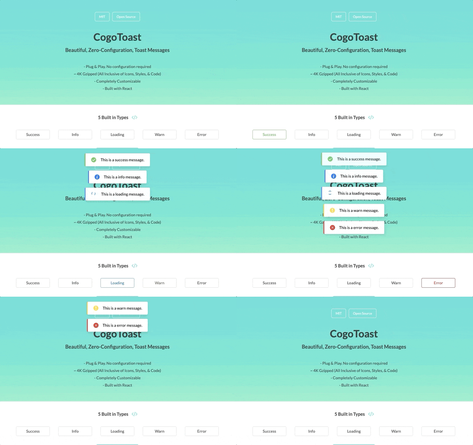
5 Built in Types
There are 5 built-in types to handle the most common cases in any application.
cogoToast.success('This is a success message');

cogoToast.info('This is a info message');

cogoToast.loading('This is a loading message');

cogoToast.warn('This is a warn message');

cogoToast.error('This is a error message');
Use JSX
cogoToast is built using React. Which means any valid jsx can be used as the message in cogoToast
cogoToast.info(
  <div>
    <b>Awesome!</b>
    <div>Isn't it?</div>
  </div>,
);
Returns a Promise
Returns a promise which resolves when the toast is about to hide.
This can be useful to do some action when the toast has completed showing.
cogoToast.loading('Loading your data...').then(() => {
  cogoToast.success('Data Successfully Loaded');
});
Hide on Click
const { hide } = cogoToast.success('This is a success message.', {
  onClick: () => {
    hide();
  },
});
Completely Customizable
The second parameter to the function is an options object that can be passed in for customization.
cogoToast.info('This is an info message', options);All Available Options
Here's a list of all the available options, to customize the toast to your needs.
| Options | Type | Default |
|---|---|---|
| hideAfter | Number in Seconds | 3 (Can be 0 to disable auto-hiding of the toast) |
| position | 'top-left', 'top-center', 'top-right', 'bottom-left', 'bottom-center', 'bottom-right' |
'top-center' |
| heading | String | '' |
| renderIcon | Function | Icon Based on the Type |
| bar | Object { size: '2px', style: 'solid/dashed/dotted', color: '#hex' } |
Based on the Type |
| onClick() | Function | null |
| role | aria-role | status |
| toastContainerID | The dom element in which the toast container is added | ct-container |
Custom Styling
You can provide your own custom styling by extending the ct-toast class in your css styles.
For all classnames, refer to /src/styles/styles.css
Only ~ 4kb gzip (with Styles and Icons)
The package contains the minified build file, along with the SVG Icons and the Styles, built into the Code, with a total of only ~4kb gzip.
Contributors
Thanks goes to these wonderful people (emoji key):
 Anmol Mahatpurkar |
 Balázs Orbán |
 Vitalii Kalchuk |
 Amar Pathak |
 Nataly Shrits |
This project follows the all-contributors specification. Contributions of any kind welcome!