1.0.0 • Published 1 year ago
inquirer-chessboard v1.0.0
inquirer-chessboard
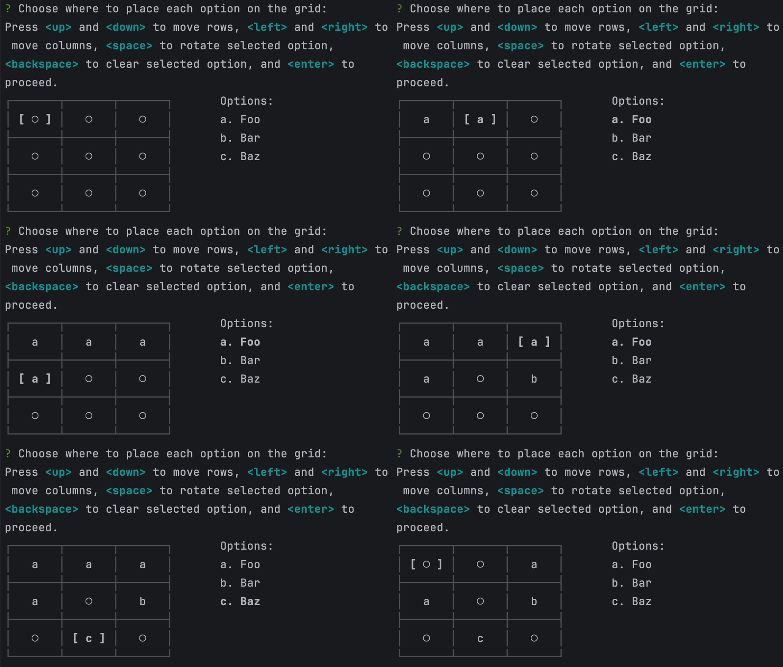
A chessboard-like prompt for inquirer.js that allows placing multiple items on a grid.
Allows a user to select positions for multiple options on a grid and returns the grid values.
Installation
npm install --save inquirer-chessboardUsage
Simply import the chessboard and call it with your desired options, then await.
The result will be a two-dimensional array containing passed option values as selected by the user.
import chessboard from 'inquirer-chessboard';

const options = ['Foo', 'Bar', 'Baz'];

chessboard({
    message: 'Choose where to place each option on the grid:',
    columns: 3,
    rows: 3,
    options: options.map((option) => ({name: option, value: option})),
}).then((answers) => {
    // Do something

    // answers will be a 3x3 array with user selections, eg.
    // [
    //   [ undefined, undefined, 'Foo'     ],
    //   [ 'Foo',     undefined, 'Bar'     ],
    //   [ undefined, 'Baz',     undefined ]
    // ]
})
Options
| Option | Default | Description |
|---|---|---|
| message: String | (required) | Prompt to display above the table |
| columns: number | (required) | Number of columns to show in table |
| rows: number | (required) | Number of rows to show in the table |
| options: Option[] | (required) | Options to display for inputting in the table |
| rowLabels: string[] | undefined | If defined, shows labels left of each row of the table |
| columnLabels: string[] | undefined | If defined, shows labels above each column of the table |
| tableOptions: TableOptions | {} | Options to pass to cli-table for displaying the table |
| wrapColumns: boolean | true | If true, arrowing past the horizontal edges of the table will wrap to the other side |
| wrapRows: boolean | true | If true, arrowing past the vertical edges of the table will wrap to the other side |
| theme: ChessboardTheme | ... | See theming section below |
Theming
A (partial) theme object can be passed to influence text element display. Internal formatting uses chalk. The theme object takes the following options:
TODO
- Tests
- Paging?
License
Copyright (c) 2025 FinalDoom Licensed under the MIT license.
1.0.0
1 year ago