lite-tree v1.0.1
LiteTree
LiteTree is a very simple vue tree component, which is designed to make it easier to display tree structures in vitepress.
We know that there are many Vue tree components, but in general, when using these components on vitepress, there are some problems, such as style conflicts, excessive volume, and too many functions, which are not suitable for the display of VitePress which is mainly for display.
So, I developed this very simple vue tree component, which has the following features:
- Small size, no dependency on any third-party library
- Simple style, small function
- Tree data is passed through the default
slot, which is very convenient - The tree data has good fault tolerance
- Support custom node styles, tags, notes, etc.
Installation
npm install lite-tree
// or
yarn add lite-tree
// or
pnpm add lite-tree
Usage
Use in vitepress.
<script setup>
import Tree from 'lite-tree'
</script>

<Tree>
         {
        title: "A公司",
        expend: true,
        children:[
          {
            title: "行政中心",
            children:[
              {title: "{color:red;font-weight:bold;}总裁办",mark:"success"},
              {title: "人力资源部",tags:['{color:red;}重点','{success}紧急']},
              {title: "财务部"},
              {title: "行政部",diff:'add'},
              {title: "法务部",diff:'add'},
              {title: "审计部",diff:'add'},
              {title: "信息中心",comment:"备用"},
              {title: "安全保卫部",comment:"{color:red}+",style:"font-size:16px;font-style:italic"}
            ]
          },
          {
            title: "市场中心",
            open:false,
            children:[
              {title: "市场部",mark:"info",tags:['{error}出错','{warning}警告']},
              {title: "销售部",diff:'delete'},
              {title: "客服部",diff:'delete'},
              {title: "品牌部",diff:"delete"},
              {title: "市场策划部"},
              {title: "市场营销部",comment:"好",tags:["{info}ddddd"]}
            ]
          },
          {
            title: "研发中心",
            children:[
              {title: "移动研发部",mark:"warning"},
              {title: "平台研发部",tags:["{success}Java","{error}Go"]},
              {title: "测试部"},
              {title: "运维部",prefix:"{color:red;}+"},
              {title: "产品部",mark:"success"},
              {title: "设计部",diff:"modify"},
              {title: "项目管理部",comment:"{color:red;}+",diff:"modify"}
            ]

          }
        ]
      }
</Tree>
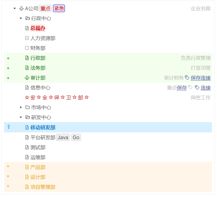
The final rendering effect is as follows:

Props
prefix:Boolean
Whether to display the prefix
diff:'add' | 'delete' | 'modify'
Whether to display the difference
Features
Tree data
The tree data is directly declared in the component Slot, which is generally in JSON format, but has good fault tolerance, as follows:
{
    title  : "A Company",         // Node title, displayed
    open : true,                // Whether to expand
    style  : "color:red",     // CSS style
    mark   : "success",       // value: `success`、`info`、`warning`、`error`
    tags   : ["",...,""],     // Node tags
    comment: "...",           // Node comment
    prefix : "...",           // Node prefix
    diff   : "add",           // display difference, value: `add`、`delete`、`modify`,or "+"、"-"、"*"
    children:[
        // child node
    ]
}
Data fault tolerance
The standard JSON format has strict requirements for the format, while LiteTree preprocesses the data format and has a certain fault tolerance:
- The node
Keycan be wrapped with"..."or'...', or omitted. - The string
Valuecan be wrapped with"..."or'...' - If you accidentally miss the
,, it can also be completed.
Node features
Each node has the following features:
comment: Node comment, displayed at the end of the nodetags: Node tags, displayed at the end of the nodeprefix: Node prefix, displayed at the beginning of the nodediff: Node difference, displayed at the beginning of the nodemark: Node mark, value:success、info、warning、error, respectively representingsuccess,information,warning,error. Rendered in different colors.
Node style
The
styleof the node can be used to specifycss stylefor the node.The
title,comment,prefix,markortagsof the node also support the declaration ofcssstyle by wrapping the string with{...}. For example,tags:["{color:red;font-weight:bold;}OK","{color:blue}+"]means thatOKis red and bold, and+is blue.
Event
Not supported yet.
Recommendation
- Internationalization Solution for React/Vue/Nodejs/Solidjs - VoerkaI18n
- React Form Development Library - speedform
- Terminal Interface Development Enhancement Library - Logsets
- Log Output Library - VoerkaLogger
- Decorator Development - FlexDecorators
- Finite State Machine Library - FlexState
- Universal Function Tool Library - FlexTools
- CSS-IN-JS Library - Styledfc
- VSCode Plugin for Adding Comments to JSON Files - json_comments_extension
- Library for Developing Interactive Command Line Programs - mixed-cli
- Powerful String Interpolation Variable Processing Tool Library - flexvars
- Frontend Link Debugging Assistant Tool - yald
- Asynchronous Signal - asyncsignal
- bundle Vue styles into JavaScript - vite-plugin-vue-style-bundler
- Vue Tree Component- LiteTree