material-bottom-nav


A bottom navigation bar adhering to the Material Design specification. It is written purely using Sass mixins which allow you to apply the style rules to any class, as shown in the demo page's stylesheet.
A running demonstration can be found here.
Installation
Install the package via npm:
npm install --save material-bottom-navUsage
Apply the mixin to a class:
@use '~material-bottom-nav' as bottom-nav;

.bottom-nav {
  @include bottom-nav.root(
    $background-color: #009688,
    $active-color: #FFFFFF,
    $inactive-color: #E0E0E0
  );
}
Structure your template:
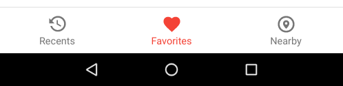
<nav class="bottom-nav">
  <a class="bottom-nav__destination" href="#">
    <svg class="bottom-nav__icon" viewBox="0 0 24 24">
      <path d="M11,7V12.11L15.71,14.9L16.5,13.62L12.5,11.25V7M12.5,2C8.97,2 5.91,3.92 4.27,6.77L2,4.5V11H8.5L5.75,8.25C6.96,5.73 9.5,4 12.5,4A7.5,7.5 0 0,1 20,11.5A7.5,7.5 0 0,1 12.5,19C9.23,19 6.47,16.91 5.44,14H3.34C4.44,18.03 8.11,21 12.5,21C17.74,21 22,16.75 22,11.5A9.5,9.5 0 0,0 12.5,2Z"></path>
    </svg>
    <span class="bottom-nav__label">Recents</span>
  </a>

  <a class="bottom-nav__destination bottom-nav__destination--active" href="#">
    <svg class="bottom-nav__icon" viewBox="0 0 24 24">
      <path d="M12,21.35L10.55,20.03C5.4,15.36 2,12.27 2,8.5C2,5.41 4.42,3 7.5,3C9.24,3 10.91,3.81 12,5.08C13.09,3.81 14.76,3 16.5,3C19.58,3 22,5.41 22,8.5C22,12.27 18.6,15.36 13.45,20.03L12,21.35Z"></path>
    </svg>
    <span class="bottom-nav__label">Favorites</span>
  </a>

  <a class="bottom-nav__destination" href="#">
    <svg class="bottom-nav__icon" viewBox="0 0 24 24">
      <path d="M12,20A8,8 0 0,1 4,12A8,8 0 0,1 12,4A8,8 0 0,1 20,12A8,8 0 0,1 12,20M12,2A10,10 0 0,0 2,12A10,10 0 0,0 12,22A10,10 0 0,0 22,12A10,10 0 0,0 12,2M12,12.5A1.5,1.5 0 0,1 10.5,11A1.5,1.5 0 0,1 12,9.5A1.5,1.5 0 0,1 13.5,11A1.5,1.5 0 0,1 12,12.5M12,7.2C9.9,7.2 8.2,8.9 8.2,11C8.2,14 12,17.5 12,17.5C12,17.5 15.8,14 15.8,11C15.8,8.9 14.1,7.2 12,7.2Z"></path>
    </svg>
    <span class="bottom-nav__label">Nearby</span>
  </a>
</nav>
Hiding inactive labels
The $hide-inactive-labels argument defaults to false. It is used to hide the
text label of any inactive destinations as described in the
anatomy section of the official spec.
Style
@use '~material-bottom-nav' as bottom-nav;

.hidden-labels-nav {
  @include bottom-nav.root(
    $background-color: #009688,
    $active-color: #FFFFFF,
    $inactive-color: #E0E0E0,
    $hide-inactive-labels: true
  );
}
Template
<nav class="hidden-labels-nav">
<a class="hidden-labels-nav__destination" href="#">
<svg class="hidden-labels-nav__icon" viewBox="0 0 24 24">
<path d="M21,16H3V4H21M21,2H3C1.89,2 1,2.89 1,4V16A2,2 0 0,0 3,18H10V20H8V22H16V20H14V18H21A2,2 0 0,0 23,16V4C23,2.89 22.1,2 21,2Z"></path>
</svg>
<span class="hidden-labels-nav__label">Movies & TV</span>
</a>
<a class="hidden-labels-nav__destination" href="#">
<svg class="hidden-labels-nav__icon" viewBox="0 0 24 24">
<path d="M12,3V12.26C11.5,12.09 11,12 10.5,12C8,12 6,14 6,16.5C6,19 8,21 10.5,21C13,21 15,19 15,16.5V6H19V3H12Z"></path>
</svg>
<span class="hidden-labels-nav__label">Music</span>
</a>
<a class="hidden-labels-nav__destination hidden-labels-nav__destination--active" href="#">
<svg class="hidden-labels-nav__icon" viewBox="0 0 24 24">
<path d="M18,22A2,2 0 0,0 20,20V4C20,2.89 19.1,2 18,2H12V9L9.5,7.5L7,9V2H6A2,2 0 0,0 4,4V20A2,2 0 0,0 6,22H18Z"></path>
</svg>
<span class="hidden-labels-nav__label">Books</span>
</a>
<a class="hidden-labels-nav__destination" href="#">
<svg class="hidden-labels-nav__icon" viewBox="0 0 24 24">
<path d="M20,11H4V8H20M20,15H13V13H20M20,19H13V17H20M11,19H4V13H11M20.33,4.67L18.67,3L17,4.67L15.33,3L13.67,4.67L12,3L10.33,4.67L8.67,3L7,4.67L5.33,3L3.67,4.67L2,3V19A2,2 0 0,0 4,21H20A2,2 0 0,0 22,19V3L20.33,4.67Z"></path>
</svg>
<span class="hidden-labels-nav__label">Newsstand</span>
</a>
<a class="hidden-labels-nav__destination" href="#">
<svg class="hidden-labels-nav__icon" viewBox="0 0 24 24">
<path d="M7,6H17A6,6 0 0,1 23,12A6,6 0 0,1 17,18C15.22,18 13.63,17.23 12.53,16H11.47C10.37,17.23 8.78,18 7,18A6,6 0 0,1 1,12A6,6 0 0,1 7,6M6,9V11H4V13H6V15H8V13H10V11H8V9H6M15.5,12A1.5,1.5 0 0,0 14,13.5A1.5,1.5 0 0,0 15.5,15A1.5,1.5 0 0,0 17,13.5A1.5,1.5 0 0,0 15.5,12M18.5,9A1.5,1.5 0 0,0 17,10.5A1.5,1.5 0 0,0 18.5,12A1.5,1.5 0 0,0 20,10.5A1.5,1.5 0 0,0 18.5,9Z"></path>
</svg>
<span class="hidden-labels-nav__label">Games</span>
</a>
</nav>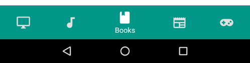
Badges
Bottom navigation icons can include badges in their upper right corner. These badges can contain dynamic information, such as a number of pending requests.
Style
@use '~material-bottom-nav' as bottom-nav;

.badges-nav {
  @include bottom-nav.root(
    $background-color: white,
    $active-color: #6200EE,
    $inactive-color: #757575,
    $hide-inactive-labels: true
  );
}
Template
<nav class="badges-nav">
  <a class="badges-nav__destination badges-nav__destination--active" href="#">
    <svg class="badges-nav__icon" viewBox="0 0 24 24">
      <path d="M12,21.35L10.55,20.03C5.4,15.36 2,12.27 2,8.5C2,5.41 4.42,3 7.5,3C9.24,3 10.91,3.81 12,5.08C13.09,3.81 14.76,3 16.5,3C19.58,3 22,5.41 22,8.5C22,12.27 18.6,15.36 13.45,20.03L12,21.35Z"></path>
    </svg>
    <span class="badges-nav__label">Item One Max</span>
    <span class="badges-nav__badge"></span>
  </a>

  <a class="badges-nav__destination" href="#">
    <svg class="badges-nav__icon" viewBox="0 0 24 24">
      <path d="M12 3V13.55C11.41 13.21 10.73 13 10 13C7.79 13 6 14.79 6 17S7.79 21 10 21 14 19.21 14 17V7H18V3H12Z" />
    </svg>
    <span class="badges-nav__label">Item Two</span>
  </a>

  <a class="badges-nav__destination" href="#">
    <svg class="badges-nav__icon" viewBox="0 0 24 24">
      <path d="M13,12H20V13.5H13M13,9.5H20V11H13M13,14.5H20V16H13M21,4H3A2,2 0 0,0 1,6V19A2,2 0 0,0 3,21H21A2,2 0 0,0 23,19V6A2,2 0 0,0 21,4M21,19H12V6H21" />
    </svg>
    <span class="badges-nav__label">Item Three</span>
    <span class="badges-nav__badge">88</span>
  </a>

  <a class="badges-nav__destination" href="#">
    <svg class="badges-nav__icon" viewBox="0 0 24 24">
      <path d="M20,11H4V8H20M20,15H13V13H20M20,19H13V17H20M11,19H4V13H11M20.33,4.67L18.67,3L17,4.67L15.33,3L13.67,4.67L12,3L10.33,4.67L8.67,3L7,4.67L5.33,3L3.67,4.67L2,3V19A2,2 0 0,0 4,21H20A2,2 0 0,0 22,19V3L20.33,4.67Z" />
    </svg>
    <span class="badges-nav__label">Item Four</span>
    <span class="badges-nav__badge">888+</span>
  </a>
</nav>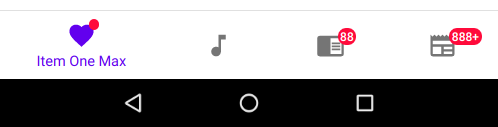
Horizontal
On mobile (in landscape mode) or tablet, bottom navigation destinations can be positioned horizontally instead of stacked.
Style
@use '~material-bottom-nav' as bottom-nav;

.horizontal-nav {
  @include bottom-nav.root(
    $background-color: #6200EE,
    $active-color: white,
    $inactive-color: #BB86FC
  );

  @include bottom-nav.horizontal();
}
Template
<nav class="horizontal-nav">
  <a class="horizontal-nav__destination horizontal-nav__destination--active" href="#">
    <svg class="horizontal-nav__icon" viewBox="0 0 24 24">
      <path d="M12,21.35L10.55,20.03C5.4,15.36 2,12.27 2,8.5C2,5.41 4.42,3 7.5,3C9.24,3 10.91,3.81 12,5.08C13.09,3.81 14.76,3 16.5,3C19.58,3 22,5.41 22,8.5C22,12.27 18.6,15.36 13.45,20.03L12,21.35Z"></path>
    </svg>
    <span class="horizontal-nav__label">Favorites</span>
  </a>

  <a class="horizontal-nav__destination" href="#">
    <svg class="horizontal-nav__icon" viewBox="0 0 24 24">
      <path d="M12 3V13.55C11.41 13.21 10.73 13 10 13C7.79 13 6 14.79 6 17S7.79 21 10 21 14 19.21 14 17V7H18V3H12Z" />
    </svg>
    <span class="horizontal-nav__label">Music</span>
  </a>

  <a class="horizontal-nav__destination" href="#">
    <svg class="horizontal-nav__icon" viewBox="0 0 24 24">
      <path d="M13,12H20V13.5H13M13,9.5H20V11H13M13,14.5H20V16H13M21,4H3A2,2 0 0,0 1,6V19A2,2 0 0,0 3,21H21A2,2 0 0,0 23,19V6A2,2 0 0,0 21,4M21,19H12V6H21" />
    </svg>
    <span class="horizontal-nav__label">Books</span>
  </a>
</nav>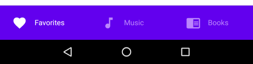
Customization
The box-model and colors of the individual styles within this component can be configured by overriding the default
variable values defined in
bottom-nav.scss.
@use '~material-bottom-nav' as bottom-nav with (
  $destination-horizontal-padding: 4px, // reduce the horizontal padding within each destination
  $icon-font-size: 28px, // increase the icon size
);

.bottom-nav {
  @include bottom-nav.root(#009688, #FFFFFF, #E0E0E0);
}
Contributing
Bug reports and pull requests are welcome on GitHub.
License
This project is available under the terms of the ISC license. See the
LICENSE file for the copyright information and licensing terms.
Examples used include icons from the Material Design Icons project (LICENSE).