material-ui-superSelectField
Table of Contents
- Preview
- Installation
- Properties
- Usage examples
- Building
- Linking in another local project
- Tests
- Contributing
- Known bugs
- TodoList
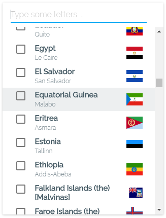
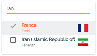
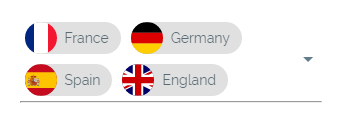
Preview (Live demo)
Installation
This component requires 3 peer dependencies :
- react
- react-dom
- material-ui
... so make sure they are installed in your project.
yarn add material-ui-superselectfield
ES5 version
import SelectField from 'material-ui-superselectfield'
ES6+ version
import SelectField from 'material-ui-superselectfield/es'
Properties
| Name | Type | Default | Description |
|---|---|---|---|
| anchorOrigin | object | { vertical: 'top', horizontal: 'left' } |
Anchor position of the menu, accepted values: top, bottom / left, right |
| autocompleteFilter | function | see below | Provide your own filtering parser. Default: case insensitive. The search field will appear only if there are more than 10 children (see showAutocompleteThreshold).By default, the parser will check for label props, 'value' otherwise. |
| canAutoPosition | bool | true | If present, this property allows the inner Popover component to position the menu in such way options are not hidden by the screen edges. |
| checkPosition | string | Position of the checkmark in multiple mode. Accepted values: '', left, right |
|
| children | any | [] | Datasource is an array of any type of nodes, styled at your convenience. /!\ REQUIRED: each node must expose a value property. This value property will be used by default for both option's value and label.A label property can be provided to specify a different value than value. |
| disabled | bool | false | Include this property to disable superSelectField. |
| elementHeight | number, number[] | 36 | Height in pixels of each option element. If elements have different heights, you can provide them in an array. |
| errorText | string or node | '' | Include this property to show an error warning. |
| floatingLabel | string or node | The content to use for the floating label element. | |
| hintText | string | 'Click me' | Placeholder text for the main selections display. |
| hintTextAutocomplete | string or node | 'Type something' | Placeholder text for the autocomplete. |
| keepSearchOnSelect | bool | false | Prevents the autocomplete field's value to be reset after each selection. |
| multiple | bool | false | Include this property to turn superSelectField into a multi-selection dropdown. Checkboxes will appear. |
| name | string | Required to differentiate between multiple instances of superSelectField in same page. | |
| nb2show | number | 5 | Number of options displayed from the menu. |
| noMatchFound | node | 'No match found' | Placeholder text / node when the autocomplete filter fails. |
| openImmediately | bool | false | Makes the menu opened on page load. |
| onAutoCompleteTyping | function | () => {} | Exposes the word typed in AutoComplete. Useful for triggering onType API requests. |
| onChange | function | () => {} | Triggers when closing the menu. Use this if you do not want to update your component state with each selection and only on menu close. signature: (selectedValues, name) with selectedValues array of selected values based on selected nodes' value property, and name the value of the superSelectField instance's name property |
| onMenuOpen | function | () => {} | Triggers when opening the Menu. |
| onSelect | function | () => {} | Triggers when selecting an item in the menu. Use this to update your componenet state with each selection from the menu (while still open). signature: (selectedValues, name) with selectedValues array of selected values based on selected nodes' value property, and name the value of the superSelectField instance's name property |
| showAutocompleteThreshold | number, 'always', 'never' | 10 | Maximum number of options from which to display the autocomplete search field. For example, if autoComplete textfield needs to be disabled, just set this prop with a value higher than children length. However, if you need the autocomplete to show always, you may pass 'always'. This will open the menu even if there are no items to display. Passing 'never' will never show the autocomplete regadless of how many children are passed. |
| useLayerForClickAway | bool | false | If true, the popover dropdown will render on top of an invisible layer, which will prevent clicks to the underlying elements, and trigger an onRequestClose('clickAway') call. |
| value | null, object, object[] | null | Selected value(s). /!\ REQUIRED: each object must expose a 'value' property. |
| withResetSelectAllButtons | bool | false | Paired with 'multiple', shows an header containing the 'RESET' and 'SELECT ALL' buttons. |
Note when setting value
if multiple is set, value must be at least an empty Array.
For single value mode, you can set value to null.
When using objects, make sure they expose a non-null value property.
PropTypes should raise warnings if implementing otherwise.
Styling properties
| Name | Type | Default | Description |
|---|---|---|---|
| autocompleteStyle | object | Allows to change the styles of the auto-complete field (inner input component). Notice: margins left/right and width of the autocomplete root element are not customisable, (automatically calculated) |
|
| autocompleteUnderlineStyle | object | Allows to change the styles of the searchTextField's underline. | |
| autocompleteUnderlineFocusStyle | object | Allows to change the styles of the searchTextField's underline when focused. | |
| checkedIcon | SVGicon | see below | The SvgIcon to use for the checked state. This is useful to create icon toggles. |
| dropDownIcon | SVGicon | see below | The SvgIcon to use for the drop down icon in the select. |
| errorStyle | object | {color: 'red'} | Allows to change the style of error message's container. Will resolve only if errorText is defined. |
| floatingLabelStyle | object | Allows to change the styles of the floating label. | |
| floatingLabelFocusStyle | object | Allows to change the styles of the floating label when focused. | |
| innerDivStyle | object | {} | Styles applied to the inner div of MenuItems hosting each of your children components. |
| hoverColor | string | 'rgba(69, 90, 100, 0.1)' | Overrides the hover background color. |
| menuStyle | object | {} | Styles applied to the comtainer which will receive your children components. |
| menuGroupStyle | object | {} | Styles applied to the MenuItems hosting your <optgroup/>. |
| menuFooterStyle | object | {} | Styles applied to the Menu's footer. |
| menuCloseButton | node | A button for an explicit closing of the menu. Useful on mobiles. | |
| noMatchFoundStyle | object | {} | Allows to change the style of the noMatchFound list item. |
| popoverClassName | string | '' | Sets the className property of the Popover component. |
| popoverWidth | number | 180 | Sets the width of the Menu. The menu is the container for 4 main sub-components: the autocomplete textfield, the header for reset/selectAll buttons, the options container, and the footer. The menu width will always set its width to the highest value between popoverWidth prop(in px) or the root component width. The default value 180px were chosen so that the header's inner buttons don't overflow. |
| resetButton | node | see below | Node used to deselect all options. /!\ Requires withResetSelectAllButtons. |
| selectAllButton | node | see below | Node used to select all options. /!\ Requires withResetSelectAllButtons. |
| selectedMenuItemStyle | object | Styles to be applied to the selected MenuItem. | |
| selectionsRenderer | function | see below | Provide your own renderer for selected options. Defaults to concatenating children's values text. Check CodeExample4 for a more advanced renderer example. |
| style | object | {} | Insert your own inlined styles, applied to the root component. |
| unCheckedIcon | SVGicon | see below | The SvgIcon to use for the unchecked state. This is useful to create icon toggles. |
| underlineErrorStyle | object | {borderColor: 'red'} | Allows to change the style of the underline in error state. Will resolve only if errorText is defined. |
| underlineFocusStyle | object | Allows to change the styles of the underline when focused. | |
| underlineStyle | object | Allows to change the styles of the underline. |
Default functions
| Name | Default function |
|---|---|
| autocompleteFilter | `(searchText, text) => !text |
| checkedIcon | <CheckedIcon style={{ top: 'calc(50% - 12px)' }} /> |
| dropDownIcon | <DropDownArrow/> |
| resetButton | <FlatButton label='reset' hoverColor='rgba(69, 90, 100, 0.1)' fullWidth /> |
| selectAllButton | <FlatButton label='select all' hoverColor='rgba(69, 90, 100, 0.1)' fullWidth labelStyle={{ whiteSpace: 'nowrap' }} /> |
| unCheckedIcon | <UnCheckedIcon style={{ top: 'calc(50% - 12px)' }} /> |
| selectionsRenderer |
(values, hintText) => {
   if (!values) return hintText
   const { value, label } = values
   if (Array.isArray(values)) {
      return values.length
         ? values.map(({ value, label }) => label || value).join(', ')
         : hintText
   }
   else if (label || value) return label || value
   else return hintText
}
Usage
Check the CodeExampleX.js provided in the repository.
Building
You can build the project with :
git clone https://github.com/Sharlaan/material-ui-superselectfield.git
yarn && yarn start
It should open a new page on your default browser @ localhost:3000
Linking in another local project
To test changes on a local build of SSF :
yarn build && yarn link... then navigate into your local project directory, and type :
yarn link material-ui-superselectfield/!\ Warning : if you reinstall dependencies in your project, this will break the link, you will have to re-link SSF.
Tests
yarn test
Contributing
Please follow these steps :
- Fork the repo, then pull the forked repo locally.
- Make your changes. Note: use incremental changes with atomic commits.
- Add unit tests for any new or changed functionality.
- Lint and test your code. Note: lint is automatically run before each commit, and test on prepush.
- Add comments to explain critical or potentially hard to understand code and tests.
- Once everything linted, tested and commented, push to your repo.
- In original repo, click on
New pull requestbutton, then click oncompare across forks, then inhead forkbutton choose your forked repo. - Explain the PR, and check any potential conflicts before saving.
- [ADMIN ONLY] Check, make comments/suggestions and eventually merge the PR.
- [ADMIN ONLY] make a release on
Masterbranch withnpm version patch|minor|major --git-tag-version MUIv0.x|MUIv1then push. Note : NWB will automatically publish it upon detecting the version bump in package.json.
Known bugs
- keyboard-focus handling combined with optgroups and autocompleted results
TodoList
implement select all and reset, for multiple mode
implement onClose handler for multiple mode, to allow registering selected values in oneshot instead of exposing values at each selection (ie one single server request)
set autoWidth to false automatically if width prop has a value
add a css rule for this.root :focus { outline: 'none' }, and :hover { darken }
add tests for focus states/styles when tabbing between multiple superSelectFields
add tests for keystrokes
add proptypes checking for value and children
support of <optgroup />
implement selectable <optgroup /> to select all inner children
check rendering performance with 200 MenuItems (integrate react-infinite)
implement the container for errors (absolutely positioned below the focusedLine)
Expose more props :
- noMatchFound message
- floatingLabelText
- canAutoPosition
- checkPosition
- anchorOrigin
- popoverStyle
- hoverColor
- disabled
- required
- errorMessage
- errorStyle
- classeNames for sub-components
- maxSelection
add props.disableAutoComplete (default: false), or a nbItems2showAutocomplete (default: null, meaning never show the searchTextField)
make Autocomplete appears only if current numberOfMenuItems > props.autocompleteTreshold
implement a checkboxRenderer for MenuItem (or expose 2 properties CheckIconFalse & CheckIconTrue)
make a PR reimplementing MenuItem.insetChildren replaced with checkPosition={'left'(default) or 'right'}
add an example with GooglePlaces
add an example with ReduxForm