0.9.3 • Published 4 years ago
material-ui-ts-responsive-table v0.9.3
material-ui-next-responsive-table
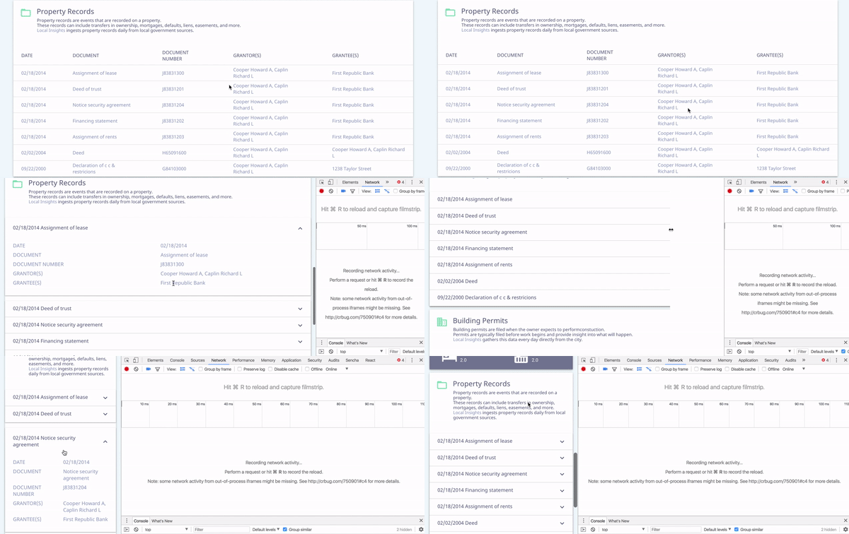
This project provides read-only responsive table for Material-UI.
Table is shown for desktop screen, list of expandable items - for tablet and mobile.

Installation
npm i --save material-ui-next-responsive-tableUsage
import ResponsiveTable from 'material-ui-next-responsive-table'

const columns = [
  {
    key: 'id',
    label: 'ID',
    primary: true,
  },
  {
    key: 'name',
    label: 'Name',
  },
  {
    key: 'authors',
    label: 'Author(s)',
    render: (value) => value.join(', ')
  },
]

const data = [
  {
    id: '1234',
    name: 'Foo',
    authors: ['Andy'],
  },
  {
    id: '4567',
    name: 'Bar',
    authors: ['Joe', 'Mike'],
  }
]

<ResponsiveTable
  columns={columns}
  data={data}
/>
ResponsiveTable Properties
| Name | Type | Default | Description |
|---|---|---|---|
| columns | array | Array of objects with Required column id (key) - used for detecting value for body cells Required column name (name) - shown in table header Optional render function (render: (value, column, row, data)) - allows to customize cell value for all cells in specific column Optional primary boolean (primary) - detects the column, which value has to be shown in the expandable list item summary (can be marked for 2 or more columns - in summary they are divided by | |
| data | array | Array of objects with keys that corresponds column id and value that should be shown in cell. | |
| noContentText | string | 'No Content' | Override the default text if no columns/rows presented. |
License
The files included in this repository are licensed under the MIT license.
