0.1.4 • Published 6 years ago
md-date-picker v0.1.4
md-date-picker
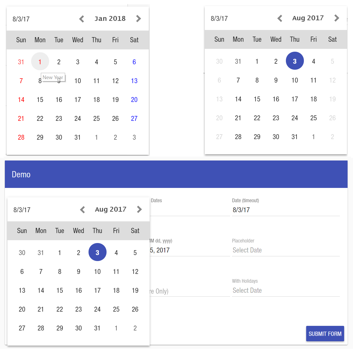
angular material customizable date picker directive/component
Demo
Live
https://ipiz.herokuapp.com/md-date-picker/demo/index.html
Local
clone repositorynpm installgulp serve
Dependencies
angularjs, angular material
| Package | Versions |
|---|---|
| angular | >=1.4 <=1.6 |
| angular-material | 1.x |
usage
bower install md-date-picker --save
//or
npm install md-date-picker --save
//module
var app = angular.module('app', ['md-date-picker']);//options
$scope.specialDaysClass['8/5/2017'] = 'blue-day'; // blue color on saturday
$scope.specialDaysClass['1/1/2017'] = { // red color on new years day with title
class: 'red-day',
title: 'New Year',
};// sample custom css
.blue-day {
color: blue;
}
.red-day {
color: red;
}<!--default-->
<md-date-picker ng-model="date" on-change="date = $date" placeholder="Select Date"></md-date-picker>
<!--show only days on current month view-->
<md-date-picker current-month-view-dates-only="true" ng-model="date" on-change="date = $date"></md-date-picker>
<!-- with special days calss and promise handling -->
<md-date-picker loading="loading" date-class="specialDaysClass" on-render="onRenderDatePicker($month, $year)" ng-model="date" on-change="date = $date"></md-date-picker>
<!-- customizable date format -->
<md-date-picker ng-model="custom" format="EEE, MMM dd, yyyy" on-change="custom = $date"></md-date-picker>Attributes
| Attributes | Type | Binding | Description |
|---|---|---|---|
| ngModel | Date | One-way binding | Your date object model |
| onChange | Function | Event | Handle on select date, ussage on-change="model = $date" |
| format | String | attribute | Uses angular date filter to format date format="EEE, MMM dd, yyyy" refer to https://docs.angularjs.org/api/ng/filter/date |
| dateClass | Object | One-way binding | Use to style dates date-calss="{'12/25/2017':{class: 'red-font'}}" |
| loading | Boolean | One-way binding | Use to create overlay on calendar with md-linear-progress |
| openOnFucos | Boolean | One-way binding | Use open picker when focused |
| ngRequired | Boolean | One-way binding | Use set the date picker input required |
| ngDisabled | Boolean | One-way binding | Use set the date picker input disabled |
| showIcon | Boolean | One-way binding | show calendar icon |
| placeholder | String | attribute | As input placeholder placeholder="Select Date" |
| dateFilter | Function | One-way binding | Use as callback function to filter available dates, function should return false to be able to disable date. Example enable only Mondays in picker function isAvailable(date) { return date.getDay() === 1; } |
| currentMonthViewDatesOnly | Boolean | Event | Use to toggle displaying other Month dates in a current calendar view |
| onRender | Function | Event | Trigger when a render of the calendar view happen, mostly on next/prev month clicked or on First render |
clone repository and run gulp for demo http://localhost:3000
Todos
- Enhancements
- Optimizations
- Unit Tests
License
MIT
Version 0.0.1
