NgxMatSelectSearch
https://github.com/bithost-gmbh/ngx-mat-select-search


What does it do?
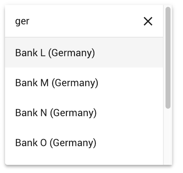
Angular component providing an input field for searching / filtering MatSelect options of the Angular Material library.
Try it
See it in action at
https://stackblitz.com/github/bithost-gmbh/ngx-mat-select-search-example
see example code, builds in browser, latest version, latest material version
https://bithost-gmbh.github.io/ngx-mat-select-search/
pre-built, latest version, material 19, works on mobile
Important Note: This project is meant as a temporary implementation of https://github.com/angular/material2/issues/5697. The goal is to have an implementation in the official Angular Material repository, a new PR will be created.
Contributions
Contributions are welcome, please open an issue and preferably file a pull request.
Support Development
We aim at providing the best service possible by constantly improving NgxMatSelectSearch and responding fast to bug reports. We do this fully free of cost.
If you feel like this library was useful to you and saved you and your business some precious time, please consider making a donation to support its maintenance and further development.

Financial Supporters
Thank you very much to our financial supporters!

Philip Viktor Schulz-Klingauf |

Salvatore Butera |
Collaborators
Contributors
Thank you very much to all our community contributors!


How to use it?
Install ngx-mat-select-search in your project:
npm install ngx-mat-select-searchImport the NgxMatSelectSearchModule e.g. in your app.module.ts:
import { MatSelectModule } from '@angular/material';
import { NgxMatSelectSearchModule } from 'ngx-mat-select-search';

@NgModule({
  imports: [
    ...
    MatSelectModule,
    NgxMatSelectSearchModule
  ],
})
export class AppModule {}
Use the ngx-mat-select-search component inside a mat-select element by placing it inside a <mat-option> element:
<mat-form-field>
  <mat-select [formControl]="bankCtrl" placeholder="Bank" #singleSelect>
    <mat-option>
      <ngx-mat-select-search [formControl]="bankFilterCtrl"></ngx-mat-select-search>
    </mat-option>
    <mat-option *ngFor="let bank of filteredBanks | async" [value]="bank">
      {{bank.name}}
    </mat-option>
  </mat-select>
</mat-form-field>
See the examples in https://github.com/bithost-gmbh/ngx-mat-select-search/tree/master/src/app/examples
how to wire the ngx-mat-select-search and filter the options available.
Or have a look at https://github.com/bithost-gmbh/ngx-mat-select-search-example to see it in a standalone app.
Template driven forms
You can alternatively use it with template driven forms as follows:
<ngx-mat-select-search ngModel (ngModelChange)="filterMyOptions($event)">Labels
In order to change the labels, use the inputs specified in the API section as follows:
<ngx-mat-select-search [formControl]="bankFilterCtrl"
                       placeholderLabel="Find bank..."
                       noEntriesFoundLabel="'no matching bank found'"></ngx-mat-select-search>
To use the i18n API for translation of the labels, add the corresponding i18n-... attributes:
<ngx-mat-select-search [formControl]="bankFilterCtrl"
                       placeholderLabel="Find bank..."
                       i18n-placeholderLabel
                       noEntriesFoundLabel="'no matching bank found'"
                       i18n-noEntriesFoundLabel></ngx-mat-select-search>
Compatibility
Current release
@angular/core:^16.0.0 || ^17.0.0 || ^18.0.0 || ^19.0.0 || ^20.0.0 || ^21.0.0 || ^22.0.0@angular/material:^16.0.0 || ^17.0.0 || ^18.0.0 || ^19.0.0 || ^20.0.0 || ^21.0.0 || ^22.0.0withMatSelectModule(@angular/material/select)
Version 7.0.10
@angular/core:^15.0.0 || ^16.0.0 || ^17.0.0 || ^18.0.0 || ^19.0.0@angular/material:^15.0.0 || ^16.0.0 || ^17.0.0 || ^18.0.0 || ^19.0.0withMatSelectModule(@angular/material/select)
Version 6.0.0
@angular/core:^15.0.0@angular/material:^15.0.0withMatLegacySelectModule(@angular/material/legacy-select)
Version 5.0.0
@angular/core:^12.0.0 || ^13.0.0 || ^14.0.0@angular/material:^12.0.0 || ^13.0.0 || ^14.0.0
Version 3.3.3
@angular/core:^8.0.0 || ^9.0.0 || ^10.0.0 || ^11.0.0 || ^12.0.0 || ^13.0.0@angular/material:^8.0.0 || ^9.0.0 || ^10.0.0 || ^11.0.0 || ^12.0.0 || ^13.0.0
Version 1.8.0
@angular/core:^5.0.0 || ^6.0.0 || ^7.0.0 || ^8.0.0@angular/material:^5.0.0 || ^6.0.0 || ^7.0.0 || ^8.0.0
API
The MatSelectSearchComponent implements the ControlValueAccessor interface.
Furthermore, it provides the following inputs:
Inputs
  /** Label of the search placeholder */
  @Input() placeholderLabel = 'Suche';

  /** Type of the search input field */
  @Input() type = 'text';

  /** Font-based icon used for displaying Close-Icon */
  @Input() closeIcon = 'close';

  /** SVG-based icon used for displaying Close-Icon. If set, closeIcon is overridden */
  @Input() closeSvgIcon?: string;

  /** Label to be shown when no entries are found. Set to null if no message should be shown. */
  @Input() noEntriesFoundLabel = 'Keine Optionen gefunden';

  /**
   * Whether the search field should be cleared after the dropdown menu is closed.
   * Useful for server-side filtering. See [#3](https://github.com/bithost-gmbh/ngx-mat-select-search/issues/3)
   */
  @Input() clearSearchInput = true;

  /** Whether to show the search-in-progress indicator */
  @Input() searching = false;

  /** Disables initial focusing of the input field */
  @Input() disableInitialFocus = false;

  /** Enable clear input on escape pressed */
  @Input() enableClearOnEscapePressed = false;

  /**
   * Prevents home / end key being propagated to mat-select,
   * allowing to move the cursor within the search input instead of navigating the options
   */
  @Input() preventHomeEndKeyPropagation = false;

  /** Disables scrolling to active options when option list changes. Useful for server-side search */
  @Input() disableScrollToActiveOnOptionsChanged = false;

  /** Adds 508 screen reader support for search box */
  @Input() ariaLabel = 'dropdown search';

  /** Whether to show Select All Checkbox (for mat-select[multi=true]) */
  @Input() showToggleAllCheckbox = false;

  /** Select all checkbox checked state */
  @Input() toggleAllCheckboxChecked = false;

  /** select all checkbox indeterminate state */
  @Input() toggleAllCheckboxIndeterminate = false;

  /** Display a message in a tooltip on the toggle-all checkbox */
  @Input() toggleAllCheckboxTooltipMessage = '';

  /** Define the position of the tooltip on the toggle-all checkbox. */
  @Input() toggleAllCheckboxTooltipPosition: 'left' | 'right' | 'above' | 'below' | 'before' | 'after' = 'below';

  /** Show/Hide the search clear button of the search input */
  @Input() hideClearSearchButton = false;

  /**
   * Always restore selected options on selectionChange for mode multi (e.g. for lazy loading/infinity scrolling).
   * Defaults to false, so selected options are only restored while filtering is active.
   */
  @Input() alwaysRestoreSelectedOptionsMulti = false;

  /**
   * Recreate array of selected values for multi-selects.
   *
   * This is useful if the selected values are stored in an immutable data structure.
   */
  @Input() recreateValuesArray = false;

  /** Output emitter to send to parent component with the toggle all boolean */
  @Output() toggleAll = new EventEmitter<boolean>();
Customize clear icon
In order to customize the search icon, add the ngxMatSelectSearchClear to your custom clear item (a mat-icon or any other element) and place it inside the ngx-mat-select-search component:
<ngx-mat-select-search>
   <mat-icon ngxMatSelectSearchClear>delete</mat-icon>
</ngx-mat-select-search>
If just the icon should be changed the inputs closeIcon and closeSvgIcon can be used.
Customize no entries found element
In order to customize the no entries found element, add the ngxMatSelectNoEntriesFound to your custom item (a mat-icon, span, button or any other element) and place it inside the ngx-mat-select-search component:
<ngx-mat-select-search>
  <span ngxMatSelectNoEntriesFound>
    No entries found
    <button mat-button color="primary">
      Add <mat-icon>add</mat-icon>
    </button>
</span>
</ngx-mat-select-search>
Custom content
Custom content with the CSS class mat-select-search-custom-header-content can be transcluded as follows:
<ngx-mat-select-search>
   <div class="mat-select-search-custom-header-content">something special</div>
</ngx-mat-select-search>
Global default options
Providing the MAT_SELECTSEARCH_DEFAULT_OPTIONS
InjectionToken, the default values of several @Input() properties can be set globally.
See the documentation of the corresponding @Input() properties of MatSelectSearchComponent.
Example:
import { MAT_SELECTSEARCH_DEFAULT_OPTIONS, MatSelectSearchOptions } from 'ngx-mat-select-search';

@NgModule({
  ...
  providers: [
    {
      provide: MAT_SELECTSEARCH_DEFAULT_OPTIONS,
      useValue: <MatSelectSearchOptions>{
        closeIcon: 'delete',
        noEntriesFoundLabel: 'No options found',
      }
    }
  ]
})
class AppModule {}
Known Problems
- The currently selected option might be hidden under the search input field when opening the options panel and the panel is at the screen border.
Development
This project was generated with Angular CLI version 1.7.1.
Development server
Run ng serve for a dev server. Navigate to http://localhost:4200/. The app will automatically reload if you change any of the source files.
Build
Run ng build to build the project. The build artifacts will be stored in the dist/ directory. Use the -prod flag for a production build.
Library Build / NPM Package
Run npm run build-lib to build the library and generate an NPM package.
The build artifacts will be stored in the dist-lib/ folder.
To release, run cd dist-lib/ && npm publish.
Running unit tests
Run npm run test to execute the unit tests via Karma.