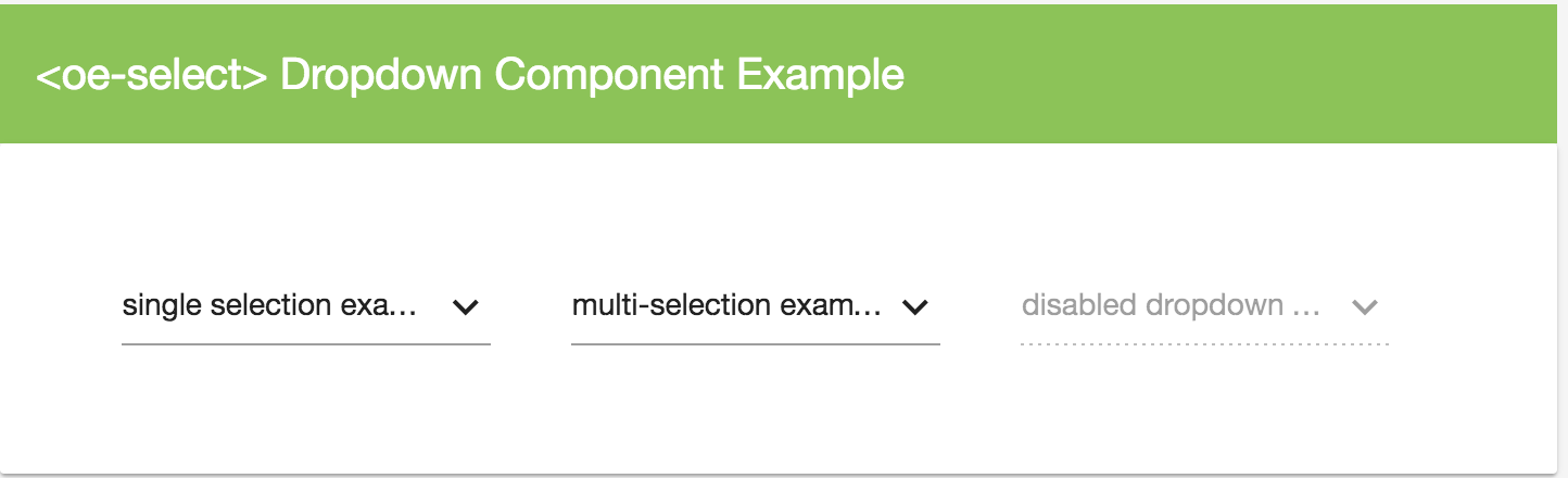
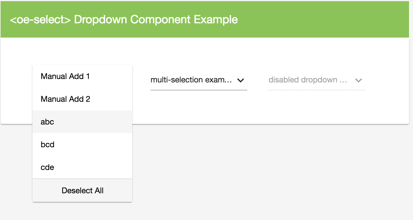
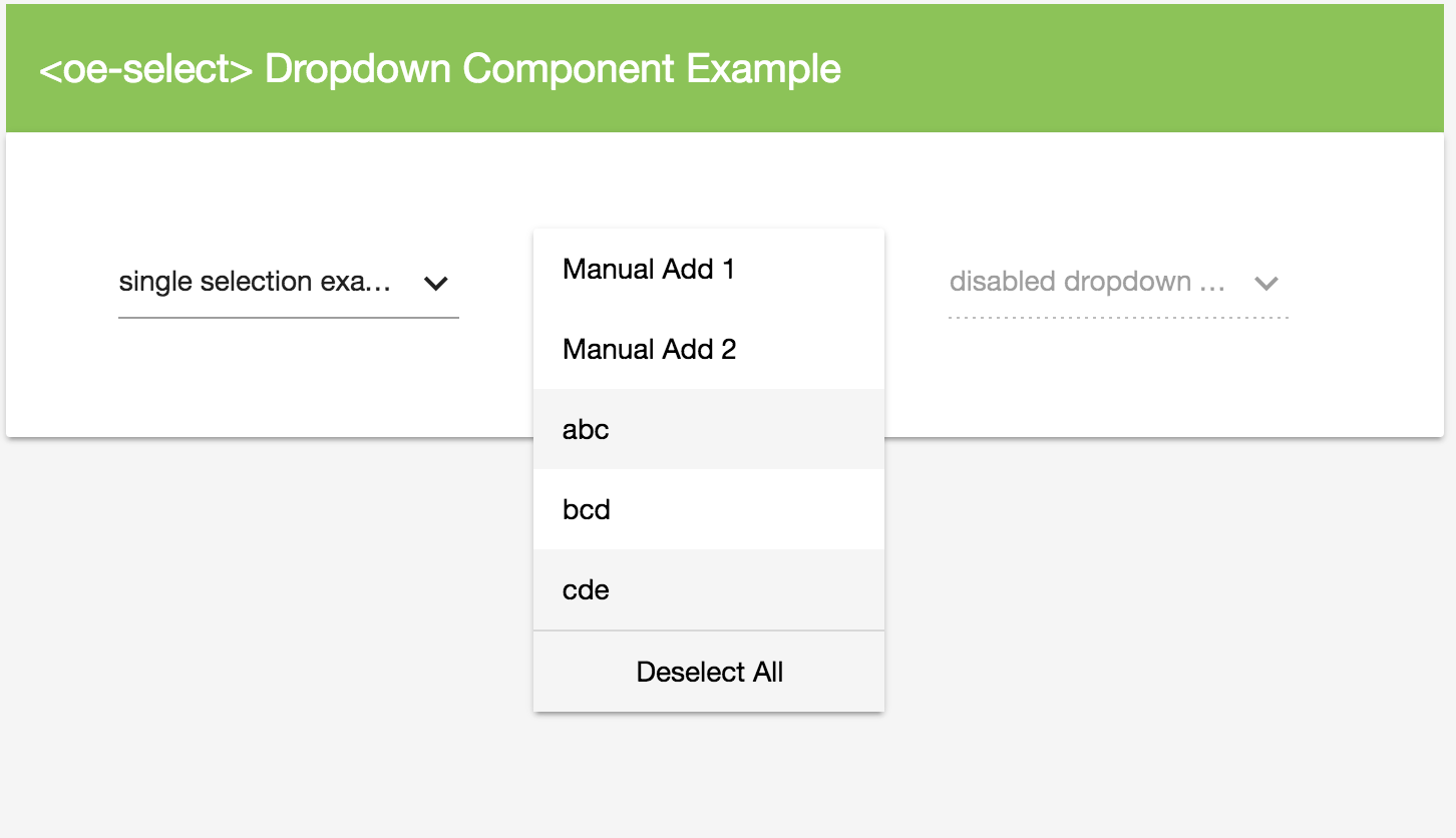
### Dependencies
- Google Material (Angular Material 2) - MdInputModule, MdIconModule
- Angular 2, RC5
Simply reference the OE_MD_SelectModule same way as you import other modules, and then start using and as explained below
@NgModule({
    imports:[CommonModule, OE_MD_SelectModule],
    declarations:[],
    providers:[],
    exports:[]
})
export class YourModule{
}
                <oe-select placeHolder="love my own work" [items]="[{a:'abc',b:1,c:true},{a:'bcd',b:2},{a:'cde',b:3}]" [allowMultiple]="true">
                </oe-select>
                <oe-select placeHolder="disabled one" [disabled]="true"
                           [items]="[{a:'abc',b:1},{a:'bcd',b:2},{a:'cde',b:3}]">
                </oe-select>
the wrapper of the dropdown, equivalent to
| Property |
value type |
description |
| items |
object array |
defines an array of data items for the dropdown to use |
| selectorId |
string |
definea the name of the current selector - a GUID will be populated as selectorId if it is not manually defined |
| selectedItems |
object array |
returns a list of selected items (if it is a single item selection dropdown, it will have maximum 1 item in the returned array) |
| selectedText |
string |
returns the current selected text; or the default placeholder text if no item selected |
| placeHolder |
string |
defines the default placeholder for the dropdown |
| disabled |
bool |
defines whether the current dropdown is disabled |
| textBinding |
string |
defines a property name from the object in item array, the value of the property from the object will be injected as the item options' display text |
| valueBinding |
string |
defines a property name from the object in item array, the value of the property from the object will be injected as the item options' display value |
| stateBinding |
string |
defines a property name from the object in item array, the value of the property from the object will be injected as the item options' display isSelected |
| allowMultiple |
bool |
define whether the dropdown allows selecting multiple items |
| Events |
parameters |
return value |
description |
| onItemSelected($event) |
$event |
void |
define a custom event using the (onItemSelected) property binding in to execute your own function when an item is selected, the $event contains the selected item data |
| onItemDeselected($event) |
$event |
void |
define a custom event using the (onItemSelected) property binding in to execute your own function when an item is deselected, the $event contains the deselected item data |
                <oe-select placeHolder="love my own work" [items]="[{a:'abc',b:1,c:true},{a:'bcd',b:2},{a:'cde',b:3}]"
                           valueBinding="b" textBinding="a" stateBinding="c"
                           (onItemDeselected)="onItemDeselected($event)"
                           (onItemSelected)="onItemSelected($event)"
                           [allowMultiple]="true">
                    <oe-option text="Manual Add 1" value="1234"></oe-option>
                    <oe-option text="Manual Add 2" value="1234"></oe-option>
                </oe-select>
- NOTE: -- remember to define the "onItemDeselected($event)" and "onItemSelected($event)" function in your component if you specified them in the property bindings
| Methods |
parameters |
return value |
description |
| show() |
- |
void |
triggers the dropdown list to be shown |
| close() |
- |
void |
triggers the dropdown list to be closed (if is shown) |
option items of the dropdown, equivalent to
- NOTE: if all your data is loaded dynamically using the data items variable in , then you don't need to worry about using the which allows you to specify option items without a data load
| Property |
value type |
description |
| item |
object |
defines an object which can be automatically loaded same way like other objects in the array, using the config options defined in |
| text |
string |
define the text displayed for the dropdown item; if no item object is defined, this text value will be automatically assigned onto an item object automatically for the component |
| value |
string, any |
defines the value to be assigned to the dropdown item; if no item object is defined, this value will be automatically assigned onto an item object for the component |
| isSelected |
bool |
define whether the item should be marked as selected |
| Method |
parameters |
return value |
description |
| toggleSelect() |
- |
void |
trigger toggle events for the current option |
