
Pivot Grid Table





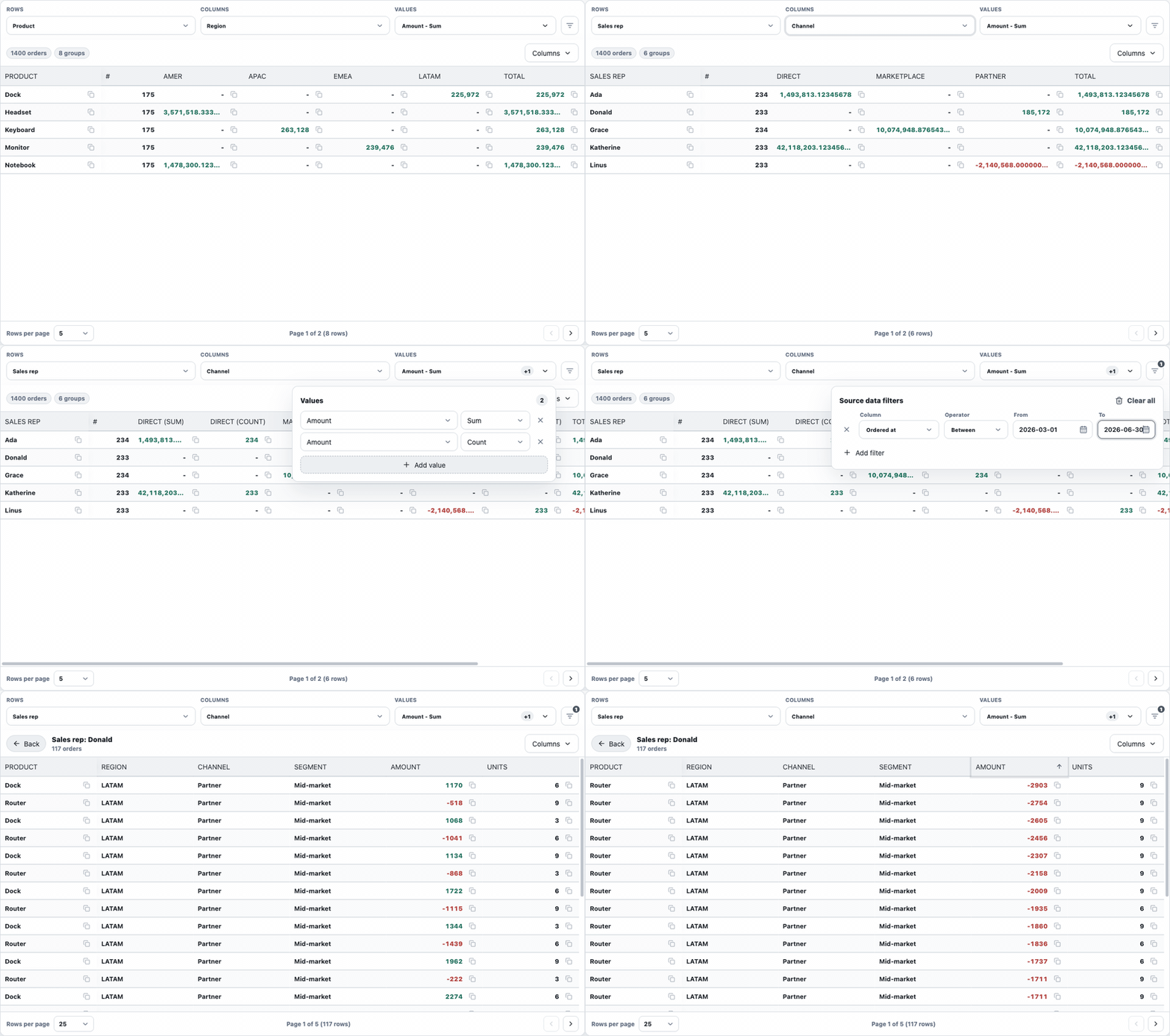
Open-source React data grid and pivot table for analytical product screens. It ships a pure TypeScript pivot engine, a virtualized React data grid, client-side and server-side pivot modes, built-in drill-in navigation, and CSS token-based styling that can be aligned with an existing design system.
Live playground: https://pivot-data-grid.vercel.app/
Source repository: https://github.com/tjablo/pivot-data-grid
Core capabilities
Pivot Grid Table keeps the core data contract portable while providing a practical React UI for analytics and finance workflows:
- Client mode: pass raw rows and compute pivot/filter/drilldown locally.
- Server mode: use managed
getPageloaders or controlledpivotResultprops with serializablePivotModel,SourceFilter[], pagination, sort, andDrillDownRequestcontracts. - Source filter action menu: users edit filters from a compact toolbar menu while apps keep full control through
filtersandonFiltersChange. - Multiple value aggregations: configure sum, count, average, min, and max metrics from a compact Values menu.
- Drill-in navigation: click a metric cell to replace the pivot with matching source rows, then return with Back.
- Virtualized rows and columns via TanStack Virtual.
- Built-in pagination with configurable rows-per-page options.
- Selectable cell text with optional per-column copy buttons.
- Configurable signed value tones for finance metrics.
- Localizable UI labels through the
labelsprop. - Themeable CSS variables with an optional Tailwind preset.
- MIT-licensed project and permissive runtime dependencies.
Install
npm install pivot-grid-table@alphaThe first public builds are published on the npm alpha dist-tag while the API is still hardening. Switch to npm install pivot-grid-table after a stable latest release exists.
import { PivotTable, type PivotFieldConfig, type PivotModel } from 'pivot-grid-table';
import 'pivot-grid-table/styles.css';

const fields: PivotFieldConfig[] = [
  { field: 'product', label: 'Product', role: 'dimension', type: 'string', copyable: true },
  { field: 'region', label: 'Region', role: 'dimension', type: 'string' },
  { field: 'amount', label: 'Amount', role: 'value', type: 'number', valueTone: 'signed' },
  { field: 'orderedAt', label: 'Ordered at', role: 'filter-only', type: 'date' },
];

const defaultPivotModel: PivotModel = {
  rows: ['product'],
  columns: ['region'],
  values: [{ field: 'amount', aggFunc: 'sum' }],
};

export function OrdersPivot({ rows }: { rows: Record<string, unknown>[] }) {
  return (
    <PivotTable
      data={rows}
      fields={fields}
      defaultPivotModel={defaultPivotModel}
      frozenColumnCount={1}
      entityName="orders"
    />
  );
}
PivotTable freezes the first visible column by default because row dimensions are usually the primary navigation surface in a pivot. Set frozenColumnCount={0} to disable it, or pass a larger number when your layout needs more pinned context. DataGrid exposes the same frozenColumnCount prop and defaults to 0.
PivotTable enables pagination by default. Configure it with the pagination object, or disable it with pagination={false}. DataGrid exposes the same pagination renderer but leaves it off by default:
<DataGrid
  rows={rows}
  columns={columns}
  pagination
/>
Use PivotTable pagination.mode: 'client' when the component should slice rows locally. In controlled server mode, use pagination.mode: 'server' when your API already returns the current page and the component should use totalRows only to render page controls. In managed server mode with getPage, omit mode; the component switches to server pagination internally. DataGrid exposes the same choice as paginationMode.
Copyable Cells
Cell text is selectable by default. Mark a DataGrid column as copyable to show a copy icon beside each value:
const columns = [
  { id: 'orderId', header: 'Order', accessor: 'orderId', copyable: true },
  {
    id: 'amount',
    header: 'Amount',
    accessor: 'amount',
    copyable: true,
    copyValue: (value) => String(value ?? ''),
  },
];
For PivotTable, set copyable: true on the relevant PivotFieldConfig. Generated row and drilldown columns for that field will expose the copy action.
Value Tones
Use valueTone: 'signed' when positive and negative numbers should carry semantic color. PivotTable reads this from PivotFieldConfig and applies it to generated metric and drilldown columns. DataGrid supports the same mode per column:
const columns = [
  {
    id: 'pnl',
    header: 'P&L',
    accessor: 'pnl',
    align: 'right',
    valueTone: 'signed',
  },
];
For product-specific rules, pass a resolver on DataGridColumn:
const columns = [
  {
    id: 'risk',
    header: 'Risk',
    accessor: 'riskScore',
    valueTone: ({ value }) => (Number(value) > 0.8 ? 'negative' : 'neutral'),
  },
];
Override --pg-positive and --pg-negative to match your design system without changing component code.
Filter-Only Fields And Date Ranges
Fields with role: 'filter-only' are excluded from row/value selectors but remain available in the source filter menu. This is useful for values such as transaction dates, booking dates, or internal status fields.
const fields: PivotFieldConfig[] = [
  { field: 'product', label: 'Product', role: 'dimension', type: 'string' },
  { field: 'amount', label: 'Amount', role: 'value', type: 'number' },
  { field: 'orderedAt', label: 'Ordered at', role: 'filter-only', type: 'date' },
];
Date fields use a package date picker built on Radix Popover, not the browser-native date input. Values still use the existing serializable filter shape and inclusive ranges:
{ id: 'orderedAt-range', field: 'orderedAt', operator: 'between', value: '2026-01-01', valueTo: '2026-01-31' }Filter edits are drafted while the source filter menu is open and applied when the menu closes. This prevents a backend getPage loader from firing on every keystroke while a user is still editing a range or text value. Pass deferFilterUpdates={false} only when you explicitly want every filter edit to update filters immediately.
Localization
Built-in UI text is configurable through labels. Pass only the keys you want to override:
<PivotTable
  data={rows}
  fields={fields}
  labels={{
    rowField: 'Wiersze',
    columnField: 'Kolumny',
    values: 'Wartości',
    addValue: 'Dodaj wartość',
    removeValue: (index) => `Usuń wartość ${index}`,
    valueFieldAria: (index) => `Pole wartości ${index}`,
    aggregationAria: (index) => `Agregacja ${index}`,
    sourceFilters: 'Filtry danych',
    addFilter: 'Dodaj filtr',
    recordCount: (filtered, total, entityName) => `${filtered}/${total} ${entityName}`,
    groupCount: (count) => `${count} grupy`,
  }}
/>
Client-Side Mode
Use client-side mode when the browser already has the complete, authorized source rows for the current analysis. PivotTable receives data, filters rows locally, computes the pivot locally, and opens drilldown rows from the same in-memory dataset.
<PivotTable
  data={orders}
  fields={fields}
  defaultPivotModel={defaultPivotModel}
  entityName="orders"
/>
See Client-side pivot mode for pagination, drilldown, and controlled UI-state examples.
Server-Side Mode
Use server-side mode when the backend owns aggregation, permissions, row limits, or query planning. The recommended path is managed getPage: the component calls your loader on initial load, model/filter changes, page changes, page-size changes, and server sort changes.
<PivotTable
  fields={fields}
  defaultPivotModel={defaultPivotModel}
  getPage={async ({ model, filters, page, sort, signal }) => {
    const response = await api.fetchPivot({ model, filters, page, sort, signal });
    return {
      result: response.pivotResult,
      totalRows: response.totalPivotGroups,
    };
  }}
  pagination={{
    defaultPageSize: 25,
    pageSizeOptions: [10, 25, 50, 100],
  }}
  drillDown={{
    getPage: async ({ request, filters, page, sort, signal }) => {
      const response = await api.fetchDrilldown({
        rowValues: request.rowValues,
        columnValues: request.columnValues,
        valueField: request.valueField,
        filters,
        page,
        sort,
        signal,
      });

      return {
        rows: response.data,
        totalRows: response.totalRows,
      };
    },
    pagination: {
      defaultPageSize: 25,
      pageSizeOptions: [25, 50, 100],
    },
  }}
  entityName="transactions"
/>;
page.pageIndex is zero-based. Return totalRows from loaders; the component derives page count and keeps the page controls in sync. Pass signal to fetch or your request layer so stale requests can be aborted.
See Server-side pivot mode for the backend PivotResult shape, generated pivot column ids, controlled mode, backend drilldown pagination, sorting, and when to use each API style.
PivotTable Props
PivotTable supports client mode with raw data, managed server mode with getPage, and controlled server mode with a backend-computed pivotResult. The most important props are grouped by responsibility:
| Prop | Purpose |
|---|---|
data |
Client-mode source rows. When set, filtering, pivoting, and drilldown run in the browser. |
getPage |
Recommended managed server-mode pivot loader. Receives model, filters, zero-based page, sort, and signal; returns { result, totalRows }. |
pivotResult |
Controlled server-mode pivot result. In backend pagination, pass only the current page in pivotResult.rows. |
fields |
Field metadata for labels, roles, filters, copy buttons, value tones, custom field cell renderers, and drilldown columns. Required in server mode. |
defaultPivotModel |
Initial uncontrolled pivot model. |
pivotModel / onPivotModelChange |
Controlled pivot model for apps that keep row/column/value selection in external state. |
filters / onFiltersChange |
Controlled source filters shared by client and server mode. |
deferFilterUpdates |
Keeps source filter menu edits local until the menu closes. Defaults to true. |
pagination |
false disables pivot pagination, true uses defaults, and an object configures pivot page sizes, controlled state, and backend pagination. |
drillDown |
Scoped drilldown behavior: managed getPage, mode, controlled rows, loading, onOpen, renderHeader, and drilldown-only pagination. |
formatValue |
Pivot metric formatter. Receives (value, columnId, context), where context includes the metric kind, field, aggregation, and pivot column metadata. |
columnSizing |
Width, minWidth, and maxWidth overrides for generated row, count, value, total, and fallback loading columns. |
labels |
Overrides built-in text and count formatters. |
className |
Theme scope for CSS token overrides. |
Use formatValue when different metrics need different display precision or units. The columnId argument is kept for compatibility, but new code should prefer the structured context:
<PivotTable
  data={orders}
  fields={fields}
  formatValue={(value, _columnId, context) => {
    if (value == null) return '-';
    if (context.kind === 'count') return String(value);
    if (context.field === 'exchangeRate' && context.aggFunc === 'avg') return String(value);
    if (context.field === 'amount') return `$${String(value)}`;
    return String(value);
  }}
/>
Client-side aggregation returns safe values as number and high-precision values as decimal string. If you need rounding or padding for decimal strings, use a decimal-aware formatter in formatValue rather than coercing those strings back to number.
Use renderFieldCell on a field when a source-field value needs richer UI. The renderer receives the value resolved from the field path, so nested paths such as order.product.constituent.ticker do not need a helper import. It applies when the field appears as a pivot row field, generated pivot column header, or drilldown source column; aggregated metric cells still use formatValue. Use location to tailor the same renderer for pivot-row, pivot-column, and drilldown.
<PivotTable
  data={orders}
  fields={[
    {
      field: 'order.product.constituent.ticker',
      label: 'Product',
      role: 'dimension',
      renderFieldCell: ({ value, location }) => <ProductCell ticker={String(value)} compact={location === 'pivot-column'} />,
    },
    { field: 'amount', label: 'Amount', type: 'number', role: 'value' },
  ]}
/>
Use drillDown.renderHeader when the default Field: value / Column: value title and record-count subtitle should be replaced with custom UI:
<PivotTable
  data={orders}
  fields={fields}
  drillDown={{
    renderHeader: ({ parts, defaultTitle, defaultSubtitle, rowCount, entityName }) => (
      <DrilldownHeader
        parts={parts}
        fallbackTitle={defaultTitle}
        fallbackSubtitle={defaultSubtitle}
        rowCount={rowCount}
        entityName={entityName}
      />
    ),
  }}
/>
The parts array contains the structured pieces used to build defaultTitle. Row fields use kind: 'row'; pivot column fields use kind: 'column'. defaultSubtitle is the built-in record-count line, and rowCount is the current drilldown row count.
[
  { kind: 'row', field: 'product', label: 'Product', value: 'Laptop' },
  { kind: 'column', field: 'region', label: 'Region', value: 'AMER' },
]
Use columnSizing when formatted values need more horizontal space:
<PivotTable
  data={orders}
  fields={fields}
  columnSizing={{
    value: { minWidth: 220 },
    total: { minWidth: 240 },
  }}
/>
Controlled backend pagination object shape:
<PivotTable
  pagination={{
    defaultPageSize: 25,
    pageSizeOptions: [10, 25, 50, 100],
    mode: 'server',
    state: paginationState,
    totalRows: totalPivotRows,
    onChange: setPaginationState,
  }}
  drillDown={{
    mode: 'replace',
    onOpen: setActiveDrillDown,
    rows: drillDownPageRows,
    loading: isDrillDownFetching,
    pagination: {
      mode: 'server',
      state: drillDownPaginationState,
      totalRows: totalDrillDownRows,
      onChange: (state, request) => fetchDrilldownPage(request, state),
    },
  }}
/>
mode defaults to client. Set it to server only when your backend already applied state.pageIndex and state.pageSize and the component should render the rows exactly as received. drillDown.pagination is separate because pivot groups and drilldown source rows are often fetched by different endpoints.
drillDown.onOpen is a notification hook for controlled integrations. For data loading, use managed drillDown.getPage or controlled drillDown.rows plus drillDown.pagination.
Styling
The distributed CSS is intentionally plain. Override tokens on a wrapper or on the className passed to PivotTable:
.finance-grid {
  --pg-accent: var(--brand-primary);
  --pg-bg: var(--app-bg);
  --pg-surface: var(--panel-bg);
  --pg-border: var(--border-subtle);
  --pg-toolbar-bg: var(--panel-muted);
  --pg-positive: var(--success);
  --pg-negative: var(--danger);
  --pg-radius: 6px;
  --pg-font-family: var(--font-sans);
}
Optional Tailwind bridge:
import pivotGridPreset from 'pivot-grid-table/tailwind-preset';

export default {
  presets: [pivotGridPreset],
};
Development
npm install
npm run dev
npm run check
npm run format
npm run typecheck
npm run coverage
npm run build
npm run pack:check
npm run release
The local playground runs at http://127.0.0.1:5173/ and includes client pivot mode, server-like pivot mode, raw virtualized grid mode, and theme switching. The deployed playground is available at https://pivot-data-grid.vercel.app/.
Documentation
- Architecture
- Client-side pivot mode
- Server-side pivot mode
- Changelog
- Styling strategy
- Publishing
- Research and license review
- Testing strategy
Status
This is an initial alpha package foundation. The public API is usable, but pre-1.0.0; expect the roadmap in docs/ARCHITECTURE.md to guide hardening around accessibility, column resizing, advanced pinning, and backend pagination.