
11.1.0 • Published 1 month ago
primereact
Licence
SEE LICENSE IN LICENSE.md
Version
11.1.0
Deps
2
Size
1.3 MB
Vulns
0
Weekly
0
primereact
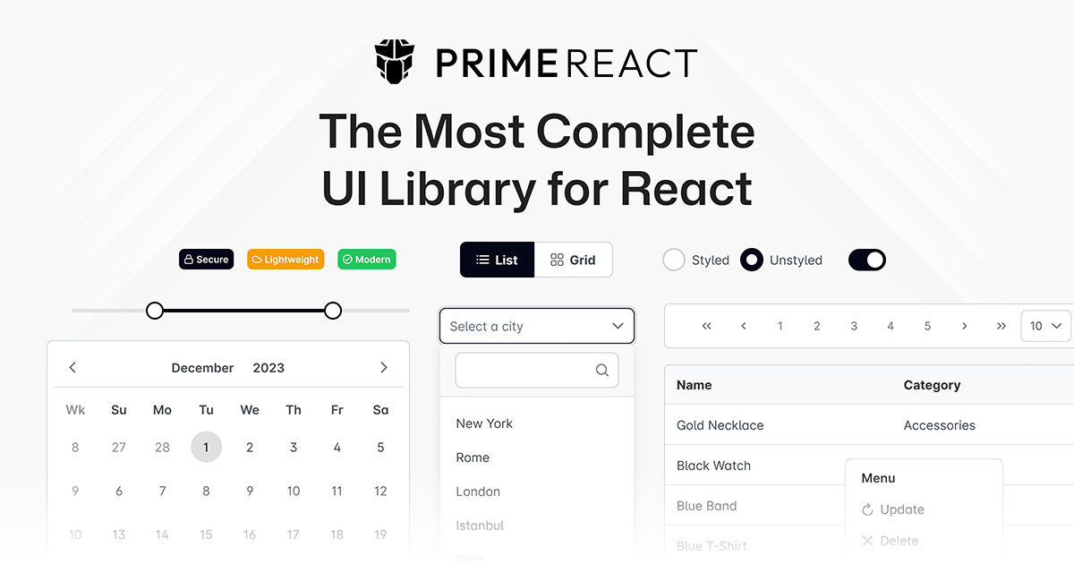
Unstyled, composable React primitives. Behavior, state, keyboard navigation and accessibility are handled; styling is left entirely open.
npm install primereactUsage
Each component has its own subpath. Multi-element components are composed from named parts, so markup, nesting and class names stay under full control.
import { Select } from 'primereact/select';
import { ChevronDown } from '@primeicons/react/chevron-down';

<Select.Root options={languages} optionLabel="label" optionValue="value">
    <Select.Trigger className="flex w-56 items-center justify-between rounded-md border px-3 py-2">
        <Select.Value placeholder="Select a language" />
        <Select.Indicator>
            <ChevronDown />
        </Select.Indicator>
    </Select.Trigger>
    <Select.Portal>
        <Select.Positioner>
            <Select.Popup className="rounded-md border bg-white shadow-lg">
                <Select.List />
            </Select.Popup>
        </Select.Positioner>
    </Select.Portal>
</Select.Root>;
The application is wrapped once with PrimeReactProvider from @primereact/core. No theme or preset is needed, since primitives ship no CSS.
Documentation
License
Licensed under the PrimeUI License - Copyright (c) PrimeTek Informatics