progress-steps-webcomponent
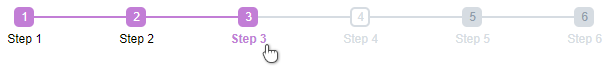
A web component for displaying the steps of a process and letting users move between them
View Example
Getting Started
CDN
Use the built files from npm from https://unpkg.com/progress-steps-webcomponent@latest
<!-- For example, use a CDN and replace 'latest' with your intended version -->
<link rel="stylesheet" href="https://unpkg.com/progress-steps-webcomponent@latest/dist/progress-steps.min.css"/>
<script src="https://unpkg.com/progress-steps-webcomponent@latest/dist/progress-steps.min.js"></script>
Manual
To build yourself, clone the repo, and run
npm i
npm run build
And use the dist/progress-steps.min.js and dist/progress-steps.min.css files
Configuration
View the example above for a complete working example. Add the component anywhere in your html:
<progress-steps id="my-steps"></progress-steps>Then initialize the control
// Find the control
let myStepper = document.querySelector('#my-steps');

// And initialize it
myStepper.init({
	steps: [{ name: 'Step 1' }, { name: 'Step 2' }, { name: 'Step 3' }],
});
Step configuration
You can disable steps by setting disabled to true.
You can attach any custom property to a step that you wish. When programmatically fetching the step later, those values can be retrieved and used. For example, you might attach custom IDs/GUIDs to them, so that when a step is changed, you can act upon the ID of that step:
myStepper.init({
	steps: [
		{ name: 'Step 1', myCustomId: 1 },
		{ name: 'Step 2', myCustomId: 2 },
		{ name: 'Step 3', myCustomId: 3 },
		{ name: 'Step 4', myCustomId: 4 },
		{ name: 'Step 5', myCustomId: 5, disabled: true },
		{ name: 'Step 6', myCustomId: 6, disabled: true },
	],
	events: {
		onStepChanged: function (stepNumber, stepObj) {
			console.log(`Step changed to ${stepNumber}!`);
			let newId = stepObj.myCustomId;
			// [Act upon newId here]
		},
	},
});
Events
| Event Name | Parameters | Description |
|---|---|---|
| onStepChanged | (stepNumber, stepObj) | Fired when the step is changed |
Methods
| Method Name | Parameters | Description |
|---|---|---|
| init | (options) | Initializes the control. See above examples for options usage |
| getStep | Returns the step object of the current active step | |
| setStep | (step) | Takes in the step number of the step to change to |
| stepUp | Increments the current active step | |
| stepDown | Decrements the current active step | |
| disableStep | (step) | Takes in the step number of a step and disables it from use |
| enableStep | (step) | Takes in the step number of a step and enables it for use |
Styling
Styling defaults can be overridden by overriding CSS variables on your component instance:
/* Ugly but complete style override demonstrating all the style components */
#my-steps{
	/* The color to fill up, left-to-right, as steps are set to active */
	--progress-fill-color: #cf78d9;
	/* The default color of the unfilled section of line and steps after the active step */
	--progress-unfilled-color: purple;

	/* The width of each step icon */
	--step-width: 20px;
	/* The font size of the step number and label */
	--font-size: 12px;
	/* The border radius of the step icon */
	--step-border-radius: 25%;
	/* The thickness of the line/progress bar/borders */
	--line-thickness: 3px;

	/* The animation speed of the progress bar filling up */
	--animation-speed: 500ms;
	/* Display attribute of the step labels. Show: 'inline-block', hide: 'none' */
	--step-label-display: 'inline-block';
	/* The vertical margin of the labels, if shown */
	--step-label-spacing: 5px;
	/* The font weight to use on step labels */
	--step-label-font-weight: normal;

	/* The font color of the step icon that is currently active */
	--current-step-font-color: red;
	/* The font color of the current step label */
	--current-label-font-color: blue;
	/* The font weight of the current step label */
	--current-label-font-weight: bold;

	/* The font color of step labels that are before the current step */
	--previous-label-font-color: red;
	/* The font color of the step icons that are before the current step */
	--previous-step-font-color: pink;

	/* The fill-color for step icons that are after the current active step */
	--future-step-fill-color: orange;
	/* The font color of step labels that are after the current step */
	--future-label-font-color: green;

	/* The font color of step labels that are disabled */
	--disabled-label-font-color: maroon;
	/* The font color of the disabled steps */
	--disabled-step-font-color: red;
	/* The fill-color for disabled step icons */
	--disabled-step-fill-color: blue;
}