


Features
- Small: Just 3,1 KB gzipped (12x lighter than react-color).
- Tree-shakeable: Only the parts you use will be imported into your app's bundle.
- Fast: Built with hooks and functional components only.
- Bulletproof: Written in strict TypeScript and has 100% test coverage.
- Typed: Ships with types included
- Simple: The interface is straightforward and easy to use.
- Cross-browser: Works out-of-the-box for most browsers, regardless of version.
- Mobile-friendly: Supports mobile devices and touch screens.
- Accessible: Follows the WAI-ARIA guidelines to support users of assistive technologies.
- No dependencies
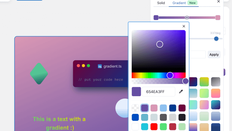
Live demos
Table of Contents
- Getting Started
- Supported Color Models
- Customization
- How to paste or type a color?
- Code Recipes
- TypeScript Support
- Usage with Preact
- Browser Support
- Why react-colorful?
- Projects using react-colorful
- Ports
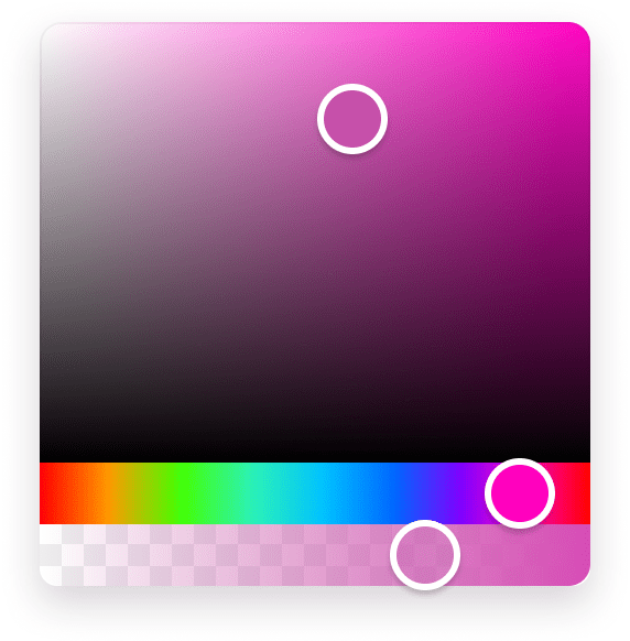
Getting Started
npm install react-colorfulimport { HexColorPicker } from "react-colorful";
const YourComponent = () => {
const [color, setColor] = useState("#aabbcc");
return <HexColorPicker color={color} onChange={setColor} />;
};Supported props
| Prop | Type | Default | Description |
|---|---|---|---|
color |
string or object |
— | The current color value |
onChange |
(color) => void |
— | Called on every color change (during dragging, on each key press) |
onChangeEnd |
(color) => void |
— | Called when the user finishes changing a color (mouseup, touchend, or keyup) |
The onChangeEnd callback is useful for undo/redo, saving to a database, or other expensive operations you don't want to run on every intermediate value:
const YourComponent = () => {
  const [color, setColor] = useState("#aabbcc");
  return (
    <HexColorPicker
      color={color}
      onChange={setColor}
      onChangeEnd={(color) => saveToDatabase(color)}
    />
  );
};
All pickers also accept every property that a regular div tag does (className, style, aria-label, etc.).
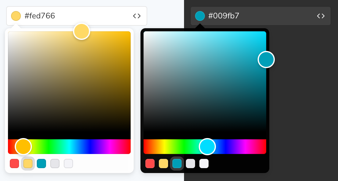
Supported Color Models
We provide 12 additional color picker components for different color models, unless your app needs a HEX string as an input/output format.
How to use another color model
Available pickers
| Import | Value example |
|---|---|
{ HexColorPicker } |
"#ffffff" |
{ HexAlphaColorPicker } |
"#ffffff88" |
{ RgbColorPicker } |
{ r: 255, g: 255, b: 255 } |
{ RgbaColorPicker } |
{ r: 255, g: 255, b: 255, a: 1 } |
{ RgbStringColorPicker } |
"rgb(255, 255, 255)" |
{ RgbaStringColorPicker } |
"rgba(255, 255, 255, 1)" |
{ HslColorPicker } |
{ h: 0, s: 0, l: 100 } |
{ HslaColorPicker } |
{ h: 0, s: 0, l: 100, a: 1 } |
{ HslStringColorPicker } |
"hsl(0, 0%, 100%)" |
{ HslaStringColorPicker } |
"hsla(0, 0%, 100%, 1)" |
{ HsvColorPicker } |
{ h: 0, s: 0, v: 100 } |
{ HsvaColorPicker } |
{ h: 0, s: 0, v: 100, a: 1 } |
{ HsvStringColorPicker } |
"hsv(0, 0%, 100%)" |
{ HsvaStringColorPicker } |
"hsva(0, 0%, 100%, 1)" |
Code example
import { RgbColorPicker } from "react-colorful";

const YourComponent = () => {
  const [color, setColor] = useState({ r: 50, g: 100, b: 150 });
  return <RgbColorPicker color={color} onChange={setColor} />;
};Customization
The easiest way to tweak react-colorful is to create another stylesheet to override the default styles.
.your-component .react-colorful {
  height: 240px;
}
.your-component .react-colorful__saturation {
  border-radius: 4px 4px 0 0;
}
.your-component .react-colorful__hue {
  height: 40px;
  border-radius: 0 0 4px 4px;
}
.your-component .react-colorful__hue-pointer {
  width: 12px;
  height: inherit;
  border-radius: 0;
}How to paste or type a color?
As you probably noticed the color picker itself does not include an input field, but do not worry if you need one. react-colorful is a modular library that allows you to build any picker you need. Since v2.1 we provide an additional component that works perfectly in pair with our color picker.
How to use HexColorInput
import { HexColorPicker, HexColorInput } from "react-colorful";

const YourComponent = () => {
  const [color, setColor] = useState("#aabbcc");
  return (
    <div>
      <HexColorPicker color={color} onChange={setColor} />
      <HexColorInput color={color} onChange={setColor} />
    </div>
  );
};| Property | Default | Description |
|---|---|---|
alpha |
false |
Allows #rgba and #rrggbbaa color formats |
prefixed |
false |
Enables # prefix displaying |
HexColorInput does not have any default styles, but it also accepts all properties that a regular input tag does (such as className, placeholder and autoFocus). That means you can place and modify this component as you like. Also, that allows you to combine the color picker and input in different ways:
<HexColorInput color={color} onChange={setColor} placeholder="Type a color" prefixed alpha />Code Recipes
- Popover picker
- Preset colors (color squares)
- Picker that accepts any color input
- Text field to be able to type/copy/paste a color
- Custom styles and layout
- Value debouncing (consider using
onChangeEndinstead for many use cases)
TypeScript Support
react-colorful supports TypeScript and ships with types in the library itself; no need for any other install.
How you can get the most from our TypeScript support
While not only typing its own functions and variables, it can also help you type yours. Depending on the component you are using, you can also import the type that is associated with the component. For example, if you are using our HSL color picker component, you can also import the HSL type.
import { HslColorPicker, HslColor } from "react-colorful";

const myHslValue: HslColor = { h: 0, s: 0, l: 0 };
Take a look at Supported Color Models for more information about the types and color formats you may want to use.
Usage with Preact
react-colorful will work flawlessly with Preact out-of-the-box if you are using WMR, Preact-CLI, NextJS with Preact, or a few other tools/boilerplates thanks to aliasing.
If you are using another solution, please refer to the Aliasing React to Preact section of the Preact documentation.
Preact + Typescript
react-colorful, like all other React + TS projects, can potentially cause issues in a Preact + TS application if you have the @types/react package installed, either as a direct dependency or a dependency of a dependency. For example, the Preact TS template comes with @types/enzyme which has @types/react as a dependency.
To fix this, create a declaration.d.ts file or add to your existing:
import React from "react";

declare global {
    namespace React {
        interface ReactElement {
            nodeName: any;
            attributes: any;
            children: any;
        }
    }
}
This will correct the types and allow you to use react-colorful along with many other React + TS libraries in your Preact + TS application.
Browser Support
It would be an easier task to list all of the browsers and versions that react-colorful does not support! We regularly test against browser versions going all the way back to 2013 and this includes IE11.
react-colorful works out-of-the-box for most browsers, regardless of version, and only requires an Object.assign polyfill be provided for full IE11 support.
Why react-colorful?
Today each dependency drags more dependencies and increases your project’s bundle size uncontrollably. But size is very important for everything that intends to work in a browser.
react-colorful is a simple color picker for those who care about their bundle size and client-side performance. It is fast and lightweight because:
- has no dependencies (no risks in terms of vulnerabilities, no unexpected bundle size changes);
- built with hooks and functional components only (no classes and polyfills for them);
- ships only a minimal amount of manually optimized color conversion algorithms (while most of the popular pickers import entire color manipulation libraries that increase the bundle size by more than 10 KB and make your app slower).
To show you the problem that react-colorful is trying to solve, we have performed a simple benchmark (using bundlephobia.com) against popular React color picker libraries:
| Name | Bundle size | Bundle size (gzip) | Dependencies |
|---|---|---|---|
| react-colorful | |||
| react-color | |||
| react-input-color | |||
| rc-color-picker |
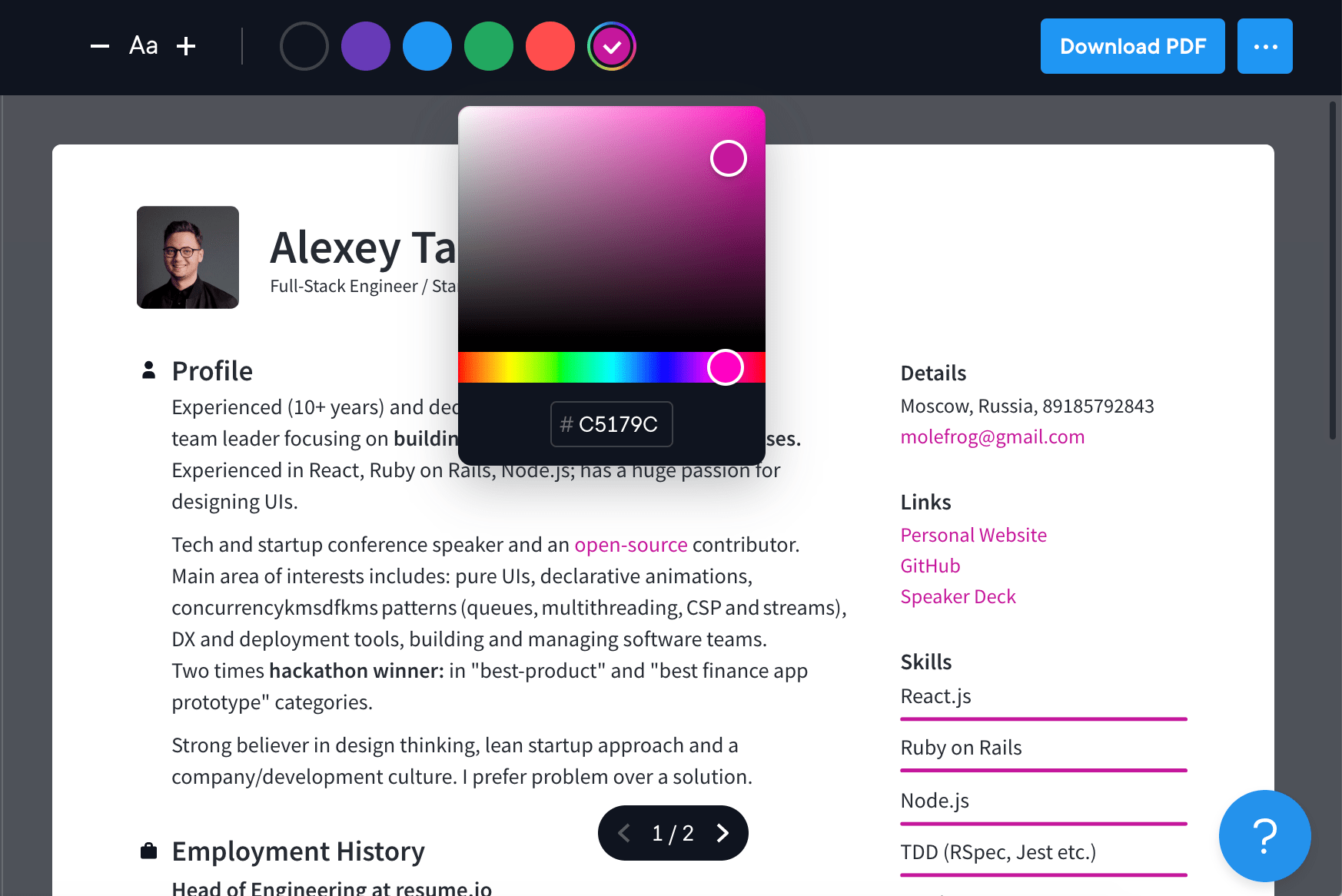
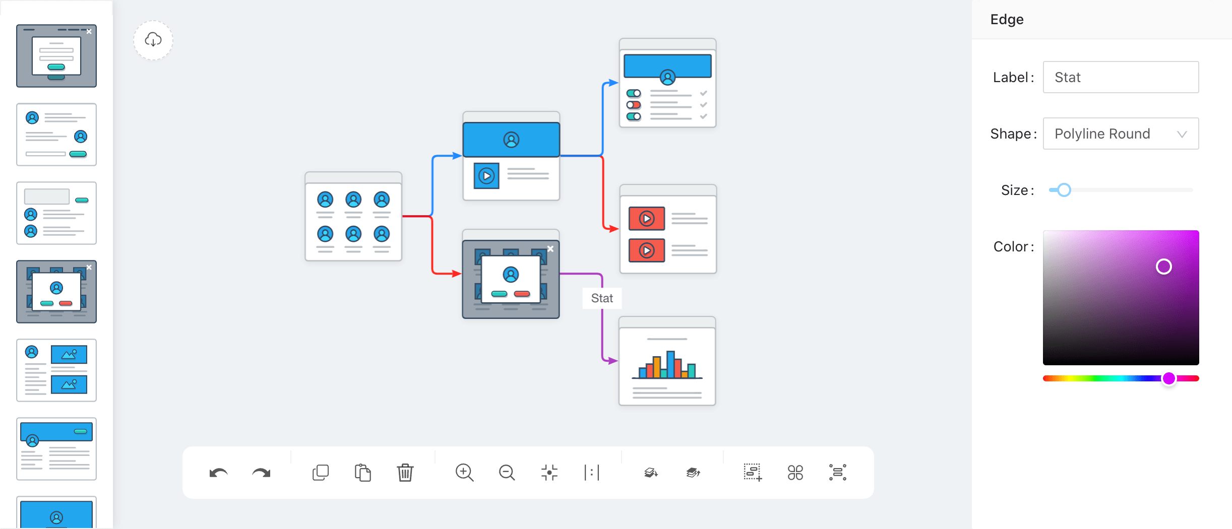
Projects using react-colorful
Storybook — the most widely used open-source tool for developing UI components
Resume.io — online resume builder with over 9,400,000 users worldwide
Wireflow.co — free tool for creating modern user flow prototypes
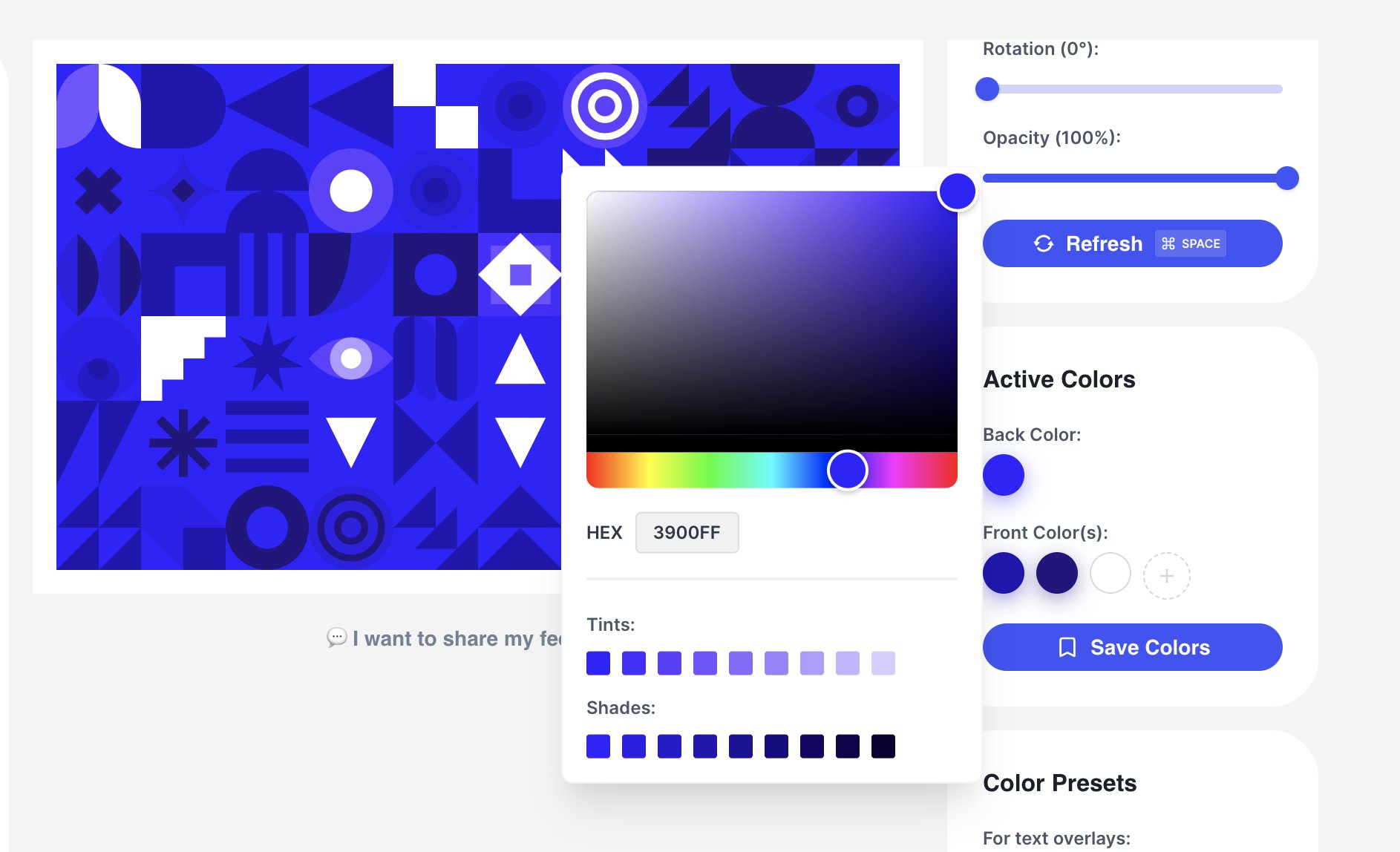
MagicPattern.design — unique geometric pattern generator
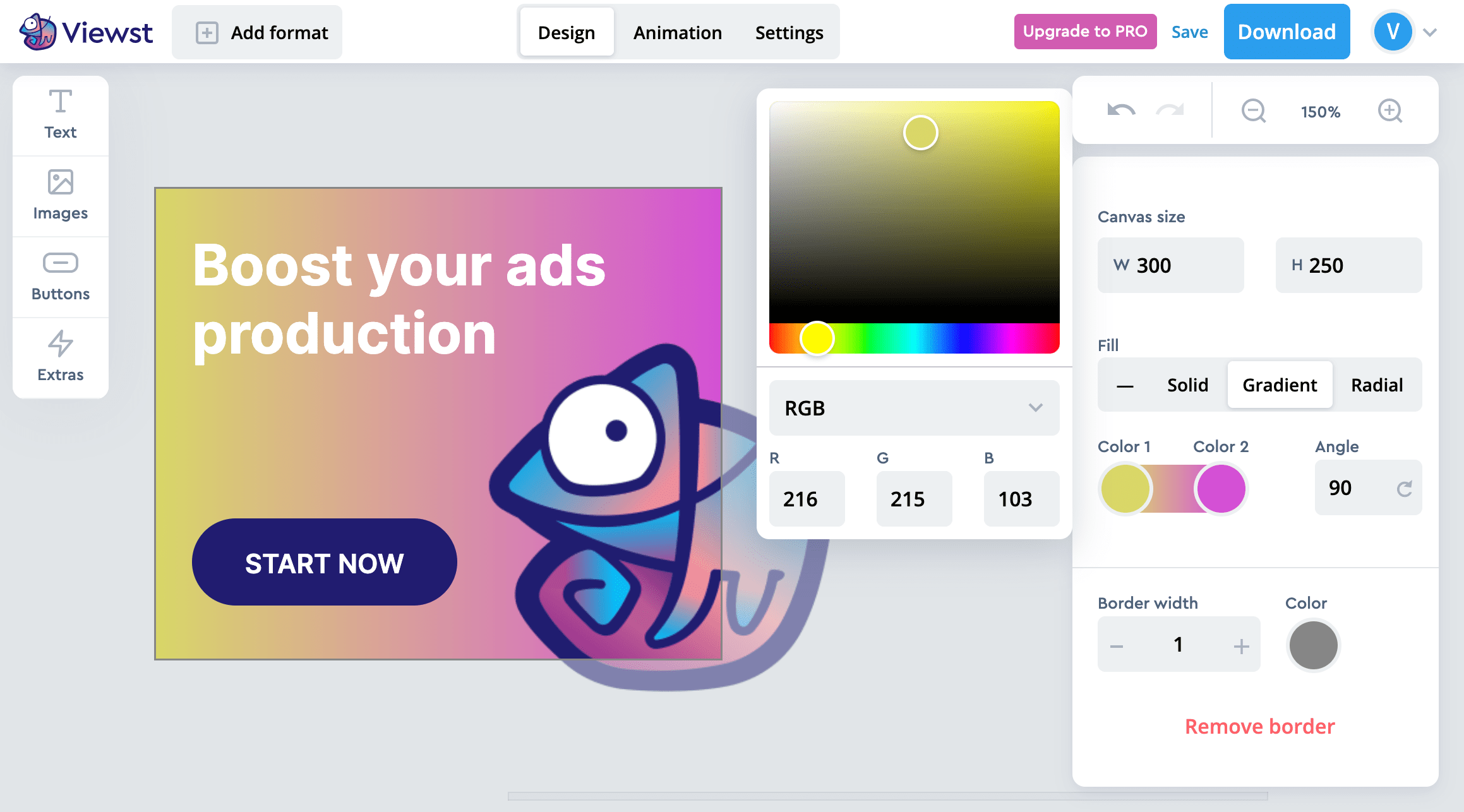
Viewst.com — online tool for designing, creating and automating ad campaigns
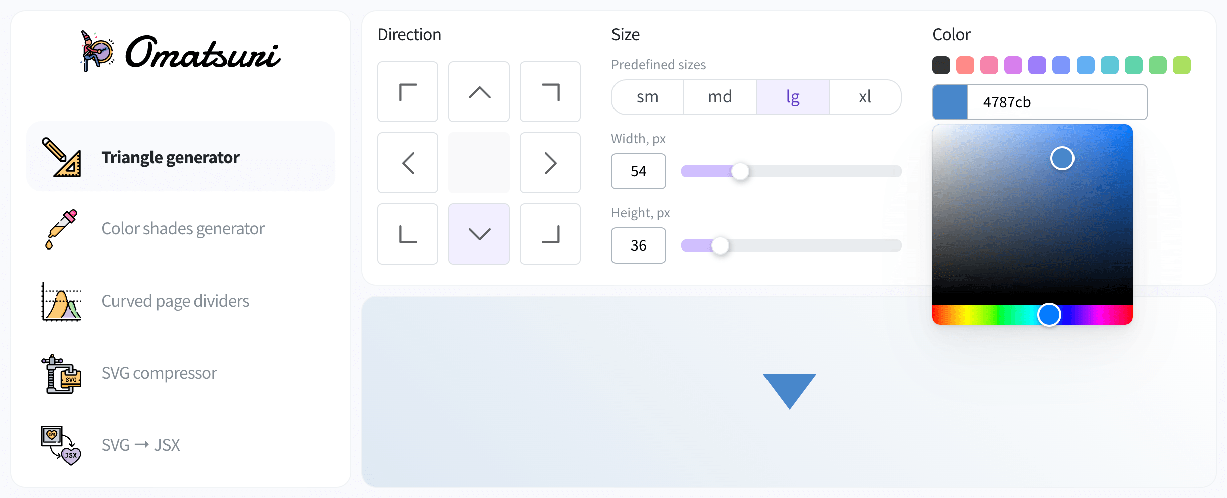
Omatsuri.app — progressive web application with a lot of different frontend focused tools
Leva — open source extensible GUI panel made for React

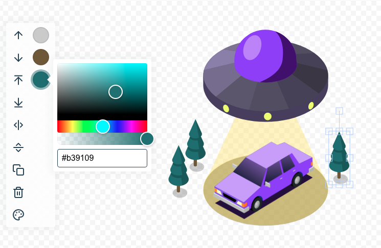
Composable — online tool for creating custom vector illustrations
snappify.io — powerful design tool to create and manage beautiful images of your code snippets
Backers and sponsors

Ports
Not using React or Preact? Not a problem! Check out the list of react-colorful ports adapted to your favourite framework or technology of choice:
vanilla-colorful — a react-colorful reimplementation in vanilla Custom Elements, generously ported by @web-padavan.
angular-colorful — a react-colorful rewritten for use with the Angular framework, lovingly ported by @fil0157.
If your port is not in the list, reach us out via GitHub issues.