0.0.85 • Published 7 years ago
react-native-image-header-scroll-view-ep v0.0.85
react-native-image-header-scroll-view
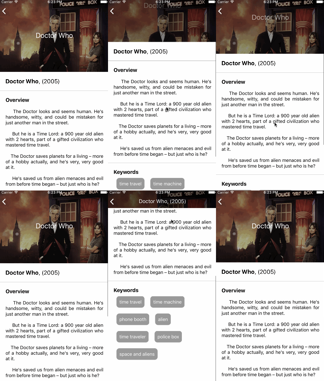
A ScrollView-like component that:
- Has a fixed image header
- Keep the image as a nav bar
- Works on iOS and Android
Installation
$ npm install react-native-image-header-scroll-view --saveDemo
 |
|
Basic Usage
import HeaderImageScrollView, { TriggeringView } from 'react-native-image-header-scroll-view';

// Inside of a component's render() method:
render() {
  return (
    <HeaderImageScrollView
      maxHeight={200}
      minHeight={MIN_HEIGHT}
      headerImage={require('../../assets/NZ.jpg')}
    >
      <View style={{ height: 1000 }}>
        <TriggeringView onHide={() => console.log('text hidden')} >
          <Text>Scroll Me!</Text>
        </TriggeringView>
      </View>
    </HeaderImageScrollView>
  );
}
You can find examples in a dedicated repository.
Usage (API)
All of the properties of ScrollView are supported. Please refer to the
ScrollView documentation for more detail.
The HeaderImageScrollView handle also the following props. None is required :
Header
| Property | Type | Default | Description | Example |
|---|---|---|---|---|
renderHeader | function | Empty view | Function which return the component to use as header. It can return background image for example. | example |
headerImage | Image source Props (object or number) | undefined | Shortcut for renderHeader={() => <Image source={this.props.headerImage} style={{ height: this.props.maxHeight, width: Dimensions.get('window').width }} />} | example |
maxHeight | number | 80 | Max height for the header | example |
minHeight | number | 125 | Min height for the header (in navbar mode) | example |
minOverlayOpacity | number | 0 | Opacity of a black overlay on the header before any scroll | example |
maxOverlayOpacity | number | 0.3 | Opacity of a black overlay on the header when in navbar mode | example |
overlayColor | string | black | Color of the overlay on the header | example |
headerContainerStyle | Object | undefined | Optional styles to be passed to the container of the header component | |
disableHeaderGrow | boolean | undefined | Disable to grow effect on the header | |
disableOverlay | boolean | undefined | Disable the image overlay |
Foreground
| Property | Type | Default | Description | Example |
|---|---|---|---|---|
renderForeground | function | Empty view | Function which return the component to use at foreground. The component is render in front of the header and scroll with the ScrollView. It can return a title for example. | example |
renderFixedForeground | function | Empty view | Function which return the component to use as fixed foreground. The component is displayed with the header but not affected by the overlay. | example |
foregroundParallaxRatio | number | 1 | Ration for parallax effect of foreground when scrolling. If 2, the header goes up two times faster than the scroll | example |
fadeOutForeground | bool | false | If set, add a fade out effect on the foreground when scroll up | example |
renderTouchableFixedForeground | function | Empty view | Same as renderFixedForeground but allow to use touchable in it. Can cause performances issues on Android | example |
Mixed
| Property | Type | Default | Description | Example |
|---|---|---|---|---|
ScrollViewComponent | Component | ScrollView | The component to be used for scrolling. Can be any component with an onScroll props (ie. ListView, FlatList, SectionList or ScrollView) | example |
scrollViewBackgroundColor | string | white | Background color of the scrollView content | example |
TriggeringView
The module also export a TriggeringView component. It is a simple view witch accept callback called when it disappear or appear at the top of the ImageHeaderScrollView. You can see an exemple in the dedicated repository.
All of the properties of View are supported.
| Property | Type | Description |
|---|---|---|
onBeginHidden | function | Called when the component start to be hidden at the top of the scroll view. |
onHide | function | Called when the component is not displayed any more after scroll up |
onBeginDisplayed | function | Called when the component begin to be displayed again after scroll down |
onDisplay | function | Called when the component finished to be displayed again. |
onTouchTop | function | Called when the Top of the component touch the Top of the ScrollView. (onDisplay + onBeginHidden) |
onTouchBottom | function | Called when the Bottom of the component touch the Top of the ScrollView. (onHide + onBeginDisplayed) |