react-native-notifier


Fast, simple, and customizable in-app notifications for React Native
Requirements
This library uses react-native-gesture-handler, a perfect library for swipes, and other gesture events.
Please check their installation guide to install it properly: https://docs.swmansion.com/react-native-gesture-handler/docs/installation
Installation
yarn add react-native-notifierOr
npm install --save react-native-notifierUsage
Wrap your app with NotifierWrapper
import { NotifierWrapper } from 'react-native-notifier';

const App = () => (
  <NotifierWrapper>
    <Navigation />
  </NotifierWrapper>
);
Then call Notifier.showNotification() anywhere in code
import { Notifier, Easing } from 'react-native-notifier';

Notifier.showNotification({
  title: 'John Doe',
  description: 'Hello! Can you help me with notifications?',
  duration: 0,
  showAnimationDuration: 800,
  showEasing: Easing.bounce,
  onHidden: () => console.log('Hidden'),
  onPress: () => console.log('Press'),
  hideOnPress: false,
});
Or add NotifierRoot at end of your App.js component. With this approach you can show notification using reference to the NotifierRoot.
Note that NotifierRoot should be the last component to display notifications correctly. Notifier.showNotification is also available.
import { NotifierRoot } from 'react-native-notifier';

function App() {
  const notifierRef = useRef();
  return (
    <>
      <Button
        title="Show Notification"
        onPress={() => notifierRef.current?.showNotification({ title: 'Using refs' })}
      />
      <NotifierRoot ref={notifierRef} />
    </>
  );
}
Props
Both NotifierWrapper and NotifierRoot receive the same props.
| Name | Type | Default | Description |
|---|---|---|---|
| omitGlobalMethodsHookup | Boolean | false | If set to true, global Notifier methods will not control this component. It's useful in case you have more than one NotifierWrapper or NotifierRoot rendered. If enabled, the only way to display notifications is using refs. |
| useRNScreensOverlay | Boolean | false | use FullWindowOverlay component from react-native-screens library. If true, Notifier will be rendered above NativeStackNavigation modals and RN Modal on iOS. This Option will work only if react-native-screens library is installed. iOS Only. |
| rnScreensOverlayViewStyle | ViewStyle | null | Style that will be used for RN View that is inside of FullWindowOverlay. iOS Only. |
All parameters of the showNotification function can be passed as props to NotifierWrapper or NotifierRoot. In this case, they will be used as default parameters when calling the showNotification function. This can be useful for setting default Component parameter.
API
showNotification
Notifier.showNotification(params: object);Show notification with params.
params
| Name | Type | Default | Description |
|---|---|---|---|
| title | String | null | Title of notification. Passed to Component. |
| description | String | null | Description of notification. Passed to Component. |
| duration | Number | 3000 | Time after notification will disappear. Set to 0 to not hide notification automatically |
| Component | Component | NotifierComponents.Notification | Component of the notification body. You can use one of the built-in components, or your custom component. |
| componentProps | Object | {} | Additional props that are passed to Component. See all available props of built-in components in the components section. |
| containerStyle | Object|Function | null | Styles Object or a Function that will receive translateY: Animated.Value as first parameter and should return Styles that will be used in container. Using this parameter it is possible to create your own animations of the notification. |
| containerProps | Object | {} | Props of Animated Container |
| queueMode | String | 'reset' | Determines the order in which notifications are shown. Read more in the Queue Mode section. |
| swipeEnabled | Boolean | true | Can notification be hidden by swiping it out |
| animationDuration | Number | 300 | How fast notification will appear/disappear |
| showAnimationDuration | Number | animationDuration || 300 | How fast notification will appear. |
| hideAnimationDuration | Number | animationDuration || 300 | How fast notification will disappear. |
| easing | Easing | null | Animation easing. Details: https://reactnative.dev/docs/easing |
| showEasing | Easing | easing || null | Show Animation easing. |
| hideEasing | Easing | easing || null | Hide Animation easing. |
| onShown | () => void | null | Function called when entering animation is finished |
| onStartHiding | () => void | null | Function called when notification started hiding |
| onHidden | () => void | null | Function called when notification completely hidden |
| onPress | () => void | null | Function called when user press on notification |
| hideOnPress | Boolean | true | Should notification hide when user press on it |
| swipePixelsToClose | Number | 20 | How many pixels user should swipe-up notification to dismiss it |
| swipeEasing | Easing | null | Animation easing after user finished swiping |
| swipeAnimationDuration | Number | 200 | How fast should be animation after user finished swiping |
| translucentStatusBar | Boolean | false | Add additional top padding that equals to StatusBar.currentHeight. Android Only. |
hideNotification
Notifier.hideNotification(onHiddenCallback?: (result: Animated.EndResult) => void);Hide notification and run callback function when notification completely hidden.
clearQueue
Notifier.clearQueue(hideDisplayedNotification?: boolean);Clear notifications queue and optionally hide currently displayed notification. Might be useful to run after logout, after which queued notifications should not be displayed.
Queue Mode
Queue mode is used to define the order in which the notification appears in case other notifications are being displayed at the moment.
For example, if you have some important information like chat messages and you want the user to see all the notifications, then you can use standby mode. Or if you want to display something like an error message, then you can use reset mode.
By default, reset mode is used, which means every new notification clears the queue and gets displayed immediately.
In most cases, you will probably use only reset or standby modes.
All possible modes:
| Mode | Effect |
|---|---|
| reset | Clear notification queue and immediately display the new notification. Used by default. |
| standby | Add notification to the end of the queue. |
| next | Put notification in the first place in the queue. Will be shown right after the current notification disappears. |
| immediate | Similar to next, but also it will hide currently displayed notification. |
Components
Currently, there are 2 components out of the box. If none of them fits your needs, then you can easily create your Custom Component.
NotifierComponents.Notification
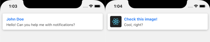
Perfect for something like chat messages and notifications like "Someone left a comment". This component is used by default.
import { Notifier, NotifierComponents } from 'react-native-notifier';

Notifier.showNotification({
  title: 'Check this image!',
  description: 'Cool, right?',
  Component: NotifierComponents.Notification,
  componentProps: {
    imageSource: require('./react.jpg'),
  },
});
Available params:
| Name | Type | Default | Description |
|---|---|---|---|
| title | String | null | Title of notification. |
| description | String | null | Description of notification. |
| componentProps.titleStyle | TextStyle | null | The style to use for rendering title. |
| componentProps.descriptionStyle | TextStyle | null | The style to use for rendering description. |
| componentProps.imageSource | Object | null | Passed to <Image /> as source param. |
| componentProps.imageStyle | ImageStyle | null | The style to use for rendering image. |
| componentProps.containerStyle | ViewStyle | null | The style to use for notification container. |
| componentProps.ContainerComponent | Component | SafeAreaView | A container of the component. Set it in case you use different SafeAreaView than the standard |
| componentProps.maxTitleLines | number | null | The maximum number of lines to use for rendering title. |
| componentProps.maxDescriptionLines | number | null | The maximum number of lines to use for rendering description. |
NotifierComponents.Alert
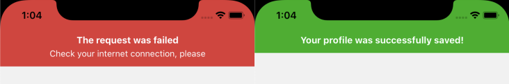
Perfect to use as a system alerts, like "Something went wrong" or "Operation was succeed".
import { Notifier, NotifierComponents } from 'react-native-notifier';

Notifier.showNotification({
  title: 'The request was failed',
  description: 'Check your internet connection, please',
  Component: NotifierComponents.Alert,
  componentProps: {
    alertType: 'error',
  },
});
Available params:
| Name | Type | Default | Description |
|---|---|---|---|
| title | String | null | Title of notification. |
| description | String | null | Description of notification. |
| componentProps.titleStyle | TextStyle | null | The style to use for rendering title. |
| componentProps.descriptionStyle | TextStyle | null | The style to use for rendering description. |
| componentProps.alertType | String | 'success' | Background color will be changed depending on the type. Available values: error(red), success(green), warn(orange) and info(blue). |
| componentProps.backgroundColor | String | null | While the background of the alert depends on alertType, you can also set the other color you want. |
| componentProps.textColor | String | 'white' | Color of title and description. |
| componentProps.ContainerComponent | Component | SafeAreaView | A container of the component. Set it in case you use different SafeAreaView than the standard |
| componentProps.maxTitleLines | number | null | The maximum number of lines to use for rendering title. |
| componentProps.maxDescriptionLines | number | null | The maximum number of lines to use for rendering description. |
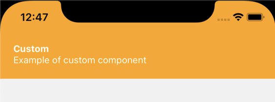
Custom Component
To customize look of the notification you can pass your own Component to showNotification function.
This makes customization much simpler than passing "style" params. With custom components you can make notification look exactly like you want.
This component will receive props title, description and anything else that you pass to componentProps object when calling showNotification.
Example
import React from 'react';
import { StyleSheet, View, Text, SafeAreaView } from 'react-native';

const styles = StyleSheet.create({
  safeArea: {
    backgroundColor: 'orange',
  },
  container: {
    padding: 20,
  },
  title: { color: 'white', fontWeight: 'bold' },
  description: { color: 'white' },
});

const CustomComponent = ({ title, description }) => (
  <SafeAreaView style={styles.safeArea}>
    <View style={styles.container}>
      <Text style={styles.title}>{title}</Text>
      <Text style={styles.description}>{description}</Text>
    </View>
  </SafeAreaView>
);

// ...

// Then show notification with the component

Notifier.showNotification({
  title: 'Custom',
  description: 'Example of custom component',
  Component: CustomComponent,
});
Custom Animations
It is easy to create your own animation using containerStyle param.
When you pass a function as containerStyle param, it will receive a translateY Animated Value as first parameter.
This Animated Value is a Driver of all Animations in this library and varies between -1000(notification completely hidden) and 0 (notification is shown). By default this value is used as a Y position of the Notification.
So when you call showNotification — this value starts changing from -1000 to 0 and when the notification is starts hiding — the value is changing from 0 to -"height of the component"+50 (or -200, depending what is bigger) and when animation is finished, the values will be set to -1000 (just to make sure that the notification is completely hidden).
You need to remember three points of the animated value:
-1000- Notification completely hidden;-200- Most likely notification is still hidden, but will be visible soon (depending on height of the notification);0- Notification is shown.
I know, this all is complicated, so here is a Code Example with combination of scaling and transition:
const getContainerStyleWithTranslateAndScale = (translateY: Animated.Value) => ({
  transform: [
    {
      // this interpolation is used just to "clamp" the value and didn't allow to drag the notification below "0"
      translateY: translateY.interpolate({
        inputRange: [-1000, 0],
        outputRange: [-1000, 0],
        extrapolate: 'clamp',
      }),
    },
    {
      // scaling from 0 to 0.5 when value is in range of -1000 and -200 because mostly it is still invisible,
      // and from 0.5 to 1 in last 200 pixels to make the scaling effect more noticeable.
      scale: translateY.interpolate({
        inputRange: [-1000, -200, 0],
        outputRange: [0, 0.5, 1],
        extrapolate: 'clamp',
      }),
    },
  ],
});

Notifier.showNotification({
  title: 'Custom animations',
  description: 'This notification is moved and scaled',
  containerStyle: getContainerStyleWithTranslateAndScale,
})
Code from example above should work great on both Android and iOS.
But if you will animate opacity style with component that have shadows (such as NotifierComponents.Notification)
you may notice that on Android shadows doesn't animate properly. To fix this problem, you need to use containerProps parameter and pass needsOffscreenAlphaCompositing: true to it. Details: RN's Repository Issue
const animatedContainerProps = isAndroid ? { needsOffscreenAlphaCompositing: true } : undefined;
// ...
Notifier.showNotification({
  title: 'Custom animations',
  description: 'This notification is moved and scaled',
  containerStyle: getContainerStyleWithTranslateAndScale,
  containerProps: animatedContainerProps,
})
Keep in mind that this library uses React Native's Animated library with Native Driver turned on, and the current version of React Native has a limited list of style properties that can be animated. Here you can view list of styles that can be animated.
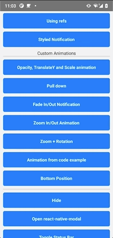
Also you can see the code of all Animations from Example GIF. Feel free to copy those animations to your codebase and play with them.
Troubleshooting
You might notice that some animations such as zoom in/out(using scale param) might work incorrectly on iOS and instead of just "scaling" component also moves up and down.
That is because of padding that was added by SafeAreaView.
This behavior can be fixed by moving safe area inset from component to container, like this:
Notifier.showNotification({
  title: 'Zoom In/Out Animation',
  containerStyle: (translateY: Animated.Value) => ({
    // add safe area inset to the container
    marginTop: safeTopMargin,
    // ...
  }),
  // replace SafeAreaView with View
  componentProps: {
    ContainerComponent: View,
  },
})
This behavior will be fixed in feature releases.
Using with react-native-navigation
If you are using react-native-navigation, this issue might be helpful to use notifier with native-navigation: https://github.com/seniv/react-native-notifier/issues/16
If you have any solutions or improvements in how to use notifier with native-navigation, then feel free to write comments in that thread!
Troubleshooting
PanGestureHandler must be used as a descendant of GestureHandlerRootView
Check this comment: https://github.com/seniv/react-native-notifier/issues/85#issuecomment-1603741147
License
MIT