react-native-pixel-launch
Pixel Launcher-style animations for React Native and Expo — overlay transitions, dialogs, bottom sheets, dome footer with FAB menu, and categorized menu grid with search.
Preview
| v1.0 — Pixel Launch Overlay | v1.1 — Full Component Suite |
|---|---|
.gif) |
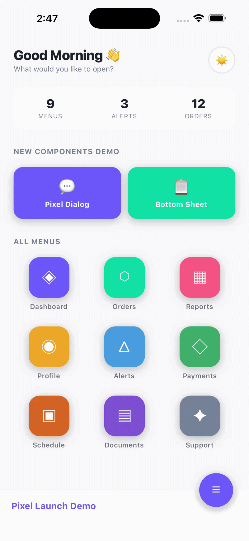 |
Features
- PixelLaunchContainer — Full-screen overlay that scales from any element (like Android's Pixel Launcher app-open animation)
- PixelDialog — Custom alert dialog that expands from an origin point to screen center
- PixelContactDialog — Pre-built Call/WhatsApp/SMS/Email dialog with zero icon dependencies
- AnimatedBottomSheet — Bottom sheet with slide animation + stagger items
- DomeFooter — SVG dome bar footer with circular FAB button cutout
- FabMenu — Expandable floating action button menu with staggered spring animations
- PixelMenuGrid — Data-driven, categorized icon grid with scale-on-press animation
- PixelMenuOverlay — Search bar + categorized menu grid combo
- PixelCard — Fully customizable animated card with header, badges, footer actions, expand/collapse
- Runs on the native thread (
useNativeDriver: true) for smooth 60/120 Hz - Works with both Expo and bare React Native
- TypeScript support built-in
- Zero required dependencies (only
reactandreact-native) - Optional
react-native-svgpeer dependency (only needed forDomeFooter)
Installation
npm install react-native-pixel-launch
# or
yarn add react-native-pixel-launch
If you want to use DomeFooter / FabMenu, also install:
npm install react-native-svgComponents
1. PixelLaunchContainer
Full-screen overlay that scales up from an origin rect and collapses back on close.
import { useState, useRef } from "react";
import { View, TouchableOpacity, Text } from "react-native";
import { PixelLaunchContainer, type LaunchOrigin } from "react-native-pixel-launch";

export default function App() {
  const [visible, setVisible] = useState(false);
  const [origin, setOrigin]   = useState<LaunchOrigin | null>(null);
  const btnRef                = useRef<View>(null);

  const handleOpen = () => {
    btnRef.current?.measure((_x, _y, width, height, pageX, pageY) => {
      setOrigin({ x: pageX, y: pageY, width, height });
      setVisible(true);
    });
  };

  return (
    <View style={{ flex: 1 }}>
      <TouchableOpacity ref={btnRef} onPress={handleOpen}>
        <Text>Open</Text>
      </TouchableOpacity>

      <PixelLaunchContainer
        visible={visible}
        origin={origin}
        onClose={() => setVisible(false)}
        onDismissed={() => console.log("fully closed")}
        backgroundColor="#FFFFFF"
      >
        <View style={{ flex: 1, alignItems: "center", justifyContent: "center" }}>
          <Text>Your screen content here</Text>
          <TouchableOpacity onPress={() => setVisible(false)}>
            <Text>Close</Text>
          </TouchableOpacity>
        </View>
      </PixelLaunchContainer>
    </View>
  );
}
Props
| Prop | Type | Required | Default | Description |
|---|---|---|---|---|
visible |
boolean |
Yes | -- | Controls open/close state |
origin |
LaunchOrigin | null |
Yes | -- | Screen-absolute rect of the trigger element |
onClose |
() => void |
Yes | -- | Called when user wants to close |
onDismissed |
() => void |
No | -- | Called after close animation completes |
backgroundColor |
string |
No | "#FFFFFF" |
Overlay background colour |
zIndex |
number |
No | 200 |
zIndex of the overlay |
children |
ReactNode |
Yes | -- | Content rendered inside the overlay |
2. PixelDialog
Custom dialog that replaces native Alert — scales from an origin point to screen center.
import { PixelDialog } from "react-native-pixel-launch";

<PixelDialog
  visible={showDialog}
  origin={dialogOrigin}
  title="Delete Item?"
  message="This action cannot be undone."
  icon={<MyIcon />}
  buttons={[
    { label: "Cancel", style: "cancel", onPress: () => setShowDialog(false) },
    { label: "Delete", style: "destructive", onPress: handleDelete },
  ]}
  onDismiss={() => setShowDialog(false)}
/>

{/* Custom button colors */}
<PixelDialog
  visible={showContact}
  origin={contactOrigin}
  title="Contact"
  message="How would you like to reach out?"
  buttons={[
    { label: "Call", style: "default", onPress: handleCall },
    { label: "WhatsApp", color: "#25D366", onPress: handleWhatsApp },
    { label: "Cancel", style: "cancel", onPress: () => setShowContact(false) },
  ]}
  onDismiss={() => setShowContact(false)}
/>
Props
| Prop | Type | Required | Default | Description |
|---|---|---|---|---|
visible |
boolean |
Yes | -- | Controls visibility |
origin |
LaunchOrigin | null |
Yes | -- | Origin rect of trigger element |
title |
string |
Yes | -- | Dialog title |
message |
string |
No | -- | Body text below title |
icon |
ReactNode |
No | -- | Icon rendered above the title |
buttons |
PixelDialogButton[] |
Yes | -- | Array of buttons |
onDismiss |
() => void |
No | -- | Called on backdrop tap |
PixelDialogButton
type PixelDialogButton = {
  label: string;
  style?: "default" | "cancel" | "destructive";
  color?: string;   // Custom text color — overrides style
  icon?: (color: string) => React.ReactNode;  // Icon with auto-matched color
  onPress: () => void;
};
3. PixelContactDialog
Pre-built contact dialog with Call, WhatsApp, SMS, and Email — wraps PixelDialog with zero config. No icon dependency — bring your own icon library.
import { PixelContactDialog } from "react-native-pixel-launch";
import MaterialCommunityIcons from "@expo/vector-icons/MaterialCommunityIcons";

<PixelContactDialog
  visible={showContact}
  origin={contactOrigin}
  phone="8461033880"
  actions={["call", "whatsapp"]}
  renderIcon={(action, color) => (
    <MaterialCommunityIcons
      name={action === "call" ? "phone" : "whatsapp"}
      size={16}
      color={color}
    />
  )}
  onDismiss={() => setShowContact(false)}
/>
Props
| Prop | Type | Required | Default | Description |
|---|---|---|---|---|
visible |
boolean |
Yes | -- | Controls visibility |
origin |
LaunchOrigin | null |
Yes | -- | Origin rect of trigger element |
phone |
string |
No | -- | Phone number for call/whatsapp/sms |
email |
string |
No | -- | Email address for email action |
countryCode |
string |
No | "91" |
Country code for WhatsApp |
actions |
ContactAction[] |
No | Auto-detected | Actions to show: "call", "whatsapp", "sms", "email" |
title |
string |
No | Phone/email | Dialog title |
message |
string |
No | "Choose an option" |
Body text |
icon |
ReactNode |
No | -- | Icon above the title |
renderIcon |
(action, color) => ReactNode |
No | -- | Render icon per button — receives resolved color |
onDismiss |
() => void |
Yes | -- | Close callback |
Default Action Colors
| Action | Label | Color |
|---|---|---|
call |
Call | #2563EB (blue) |
whatsapp |
#25D366 (green) |
|
sms |
SMS | #F59E0B (amber) |
email |
#EA4335 (red) |
4. AnimatedBottomSheet
Bottom sheet with slide-up animation, drag-to-dismiss, and stagger items.
import { AnimatedBottomSheet, StaggerItem } from "react-native-pixel-launch";

<AnimatedBottomSheet
  visible={isOpen}
  onClose={() => setIsOpen(false)}
  title="Options"
  bottomOffset={80}
  backgroundColor="#FFFFFF"
>
  <StaggerItem index={0}><Text>Row 1</Text></StaggerItem>
  <StaggerItem index={1}><Text>Row 2</Text></StaggerItem>
  <StaggerItem index={2}><Text>Row 3</Text></StaggerItem>
</AnimatedBottomSheet>
Props
| Prop | Type | Required | Default | Description |
|---|---|---|---|---|
visible |
boolean |
Yes | -- | Controls open/close |
onClose |
() => void |
Yes | -- | Called on backdrop tap or swipe down |
title |
string |
No | -- | Header title |
bottomOffset |
number |
No | 0 |
Distance from screen bottom |
originX |
number |
No | center | X position the sheet scales from |
maxHeightRatio |
number |
No | 0.80 |
Max height as fraction of screen |
backgroundColor |
string |
No | "#FFFFFF" |
Sheet background color |
titleColor |
string |
No | "#111827" |
Title text color |
handleColor |
string |
No | "#E5E7EB" |
Drag handle color |
dividerColor |
string |
No | "#F3F4F6" |
Divider line color |
backdropMaxOpacity |
number |
No | 0.45 |
Backdrop opacity when open |
children |
ReactNode |
No | -- | Sheet content |
5. DomeFooter
SVG dome bar footer with circular cutout for a floating action button.
import { DomeFooter, FOOTER_BAR_H } from "react-native-pixel-launch";
import { useSafeAreaInsets } from "react-native-safe-area-context";

function MyFooter() {
  const insets = useSafeAreaInsets();
  const barH = FOOTER_BAR_H + insets.bottom;

  return (
    <DomeFooter
      barH={barH}
      primaryColor="#6C63FF"
      footerColor="#1E1E30"
      brandText="My App"
      isFabOpen={fabOpen}
      isSheetOpen={sheetOpen}
      isMenuOpen={menuOpen}
      onToggleFab={() => setFabOpen(!fabOpen)}
      onCloseSheet={() => setSheetOpen(false)}
      onCloseMenu={() => setMenuOpen(false)}
      renderIcon={(name) => (
        <Text style={{ color: "#FFF", fontSize: 22 }}>
          {name === "menu" ? "☰" : "✕"}
        </Text>
      )}
    />
  );
}
Props
| Prop | Type | Required | Default | Description |
|---|---|---|---|---|
barH |
number |
Yes | -- | Total bar height (FOOTER_BAR_H + safe area) |
primaryColor |
string |
Yes | -- | Brand colour for FAB button |
footerColor |
string |
Yes | -- | Footer bar background colour |
brandText |
string |
No | "" |
Text shown on the footer bar |
onBack |
() => void |
No | -- | Sub-screen mode: shows close button |
isSheetOpen |
boolean |
No | false |
Whether a sheet overlay is open |
isFabOpen |
boolean |
No | false |
Whether the FAB menu is open |
isMenuOpen |
boolean |
No | false |
Whether the menu is open |
onCloseSheet |
() => void |
No | -- | Close sheet callback |
onToggleFab |
() => void |
No | -- | Toggle FAB menu callback |
onCloseMenu |
() => void |
No | -- | Close menu callback |
renderIcon |
(name) => ReactNode |
No | -- | Custom icon renderer |
6. FabMenu
Expandable floating action button menu with staggered spring animations.
import { FabMenu } from "react-native-pixel-launch";

<FabMenu
  isOpen={fabOpen}
  bottomOffset={barH}
  primaryColor="#6C63FF"
  items={[
    {
      key: "menu",
      icon: <Text style={{ color: "#FFF" }}>☰</Text>,
      label: "Menu Items",
      onPress: () => openMenu(),
    },
    {
      key: "settings",
      icon: <Text style={{ color: "#FFF" }}>⚙</Text>,
      label: "Settings",
      onPress: () => openSettings(),
    },
  ]}
  onClose={() => setFabOpen(false)}
/>
Props
| Prop | Type | Required | Default | Description |
|---|---|---|---|---|
isOpen |
boolean |
Yes | -- | Controls menu visibility |
bottomOffset |
number |
Yes | -- | Distance from screen bottom |
primaryColor |
string |
Yes | -- | Colour for FAB buttons |
items |
FabMenuItem[] |
Yes | -- | Menu items to display |
onClose |
() => void |
Yes | -- | Close callback |
7. PixelMenuGrid
Data-driven, categorized icon grid with scale-on-press animation and LaunchOrigin measurement.
import { PixelMenuGrid, type PixelMenuItem } from "react-native-pixel-launch";
import Icon from "@expo/vector-icons/MaterialCommunityIcons";

type MyItem = PixelMenuItem & { icon: string };

const items: MyItem[] = [
  { key: "home", title: "Home", icon: "home", color: "blue", category: "Main", order: 1 },
  { key: "chat", title: "Chat", icon: "chat", color: "green", category: "Main", order: 2 },
  { key: "settings", title: "Settings", icon: "cog", color: "gray", category: "Other", order: 3 },
];

<PixelMenuGrid
  items={items}
  primaryColor="#6C63FF"
  renderIcon={(item, color, size) => (
    <Icon name={item.icon as any} size={size} color={color} />
  )}
  onItemPress={(item, origin) => {
    // origin has { x, y, width, height } for PixelLaunchContainer
    console.log("Pressed", item.title, origin);
  }}
/>
Props
| Prop | Type | Required | Default | Description |
|---|---|---|---|---|
items |
PixelMenuItem[] |
No | -- | Flat list (auto-grouped by category) |
sections |
PixelMenuSection[] |
No | -- | Pre-grouped sections |
renderIcon |
(item, color, size) => ReactNode |
Yes | -- | Icon renderer |
onItemPress |
(item, origin) => void |
No | -- | Press callback with measured position |
searchTerm |
string |
No | "" |
Filter items by title |
primaryColor |
string |
No | "#2563EB" |
Accent color for section headers |
iconCircleColor |
string |
No | "#FFFFFF" |
Icon circle background |
labelColor |
string |
No | "#1F2937" |
Card label text color |
columns |
number |
No | 4 |
Number of grid columns |
iconSize |
number |
No | 64 |
Icon circle diameter |
bottomPadding |
number |
No | 0 |
Extra bottom padding |
8. PixelMenuOverlay
Search bar + categorized menu grid combo. Manages search state internally.
import { PixelMenuOverlay } from "react-native-pixel-launch";

<PixelMenuOverlay
  items={menuItems}
  primaryColor="#6C63FF"
  iconCircleColor="#1E1E30"
  labelColor="#CBD5E0"
  searchBackgroundColor="#1E1E30"
  searchTextColor="#FFFFFF"
  searchPlaceholderColor="#718096"
  bottomPadding={100}
  renderIcon={(item, color, size) => (
    <Icon name={item.icon} size={size} color={color} />
  )}
  onItemPress={(item, origin) => openScreen(item, origin)}
/>
Props
Inherits all PixelMenuGrid props (except searchTerm) plus:
| Prop | Type | Required | Default | Description |
|---|---|---|---|---|
searchPlaceholder |
string |
No | "Search in menu" |
Input placeholder |
searchBackgroundColor |
string |
No | "#FFFFFF" |
Search pill background |
searchTextColor |
string |
No | "#202124" |
Search input text color |
searchPlaceholderColor |
string |
No | "#9AA0A6" |
Placeholder text color |
searchShadowColor |
string |
No | primaryColor | Search pill shadow color |
renderSearchIcon |
() => ReactNode |
No | -- | Custom search icon |
renderClearIcon |
() => ReactNode |
No | -- | Custom clear icon |
showSearch |
boolean |
No | true |
Show/hide search bar |
headerContent |
ReactNode |
No | -- | Content above search bar |
9. PixelCard
Fully customizable, animated card component with optional gradient header, badges, footer actions, expand/collapse, and spring press animation.
import { PixelCard } from "react-native-pixel-launch";
import Icon from "@expo/vector-icons/MaterialCommunityIcons";

// ── Elevated card with gradient header, badges, and footer actions ──
<PixelCard
  variant="elevated"
  borderRadius={20}
  accentBorderWidth={4}
  accentBorderColor="#1967D2"
  header={{
    gradientColors: ["#1967D2", "#4285F4"],
    icon: <Icon name="book-open-outline" size={20} color="#FFF" />,
    iconBackgroundColor: "rgba(255,255,255,0.2)",
    title: "Mathematics",
    titleStyle: { fontSize: 18, fontWeight: "800", fontFamily: "System" },
    subtitle: "Class IV · Section A",
    subtitleStyle: { fontSize: 12, color: "rgba(255,255,255,0.75)" },
    right: (
      <View style={{ backgroundColor: "#E8F0FE", borderRadius: 99, paddingHorizontal: 8, paddingVertical: 2 }}>
        <Text style={{ color: "#1967D2", fontSize: 11, fontWeight: "700" }}>HOMEWORK</Text>
      </View>
    ),
  }}
  badges={[
    { text: "2 files", backgroundColor: "#E8F0FE", color: "#1967D2", icon: <Icon name="file-outline" size={12} color="#1967D2" /> },
    { text: "Due Tomorrow", backgroundColor: "#FEF2F2", color: "#B91C1C" },
  ]}
  footer={{
    separator: true,
    separatorColor: "#E5E7EB",
    actions: [
      { key: "view", label: "View", icon: <Icon name="eye-outline" size={16} color="#1967D2" />, color: "#1967D2", backgroundColor: "#E8F0FE", onPress: () => {} },
      { key: "download", label: "Download", icon: <Icon name="download" size={16} color="#FFF" />, color: "#FFF", backgroundColor: "#1967D2", onPress: () => {} },
    ],
  }}
  onPress={() => console.log("Card pressed")}
>
  <View style={{ padding: 14 }}>
    <Text>Complete exercises 1-10 from Chapter 5.</Text>
  </View>
</PixelCard>

// ── Simple outlined card (not clickable) ──
<PixelCard variant="outlined" borderColor="#E5E7EB" padding={16}>
  <Text>Static content card — no press interaction</Text>
</PixelCard>

// ── Expandable card ──
<PixelCard
  variant="filled"
  backgroundColor="#F9FAFB"
  expandable
  header={{
    backgroundColor: "#1967D2",
    title: "Click to expand",
    titleStyle: { color: "#FFF" },
  }}
>
  <View style={{ padding: 14 }}>
    <Text>This content collapses and expands with LayoutAnimation.</Text>
  </View>
</PixelCard>

// ── Card with status dot ──
<PixelCard variant="elevated" statusColor="#22C55E" statusPosition="top-right" padding={16}>
  <Text>Online status indicator</Text>
</PixelCard>
Props
| Prop | Type | Default | Description |
|---|---|---|---|
variant |
"elevated" | "outlined" | "filled" | "gradient" |
"elevated" |
Visual style |
backgroundColor |
string |
"#FFFFFF" |
Card background color |
borderRadius |
number |
16 |
Corner radius |
borderColor |
string |
"#E5E7EB" |
Border color |
borderWidth |
number |
0 (1 for outlined) |
Border width |
accentBorderWidth |
number |
0 |
Left accent stripe width |
accentBorderColor |
string |
"#6366F1" |
Left accent stripe color |
shadowColor |
string |
"#000" |
Shadow color (elevated only) |
shadowOpacity |
number |
0.08 |
Shadow opacity |
elevation |
number |
4 |
Android elevation |
padding |
number |
0 |
Body inner padding |
margin |
number |
0 |
Outer margin |
marginHorizontal |
number |
-- | Horizontal margin override |
marginVertical |
number |
-- | Vertical margin override |
overflow |
"hidden" | "visible" |
"hidden" |
Overflow behavior |
onPress |
() => void |
-- | Makes card clickable with spring animation |
onLongPress |
() => void |
-- | Long press callback |
pressScale |
number |
0.97 |
Scale factor on press |
activeOpacity |
number |
0.92 |
Opacity on press |
disablePressAnimation |
boolean |
false |
Disable press scale animation |
expandable |
boolean |
false |
Enable expand/collapse |
expanded |
boolean |
-- | Controlled expand state |
onExpandChange |
(expanded: boolean) => void |
-- | Expand state callback |
expandIcon |
(expanded: boolean) => ReactNode |
-- | Custom expand icon |
statusColor |
string |
-- | Status dot color |
statusPosition |
"top-right" | "top-left" | "header-right" |
"top-right" |
Status dot position |
style |
ViewStyle |
-- | Root style override |
bodyStyle |
ViewStyle |
-- | Body wrapper style override |
Header Config (header prop)
| Prop | Type | Default | Description |
|---|---|---|---|
gradientColors |
string[] |
-- | Header background colors (solid fallback) |
backgroundColor |
string |
-- | Solid header background |
icon |
ReactNode |
-- | Left icon |
iconBackgroundColor |
string |
"rgba(255,255,255,0.2)" |
Icon circle background |
iconSize |
number |
40 |
Icon circle diameter |
iconBorderRadius |
number |
iconSize/2 |
Icon circle corner radius |
title |
string |
-- | Header title |
titleStyle |
TextStyle |
-- | Full font control (size, weight, family, color) |
subtitle |
string |
-- | Header subtitle |
subtitleStyle |
TextStyle |
-- | Full font control |
right |
ReactNode |
-- | Right-side content |
padding |
number |
14 |
Header padding |
render |
() => ReactNode |
-- | Full custom render (overrides all above) |
Footer Config (footer prop)
| Prop | Type | Default | Description |
|---|---|---|---|
actions |
PixelCardAction[] |
-- | Action buttons |
render |
() => ReactNode |
-- | Full custom render (overrides actions) |
padding |
number |
12 |
Footer padding |
separator |
boolean |
true |
Show separator line |
separatorColor |
string |
"#F3F4F6" |
Separator color |
PixelCardAction
type PixelCardAction = {
  key: string;
  label: string;
  icon?: ReactNode;
  color?: string;            // Text/icon color
  backgroundColor?: string;  // Button background
  fontSize?: number;
  fontWeight?: TextStyle["fontWeight"];
  fontFamily?: string;
  borderRadius?: number;
  outlined?: boolean;        // Outlined style instead of filled
  onPress: () => void;
};
PixelCardBadge
type PixelCardBadge = {
  text: string;
  color?: string;            // Text color
  backgroundColor?: string;  // Badge background
  fontSize?: number;
  fontWeight?: TextStyle["fontWeight"];
  fontFamily?: string;
  borderRadius?: number;
  icon?: ReactNode;          // Left icon
};
Types
LaunchOrigin
type LaunchOrigin = {
  x: number;      // pageX from ref.measure()
  y: number;      // pageY from ref.measure()
  width: number;
  height: number;
};
PixelMenuItem
type PixelMenuItem = {
  key: string;        // Unique identifier
  title: string;      // Display label
  color?: string;     // Icon color (hex or named: "red", "blue", etc.)
  category?: string;  // Section grouping
  order?: number;     // Sort order within category
};
PixelMenuSection
type PixelMenuSection<T extends PixelMenuItem = PixelMenuItem> = {
  category: string;
  items: T[];
};
FabMenuItem
type FabMenuItem = {
  key: string;
  icon: React.ReactNode;
  label: string;
  onPress: () => void;
};
Exported Constants
| Constant | Value | Description |
|---|---|---|
FOOTER_BAR_H |
56 |
Footer bar height (without safe area) |
DOME_R |
50 |
Dome radius |
DOME_CX |
screenWidth - 58 |
Dome center X position |
BTN_R |
30 |
FAB button radius |
CUP_RIM_R |
39 |
Dome cutout rim radius |
Named Colors
PixelMenuGrid resolves named colors automatically:
red orange yellow green teal blue indigo violet purple pink cyan gray brown lime amber
You can extend or override these with the namedColors prop.
Changelog
v1.3.0
- New: PixelCard — Fully customizable animated card component with 4 variants (elevated, outlined, filled, gradient), optional gradient header with icon/title/subtitle, badge row, footer action buttons, expand/collapse with LayoutAnimation, status dot indicator, spring press animation, and full font customization (size, weight, family) on all text elements.
- AnimatedBottomSheet: Added
contentContainerStyleprop to override internal ScrollView padding. AddedautomaticallyAdjustKeyboardInsetsfor keyboard-aware scrolling.
v1.2.0
- New: PixelContactDialog — Pre-built contact dialog with Call, WhatsApp, SMS, Email actions. Zero icon dependencies — bring your own via
renderIcon. - PixelDialog: Added
iconrender function on buttons — receives resolved color so icon and text always match.
v1.1.1
- PixelDialog: Added optional
colorprop toPixelDialogButtonfor custom button text colors. Overrides thestylepreset when provided.
License
MIT — made by Sourabh Patidar