
react-native-sweet-alert
Cute, native alert dialogs for React Native - success, error, warning, normal, and progress styles, built on the New Architecture (TurboModules).
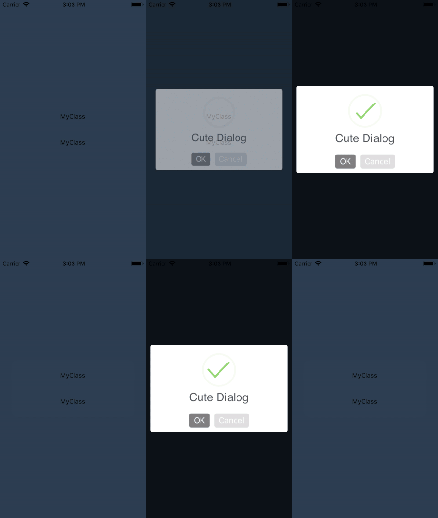







Features
- Five alert styles -
success,error,warning,normal,progress - Progress style - determinate (with a
setProgress()ticker) or indeterminate spinner - Promise-based API -
await showAlert(options)resolves{ confirmed: boolean } - Cancellable - optional tap-outside-to-dismiss on any style
- Themeable buttons and colors - per-alert hex colors for confirm/other buttons and the progress bar
- Dark mode aware - card background and text adapt automatically on both platforms
- New Architecture (TurboModules) - a Codegen spec, no legacy bridge fallback
- Fully typed - written in TypeScript, no
@typespackage needed
Requirements
- React Native 0.86+ with the New Architecture (the only architecture RN itself supports as of 0.82 - there's no legacy-bridge fallback here).
- iOS 15+, Android API 24+.
Installation
npm install react-native-sweet-alertAutolinking handles the rest - no manual bridging headers, no AndroidManifest.xml edits.
Usage
import SweetAlert from 'react-native-sweet-alert';

const result = await SweetAlert.showAlert({
  style: 'success',
  title: 'Great job!',
  subTitle: 'Everything went smoothly.',
  confirmButtonTitle: 'OK',
});

// result.confirmed is `true`/`false` depending on which button was pressed.
Alert styles
style is one of 'success' | 'error' | 'warning' | 'normal' | 'progress'.
await showAlert({
  style: 'warning',
  title: 'Are you sure?',
  subTitle: "This can't be undone.",
  confirmButtonTitle: 'Delete',
  confirmButtonColor: '#F27474',
  otherButtonTitle: 'Cancel',
  otherButtonColor: '#8CC152',
});
Set cancellable: true to let the user dismiss the alert by tapping outside it (resolves with { confirmed: false }).
Progress style
await showAlert({
  style: 'progress',
  title: 'Uploading...',
  progress: 0, // omit for an indeterminate spinner
  progressBarColor: '#4A90D9',
  progressCircleRadius: 36,
  progressBarWidth: 6,
});

setProgress(50); // update the same alert's progress later
dismissAlert(); // dismiss it programmatically when done
Full options reference
| Option | Type | Notes |
|---|---|---|
style |
string |
Required. success/error/warning/normal/progress |
title |
string |
|
subTitle |
string |
|
confirmButtonTitle |
string |
|
confirmButtonColor |
string |
Hex color, e.g. #4A90D9 |
otherButtonTitle |
string |
Omit to show a single-button alert |
otherButtonColor |
string |
Hex color |
cancellable |
boolean |
Tap outside to dismiss |
progress |
number |
0-100; progress style only. Omit for indeterminate |
progressBarColor |
string |
progress style only |
progressCircleRadius |
number |
progress style only, in dp/pt |
progressBarWidth |
number |
progress style only, in dp/pt |
Example app
See example/ for a runnable Expo app exercising every alert style. From the repo root:
pnpm install
pnpm example ios     # or: pnpm example android
Contributing
License
MIT
Made with create-react-native-library