0.2.1 • Published 7 years ago
react-native-swipeable-rating v0.2.1
react-native-swipeable-rating
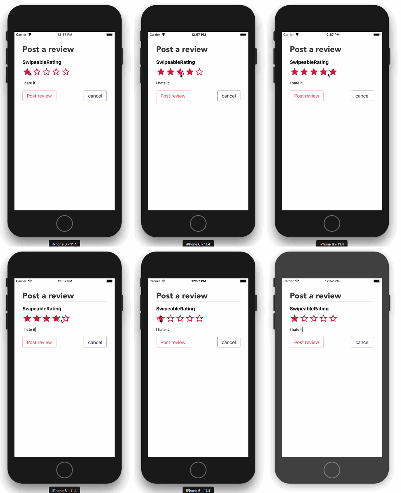
Star rating component with support for swipe and / or touch selection

Usage
react-native-vector-icons package is required, set it up if you haven't already.
install > npm i react-native-swipeable-rating
Basic example
import React, { Component } from 'react';
import { View } from 'react-native';
import SwipeableRating from 'react-native-swipeable-rating';

class MyStarRating extends Component {
  state = {
    rating: 0
  }

  handleRating = (rating) => {
    this.setState({rating});
  }

  render(){
    return(
      <View style={{marginHorizontal: 30}}>
        <SwipeableRating
          rating={this.state.rating}
          size={32}
          gap={4}
          onPress={this.handleRating}
          xOffset={30}
        />
      </View>
    )
  }
}
See the full example app
There are a few different ways the component can be used:
- The above example works with swiping and tapping on individual stars.
rating={n},swipeable={false}and noonPresswill make it a dumb/static component that displays a rating.swipeable={false}with anonPressfunction will make the individual stars a tappableTouchableOpacity.- if you use
allowHalvesyou will also need to changeminRatingto0.5
Props
| Prop name | type | default | Desc | Required? |
|---|---|---|---|---|
| rating | number | The rating | ✅ | |
| onPress | function | The function to be called when swiping or tapping | ||
| swipeable | boolean | true | Allow/disallow swiping the component to change the rating | |
| xOffset | number | 0 | The offset from the left of the screen to the start of the component (ignore if swipeable={false}) | no but you will almost definitely need to change it! |
| style | object | Styles the rating container | ||
| color | string | 'crimson' | Color applied to the default star icon | |
| emptyColor | string | 'crimson' | Color applied to the default empty star icon | |
| size | number | 24 | The size applied to the default icons | |
| gap | number | 0 | marginRight applied to the default icons | |
| minRating | number | 1 | The minimum rating to allow | |
| maxRating | number | 5 | The maximum rating to allow / amount of stars to display | |
| allowHalves | boolean | false | Allow ratings to go up in increments of 0.5 instead of 1 | |
| filledIcon | string or function | 'star' | The MaterialIcons icon to use for the filled star OR your custom component function (receives size, gap, number args) | |
| halfFilledIcon | string or function | 'star-half' | The MaterialIcons icon to use for the half filled star OR your custom component function (receives size, gap, number args) | |
| emptyIcon | string or function | 'star-border' | The MaterialIcons icon to use for the empty star OR your custom component function (receives size, gap, number args) |
You must make your custom icon components size (+ gap, if you use it) total width, so the correct swipe distances can be calculated.
size, gap, color, emptyColor, n (the icon's rating number (index) beginning at 1) are passed to the custom icon functions for convenience.