react-responsive-accordion v1.0.0
React Responsive Accordion Component
React component to wrap content in Accordion element.

This component is dependent on React Collapsible
Installation
Installation can be achieved via NPM.
npm install react-responsive-accordionAlternatively just download the Accordion.js file form the src folder and include it in your project in your chosen way.
Usage
Collapsible can receive any HTML elements or React component as it's children. Collapsible will wrap the contents, as well as generate a trigger element which will control showing and hiding.
ES6 Example
import React from 'react';
import Accordion from 'react-responsive-accordion';

var App = React.createClass({


  render: function() {
    return(
      <div>

        <Accordion>
          <div data-trigger="A nifty React accordion component">
            <p>So this is an Accordion component that used the <a href="https://github.com/glennflanagan/react-collapsible">react-collapsible</a> component. How handy.</p>
          </div>

          <div data-trigger="What the difference?" data-trigger-when-open="THAT is the difference!">
            <p>An Accordion is different to a Collapsible in the sense that only one "tray" will be open at any one time.</p>
          </div>

          <div data-trigger="I'm responsive and I have a little secret. Look inside.">
            <p>And this Accordion component is also completely repsonsive. Hurrah for mobile users!</p>
          </div>
        </Accordion>

      </div>
    );
  }

});

export default App;
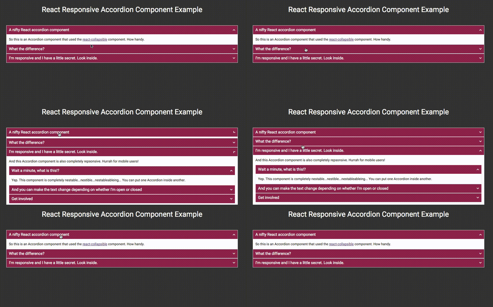
With a little CSS becomes

Children Properties
The Accordion expects to wrap its children's content in the React Collapsible compoenent. In order to set the text on these compoenents then the Accordion children are able to take the following properties.
data-trigger | string | required
The text to appear in the trigger link.
data-trigger-when-open | string
Optional trigger text to change to when the Collapsible is open.
data-trigger-Disabled | boolean
Optional flag to disable triggers programatically.
Accordion Properties (Options)
startPosition | number | default: 0
The zero based position you wish the Accordion to start open at.
transitionTime | number | default: 400
The number of milliseconds for the open/close transition to take.
easing | string | default: 'liner'
The CSS easing method you wish to apply to the open/close transition. This string can be any valid value of CSS transition-timing-function. For reference view the MDN documentation.
classParentString | string | default: Collapsible
Use this to overwrite the parent CSS class for the Collapsible component parts. Read more in the CSS section below.
CSS Styles
The CSS styles for this Accordion adopt the same structure as the React Collapsible component.
In theory you don't need any CSS to get this to work, but let's face it, it'd be pretty rubbish without it.
By default the parent CSS class name is .Collapsible but this can be changed by setting the classParentString property on the Accordion component.
The CSS class names follow a type of BEM pattern of CSS naming. Below is a list of the CSS classes available on the component.
.Collapsible
The parent element for the components.
.Collapsible__trigger
The trigger link that controls the opening and closing of the component. The state of the component is also reflected on this element with the modifier classes;
is-closed| Closed stateis-open| Open setState
.Collapsible__contentOuter
The outer container that hides the content. This is set to overflow: hidden within the javascript but everything else about it is for you to change.
.Collapsible__contentInner
This is a container for the content passed into the compoenent. This keeps everything nice and neat and allows the component to do all it's whizzy calculations.
Example
An example of the component in action is available in the example folder. To see it in action you can run npm install and then run gulp. This will compile all the JSX into JS and open the example page using BrowserSync.
Licence
React Responsive Collapsible Section Component is MIT licensed