


React Shadow Picker
A shadow picker inspired by the Chromium devtools
Example
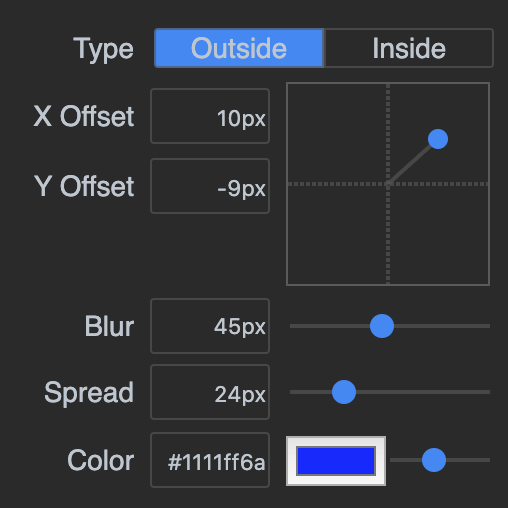
Installation
yarn add react-shadow-pickerUsage
The component can be used either in a Controlled or Uncontrolled way. If you pass the value back to the component, it will be controlled.
import {ShadowPicker} from "react-shadow-picker";

const App = () => {
	const [shadow, setShadow] = useState("0px 0px 10px 10px #44444455");

	return (
		<div style={{boxShadow: shadow}}>
			<ShadowPicker
				value={shadow}
				onChange={(value) => {
					setShadow(value);
				}}
			/>
		</div>
	);
};
Styling
Assign the picker a custom class
<ShadowPicker className={"custom-picker"} ... />and then style it with these classes
.custom-picker.shadow-picker {
	background: antiquewhite;
	color: blue;
}
.custom-picker .shadow-picker__position {
	border: 1px solid blue;
}
.custom-picker .shadow-picker__position.active {
	background: aquamarine;
}
.custom-picker .shadow-picker__grid {
	border: 1px solid blue;
}
.custom-picker .shadow-picker__grid-line {
	color: red;
}
.custom-picker .shadow-picker__grid-handle {
	color: red;
}
.custom-picker .shadow-picker__input {
	border: 1px solid teal;
}
.custom-picker .shadow-picker__slider {
	background: red;
}
.custom-picker .shadow-picker__slider::-webkit-slider-thumb {
	background: blue;
}