1.0.3 • Published 2 years ago
react-weblineindia-time-picker v1.0.3
ReactJS - TimePicker
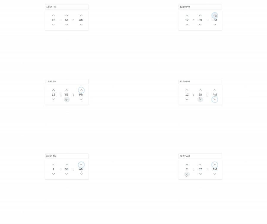
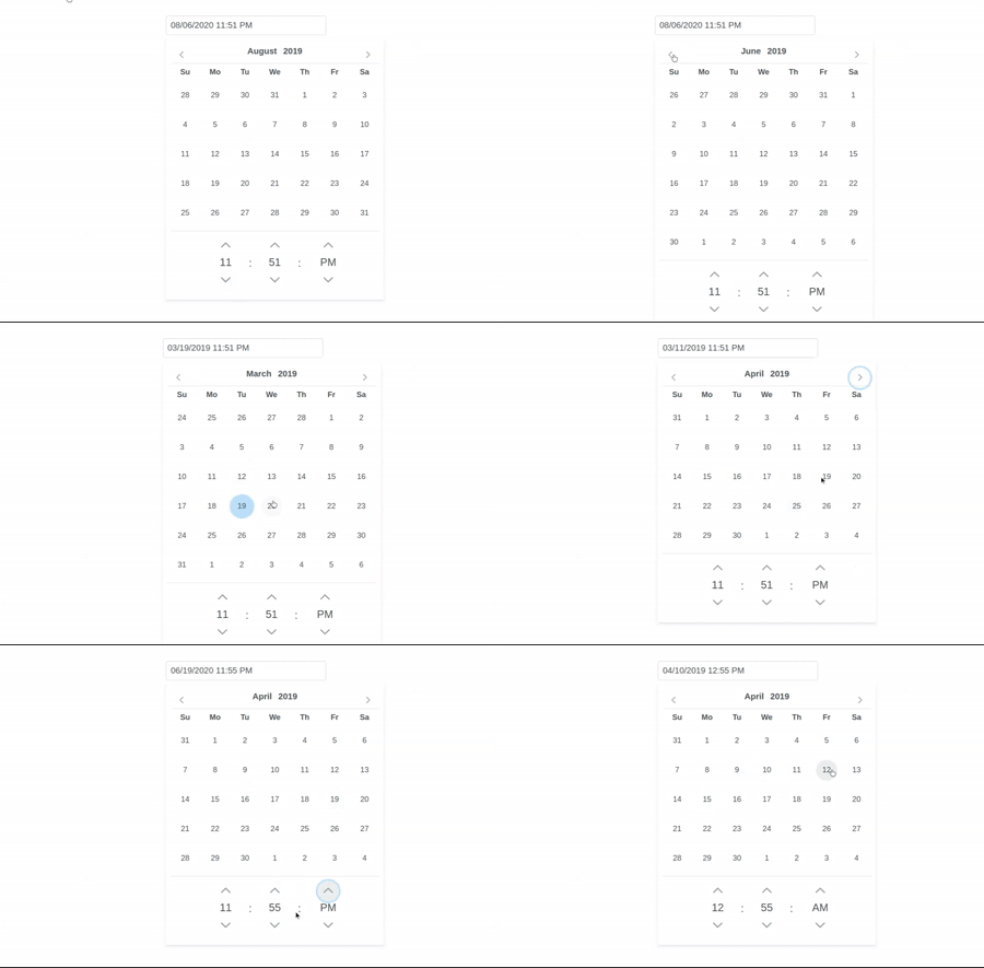
A ReactJS based TimePicker component to implement time or datetime selection.
Table of contents
- Browser Support
- Demo
- Getting started
- Usage
- Available Props
- Methods
- Want to Contribute?
- Collection of Other Components
- Changelog
- Credits
- License
- Keywords
Browser Support
 |  |  |  |  |
|---|---|---|---|---|
| 83.0 ✔ | 77.0 ✔ | 13.1.1 ✔ | 83.0 ✔ | 11.9 ✔ |
Demo
Getting started
Install the npm package:
npm install react-weblineindia-time-picker
# OR
yarn add react-weblineindia-time-picker
Usage
Use the <react-weblineindia-time-picker> component:
import React ,{ Component } from 'react';
import TimePicker from 'react-weblineindia-time-picker'

class Test extends Component {
  constructor(props) {
    super(props);
    this.state = {
      date: null
    };
  }

  render() {
    return (
      <div>
        <Calendar
          id="time24" value={this.state.date} onChange={(e) => this.setState({ date: e.value })} showTime showSeconds
        />
      </div>
    );
  }
}

export default Test;
Available Props
| Prop | Type | default | Description |
|---|---|---|---|
| value | any | null | Value of the component. |
| locale | string | en | Localization for different languages and formats is defined by binding the locale. |
| dateFormat | string | mm/dd/yy | EFormat of the date. |
| monthNavigator | boolean | false | Whether the month should be rendered as a dropdown instead of text. |
| yearNavigator | boolean | false | Whether the year should be rendered as a dropdown instead of text. |
| minDate | Date | null | The minimum selectable date. |
| maxDate | Date | null | The maximum selectable date. |
| disabledDates | array | null | Array with dates to disable. |
| disabledDays | array | null | Array with disabled weekday numbers. |
| showTime | boolean | true | Whether to display timepicker. |
| timeOnly | boolean | false | Whether to display timepicker only. |
| hourFormat | String | 12 | Specifies 12 or 24 hour format. |
| stepHour | Number | 1 | Hours to change per step. |
| stepMinute | Number | 1 | Minutes to change per step. |
| stepSecond | Number | 1 | Seconds to change per step. |
| showSeconds | boolean | false | Whether to show the seconds in time picker. |
| timeSeparator | string | : | Separator of time selector. |
| inline | boolean | false | When enabled, displays the calendar as inline instead of an overlay. |
| showOtherMonths | boolean | false | Whether to display dates in other months (non-selectable) at the start or end of the current month. To make these days selectable use the selectOtherMonths option. |
| selectOtherMonths | boolean | Array with disabled weekday numbers. | Whether days in other months shown before or after the current month are selectable. This only applies if the showOtherMonths option is set to true. |
| numberOfMonths | number | 1 | Number of months to display. |
| view | string | date | Type of view to display, valid valids are "date" for datepicker and "month" for month picker. |
| yearRange | string | 1960:2050 | The range of years displayed in the year drop-down in (nnnn:nnnn) format such as (2000:2020). |
| panelClass | string | null | Style class of the datetimepicker panel. |
| panelStyle | string | null | Inline style of the datetimepicker panel. |
| maxDateCount | number | null | Maximum number of selectable dates in multiple mode. |
| showOnFocus | boolean | true | When disabled, datepicker will not be visible with input focus. |
| autoZIndex | boolean | true | Whether to automatically manage layering. |
| baseZIndex | number | 0 | Base zIndex value to use in layering. |
| showButtonBar | boolean | false | Whether to display today and clear buttons at the footer |
| shortYearCutoff | string | +10 | The cutoff year for determining the century for a date. |
| hideOnDateTimeSelect | boolean | false | Whether to hide the overlay on date selection when showTime is enabled. |
| showWeek | boolean | false | When enabled, calendar will show week numbers. |
| manualInput | boolean | false | Wheter to allow prevents entering the date manually via typing. |
| ariaLabelledBy | string | null | Establishes relationships between the component and label(s) where its value should be one or more element IDs. |
| appendTo | string | null | Id of the element or "body" for document where the overlay should be appended to. |
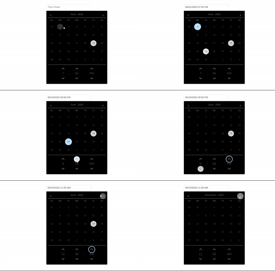
| isDarkTheme | boolean | false | dark theme for calendar |
Methods
| Name | Parameters | Description |
|---|---|---|
| date-select | value: Selected value | Callback to invoke when a date is selected. |
| show | - | Callback to invoke when datepicker panel is shown. |
| hide | - | Callback to invoke when datepicker panel is hidden. |
| today-click | date: Today as a date instance | Callback to invoke when today button is clicked. |
| clear-click | event: Click event | Callback to invoke when clear button is clicked. |
| month-change | event.month: New month event.year: New year | Callback to invoke when a month is changed using the navigators. |
| year-change | event.month: New month event.year: New year | Callback to invoke when a year is changed using the navigators. |
Styling
Following is the list of structural style classes.
| Name | Element |
|---|---|
| p-calendar | Main container element. |
| p-calendar-w-btn | Main container element when button is enabled. |
| p-calendar-timeonly | Main container element in time picker only mode. |
| p-inputtext | Input element. |
| p-datepicker | Datepicker element. |
| p-datepicker-inline | Datepicker element in inline mode |
| p-monthpicker | Datepicker element in month view. |
| p-monthpicker-month | Month cell in month view mode. |
| p-datepicker-touch-ui | Datepicker element in touch ui mode. |
| p-datepicker-calendar | Table containing dates of a month. |
| p-datepicker-current-day | Cell of selected date. |
| p-datepicker-today | Cell of today's date. |
Want to Contribute?
- Created something awesome, made this code better, added some functionality, or whatever (this is the hardest part).
- Fork it.
- Create new branch to contribute your changes.
- Commit all your changes to your branch.
- Submit a pull request.
Collection of Components
We have built many other components and free resources for software development in various programming languages. Kindly click here to view our Free Resources for Software Development.
Changelog
Detailed changes for each release are documented in CHANGELOG.md.
Credits
react-weblineindia-time-picker is inspired by primereact.
License
Keywords
react-weblineindia-time-picker, react-calendar, react-time-picker, timepicker, reactjs-timepicker, datetimepicker, date-time-picker


