
slide-swiper-component
A smooth, adaptive swipe component with haptic feedback, procedural sound, and progressive colour transitions. Zero dependencies. Works in any browser.





Demo
Inbox · Delete / Archive — Approvals · Approve / Reject
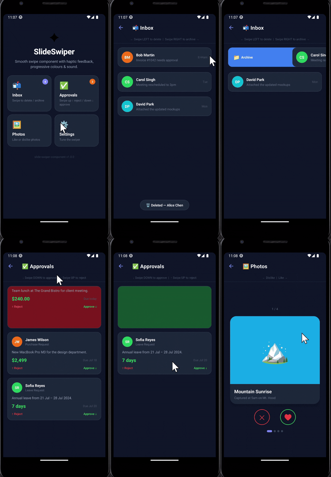
Photos · Like / Dislike — Settings · Themes & Haptic
.gif)
Features
| Feature | Detail |
|---|---|
| Horizontal swipe | Left / right with archive, delete actions |
| Vertical swipe | Down = approve (green) · Up = reject (red) |
| Progressive colours | Element colour shifts live as you drag |
| Haptic feedback | Vibration patterns via the Vibration API |
| Sound effects | Procedural tones via Web Audio API — no audio files |
| Runtime updates | Change any option without re-initialising |
| TypeScript | Full type definitions included |
| Zero dependencies | No external packages required |
| CDN ready | Works via <script> tag, ESM import, or CommonJS |
| Accessible | ARIA role and aria-label set automatically |
Installation
npm install slide-swiper-componentyarn add slide-swiper-componentCDN (no build step)
<!-- jsDelivr -->
<script src="https://cdn.jsdelivr.net/npm/slide-swiper-component/dist/index.umd.js"></script>

<!-- UNPKG -->
<script src="https://unpkg.com/slide-swiper-component/dist/index.umd.js"></script>
Quick Start
HTML + CDN
<!DOCTYPE html>
<html lang="en">
<head>
  <meta charset="UTF-8" />
  <meta name="viewport" content="width=device-width, initial-scale=1.0" />
</head>
<body>

  <div id="my-swiper" style="
    width: 100%; max-width: 360px; height: 110px;
    border-radius: 14px; display: flex;
    align-items: center; justify-content: center;
    color: white; font-family: sans-serif; font-weight: 700;
  ">
    Swipe me ← →
  </div>

  <script src="https://unpkg.com/slide-swiper-component/dist/index.umd.js"></script>
  <script>
    const swiper = new SlideSwiper({
      selector:     '#my-swiper',
      direction:    'horizontal',
      onSwipeLeft:  () => console.log('Deleted!'),
      onSwipeRight: () => console.log('Archived!'),
    });
  </script>
</body>
</html>
npm + ES Module
import SlideSwiper from 'slide-swiper-component';

const swiper = new SlideSwiper({
  selector:           '#my-swiper',
  direction:          'horizontal',   // 'horizontal' | 'vertical'
  sensitivity:        0.6,            // 0.1 – 1.0
  transitionDuration: 300,            // ms
  hapticEnabled:      true,
  soundEnabled:       true,
  colors: {
    default:         'linear-gradient(135deg, #667eea 0%, #764ba2 100%)',
    right:           'linear-gradient(135deg, #22c55e 0%, #16a34a 100%)',
    left:            'linear-gradient(135deg, #ef4444 0%, #dc2626 100%)',
    approveGradient: 'linear-gradient(135deg, #22c55e 0%, #16a34a 100%)',
    rejectGradient:  'linear-gradient(135deg, #ef4444 0%, #dc2626 100%)',
  },
  size: { width: '100%', height: '110px' },
  onSwipeLeft:     (data) => console.log('← left',  data.timestamp),
  onSwipeRight:    (data) => console.log('→ right', data.timestamp),
  onSwipeComplete: (data) => console.log('done',    data.direction),
});
CommonJS
const SlideSwiper = require('slide-swiper-component');Options
| Option | Type | Default | Description |
|---|---|---|---|
selector |
string |
'.slide-swiper' |
CSS selector for the target element |
direction |
'horizontal' | 'vertical' |
'horizontal' |
Swipe axis |
sensitivity |
number |
0.5 |
Drag multiplier — clamped to [0.1, 1] |
transitionDuration |
number |
300 |
Completion animation in ms |
hapticEnabled |
boolean |
true |
Vibration API feedback |
soundEnabled |
boolean |
true |
Web Audio API tones |
thresholdPercentage |
number |
30 |
% of element size to register a swipe |
colors |
object |
— | Per-direction gradient strings (see below) |
size |
object |
{ width: '100%', height: '120px' } |
CSS dimensions |
onSwipeLeft |
function |
— | Left / up swipe callback |
onSwipeRight |
function |
— | Right / down swipe callback |
onSwipeComplete |
function |
— | Called on every drag release |
colors object
| Key | When used | Default |
|---|---|---|
default |
Idle state | Purple gradient |
right |
Horizontal right swipe | Blue gradient |
left |
Horizontal left swipe | Pink gradient |
approveGradient |
Vertical swipe-down | Green gradient |
rejectGradient |
Vertical swipe-up | Red gradient |
// Example — custom colour scheme
colors: {
  default:         'linear-gradient(135deg, #0f172a 0%, #1e293b 100%)',
  right:           'linear-gradient(135deg, #22c55e 0%, #16a34a 100%)',
  left:            'linear-gradient(135deg, #ef4444 0%, #dc2626 100%)',
  approveGradient: 'linear-gradient(135deg, #22c55e 0%, #16a34a 100%)',
  rejectGradient:  'linear-gradient(135deg, #ef4444 0%, #dc2626 100%)',
}
API Methods
swiper.reset()
Returns the element to its resting position immediately.
swiper.reset();swiper.updateConfig(options)
Update any option at runtime without re-creating the instance.
swiper.updateConfig({
  sensitivity: 0.8,
  soundEnabled: false,
  colors: {
    right: 'linear-gradient(135deg, #06b6d4, #0891b2)',
  },
  size: { width: '280px', height: '90px' },
});
swiper.destroy()
Removes all event listeners and releases the Web Audio context. Safe to call multiple times.
swiper.destroy();Callback Payloads
onSwipeLeft / onSwipeRight
{
  direction:  'left' | 'right';   // resolved swipe direction
  timestamp:  number;             // Date.now()
}
onSwipeComplete
{
  direction: 'left' | 'right' | 'none';  // 'none' = below threshold
  delta:     number;                      // raw pixel drag distance
  threshold: number;                      // pixels required
}
Vertical Mode — Approve / Reject
In vertical mode the gesture mapping is:
| Gesture | Direction | Default colour | Callback |
|---|---|---|---|
| Swipe down | right callback | approveGradient (green) |
onSwipeRight |
| Swipe up | left callback | rejectGradient (red) |
onSwipeLeft |
const approvalCard = new SlideSwiper({
  selector:  '#card',
  direction: 'vertical',
  colors: {
    approveGradient: 'linear-gradient(135deg, #22c55e, #16a34a)',
    rejectGradient:  'linear-gradient(135deg, #ef4444, #dc2626)',
  },
  onSwipeRight: () => approve(),   // swipe DOWN
  onSwipeLeft:  () => reject(),    // swipe UP
});
Sound Effects
Generated on-the-fly via the Web Audio API — no audio files required.
| Trigger | Frequency | Duration |
|---|---|---|
| Drag start | 400 Hz | 55 ms |
| Drag move | 560 Hz | 30 ms |
| Swipe complete | 820 Hz | 160 ms |
| Snap back | 460 Hz | 100 ms |
Move tones are throttled to 1 per 80 ms to prevent audio flooding.
Haptic Feedback Patterns
Uses navigator.vibrate() where supported (most Android browsers).
| Trigger | Vibration pattern |
|---|---|
| Drag start | 10 ms |
| Snap back | 20 ms |
| Swipe complete | [30, 15, 30] ms |
Browser Support
| Feature | Chrome | Firefox | Safari | Edge | Mobile |
|---|---|---|---|---|---|
| Touch events | |||||
| Mouse events | — | ||||
| Web Audio API | |||||
| Vibration API | |||||
| CSS Transforms |
= Limited or no support on some devices
Use Cases
- Inbox apps — swipe right to archive, left to delete
- Approval workflows — swipe down to approve, up to reject
- Photo rating — Tinder-style like / dislike
- Music players — skip / previous track
- Notification trays — dismiss banners
- E-commerce — add to cart / remove
- Survey / quiz — agree / disagree
Accessibility
role="slider"andaria-labelare applied automatically- Sound and haptics can be disabled independently via options
- Works alongside screen readers
- Respects
prefers-reduced-motionwhentransitionDuration: 0is set
Contributing
Issues and pull requests are welcome.
- Fork the repo
- Create a branch:
git checkout -b feat/my-feature - Make changes in
src/SlideSwiper.js - Build:
npm run build - Test:
npm test - Open a pull request
Changelog
See CHANGELOG.md for version history.
License
MIT 2026 iaishuvenkat