Solid corner smoothing
This is a component package used to create smooth curved corners for solidJS. You can use it easily for basic tags or a solid-styled-components.
From version 0.2.0 will support solid-start and the documentation has been changed
Link demo
Installation
npm install solid-corner-smoothing
pnpm install solid-corner-smoothing
yarn add solid-corner-smoothing
Usage
Import
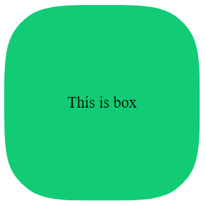
import SolidCornerSmoothing from 'solid-corner-smoothing';Basic
const App = () => {
  return (
    <div>
      <SolidCornerSmoothing
        class="box"
        options={{
          cornerRadius: 40,
          cornerSmoothing: 0.8,
          reSize: true,
          preserveSmoothing: true,
        }}
      >
        This is box
      </SolidCornerSmoothing>
    </div>
  );
};

export default App;
Using with reactivity
you can use react and have to enable reSize prop to be able to change element state according to it
const [radius, setRadius] = createSignal(60);
const [smoothing, setSmoothing] = createSignal(0.7);

return (
  <div>
    <SolidCornerSmoothing
      class="box"
      options={{
        cornerRadius: radius(),
        cornerSmoothing: smoothing(),
        preserveSmoothing: true
        reSize: true
      }}
    >
      This is box
    </SolidCornerSmoothing>
  </div>
);
Wrapper
pass the tag name as a string to the wrapper prop that will be used as the root tag
return (
  <div>
    <SolidCornerSmoothing
      class="box"
      wrapper="form"
      options={{ cornerRadius: 60, cornerSmoothing: 0.8 }}
    >
      This is box
    </SolidCornerSmoothing>
  </div>
);
Solid-styled-components
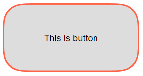
You can also pass a style-components to the wrapper prop to generate the root tag
const Btn = styled('button')`
  display: flex;
  justify-content: center;
  align-items: center;
  width: 200px;
  height: 100px;
  border: none;
`;

return (
  <div>
    <SolidCornerSmoothing
      wrapper={Btn}
      options={{
        cornerRadius: 30,
        cornerSmoothing: 0.8,
        backgroundColor: '#ddd',
        border {
          color: "tomato",
          size: 2
        }
      }}
    >
      This is button
    </SolidCornerSmoothing>
  </div>
);
Use css
Background color can be used via css or options props, border color can only be passed through options props. (the colors passed options props also accept css variables)
return (
  <div>
    <SolidCornerSmoothing
      class="box"
      wrapper="button"
      options={{
        cornerRadius: 30,
        cornerSmoothing: 0.8,
        preserveSmoothing: true
        border: {
          color: "tomato",
          size: 2
        }
      }}
    >
      This is button
    </SolidCornerSmoothing>
  </div>
);
.box {
display: flex;
justify-content: center;
align-items: center;
width: 200px;
height: 100px;
background-color: gray;
}Props
| Prop name | Type value | Description |
|---|---|---|
| wrapper | string, Styled Element | Root tag (default is div), can also be a solid-styled-components |
| options | Options | Where to put options. (required to work)border-radius. |
Options
| Prop name | Type value | Description |
|---|---|---|
| cornerRadius | number | Similar to the CSS property border-radius. |
| topLeftCornerRadius | number | Radius each corner |
| topRightCornerRadius | number | Radius each corner |
| bottomRightCornerRadius | number | Radius each corner |
| bottomLeftCornerRadius | number | Radius each corner |
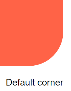
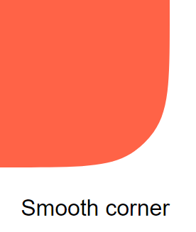
| cornerSmoothing | number | The degree of corner smoothing as a number in the range 0–1. 0 is equivalent to no smoothing and looks like normal border-radius. 1 indicates maximal smoothing. |
| preserveSmoothing | boolean | Allow corner smoothing to work better on large rounded corners. |
| reSize | boolean | Allows resizing and corners |
| border.size | number | When this prop has a value, it will turn into border mode (need to change the css according to the instructions or use prop borderColor and backgroundColor) |
| border.color | string | Border color |
| backgroundColor | string | Background color (can still use css if not using this prop) |
| fitBorderWidth | number | Add custom angle width parameter to fix visual effects |