
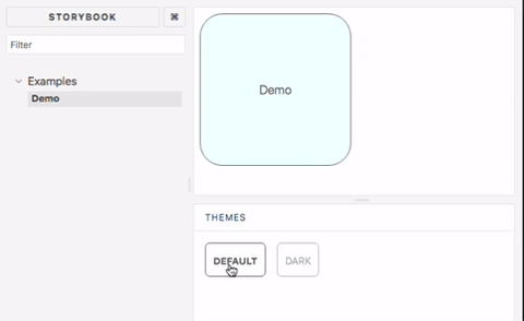
This addon allows storybook to showcase components with multiple different styled-component themes. Supports storybook v4, v5, v6 and newer
Installation
yarn add storybook-addon-styled-component-theme --devConfiguration
storybook v6
Add a decorator to stories in .storybook/preview.js
import { addDecorator } from "@storybook/react";
import { withThemesProvider } from "storybook-addon-styled-component-theme";
import { ThemeProvider } from "styled-components";

const themes = [theme1, theme2];
addDecorator(withThemesProvider(themes), ThemeProvider);
Add to .storybook/main.js
module.exports = {
  ...
  addons: [
    ...
    "storybook-addon-styled-component-theme/dist/preset"
  ]
};
storybook v5 and v4
Add to .storybook/addons.js
// v1.3, storybook v5.2
import "storybook-addon-styled-component-theme/dist/register";

// v1.2, storybook v4, v5.0
import "storybook-addon-styled-component-theme/dist/src/register";
addDecorator to .storybook/preview.js
import { addDecorator } from "@storybook/react";
import { withThemesProvider } from "storybook-addon-styled-component-theme";

const themes = [theme1, theme2];
addDecorator(withThemesProvider(themes));
Remind
Make sure every theme object has a name property
Contributing
Build local library
yarn

yarn build
Start the local example
cd example

yarn

yarn storybook
Run all the spec
yarn test