
Storybook/Addon: styled-components with themes
Storybook addon for styled components with theme provider
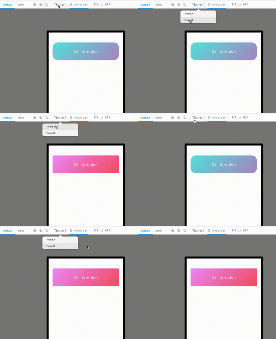
Getting Started
Installing
yarn add storybook-addon-styled-components-themes --DConfiguration
Register the addon in .storybook/main.js
module.exports = {
  stories: ['../src/**/*.stories.(tsx|mdx)'],
  addons: ['storybook-addon-styled-components-themes/register']
};
Add parameters to stories in .storybook/preview.js
addParameters({
  styledComponentsThemes: {
    /**
     * Themes
     */
    themes: [ThemeA, ThemeB],
    /**
     * Theme to start on - index - optional
     */
    initialTheme: 1, // optional
    /**
     *  Key for show name of theme - optional
     */
    label: 'name', // optional
  },
});
Add decorator to stories in .storybook/preview.js
addDecorator(story => (
    <WithThemeProvider>
        {story()}
    </WithThemeProvider>
));
License
This project is licensed under the MIT License - see the LICENSE.md file for details