
storybook-dark-mode
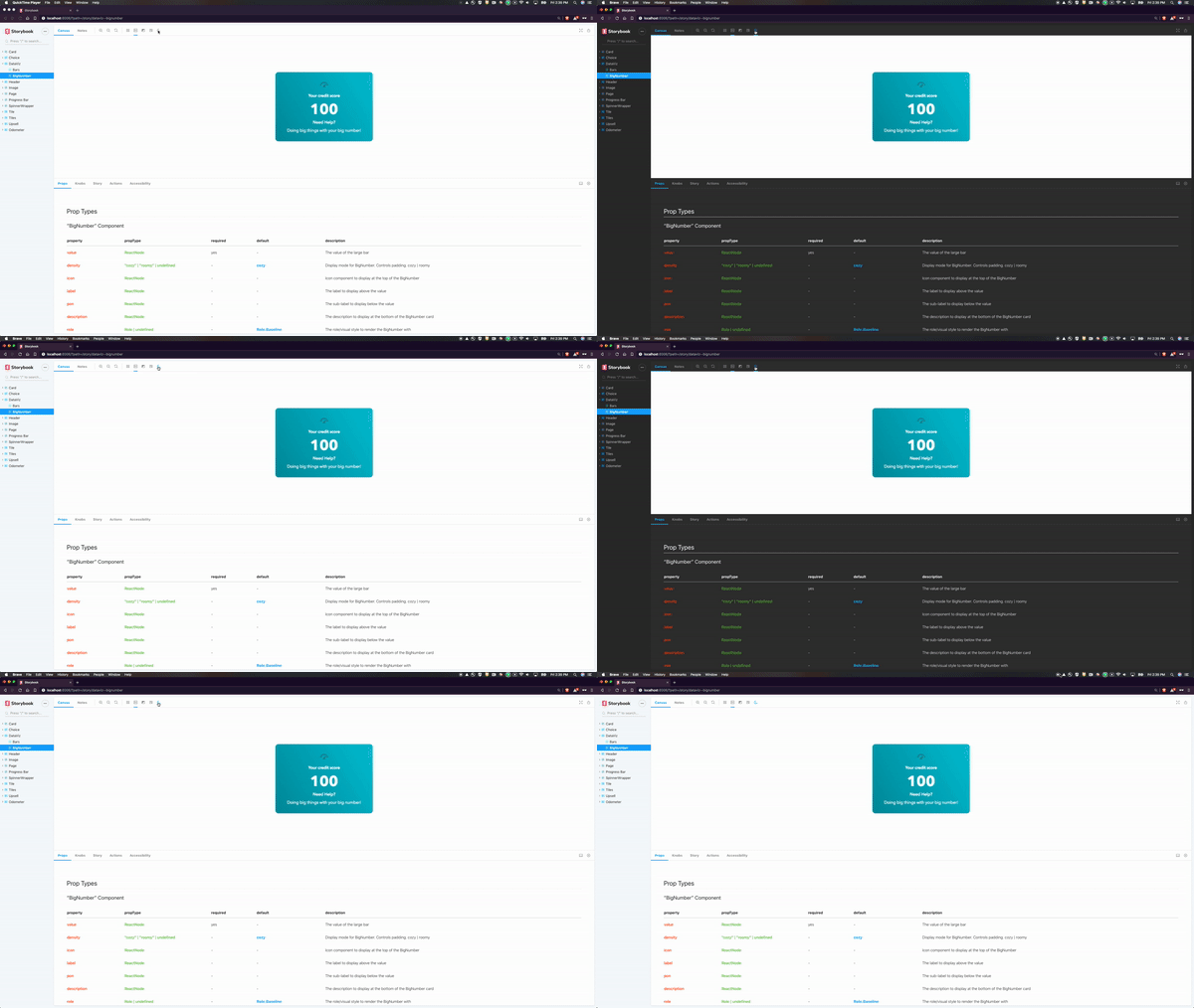
A storybook addons that lets your users toggle between dark and light mode.
Installation
Install the following npm module:
npm i --save-dev storybook-dark-modeor with pnpm:
pnpm add -D storybook-dark-modeThen, add following content to .storybook/main.js
module.exports = {
  addons: ['storybook-dark-mode']
};
Upgrade from earlier version
Change in .storybook/main.js
module.exports = {
-  addons: ['storybook-dark-mode/register']
+  addons: ['storybook-dark-mode']
};
Configuration
Configure the dark and light mode by adding the following to your .storybook/preview.js file:
import { themes } from 'storybook/theming';

export const parameters = {
  darkMode: {
    // Override the default dark theme
    dark: { ...themes.dark, appBg: 'black' },
    // Override the default light theme
    light: { ...themes.normal, appBg: 'red' }
  }
};
Default Theme
Order of precedence for the initial color scheme:
- If the user has previously set a color theme it's used
- The value you have configured for
currentparameter in your storybook - The OS color scheme preference
Once the initial color scheme has been set, subsequent reloads will use this value.
To clear the cached color scheme you have to localStorage.clear() in the chrome console.
export const parameters = {
  darkMode: {
    // Set the initial theme
    current: 'light'
  }
};
Dark/Light Class
This plugin will apply a dark and light class name to the manager. This allows you to easily write dark mode aware theme overrides for the storybook UI.
You can override the classNames applied when switching between light and dark mode using the darkClass and lightClass parameters.
export const parameters = {
  darkMode: {
    darkClass: 'lights-out',
    lightClass: 'lights-on'
  }
};
You can also pass an array to apply multiple classes.
export const parameters = {
  darkMode: {
    darkClass: ['lights-out', 'foo'],
    lightClass: ['lights-on', 'bar']
  }
};
Preview class target
This plugin will apply the dark/light class to the <body> element of the preview iframe. This can be configured with the classTarget parameter.
The value will be passed to a querySelector() inside the iframe.
This is useful if the <body> is styled according to a parent's class, in that case it can be set to html.
export const parameters = {
  darkMode: {
    classTarget: 'html'
  }
};
Story integration
Preview ClassName
This plugin will apply the darkClass and lightClass classes to the preview iframe if you turn on the stylePreview option.
export const parameters = {
  darkMode: {
    stylePreview: true
  }
};
React
If your components use a custom Theme provider, you can integrate it by using the provided hook.
import { useDarkMode } from 'storybook-dark-mode';

// your theme provider
import ThemeContext from './theme';

// create a component that uses the dark mode hook
function ThemeWrapper(props) {
  // render your custom theme provider
  return (
    <ThemeContext.Provider value={useDarkMode() ? darkTheme : defaultTheme}>
      {props.children}
    </ThemeContext.Provider>
  );
}

export const decorators = [renderStory => <ThemeWrapper>{renderStory()}</ThemeWrapper>)];
Theme Knobs
If you want to have you UI's dark mode separate from you components' dark mode, implement this global decorator:
import { themes } from 'storybook/theming';

// Add a global decorator that will render a dark background when the
// "Color Scheme" knob is set to dark
const knobDecorator = storyFn => {
  // A knob for color scheme added to every story
  const colorScheme = select('Color Scheme', ['light', 'dark'], 'light');

  // Hook your theme provider with some knobs
  return React.createElement(ThemeProvider, {
    // A knob for theme added to every story
    theme: select('Theme', Object.keys(themes), 'default'),
    colorScheme,
    children: [
      React.createElement('style', {
        dangerouslySetInnerHTML: {
          __html: `html { ${
            colorScheme === 'dark' ? 'background-color: rgb(35,35,35);' : ''
          } }`
        }
      }),
      storyFn()
    ]
  });
};

export const decorators = [knobDecorator];
Events
You can also listen for the DARK_MODE event via the addons channel.
import { addons } from 'storybook/preview-api';
import { DARK_MODE_EVENT_NAME } from 'storybook-dark-mode';

// your theme provider
import ThemeContext from './theme';

// get channel to listen to event emitter
const channel = addons.getChannel();

// create a component that listens for the DARK_MODE event
function ThemeWrapper(props) {
  // this example uses hook but you can also use class component as well
  const [isDark, setDark] = useState(false);

  useEffect(() => {
    // listen to DARK_MODE event
    channel.on(DARK_MODE_EVENT_NAME, setDark);
    return () => channel.off(DARK_MODE_EVENT_NAME, setDark);
  }, [channel, setDark]);

  // render your custom theme provider
  return (
    <ThemeContext.Provider value={isDark ? darkTheme : defaultTheme}>
      {props.children}
    </ThemeContext.Provider>
  );
}

export const decorators = [renderStory => <ThemeWrapper>{renderStory()}</ThemeWrapper>)];
Since in docs mode, Storybook will not display its toolbar,
You can also trigger the UPDATE_DARK_MODE event via the addons channel if you want to control that option in docs mode,
By editing your .storybook/preview.js.
import React from 'react';
import { addons } from 'storybook/preview-api';
import { DocsContainer } from '@storybook/addon-docs';
import { themes } from 'storybook/theming';

import {
  DARK_MODE_EVENT_NAME,
  UPDATE_DARK_MODE_EVENT_NAME
} from 'storybook-dark-mode';

const channel = addons.getChannel();

export const parameters = {
  darkMode: {
    current: 'light',
    dark: { ...themes.dark },
    light: { ...themes.light }
  },
  docs: {
    container: props => {
      const [isDark, setDark] = React.useState();

      const onChangeHandler = () => {
        channel.emit(UPDATE_DARK_MODE_EVENT_NAME);
      };

      React.useEffect(() => {
        channel.on(DARK_MODE_EVENT_NAME, setDark);
        return () => channel.removeListener(DARK_MODE_EVENT_NAME, setDark);
      }, [channel, setDark]);

      return (
        <div>
          <input type="checkbox" onChange={onChangeHandler} />
          <DocsContainer {...props} />
        </div>
      );
    }
  }
};
Contributors
Thanks goes to these wonderful people (emoji key):


This project follows the all-contributors specification. Contributions of any kind welcome!