v-tooltip


Easy tooltips, popovers and dropdown with Popper.js
Sponsors

Useful Links
Table of Contents
Getting started
This package offers two different usages: directive or component. You can use them to create tooltips, popovers or all kinds of dropdowns.
- Install the plugin:
npm install --save v-tooltip- Add the plugin into your app:
import Vue from 'vue'
import VTooltip from 'v-tooltip'

Vue.use(VTooltip)Add some style to your liking.
Use the
v-tooltipdirective:
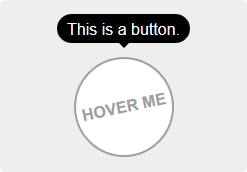
<button v-tooltip="'You have ' + count + ' new messages.'">- Use the
v-popovercomponent:
<v-popover>
  <!-- This will be the popover target (for the events and position) -->
  <button>Click me</button>
  <!-- This will be the content of the popover -->
  <MyAwesomeComponent slot="popover"/>
</v-popover>Installation
Npm
npm install --save v-tooltipInstall the plugin into Vue:
import Vue from 'vue'
import VTooltip from 'v-tooltip'

Vue.use(VTooltip)
Or use the directives and components directly:
import Vue from 'vue'
import { VTooltip, VPopover, VClosePopover } from 'v-tooltip'

Vue.directive('tooltip', VTooltip)
Vue.directive('close-popover', VClosePopover)
Vue.component('v-popover', VPopover)
Browser
Include v-tooltip in the page.
<script src="https://unpkg.com/v-tooltip@^2.0.0"></script>If Vue is detected in the Page, the plugin is installed automatically.
Manually install the plugin into Vue:
Vue.use(VTooltip)Or use the directives and components directly:
Vue.directive('tooltip', VTooltip.VTooltip)
Vue.directive('close-popover', VTooltip.VClosePopover)
Vue.component('v-popover', VTooltip.VPopover)
Usage
Directive
In the template, use the v-tooltip directive:
<button v-tooltip="'You have ' + count + ' new messages.'">Of course, you can use a reactive property:
<button v-tooltip="tooltipContent"> HTML is enabled in the tooltip by default. If you plan on using content coming from the users, please disable HTML parsing with the html global option to prevent XSS attacks:
import VTooltip from 'v-tooltip'
Vue.use(VTooltip, {
  defaultHtml: false,
})
Or directly on package:
import VTooltip from 'v-tooltip'
VTooltip.options.defaultHtml = false
You can then specify html: true on each tooltip you want to render HTML in. See below for more info on the tooltip options.
You can specify the tooltip position as a modifier:
<button v-tooltip.bottom-start="'You have ' + count + ' new messages.'">The available positions are:
'auto''auto-start''auto-end''top''top-start''top-end''right''right-start''right-end''bottom''bottom-start''bottom-end''left''left-start''left-end'
You need to add style to the tooltips: examples.
Object notation
You can use an object instead of a simple string:
<button v-tooltip="{ content: 'You have ' + count + ' new messages.' }">Dynamic CSS classes
You can set the tooltip css classes dynamically with the object notation:
<button v-tooltip="{ content: 'You have ' + count + ' new messages.', classes: ['a', 'b'] }">This will replace the default CSS classe with 'a b' on the tooltip element.
You can also use the standard class notation:
<button v-tooltip="{ content: 'You have ' + count + ' new messages.', classes: 'a b' }">Or a reactive property:
<button v-tooltip="{ content: 'You have ' + count + ' new messages.', classes: tooltipClasses }">Other options
<button v-tooltip="options">content- HTML text to be displayed in the tooltip. Can also be a function that returns the content or a Promise.classes- (see above)targetClasses- CSS classes added to the target element of the tooltip.html- Boolean: allow HTML tooltip content.delay- Show/Hide delay, or object:{ show: 500, hide: 100 }(ms).placement- (see above)trigger- Events triggering the tooltip separated with spaces:'hover','click','focus'or'manual'('manual'can't be combined with any other event).show- Boolean to manually open or hide the tooltip.offset- Offset of the position (px).container- Selector: Container where the tooltip will be appended (e.g.'body'). Set it tofalseto append popover on target parent node.boundariesElement- DOM element for the tooltip boundaries.template- HTML template of the tooltip.arrowSelector- CSS selector to get the arrow element in the tooltip template.innerSelector- CSS selector to get the inner content element in the tooltip template.autoHide- Boolean: automatically close the tooltip on mouseover.hideOnTargetClick- Boolean: automatically close the tooltip on target click.loadingClass- CSS classes added to the tooltip when content is loading.loadingContent- Same ascontent, used when the actual tooltip content is loading.popperOptions- Other Popper.js options.
You can change the default values in the Global options.
Async content example
The content option accepts a promise:
<button
  v-tooltip="{
    content: asyncMethod(),
    loadingContent: 'Please wait...',
    loadingClass: 'content-is-loading',
  }"
>Hover me!</button>
Manual trigger example
Use the trigger and show options:
<button
  v-tooltip="{
    content: 'Tooltip content here',
    show: isOpen,
    trigger: 'manual',
  }"
>A button</button>
Tooltip auto-hiding
By default, if trigger contains 'hover', the tooltip is automatically hidden on hover or click. To disable this, set the autoHide option to false:
VTooltip.options.autoHide = falseDisabling tooltips
On mobile, you can disable the tooltips with the VTooltip.enabled property:
VTooltip.enabled = window.innerWidth > 768Component
If you need to display components inside the tooltip (or popover/dropdown, technically it's the same ), use the v-popover component:
<v-popover
  offset="16"
>
  <!-- This will be the popover target (for the events and position) -->
  <button class="tooltip-target b3">Click me</button>

  <!-- This will be the content of the popover -->
  <template slot="popover">
    <input class="tooltip-content" v-model="msg" placeholder="Tooltip content" />
    <p>
      {{ msg }}
    </p>

    <!-- You can put other components too -->
    <ExampleComponent char="=" />
  </template>
</v-popover>
By default, the popover will have the tooltip and popover classes, so you can easily override the style:
.tooltip {
  // ...

  &.popover {
    $color: #f9f9f9;

    .popover-inner {
      background: $color;
      color: black;
      padding: 24px;
      border-radius: 5px;
      box-shadow: 0 5px 30px rgba(black, .1);
    }

    .popover-arrow {
      border-color: $color;
    }
  }
}
Set the arrow element z-index CSS property:
.tooltip-arrow {
  z-index: 1;
}
Popover Component Reference
Props:
open- Boolean that shows or hide the popover.disabled- Boolean that disables the popover. If it was already open, it will be closed.placement- (see above)delay- (see above)trigger- (see above)offset- (see above)container- (see above)boundariesElement- (see above)popperOptions- (see above)popoverClass- Classes applied to the popover element. Use this to apply different themes to the popover.popoverBaseClass- Base classes applied to the popover element (defaults to'tooltip popover').popoverWrapperClass- Class of the element that contains the arrow and inner content.popoverArrowClass- Class of the arrow element.popoverInnerClass- Class of the inner content element.autoHide- Hide the popover if clicked outside.handleResize- Automatically update the popover position if its size changes.openGroup- If set, will close all the open popovers that have a differentopen-groupvalue or unset.openClass- Class put on the popover when it's open.
You can change the default values in the Global options.
Events:
update:open(Boolean)- This allow you to use the.syncmodifier on theopenprop.showapply-show- Emitted after the show delayhideapply-hide- Emitted after the hide delaydisposeauto-hide- Emitted when the popover is closed if clicked outside.close-directive- Emitted when the popover is closed with the Close directive.close-group- Emitted when the popover is closed because a popover of anotheropen-groupwas shown.resize- Emitted when the content size changes. You must set thehandleResizeprop totrue.
Disable popover
<v-popover :disabled="isDisabled"></v-popover>data () {
return {
isDisabled: true,
}
}Close directive
Use the v-close-popover directive on an element inside the popover to close it when the element is clicked (or touched on mobile):
<v-popover>
  <button>Click me</button>

  <template slot="popover">
    <a v-close-popover>Close</a>
  </template>
</v-popover>
You can also set it to true or false to enable or disable the directive (enabled by default):
<a v-close-popover="false">Close</a>
<a v-close-popover="true">Close</a>
You can also use a property:
<a v-close-popover="myBooleanProp">Close</a>data () {
return {
myBooleanProp: true,
}
}Close all the popovers in the page with the all modifier:
<a v-close-popover.all>Close All</a>Global options
The default global options are:
{
  // Default tooltip placement relative to target element
  defaultPlacement: 'top',
  // Default CSS classes applied to the tooltip element
  defaultClass: 'vue-tooltip-theme',
  // Default CSS classes applied to the target element of the tooltip
  defaultTargetClass: 'has-tooltip',
  // Is the content HTML by default?
  defaultHtml: true,
  // Default HTML template of the tooltip element
  // It must include `tooltip-arrow` & `tooltip-inner` CSS classes (can be configured, see below)
  // Change if the classes conflict with other libraries (for example bootstrap)
  defaultTemplate: '<div class="tooltip" role="tooltip"><div class="tooltip-arrow"></div><div class="tooltip-inner"></div></div>',
  // Selector used to get the arrow element in the tooltip template
  defaultArrowSelector: '.tooltip-arrow, .tooltip__arrow',
  // Selector used to get the inner content element in the tooltip template
  defaultInnerSelector: '.tooltip-inner, .tooltip__inner',
  // Delay (ms)
  defaultDelay: 0,
  // Default events that trigger the tooltip
  defaultTrigger: 'hover focus',
  // Default position offset (px)
  defaultOffset: 0,
  // Default container where the tooltip will be appended
  defaultContainer: 'body',
  defaultBoundariesElement: undefined,
  defaultPopperOptions: {},
  // Class added when content is loading
  defaultLoadingClass: 'tooltip-loading',
  // Displayed when tooltip content is loading
  defaultLoadingContent: '...',
  // Hide on mouseover tooltip
  autoHide: true,
  // Close tooltip on click on tooltip target?
  defaultHideOnTargetClick: true,
  // Auto destroy tooltip DOM nodes (ms)
  disposeTimeout: 5000,
  // Options for popover
  popover: {
    defaultPlacement: 'bottom',
    // Use the `popoverClass` prop for theming
    defaultClass: 'vue-popover-theme',
    // Base class (change if conflicts with other libraries)
    defaultBaseClass: 'tooltip popover',
    // Wrapper class (contains arrow and inner)
    defaultWrapperClass: 'wrapper',
    // Inner content class
    defaultInnerClass: 'tooltip-inner popover-inner',
    // Arrow class
    defaultArrowClass: 'tooltip-arrow popover-arrow',
    // Class added when popover is open
    defaultOpenClass: 'open',
    defaultDelay: 0,
    defaultTrigger: 'click',
    defaultOffset: 0,
    defaultContainer: 'body',
    defaultBoundariesElement: undefined,
    defaultPopperOptions: {},
    // Hides if clicked outside of popover
    defaultAutoHide: true,
    // Update popper on content resize
    defaultHandleResize: true,
  },
}
You can change the options during install with the arguments:
import VTooltip from 'v-tooltip'
Vue.use(VTooltip, options)
Or directly on package:
import VTooltip from 'v-tooltip'
// Set custom CSS class
VTooltip.options.defaultClass = 'my-tooltip'
Style Examples
Bellow are some examples of style you need. Here is another example, used in the live demo.
Sass / Less
.tooltip {
  display: block !important;
  z-index: 10000;

  .tooltip-inner {
    background: black;
    color: white;
    border-radius: 16px;
    padding: 5px 10px 4px;
  }

  .tooltip-arrow {
    width: 0;
    height: 0;
    border-style: solid;
    position: absolute;
    margin: 5px;
    border-color: black;
    z-index: 1;
  }

  &[x-placement^="top"] {
    margin-bottom: 5px;

    .tooltip-arrow {
      border-width: 5px 5px 0 5px;
      border-left-color: transparent !important;
      border-right-color: transparent !important;
      border-bottom-color: transparent !important;
      bottom: -5px;
      left: calc(50% - 5px);
      margin-top: 0;
      margin-bottom: 0;
    }
  }

  &[x-placement^="bottom"] {
    margin-top: 5px;

    .tooltip-arrow {
      border-width: 0 5px 5px 5px;
      border-left-color: transparent !important;
      border-right-color: transparent !important;
      border-top-color: transparent !important;
      top: -5px;
      left: calc(50% - 5px);
      margin-top: 0;
      margin-bottom: 0;
    }
  }

  &[x-placement^="right"] {
    margin-left: 5px;

    .tooltip-arrow {
      border-width: 5px 5px 5px 0;
      border-left-color: transparent !important;
      border-top-color: transparent !important;
      border-bottom-color: transparent !important;
      left: -5px;
      top: calc(50% - 5px);
      margin-left: 0;
      margin-right: 0;
    }
  }

  &[x-placement^="left"] {
    margin-right: 5px;

    .tooltip-arrow {
      border-width: 5px 0 5px 5px;
      border-top-color: transparent !important;
      border-right-color: transparent !important;
      border-bottom-color: transparent !important;
      right: -5px;
      top: calc(50% - 5px);
      margin-left: 0;
      margin-right: 0;
    }
  }

  &.popover {
    $color: #f9f9f9;

    .popover-inner {
      background: $color;
      color: black;
      padding: 24px;
      border-radius: 5px;
      box-shadow: 0 5px 30px rgba(black, .1);
    }

    .popover-arrow {
      border-color: $color;
    }
  }

  &[aria-hidden='true'] {
    visibility: hidden;
    opacity: 0;
    transition: opacity .15s, visibility .15s;
  }

  &[aria-hidden='false'] {
    visibility: visible;
    opacity: 1;
    transition: opacity .15s;
  }
}
CSS
.tooltip {
  display: block !important;
  z-index: 10000;
}

.tooltip .tooltip-inner {
  background: black;
  color: white;
  border-radius: 16px;
  padding: 5px 10px 4px;
}

.tooltip .tooltip-arrow {
  width: 0;
  height: 0;
  border-style: solid;
  position: absolute;
  margin: 5px;
  border-color: black;
  z-index: 1;
}

.tooltip[x-placement^="top"] {
  margin-bottom: 5px;
}

.tooltip[x-placement^="top"] .tooltip-arrow {
  border-width: 5px 5px 0 5px;
  border-left-color: transparent !important;
  border-right-color: transparent !important;
  border-bottom-color: transparent !important;
  bottom: -5px;
  left: calc(50% - 5px);
  margin-top: 0;
  margin-bottom: 0;
}

.tooltip[x-placement^="bottom"] {
  margin-top: 5px;
}

.tooltip[x-placement^="bottom"] .tooltip-arrow {
  border-width: 0 5px 5px 5px;
  border-left-color: transparent !important;
  border-right-color: transparent !important;
  border-top-color: transparent !important;
  top: -5px;
  left: calc(50% - 5px);
  margin-top: 0;
  margin-bottom: 0;
}

.tooltip[x-placement^="right"] {
  margin-left: 5px;
}

.tooltip[x-placement^="right"] .tooltip-arrow {
  border-width: 5px 5px 5px 0;
  border-left-color: transparent !important;
  border-top-color: transparent !important;
  border-bottom-color: transparent !important;
  left: -5px;
  top: calc(50% - 5px);
  margin-left: 0;
  margin-right: 0;
}

.tooltip[x-placement^="left"] {
  margin-right: 5px;
}

.tooltip[x-placement^="left"] .tooltip-arrow {
  border-width: 5px 0 5px 5px;
  border-top-color: transparent !important;
  border-right-color: transparent !important;
  border-bottom-color: transparent !important;
  right: -5px;
  top: calc(50% - 5px);
  margin-left: 0;
  margin-right: 0;
}

.tooltip.popover .popover-inner {
  background: #f9f9f9;
  color: black;
  padding: 24px;
  border-radius: 5px;
  box-shadow: 0 5px 30px rgba(black, .1);
}

.tooltip.popover .popover-arrow {
  border-color: #f9f9f9;
}

.tooltip[aria-hidden='true'] {
  visibility: hidden;
  opacity: 0;
  transition: opacity .15s, visibility .15s;
}

.tooltip[aria-hidden='false'] {
  visibility: visible;
  opacity: 1;
  transition: opacity .15s;
}
LICENCE MIT - Created by Guillaume CHAU (@Akryum)